Have you ever wondered about the meaning of McDonald’s logo? The iconic Golden Arches represent more than just a fast-food symbol. They’re a global emblem representing quick service, affordability, and a unique dining experience.
Recognized by billions of people around the world, this is a logo that has a rich history that mirrors the evolution of one of the world’s most successful fast-food chains.
From its humble beginnings as a barbecue drive-in in San Bernardino, CA, to becoming the largest restaurant chain by revenue, the McDonald’s logo has played a significant role in shaping the brand’s identity.
So, let’s explore the story behind McDonald’s logo and discover what makes it unique!
Table of contents
Brief History Of McDonald’s
McDonald’s started as just one little burger place. But now it’s worth a whopping $106.4 billion and is the 9th most valuable brand in the world. McDonald’s is everywhere in the fast-food world.
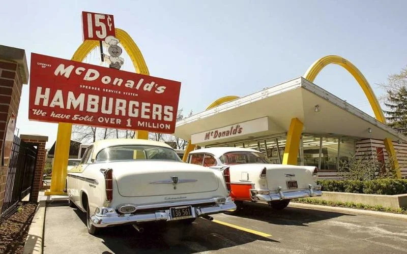
Back in 1940, it was just a tiny hamburger stand. Then Ray Kroc came along and gave the whole brand a makeover. Like the food it serves, the McDonald’s logo is famous.
Those golden arches in the shape of an “M” were inspired by the arches at the first McDonald’s restaurants. At first, nobody paid much attention to the arches in the logo. However, they became a big deal when Ray Kroc took over the whole business in 1961. They became a potent symbol, just like the chain itself.
Nowadays, those arches are a symbol that other food and drink companies want to copy to succeed. McDonald’s has grown so much from its humble beginnings. You can find a McDonald’s in almost every country; sometimes, you’ll see one of its restaurants on nearly every street.
This is partly because McDonald’s sells cheap food and serves it up fast. But what makes McDonald’s stand out is that shiny golden logo.
Also check out: Premade Logo Templates Mega Bundle
Significance Of The Logo
In the current McDonald’s logo, you’ll notice two main brand colors: yellow and red. They’re super bright and catch your eye right away. But there’s more to them than just being bright colors.
The red background makes you feel hungry and excited. It grabs your attention. Yellow, also called gold, is the easiest color to see daily. You can spot the McDonald’s “M” from afar.
Kids can always spot a McDonald’s from so far away. The mix of red and yellow makes you think of speed and quickness. And that’s why lots of fast-food places use red and yellow too.
The people who made this logo chose these colors on purpose. They wanted everyone to think about McDonald’s all the time. But there’s more to these colors than just being easy to see. The golden color makes you feel about having your treasure, like owning a gold mine. And the red and yellow together look just like ketchup and mustard, the perfect toppings for burgers and fries.
Also check out: Aurora 3D Logo & Text Maker
McDonald’s Logo Meaning
When you drive up to a McDonald’s, the first thing that catches your eye is those huge, sturdy golden arches. They stand for reliability, where you can kick back and enjoy a burger after a long day at work.
People recognize this logo from China to South Africa because it’s simple. It’s just one “m”, and it’s golden. There’s nothing else like it in the whole world. It’s just McDonald’s, plain and simple.
Even little kids as young as three know this logo. It’s a shining example of how keeping things simple makes logos stick in people’s minds. The fewer details, the better people remember.
The top logo designers don’t just make logos that look good. They make symbols that stick around and mean something to everyone. It’s like a never-ending loop.
These aren’t your usual arches – they’re soft and delicious-looking. They show strength and authority, but something fun about them makes you hungry. And hey, don’t they look like fries, too?
But no matter how you see these arches, you can’t deny the power and authority they exude. This simple design doesn’t lose any impact. Instead, it adds strength and character to the whole brand.
Also check out: A to Z Floral Logos Bundle
McDonald’s Slogan
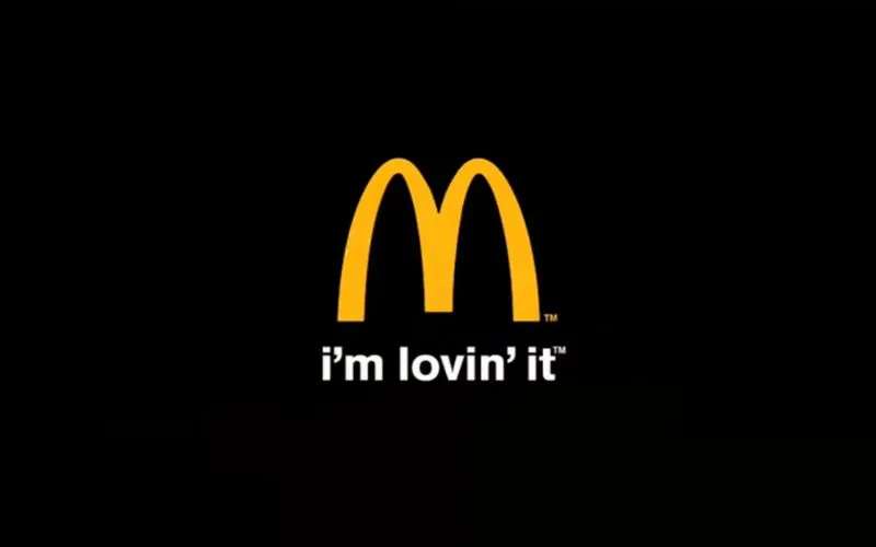
I’m lovin’ it :
“I’m lovin’ it,” with its catchy tune and simple yet powerful message, gets stuck in your head whether you like it. This slogan has been a huge boost for the company, helping it bounce back from tough times in the past.
Some other best McDonald’s tagline:
- Look for the Golden Arches!
- Two all-beef patties, special sauce, lettuce, cheese, pickles, onions on a sesame seed bun.
- You deserve a break today
- It’s a good time for the great taste of McDonald’s
Also check out: Majestic Vector Logo Templates
Discover some cool logos and their hidden logo meanings.
Conclusion
The McDonalds logo is an excellent example of smart branding. It was created based on the arches in their physical stores, making it easy for customers to connect with something familiar. This helps people recognize the brand better.
Changing to the golden arches logo was a big deal because it turned the arches into an “M”, showing that it’s all about McDonald’s.
Nowadays, McDonald’s is so big and famous that they can simplify the logo down to just the arches and still have it work as great marketing. Even without any words or fancy colors, people still know it’s McDonald’s right away. This shows their strong marketing and the value of a simple but unique logo.
In conclusion, McDonald’s logo meaning goes beyond just a symbol. It reflects the brand’s rich history, values, and global impact.
Like this post? Check out more fantastic web design content here.
Frequently Asked Questions
1. What do the golden arches in the McDonald’s logo mean?
Ans. The golden arches represent the letter “M” for McDonald’s. Originally, they came from the design of the restaurant buildings in the 1950s. Over time, they became a powerful symbol of the brand.
2. Why did McDonald’s choose yellow and red for its logo?
Ans. Yellow is bright and attention-grabbing, while red creates a sense of urgency and excitement. Together, these colors make people feel hungry and happy—perfect for a fast-food chain.
3. What makes the McDonald’s logo so effective?
Ans. It’s simple, bold, and instantly recognizable. The golden arches are easy to spot from far away, and the colors trigger strong emotional responses. All of this makes the logo stick in people’s minds.
4. Who designed the McDonald’s logo?
Ans. The original arches came from architect Stanley Meston’s restaurant design in the 1950s. Later, the arches were stylized into the “M” we see today, and the logo became a central part of the brand identity.


