Are you a car lover? Then you must, at one point in life, think about the four rings of the Audi logo meaning.
Audi is a famous German car company that started in 1909 and joined Auto Union GmbH in 1932. Volkswagen AG owns it and has factories worldwide that make cars on every continent.

So let’s explore the secret behind the four rings of the Audi logo meaning.
Table of contents
History of Audi

August Horch, the founder, established his first automobile manufacturing company in 1899, “August Horch & Cie.” However, due to disagreements with partners, he left in 1909. Horch then started a new company in Zwickau on July 16, 1909, naming it “August Horch Automobilwerke GmbH”. However, his old partners sued him for trademark issues over the “Horch” name.
While finding a new name, August Horch was in a meeting with his business friends Paul and Franz Fikentscher. During their meeting, Franz’s son, quietly studying Latin, suggested “Audi” as an alternative to “Horch.” “Horch” means “listen” in German, and “Audi” has a similar meaning in Latin. Inspired by the Latin phrase “audiatur et altera pars” meaning “listen to the other side” or “let the other side be heard”.
The similarity in meanings made “Audi” a suitable choice. So, the idea of using “Audi” as the company name was accepted, and on April 25, 1910, the company officially registered as “Audi Automobilwerke GmbH Zwickau” and later as “Audiwerke AG Zwickau”. This brand has evolved over the years, becoming a part of the Volkswagen Group in 1965 and a top luxury automobile brand globally, known for its innovative technology, sleek designs, and environmental commitment.
Check out BMW Logo Meaning And History.
The Audi Logo Olympic Rings Meaning

If you’ve ever wondered what the four rings of the Audi logo meaning could be, you might have heard various explanations. Some people suggest they’re connected to the Olympic rings, while others say that it means the company’s core principles. However, the correct explanation is simple: the rings reflect the automaker’s heritage. So, now let’s check the Audi logo evolution.
The Evolution Of Audi Logo
1909: (First One In Audi Logo History)
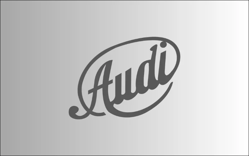
Audi’s first logo was introduced in 1909 before its official launch and had a fancy handwritten typography style. It used dark grey colors, giving it a serious and professional look. It’s worth noting that this design with fancy handwriting and dark gray colors was only used briefly when August Horch Automobilwerke GmbH started in 1909.
1909 (Second Attempt Of Making Audi Logo)
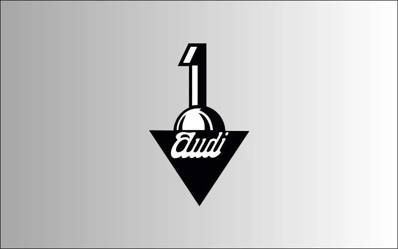
A new Audi symbol was designed in the same year, in 1909 and had a different Audi logo meaning. The company only used it for a few months before they switched to a newer version in the same year. The first design from that time looked like a significant number “1” coming out of a sphere, partly hidden behind a black triangle pointing down. The “Audi” name was written in fancy white letters on a black background, adding a touch of elegance and style to the design.
1909-1932 (Third attempt In The Same Year)
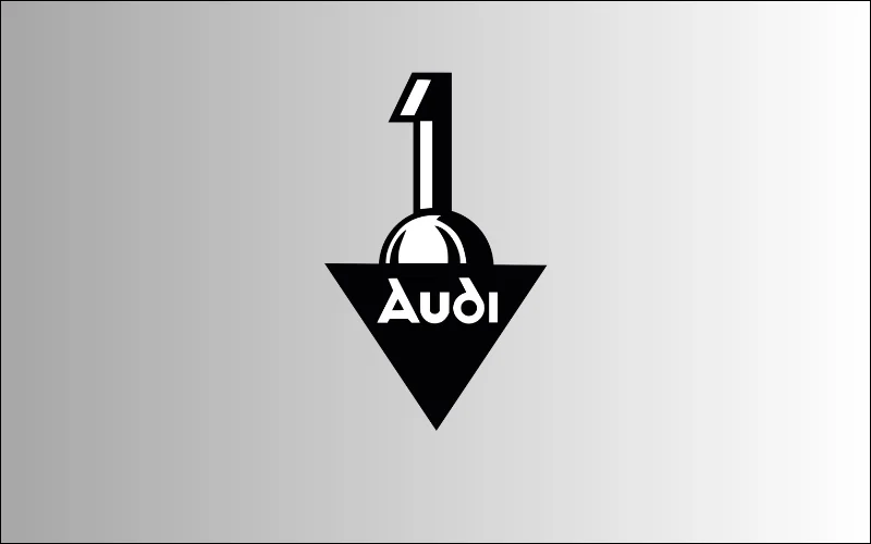
In that same year, the emblem updated to a better design. It showed a solid black triangle pointing down, with the number one above it. The word “Audi” was in white cursive letters written in thick font, with smooth lines, running along the top of the shape. These changes made the logo look better and easier to read. This logo stuck with the car company until 1932 when the Auto Union formed.
1932-1949
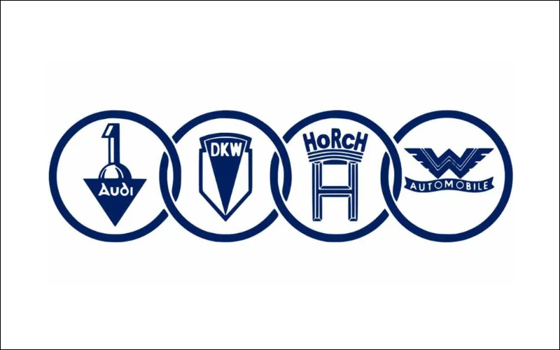
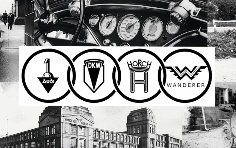
In 1932, the original Auto Union logo featured four blue rings, each displaying the emblem of one of the four brands Audi, DKW, Horch, and Wanderer Automobile, which merged to form Auto Union AG. This merger occurred due to the economic crisis, significantly impacting the car industry. Upon forming Auto Union, they introduced a new logo to demonstrate unity. This Audi logo meaning symbolized how these companies are united and strong. Over time, the four-ring logo has become a well-known symbol for Audi, illustrating its history and the combined legacy and skills of the four companies that united to create Auto Union.
Know the secret behind F1 Logo Meaning
1949-1969

In 1949, the brand introduced a simpler logo. They removed the individual emblems of the four-ring brands and added a horizontal rectangle. Inside this rectangle, the words “Auto Union” were written in a basic capitalized sans-serif font. This change made the logo cleaner and less complicated by eliminating the separate emblems within the rings.
1969

In 1965, Audi Union came under Volkswagen’s control, marking a significant milestone in the company’s evolution. In 1969, the company introduced a new logo. It was a simple black rectangular badge with stretched white ” Audi ” lettering. This change came after the merging of Auto Union and NSU Motorenwerke AG to form Audi NSU Auto Union AG, later known as Audi AG. During this period, the logo included “NSU” (an abbreviation of “Neckarsulm“), reflecting the merging of the two companies and their shared history.
Also check out The Evolution of Amazon Logo.
1969-1995
In 1969, Auto Union transformed into Audi. Then, it introduced a different version of the logo, removing the rectangular banner. The emblem now only had four thick blue rings, linking together to show Audi as its symbol.
Check out McDonald’s Logo Meaning
1969-1995
During that same period, designers created a logotype with a horizontal black oval shape. They included the Audi lettering inside this shape. They also crafted the inscription uniquely, using a non-standard Audi logo font with bold white letters. Noting, they designed the letter “d” in “Audi” with a rounded shape, making it a distinguishing feature of the logo.
Check out Beats Logo Meaning, History & Significance
1978-1995
In 1978, Audi changed its logo. They turned the black oval background to red and outlined it with a thick white and thin red border. By choosing red for the background and adding the white and red outline, the logo gained vibrancy and visibility, making it stand out.
1995-2009
In 1995, the company redesigned its logo, merging the rings and wordmarks. Their logo was silver three-dimensional rings below bold red lettering of “Audi” in a custom font. This combination produced an attractive contrast and added elegance and exclusivity to the Audi logo’s meaning. The silver rings symbolized the brand’s history, while the bold red letters added a modern touch.
2009-2016
In 2009, Audi changed the logo by enlarging the glossy rings and reducing the size of the nameplate. This change made the logo more prominent and visually striking. They placed the “Audi” wordmark on the bottom left part of the logo, highlighting the four-ring emblem as the main feature. They changed the font for the lettering to a more traditional sans serif typeface. This modification made a stronger visual impact, symbolizing technological progress and modern style.
2016- Now
In 2016, Audi simplified the logo. They removed the three-dimensional effects on the rings and eliminated additional writing, giving the Audi new logo a more stylish and concise appearance. Audi officials described the new logo using the principles of purity, reduction, and consistency. They intended to create a logo that remains recognizable and consistent across various mediums.
Check out: Famous Logos With Hidden Meanings
The Brands Behind the Audi Logo
August Horch
At the end of the 19th century, Germany had numerous car manufacturers. One was August Horch & Cie., founded in Cologne on November 14, 1899. August Horch, a notable figure in automobile engineering, established the company. Before starting his venture, he had spent three years managing automobile production at Carl Benz in Mannheim. In 1904, August Horch changed his business location to Zwickau and turned it into a joint-stock company.
Explore the exciting mystery behind the Toyota Logo Meaning.
Wanderer
In 1885, two mechanics, Johann Baptist Winklhofer and Richard Adolf Jaenicke, opened a bicycle repair workshop in Chemnitz. Shortly afterwards, they began manufacturing their bicycles due to high demand. The bicycles were marketed under the brand name Wanderer, and in 1896, the company started trading as Wanderer Fahrradwerke AG. Wanderer built its first motorcycle in 1902. Finally, in 1913, they put the idea of branching out into car production into practice.
Check out the Top 18 Logos with Hidden Meaning.
DKW
Founded in Chemnitz 1902 as Rasmussen & Ernst, the company relocated to Zschopau in the Erzgebirge region in 1907. It initially produced and sold exhaust-steam oil separators for steam power plants, vehicle mudguards and lights, vulcanization equipment, and various centrifuges. The company’s founder, Jörgen Skafte Rasmussen, began experimenting with a steam-driven motor vehicle in 1916 and registered DKW (abbreviation of Dampfkraftwagen) as a trademark in 1922. In 1919, the company started manufacturing two-stroke engines, initially as a working toy engine. This prompted a name change in 1921 to “Zschopauer Motorenwerke J.S. Rasmussen OHG.” One year later, the first motorcycles bearing the brand name DKW rolled out of the Zschopau factory.
A Beginner Guide to Business Logo Design
Conclusion
Now that you have learned about the Audi logo meaning as well as its history, your curiosity must have been fulfilled and understood.
The Audi logo carries a significant brand’s history and progressive outlook. Each logo element reflects the company’s commitment to innovation and excellence from its origins to its present-day black ring symbol. As we unravel the meaning of the iconic emblem, we see a symbol of Audi’s improvement in automotive technology and design. Therefore, whenever you spot the iconic emblem, remember the Audi logo meaning and history of the Audi logo, which signifies more than just a brand.
Like this post? Check out more fantastic web design content here.
