As one of the most recognizable symbols in motorsport, the Formula 1 (F1) logo carries more than just aesthetic appeal. In this article, we delve into the depths of the F1 logo meaning, uncovering the the cleverly hidden details, F1 logo evolution and the elements that reflect the essence of this popular sport.
Let’s decode the popular logo’s history and significance, from its humble beginnings to its current iconic status.
Table Of Contents – F1 Logo Meaning & History
A Brief History Of Formula 1

Since its inception in 1950, Formula 1 has evolved into the pinnacle of motorsport. Its high-speed thrills, cutting-edge technology, and legendary drivers have captivated audiences worldwide. From the iconic circuits of Monaco and Monza to the intense rivalries between teams like Ferrari, McLaren, and Mercedes, F1 has carved out a unique place in sports history.
Over time, they have achieved remarkable feats of engineering innovation, from carbon fiber chassis to hybrid power units, pushing the boundaries both on and off the track.
Check out: Beginners Guide to Business Logo Design
Beyond the adrenaline-fueled races, they have also made significant changes in safety, implementing groundbreaking measures to protect drivers and ensure their well-being.
As F1 continues to evolve and adapt to the ever-changing landscape of motorsport, it has also evolved as a brand. Over time, the global and multi-cultural reach has also led to a more modern design strategy to cater to diverse fandoms and enthusiasts.
Check Out: FedEx Logo Hidden Meaning & History
Latest F1 Logo Meaning and Hidden Details

Significance of Colors
- Red is a color commonly associated with passion, energy, and excitement. In the F1 logo meaning, the use of red symbolizes the adrenaline-fueled nature of racing and the intense competition that drives it.
- The F1 racing logo incorporates white or silver accents to contrast and balance the design. These lighter hues represent purity, precision, and technological innovation, highlighting the engineering excellence that defines Formula 1 racing.
Check Out: Amazon Brand Colors & Codes
Formula 1 Logo Hidden Meaning

- The sleek, modern font and the arrangement of the letters suggest speed, precision, and forward motion.
- The italicized font suggests movement, reflecting the high-speed nature of Formula 1 racing.
- The elongated tail of the “1” somewhat resembles the silhouette of a racing car, again representing speed and swiftness.
- If you look at the F1 logo, it seems like a race track.
- Yet another Formula 1 logo meaning/hidden element is that the logo looks like the number “1” rotated 90 degrees to the left.
Check Out: Toyota Logo Meaning & History
F1 Logo History and Evolution Over The Years

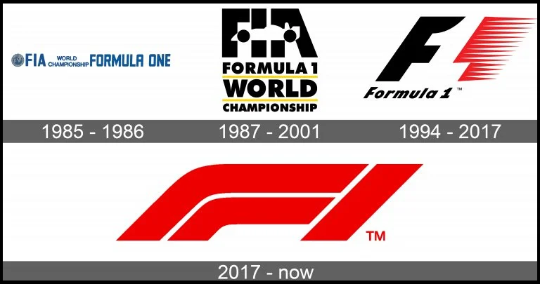
1985 – 1987
The F1 old logo featured a horizontal rectangular shape with a wordmark positioned alongside a rounded emblem on its left side. Its distinct color scheme had shades of blue against a light gray backdrop, with darker tones of blue and gray utilized within the emblem.
1987 – 1993
The subsequent version of the Formula 1 logo adopted a more compact design. It featured a black wordmark consisting of three distinct elements accompanied by a yellow underline, with the addition of “FIA” lettering positioned above.
Within this arrangement, the negative space between the black lines of “FIA” created a race car with the second stroke of the “F” and the middle stroke of the “A” being the wheels. This added a dynamic visual element to the cleverly redesigned logo.
Check out: Pixalogo – The Best Logo Design Bundle
1993 – 2018
In 1993, Carter Wong crafted the most iconic version of the Formula 1 logo. It featured a slanted letter “F” accompanied by speed marks. The numeral “1” formed within the negative space to its right.
This logo redesign created a dynamic visual representation of the sport’s essence. The color scheme of this renowned logo, which features black and red against a white background, is the most recognized logo of this brand.
Discover some cool logos and their hidden logo meanings.
2018 – Present
According to F1 logo history, the current logo was adopted in 2018, which we discussed above.
Check out: Majestic Vector Logo Templates
Check Out: Top 12 Logos With Hidden Meanings
In Conclusion: The History Of F1 Logo
Designing a logo that looks good and has meaning can be quite a task. But F1 has nailed it every single time and has successfully imbibed the sport’s spirit in the logo.
With the rapid growth and the diverse audience it has gained over the years, a brand needs to evolve in design. And they have done it with finesse. We hope you enjoyed discovering the Formula 1 logo history and F1 logo meaning.
Like this post? Check out more amazing graphic & web design inspiration here.


