Once known primarily as a courier company, FedEx has evolved into more than just a delivery service. With a history spanning several decades and a reputation for innovation and efficiency, this iconic brand has become a driving force in the logistics and transportation industry. From offering overnight delivery services to embracing cutting-edge technology such as drones and autonomous vehicles, FedEx has continually met the evolving needs of its customers. Let us explore the brand design strategies of this globally recognized courier company and the FedEx logo’s hidden meaning, motto, design, and significance.
Table Of Contents – FedEx Logo Meaning
A Brief History Of The Company
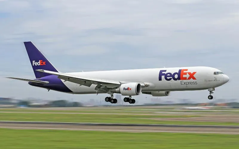
FedEx was founded in 1971 by Frederick W. Smith, initially operating as Federal Express Corporation. The founder picked the word “Federal” in the name to attract the Federal Reserve Bank as a customer.
Smith’s vision was to create a reliable overnight delivery service. He proposed a hub-and-spoke distribution model to make this a reality, which revolutionized the logistics industry.
Discover some nifty logos and their hidden logo meanings.
One of the pivotal moments in FedEx’s history came in 1973 when the company successfully delivered 186 packages overnight to 25 cities in the United States. This achievement solidified the company’s reputation for reliability and led to its eventual rapid growth.
Today, FedEx is a multinational corporation with diverse services, including express shipping, freight forwarding, and e-commerce solutions. Let’s now take a look at the FedEx logo design, history, and meaning behind the globally known symbol.
Check out Beginners Guide to Business Logo Design
FedEx Logo Meaning and Its Significance
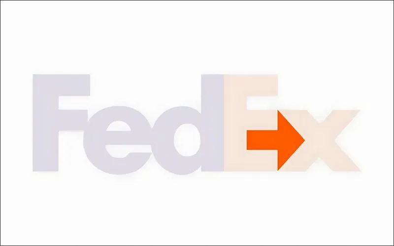
At first glance, the FedEx new logo appears simple, featuring the company name in bold purple and orange letters. However, upon closer inspection, you notice a hidden arrow formed by the negative space between the letters “E” and “x.”
This FedEx secret arrow, pointing forward to the right, symbolizes movement, speed, and progress—all essential qualities associated with its courier and logistics services.
Check Out: Aurora 3D Logo & Text Maker
Arrow On FedEx Logo and What It Stands For
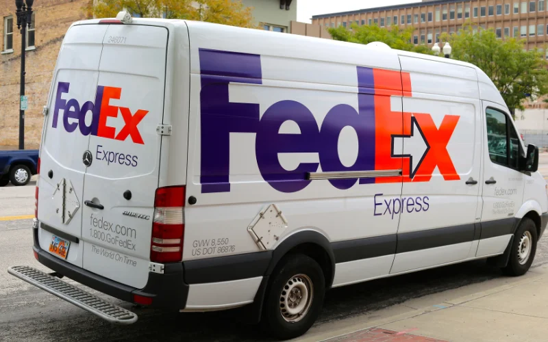
The current FedEx logo was launched in 1994 and is three decades old. While the emblem looks very simple at first, if you look closely, you will see a hidden arrow in the space between E and x.
Let’s understand the FedEx arrow’s meaning. The idea behind incorporating the arrow pointing to the right was to convey the visual idea of packages being swiftly and efficiently delivered from one location to another. The Federal Express logo also symbolizes movement, speed, and progress, which are essential qualities of any courier service. This captures the essence of the FedEx logo’s meaning.
Check Out: Famous Brand Logo Animations
FedEx Slogan
“Where now meets next” – Latest FedEx motto released in 2021
This top courier and logistics company’s brand & creative design vision have evolved over the years, with around 15 known mottos/slogans released.
Here are some famous FedEx slogan over the years:
- “When it Absolutely, Positively has to be there overnight” – 1978 to 1983
- “It’s not Just a Package, It’s Your Business” – 1987–1988
- “Our Most Important Package is Yours” – 1991–1994
- “Absolutely, Positively Anytime” – 1995
- “The Way the World Works” – 1996 to 1998
- “Be Absolutely Sure” – 1998 to 2000
- “This is a Job for FedEx” – 2001 to 2002
- “Don’t worry, there’s a FedEx for that” – 2002 to 2003
- “Relax, it’s FedEx” – 2004 to 2008
- “The World On Time” – 2001 to present
- “We Understand” – 2009 to present
- “We Live To Deliver” – 2009 to present
Check Out: Top 12 Logos With Hidden Meaning
Check Out: World’s Top Logo Designers
In Conclusion
The Making Of An Iconic Brand—FedEx has established its place in the world of transport and logistics. It has nailed brand recall and the evolution of creative strategies with time. While the industry does not seem very innovative, we should give kudos to it for its ability to still be creative with its marketing.
Isn’t this all a brand asks for? Do they want to get their brand at the top of their customers’ minds whenever they think of that service/product? This top courier brand is an excellent example of subtle but great marketing strategies. We hope this blog helped you in understanding the FedEx logo meaning.
Like this post? Check out more fantastic web & graphic design inspiration here.
