The first film posters rule is the following: Posters are not art! You’re not designing them for your friends, but for the wide audience to whom you’re supposed to sell tickets.
The title, for instance, should be huge. You should avoid fonts and colors that don’t let the title pop and choose ones that make it readable at first sight.

Movie posters ought to follow a scheme and to be balanced in a specific, prescribed way.
All designers are supposed to follow the same layout because every deviation would mean risking promoting something else rather than a movie. To be clearer, the poster wouldn’t exactly remind viewers of a cinema projection, but rather a novel or a new album.
Another important consideration is not to put too much spotlight on actors unless they’re worldwide known stars. The essence is your story, and you have to make that clear.
Then, one bold and genre connected image will be enough to convey the main message, problem, or conflict going on in the movie.

If you think you can’t do it yourself, take an expert instead. When promoting a professional movie with a professional crew behind it, an unprofessionally designed poster is not the best way to go.
How will your audience engage with the poster?
- Look at them
- Acknowledge their existence (or not)
- Express interest (or not)
- Remember them

Had all of these phases been accomplished, users will most likely engage with the poster and see the movie, but there is a lot to be done before that happens: the biggest challenge, for instance, is to defeat the thousands of competitive messages being presented to them every day.
Media is just full of promotional posters, so think well about your marketing campaign, and learn how to make movie posters as visible as possible.
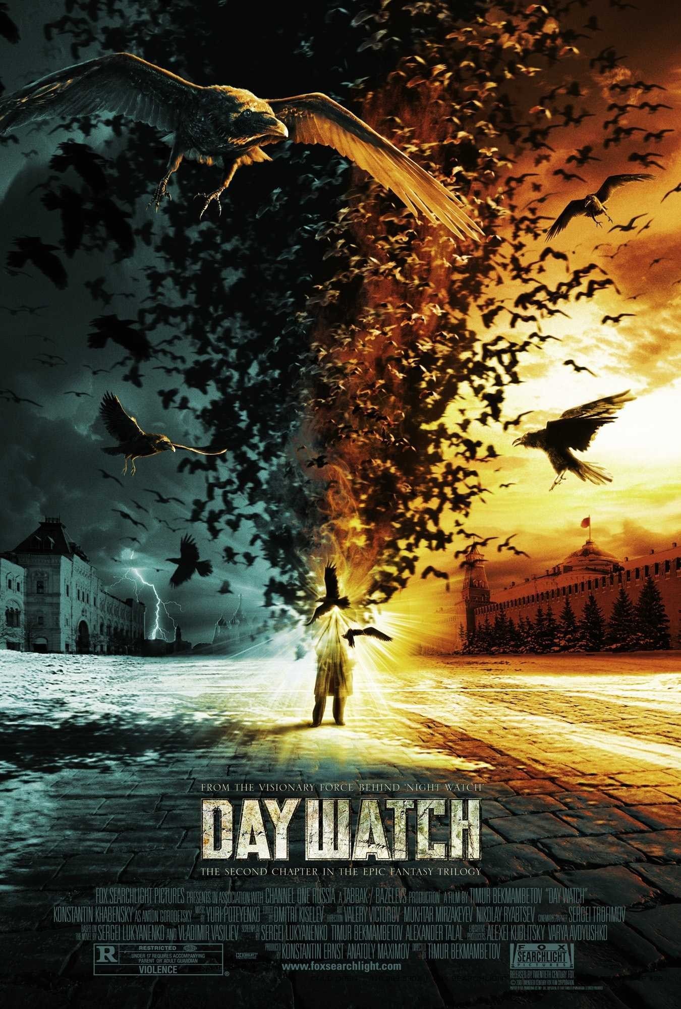
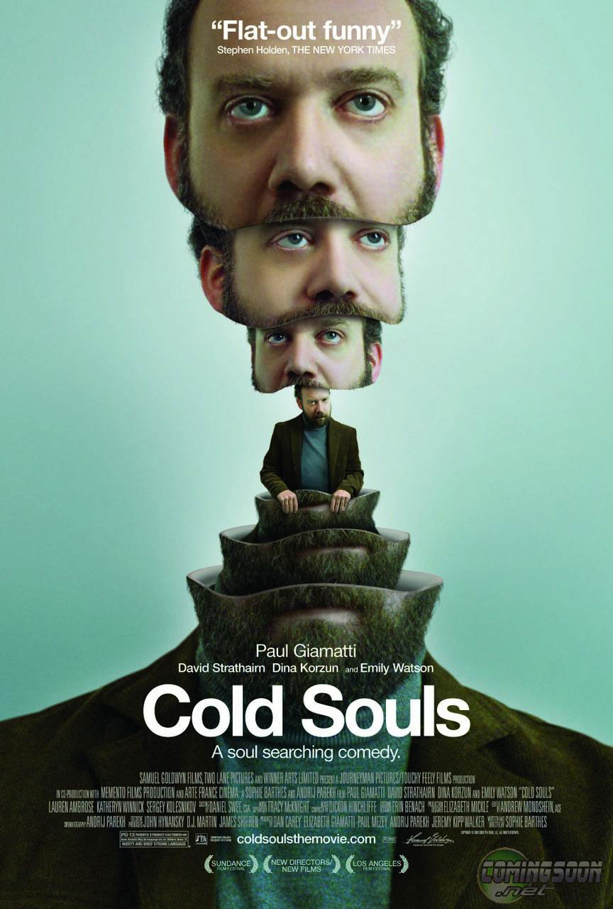
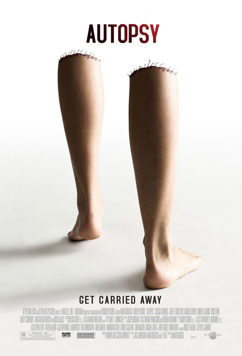
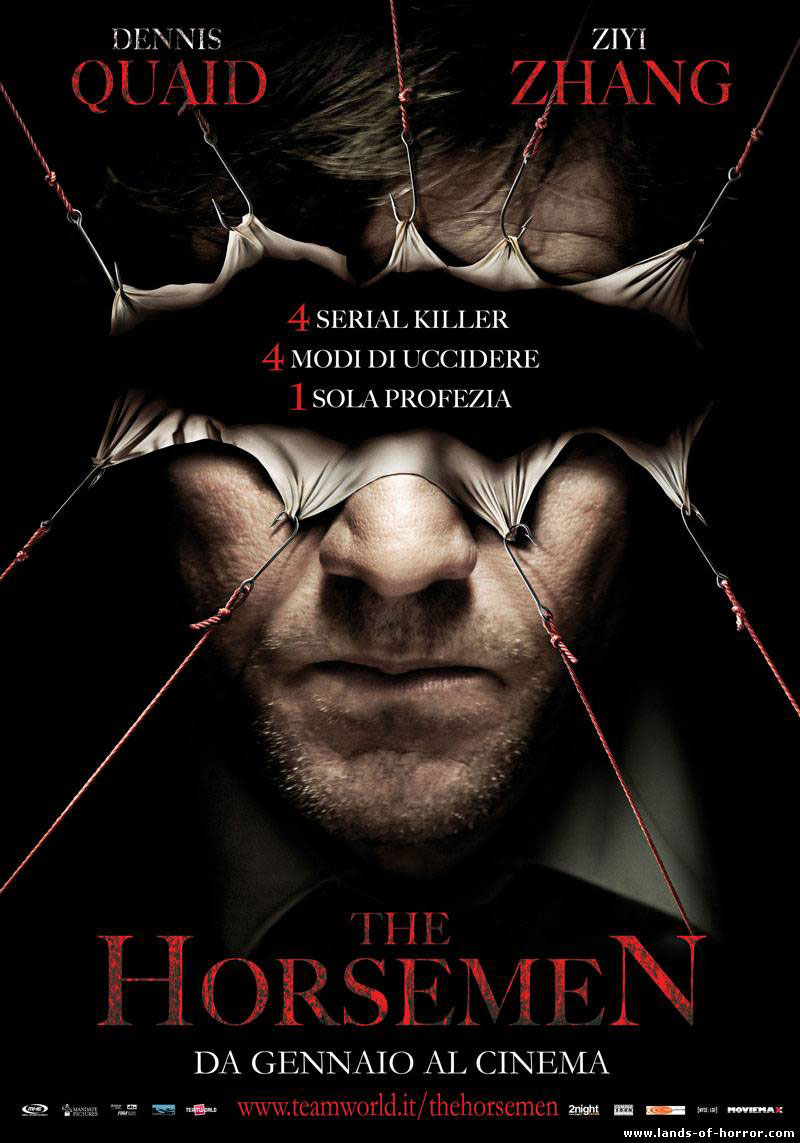
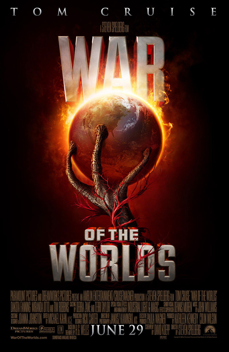
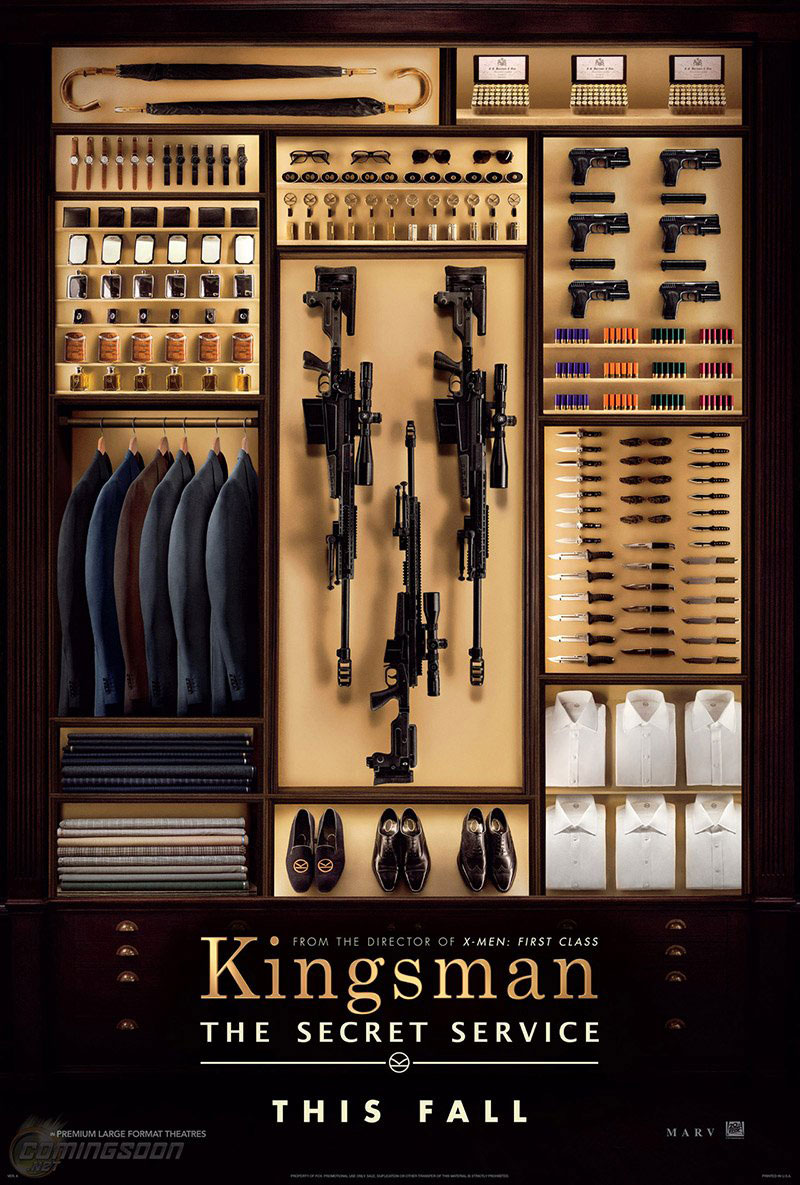
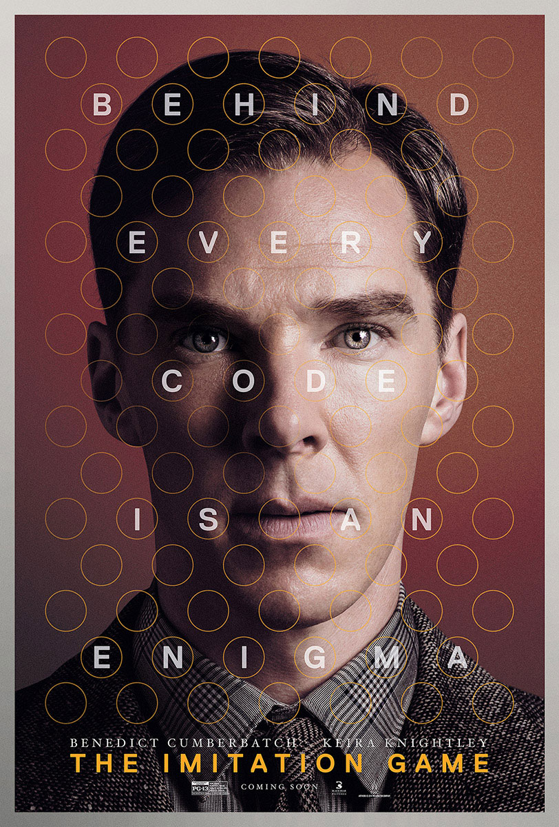
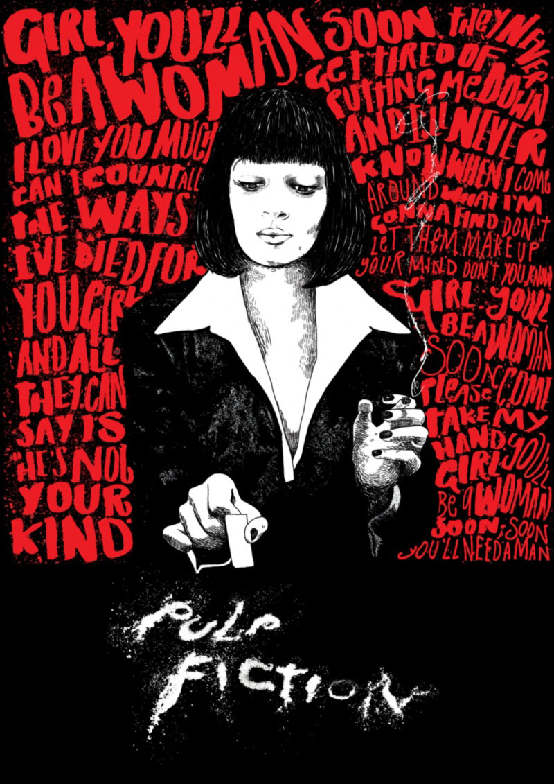
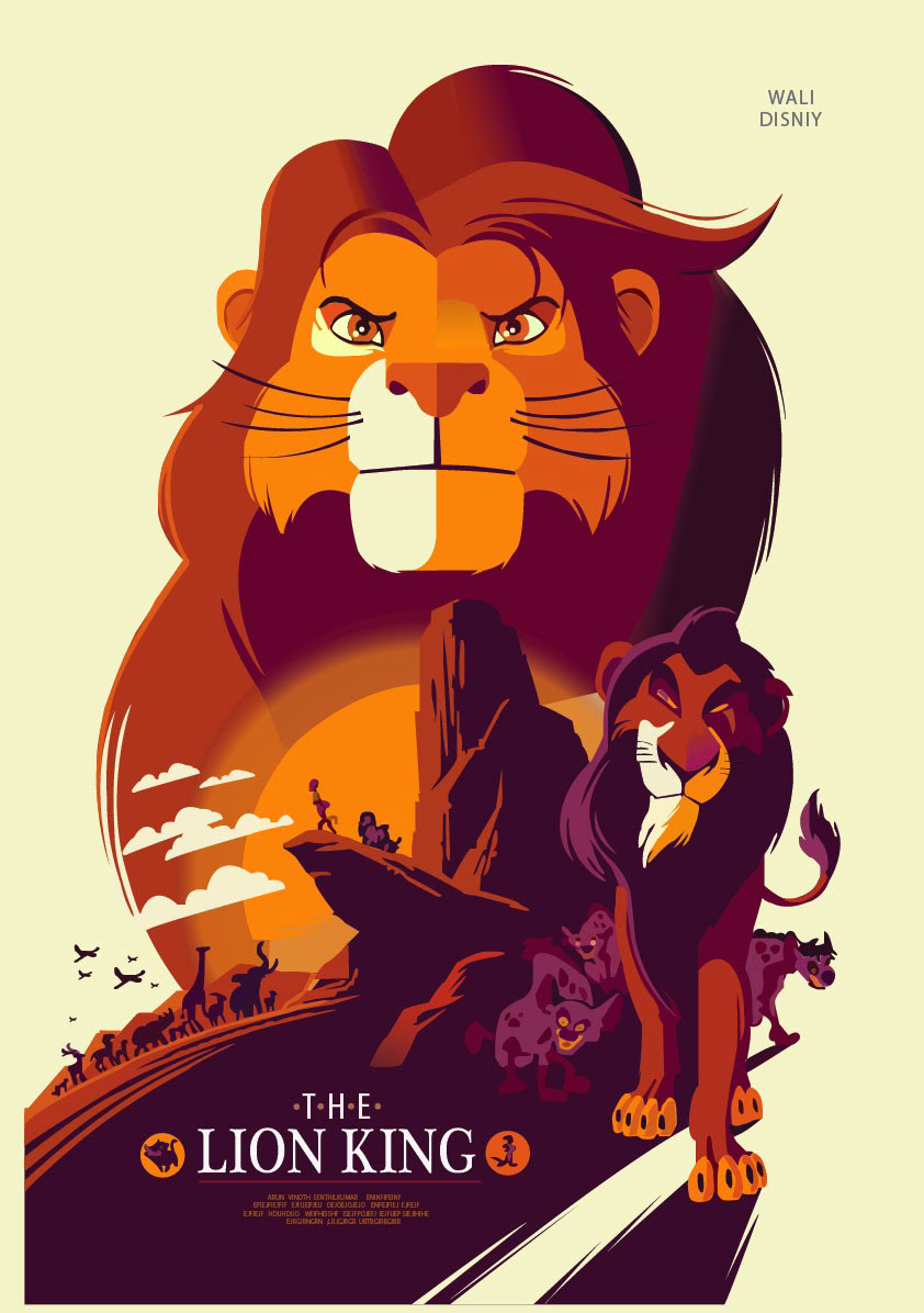
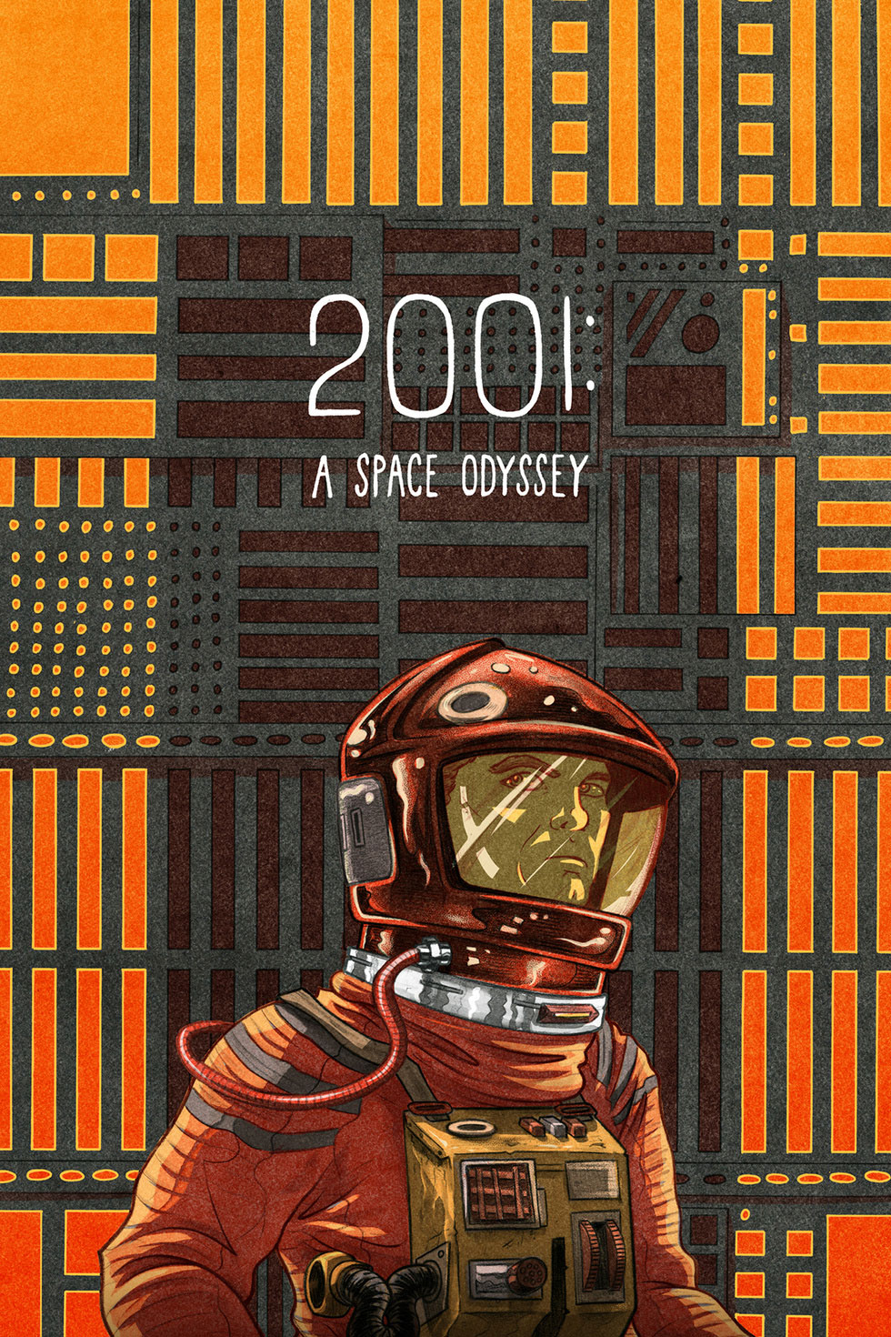
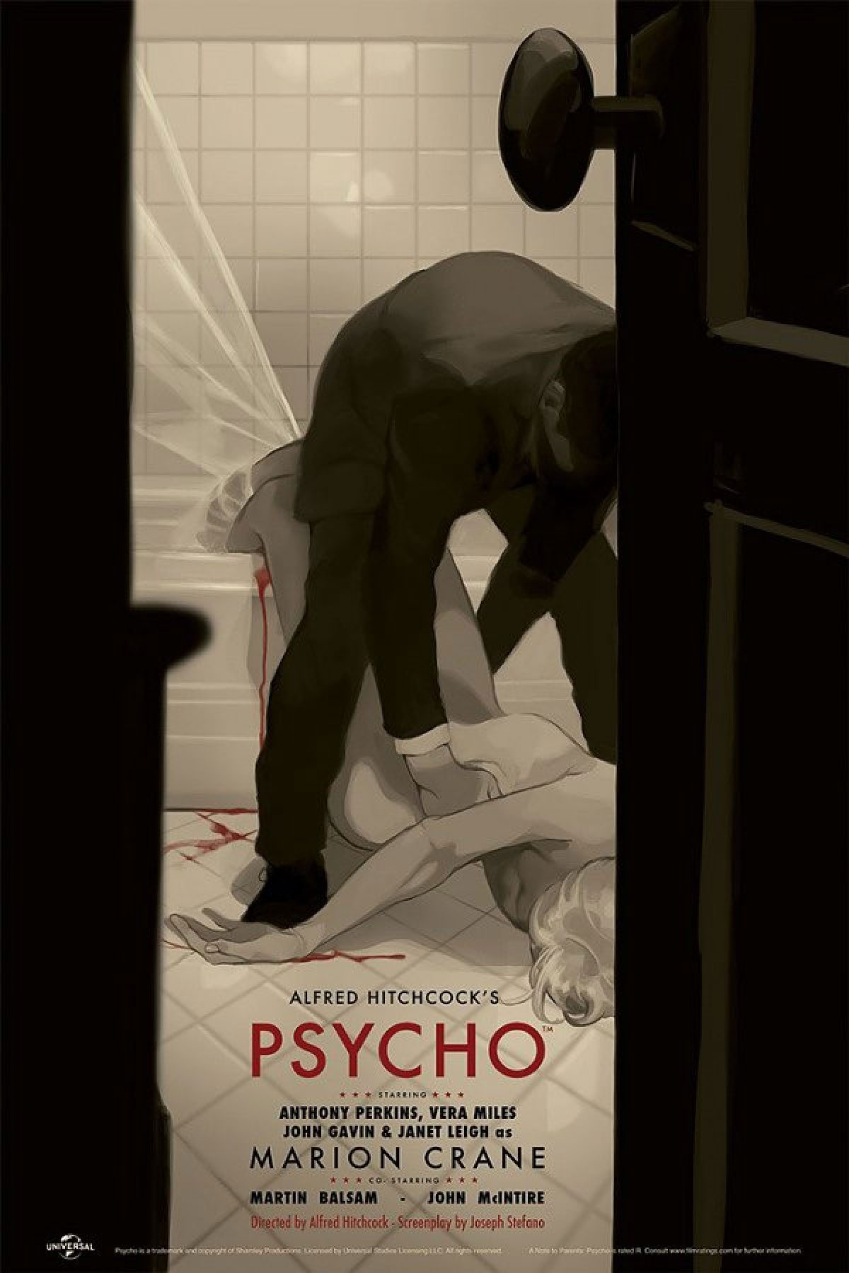
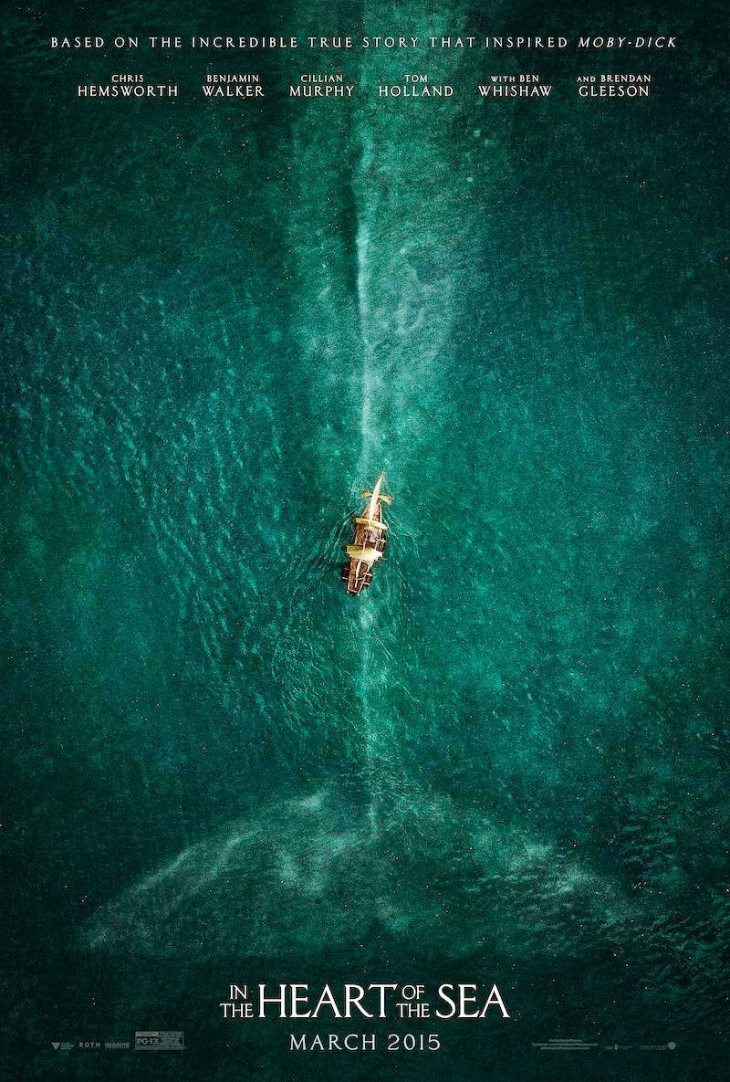
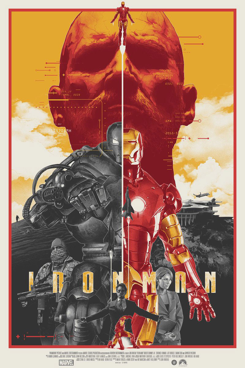
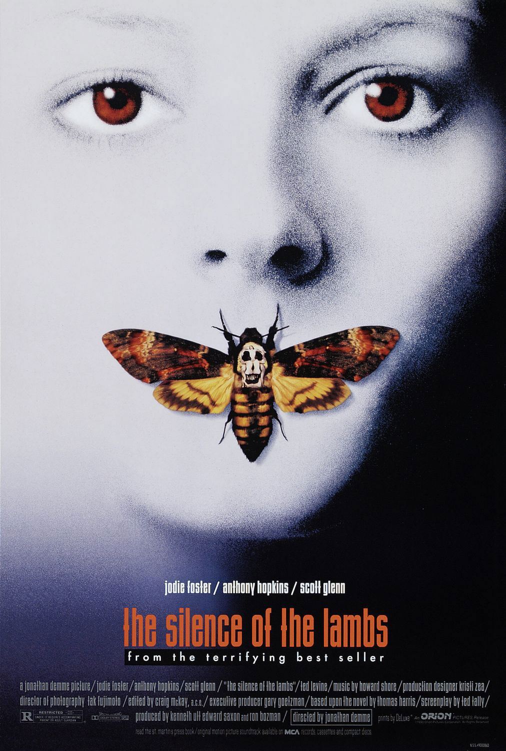
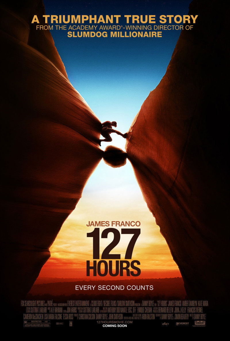
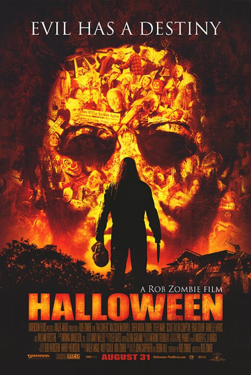
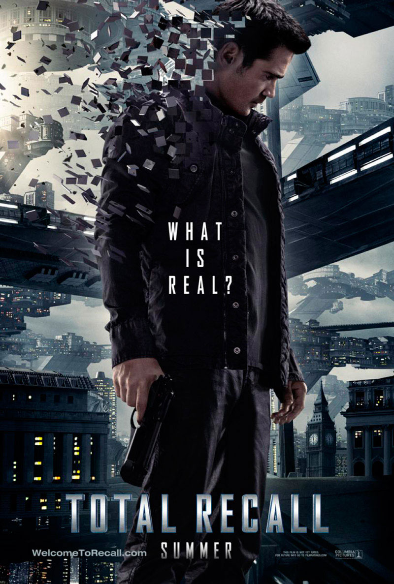
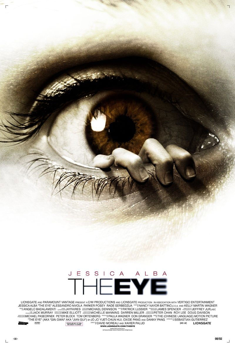
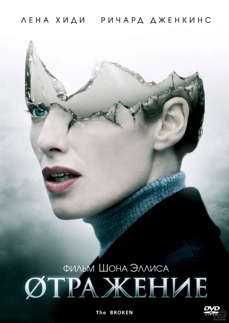
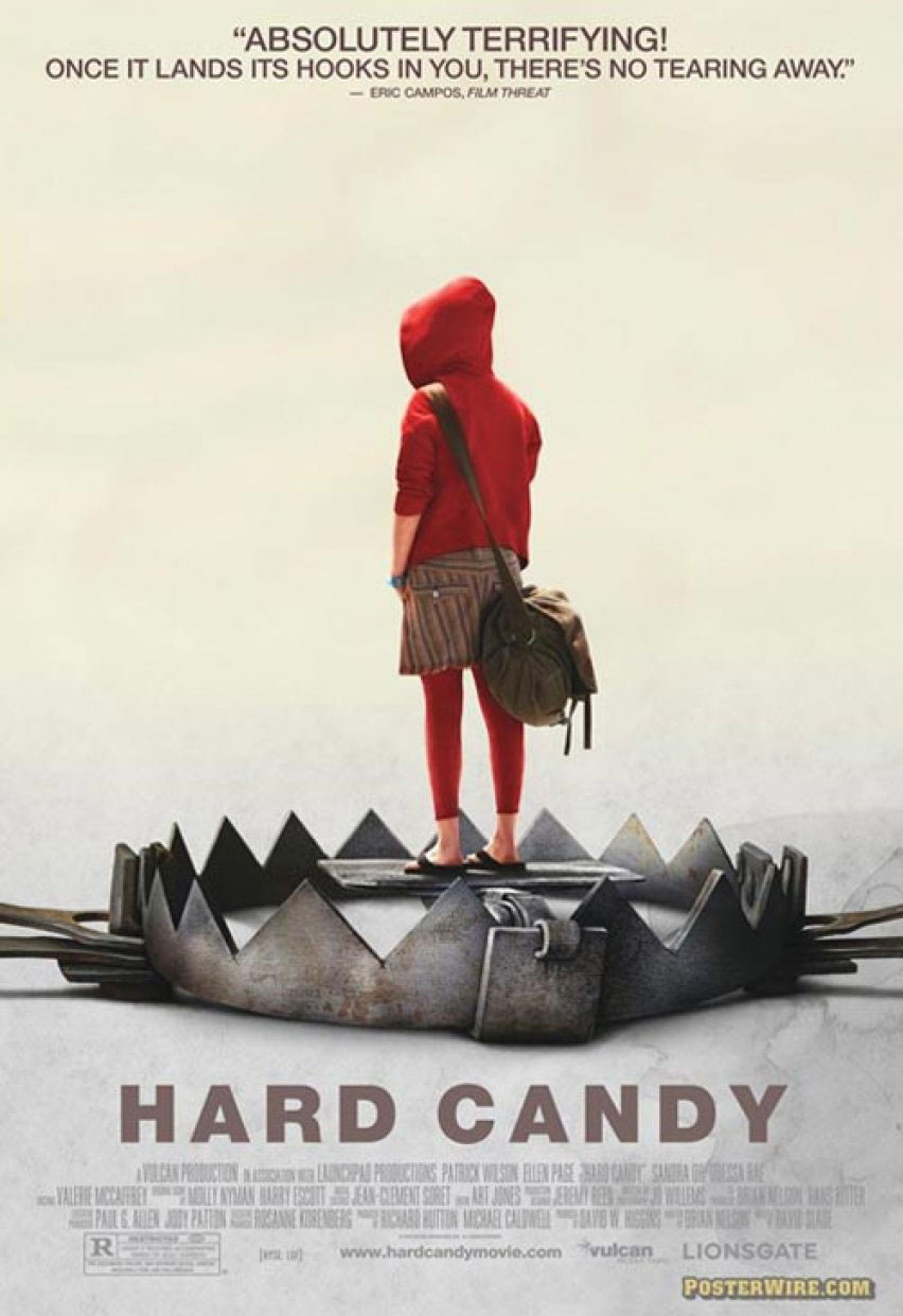
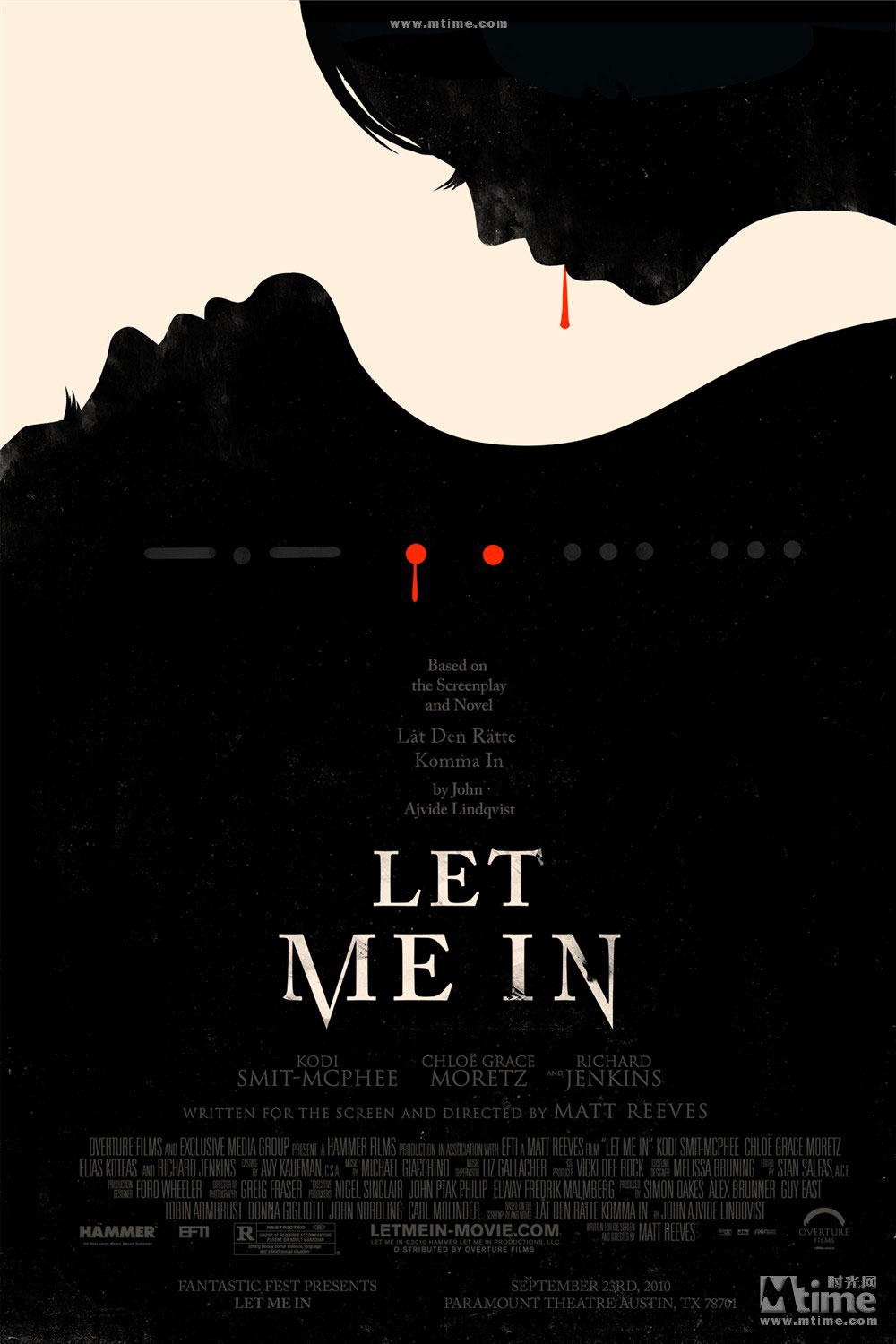
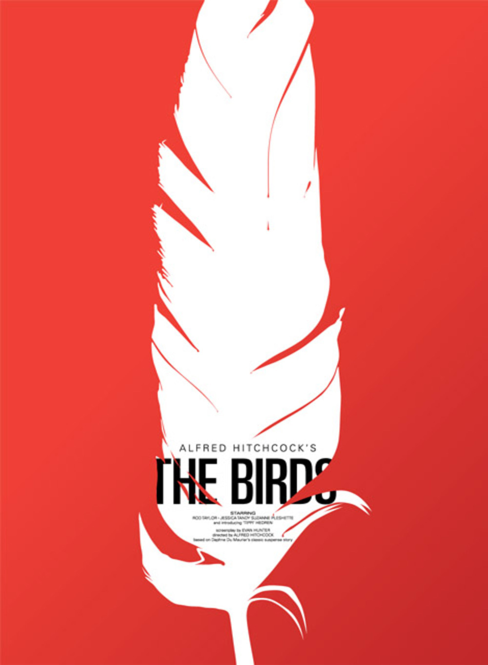
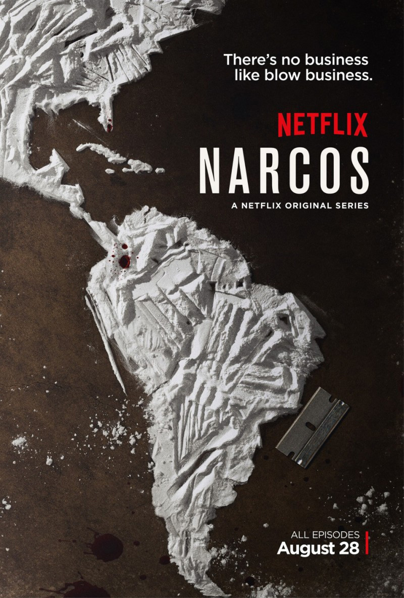
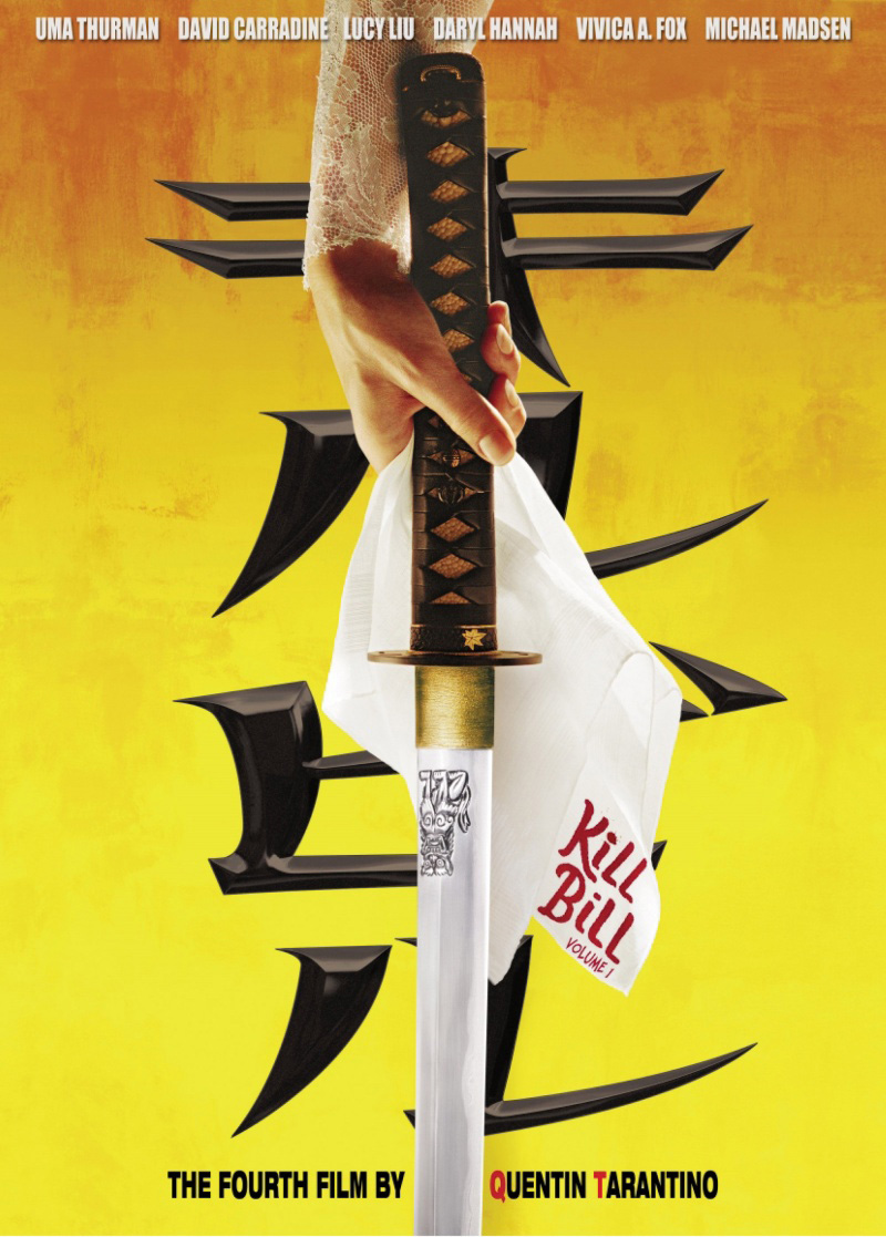
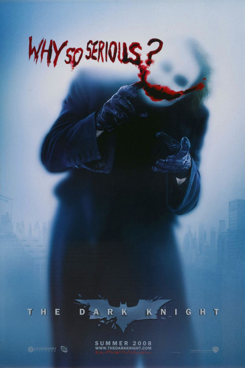
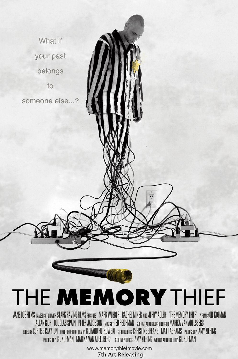
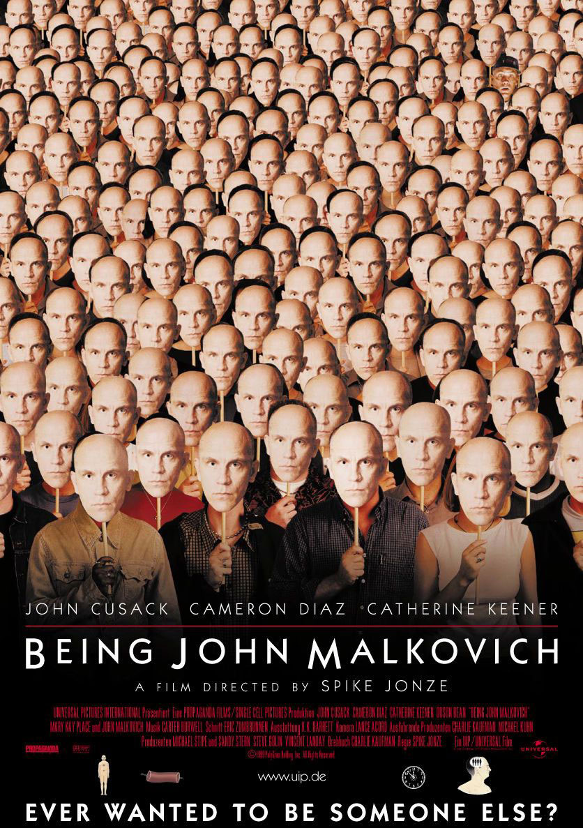
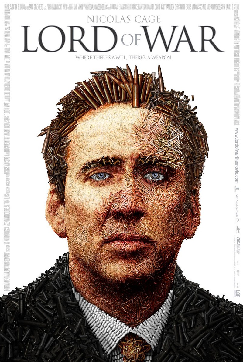
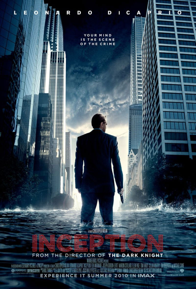
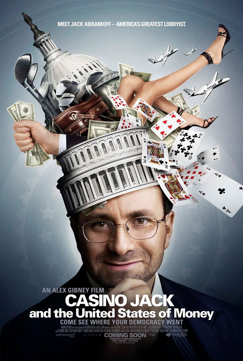
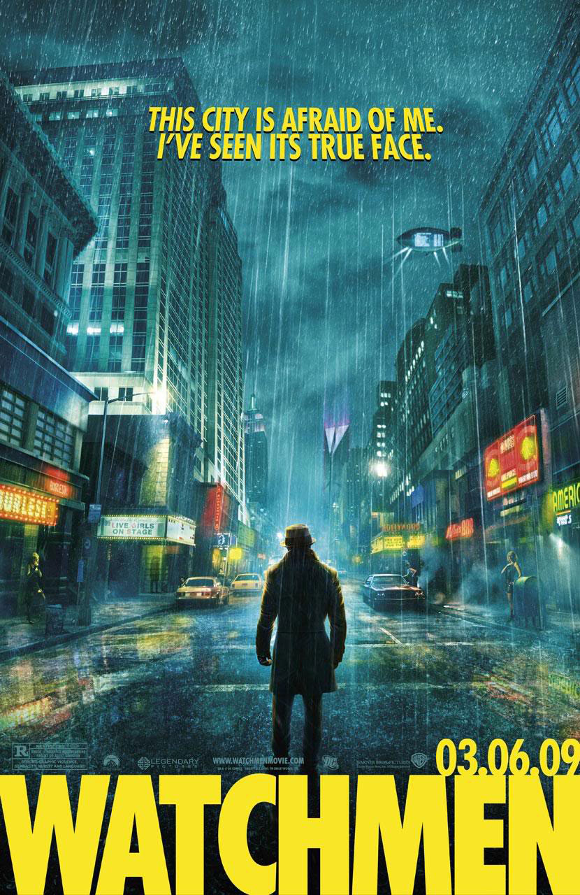
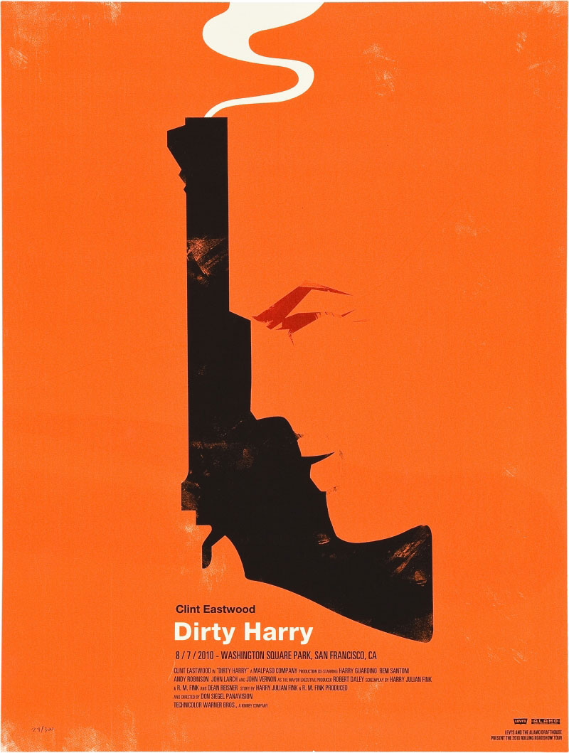
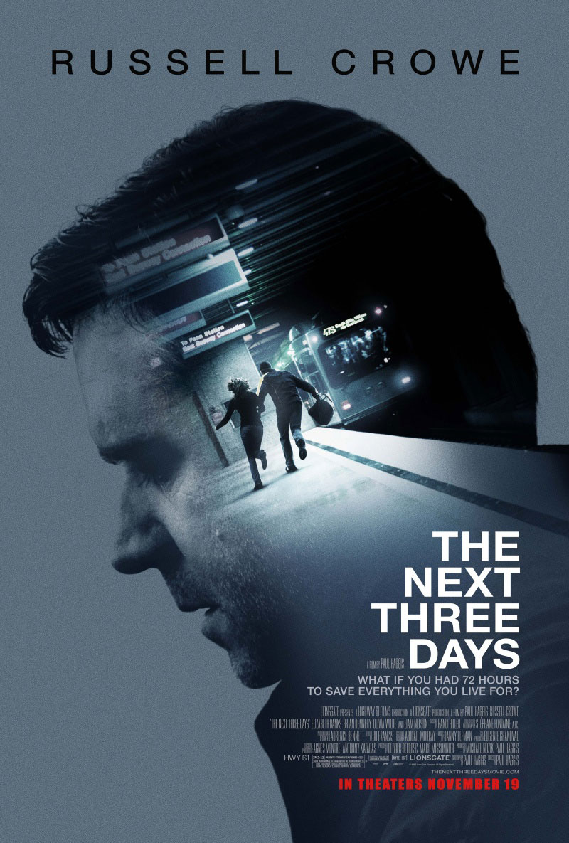
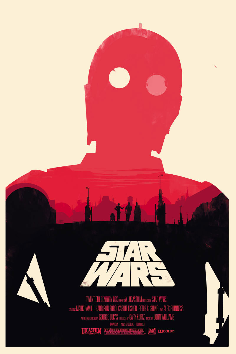
An overview of outstanding and most creative movie posters
Obviously, designing posters requires artistic skills, but above all clear communication and selling tactics. According to Tomasz Opasinski, all posters can be categorized into three basic groups: metaphor-based designing, word-based designing, and curve-based designing.
This doesn’t mean that every poster should fall under one of these categories – there are, and there will always be designs that are trying to break the rules.
The most artistic ones are definitely metaphor-based posters, using an abstract image instead of a scene in order to communicate the key message. Still, they are really rare compared to the other groups.
Word-based posters, on the other hand, are literally listing the key elements on the movie.
Finally, curve-based posters are the ones Tomasz describes as the ‘easiest way to start’. He mentioned approximately 150 examples of how movie scenes, actors, or other elements can be positioned on the poster in order to communicate the main feeling or idea of the movie.
AIDA
AIDA is the best formula for designing a performance-based poster, simply because it sells. The name is an acronym for 4 basic steps: attention, interest, desire, and action, and has been applied thousands of times to advertise successful movies.
Posters based on AIDA are simply iconic – they present the film theme very effectively, even if they don’t reveal completely what the storyline is about.
Most of the time, they include a middle-scene from the movie trying to tense and to inspire the viewer to watch it, as for instance a dangerous situation that makes him guess what is going to happen next.
As you can see, the role of the poster is to intrigue the viewer to see the movie in order to find out what happened. AIDA works for all genres, but it is mostly applied to fantasy and unrealistic events, especially such that have to do with psychology and superpowers. 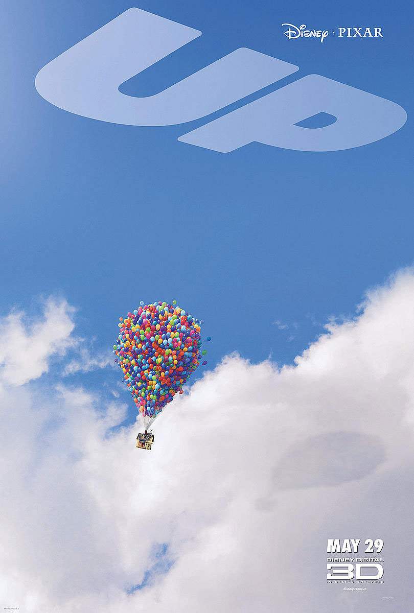
What we can all learn from the AIDA formula is that style is extremely important both when making an art movie and blockbusters. Some movie posters were so bold and creative that they stayed remembered by the audience long after the movie lost its momentum.
Focus on one idea
Rather than trying to push everything on a piece of paper, choose a focal idea or a message that can be understood by everyone. Make sure that the idea is not only visually attractive, but it manages also to inspire fans to see that movie.
Keep details consistent
The same as the scenes, pay attention to your titles and make sure you’re using the consistent font. Try to replicate the style wherever your product is being described, and ensure that the color contrasts one of the backgrounds.
Balance your composition
In case you need to include a lot of types, use the grid as much as necessary. Together with it, try to define a style and to explain at least a bit of the movie’s content using images.
You have no other choice than high resolution!
The main reason why you’re actually designing the process is to influence viewers’ buying decisions and to excite them to check your movie by only conveying a visual message about it.
Perception dictates their decision, so try to improve results by touching the audience emotionally from the very first moment. It’s true, we live in a time of multiple media sources and video trailers, but the poster is still the viewer’s first and most important encounter with a movie.
Style
The secret is to use graphic design to invoke moods and emotions related to the movie. Therefore, if working on a horror movie, try to make viewers feel tense and scared.
On the other hand, convey a comedy message in a light and funny style. Your ultimate task is to strike customers with memorable ideas, making sure they’ve understood them properly long before they’ve even watched the movie.
Text
Together with the movie’s title, you have to include a tagline (a memorable sentence/branding slogan that says more about the movie’s main message). At the same time, you have to mention the director, the leading actors (characters), the due release date, and a block of credits to thank in the bottom part.
In case there is someone really famous whose presence you want to emphasize in the movie, or even a specific part you think would attract the most attention, those can also be written on the poster (of course, only if you deem them to be absolutely indispensable).
Imagery
Choosing the images for your movie poster will be the most difficult part of the job. Instead of doing it yourself, we recommend you to hire an expert designer to help you since he’s probably going to have the experience necessary to learn from old movies in the genre.
Most of the time, it will be a scene or a good photo of the actors who are participating, or even symbolic images related to the title.
The Internet can be an invaluable source of mood-driver images, and you can also forgo those for representative drawings and to use illustrations rather than photography. Using unique and personal images, however, is still the best and safest way to go.
Research
Before performing whatever action, research the market. You need to know what your audience wants and what is already given to them, in order to brainstorm ideas and concepts that will make your poster stand out from the crowd. Still, researching doesn’t mean copying.
Your poster should be:
Beautiful – It should deliver the message in a visually attractive way.
Focused – It should be precise, and communicate no more than one message/idea.
Ordered – It should have an obvious and well-organized sequence.
Digitize the concept the best way you can – set the camera on high resolution and don’t start anywhere below 150ppi.
Once again, we remind you that there are many factors to be taken into account when designing a movie poster: the title, the leading cast, classification, director, distributors, producers, and so on.
Other posters can give you a solid picture of what you should do, but blind-copying is absolutely out of the question.
Your poster is an integrated part of the movie, and that means it will undergo the same layers of estimation and approval as the movie it represents.
Your biggest challenge as a designer is to balance the composition, namely to tell your novel story in a tried and tested way, making sure it is unique enough to attract as many moviegoers and positive critics as possible.
Movie posters before and nowadays
The artistic side of designing movie posters is undeniable, but it has unfortunately been underestimated in recent years. Their original purpose was to do cinema advertising, which is why they reminded of restaurant menus: you could see what the cinema can offer, and you could choose a piece to enjoy.
Nowadays, however, competition changed the process: movie posters are becoming decorative memorabilia, and they tend to invoke emotions more than to inform users in a decorative manner. Still, that doesn’t decrease the importance of conveying information, but to preserve the message.
That’s exactly what this article is trying to explain.
What movie posters do is to ‘capture’ the mood and atmosphere of motion pictures in a static, immortal image.
The once highly respected art form has now become a functional tool, edited without artistic considerations, cropped, transformed, and stuffed with elements that follow no other logic than the one of conveying information.
What can be concluded from this is that any artistic sense or ambition has been ruthlessly abandoned for the sake of plain uniformity.
This doesn’t necessarily make new posters bad, but the last 12 months recorded striking levels of lackadaisical nothingness where all designs resemble each other, but none is independent enough to be remembered.
The ongoing tug-of-war and ridiculous contractual obligations transformed posters into the victims of their own art, where instead of grabbing attention with uniqueness, they need to follow a set of strictly prescribed rules, limited options, and commercial needs.
No one will tell you why, but you will still be required to adjust the author’s name to a particular font size or to choose ABC1 males, for instance.
It’s true – movie posters are designed for commercial purposes, as the ultimate goal is for the viewer to buy a ticket and to watch the movie.
It has been like this ever since the first movie poster appeared (Jules Cheret’s poster on ‘Projections Artistiques’ in 1890) – posters at the time were simple text boxes where there was no other art than to mention the director, the producer, and of course the title.
Luckily, the movie industry started growing, and studios understood the marketing value of creative posters aimed to depict movie scenes and to promote them to viewers. Back in the time, posters were made using inexpensive paper, and they were not meant to be preserved or collected.
The 1920s mindset, however, brought a huge change on the horizon: ever between the 1920s and 1940s, posters were made by reputable artists and illustrators (Hap Hadley, Al Hirschfeld, John Held Jr., Louis Fancher, Armando Seguso, Ted Ireland, and Clayton Knight).
MGM became the leader with their pastel-polished posters on white backgrounds and was followed by 20th Century Fox which took the opposite way using vibrant tones to promote musicals.
The Great Depression and the Second World War were simply destructive for the movie industry, and MGM and other producers started crediting theaters to return posters they kept out of circulation during the war.
Unfortunately, they managed to recover only 20 original posters of all movies made between 1930 and 1945.
In the period to follow (somewhere until the 1980s) the task of printing and distributing advertisement materials was entrusted to NNS (the National Screen Service).
Soon after, the leading role was taken by evolving multi-screen cinemas which used the transition period to exchange posters from their large inventories or to resell them to passionate collectors.
The French 1870s poster tradition soon spread to every European city and town. Rather than as advertising materials, posters were becoming a contemporary form of art, and it is believed that Polish producers had a big role in it.
Their commissioning artists (Stefan Norblin, for instance) used the Art Noveau style to popularize posters, after establishing a powerful film industry where posters were the main communication mean related to the newly obtained independence of the state.
The evolution of movie posters during the last 10 decades
Posters have been on the scene since the early 1920s, all of them handmade as there was no technology to use at the time. Their purpose was to depict movies scenes by drawing them on a traditional piece of paper.
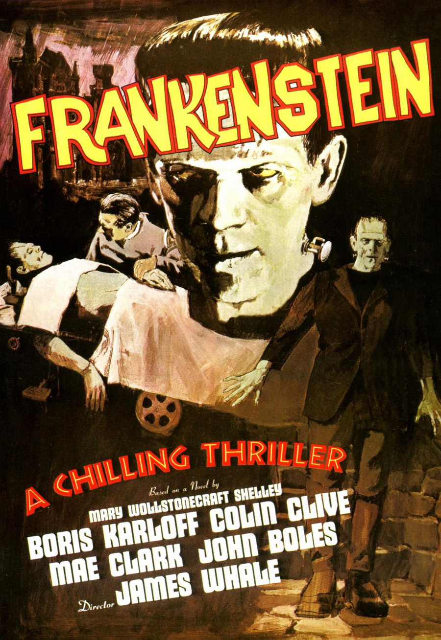
The technology didn’t change even 10 years later, but the exception was that in the 1930s, posters were no longer depicting movie scenes, but representing the face of the characters participating in the movie. Creative artists at the time believed that posters will be more interesting with bolder fonts and more vivid colors that catch the eye.
The 1940s, on the other hand, will stay remembered by common character illustrations, and plenty of experimentation with layouts and fonts. Scene depictions seemed to be overcome, and the intention was to capture the audience with playful color and interesting characters.
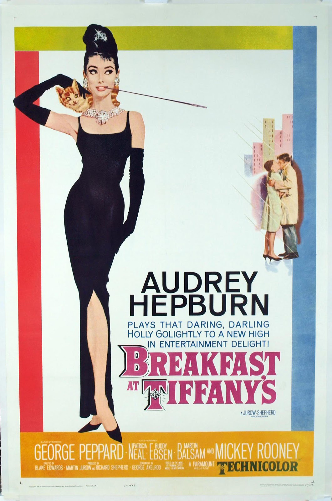
During the 1950’s were developed the first conceptual ideas, as can be seen from the ‘Love in the afternoon’ movie. There were no characters, but only fonts, patterns, and colors behaving like visual clues to indicate what the movie could be about. It was exactly in the 1950s that today’s highly appreciated teaser posters started to appear.
In the 1960s, the focus switched again, but this time on typography rather than on images. Illustrations were still present, but the central elements were fonts and layouts, considered to be highly prominent in comparison to the already-seen imagery.
The 1970’s are definitely the favorite era of the movie industry; because it was exactly then that photography gained momentum and made its grand appearance on movie posters. As it can be expected, text and illustrations started playing a less dominant role.
1980 was the year when posters started resembling the ones of today, as more attention as being paid to balancing imagery with writing and using photography for the background rather than the central part of the posters. Most producers started following common schemes, and their colors and iconic imagery didn’t differ significantly from each other.
The 1990’s which you probably remember, gifted posters with the advantage of good structure. The background was usually a simple photograph, covered with names, titles, and slogans. Photography still owned the throne, and designers were trying to achieve uniqueness by experimenting with sizes, layouts, and font sizes.
Finally, the 2000’s: The 2000’s brought manipulation the scene because there were many programs such as Photoshop which could transform photos and layouts, and modernize posters in general.
Still, it seemed back then as it seems now, that the 1980s and the 1990s were the years where the movie advertising industry achieved its full potential, and that there isn’t that much layer progress to be achieved, neither in terms of fonts nor technology.