You are already surrounded by quality startup website design and startup apps, which makes a high-profile online presence simply compulsory. It may have been an option in the past, but you don’t get to choose anymore: if you want users to take your business seriously, you need to go out there and be remembered.
Arriving there won’t be easy, though. Unless you’re launching a design startup, you probably know nothing about the essentials of this branch, and what is even worse – you don’t have the resources you need to make your website succeed.
Many startups are challenged with this dilemma, so they either push web design for startups in the hands of a developer whose job has nothing to do with it, or they simply neglect the problem and postpone it for ‘better days’. The thing is – if you really want your startup to thrive, neither of them will be enough.
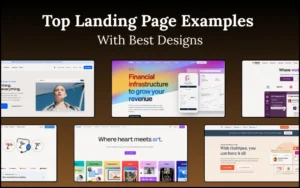
Let’s check a few tips for startup website design, and see how you can strengthen your brand, attract more visitors, obtain higher conversion rates, and overall – succeed.
Fuel your web design fascination with these curated design resources.
Table Of Contents: Design Essentials For Startups
- The power of simplicity in startup company website design
- DIY is not an option (unless you’re a designer yourself)
- Consider your mobile audience
- Restrict the use of color for startup website development
- Do some quality branding
- Limit the number of typefaces
- Make content readable in web design for start ups
- Use visual elements that grab attention
- Run some A/B testing in startup website development
- Do research for website design for start ups
The power of simplicity in startup company website design
 Image source: blockscore.com
You are new on the market, and you have to make your onboarding as smooth as possible. As for the first time, offer users some clean, easy-to-navigate design, and introduce familiar elements and friendly patterns. Users will like the fact that they are not deterred with tenths of pages to go through before they figure out what your business is all about.
Besides, simple design won’t require that much effort or money, and people will adapt to them easily. At the same time, they will remember them, and will be pleased to access them easily from every device. Go ahead and ask few users what they expect: it will almost seem as if we had read their minds.
Also read: How to Optimize Your Images for Great Search Results
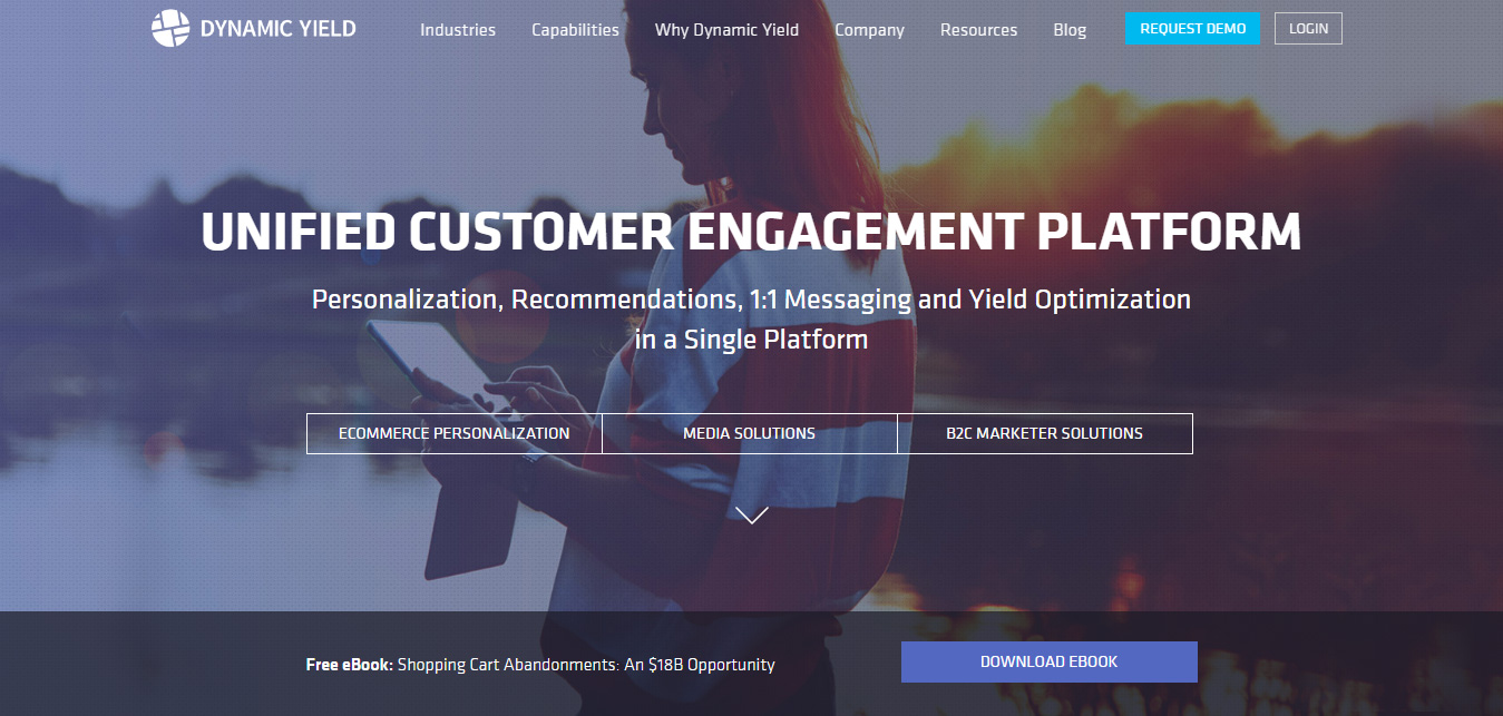 Image source: dynamicyield.com
Too much creaming and decorating is always perceived as trying to hide flaws, so don’t make yourself go through a painful process of proving that you’re worth their trust.
Keep a low profile, and choose a single element to be the focal point. Your design is like a neon sign: it has to be short and clear in order not to distract users.
DIY is not an option (unless you’re a designer yourself)
Don’t save on the most important aspect of your e-business and expect it to function magically. It won’t! Good websites need a professional touch from a designer who understands your vision and is able to execute the project properly.
Look for experts in the area, and discuss your business model with designers you believe could execute the plan in an equally exciting and ambitious way as you’ve imagined it.
Check out this blog to learn about best practices for website design.
 Image source: mainframe.co
Freelancing platforms are ideal for the purpose, so feel free to look for a designer on elance.com, freelancer.com, upwork.com, etc. Hiring on project basis is good because you don’t have to maintain a permanent relationship with the designer, and your money is well-secured in case he doesn’t finish the job properly.
Also read: How To Use Color Efficiently In Web Design
 Image source: duolingo.com
In the meantime, you will have access to previous work records and customer feedback to see whether the designer is the right person to hire. If he did well with 50 startups before you, what makes you think he won’t do it with you too?
If hiring a third-party designer is not an option, consider inviting one to be your investor or co-founder. You may not be interested to share profits, but without some quality touch on web design, you might not have anything to share. Fair investment, don’t you think so?
Consider your mobile audience
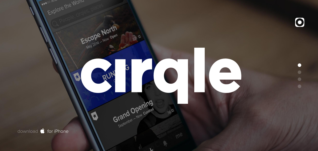 Image source: cirqle.com
More and more users are accessing Internet using their mobile phones, which suggests that desktop versions will be outstripped in the close future. As a matter of fact, you may be operating in a sector where they already are.
Even if you want to give time to the time, a fist-launch mobile version still makes sense. It would mean you’ve already adapted your website to fit the frames of multiple devices, and you’ve narrowed down the audience whose attention you want to capture. Long story short, all decisions will become easier.
Restrict the use of color for startup website development
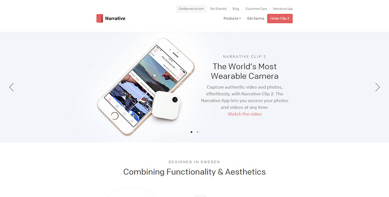 Image source: getnarrative.com
Colors are very important tools that can make your brand successful and memorable, but that doesn’t mean you have to apply all of them, everywhere. Take a second and think of the most famous brands you know: Facebook, Coca-Cola, and Starbucks – our minds instantly associate all of them with a single color.
Use on or two colors the most, and apply neutral shades on the copy and the side elements (lines, boxes, icons, etc.).
Do some quality branding
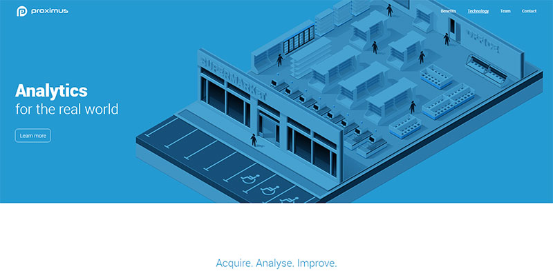 Image source: proximus.io
Your brand is the identity of your business, and handling it right is imperative for your business’s success. That’s why limited branding (as for instance keeping logos in the homepage’s corner) is very likely to stop you from growing your startup business.
You need to remind users of your brand consistently, and keep it present throughout their entire online experience. The presence of the logo on images, schemes, and other elements will help users identify you easily, and to make a straightforward connection between the content/product and your long-term mission and idea.
Also read: Content Writing Tips For Beginners: Visual Content vs Text Content Ideas
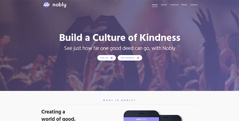 Image source: nobly.com
What is most important in the case is that they will remember your work long after they’ve visited your website.
A common mistake all startups should avoid is color inconsistency. In order to understand this, think of social networks and how they’re intentional with a single color for the same activity.
The same should happen with your website: once you’ve created the scheme, follow it, and make people associate these colors with your brand wherever they see them. In such way, you will convey a consistent message.
Limit the number of typefaces
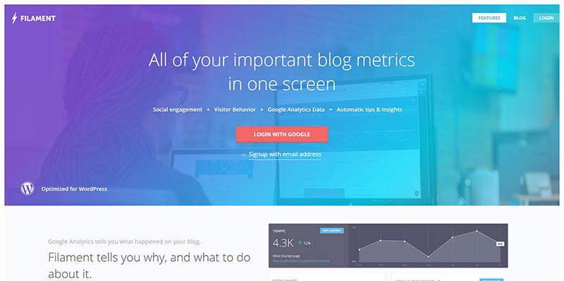 Image source: filament.io
Typefaces play a critical role on every website, increasing its credibility when done right, or destroying its image when messy and disorganized. That means that designers have to be very careful when choosing their typeface, and to resist the temptation to try the plethora being offered to them.
Instead, they should narrow the choice down to one or two typefaces, which can make content more legible and trustworthy.
Make content readable in web design for start ups
The importance of typography in web design is huge: it is exactly fonts that are going to determine how people read and understand your content, and whether you’ve conveyed your message right.
 Image source: apptopia.com
Things to have in mind:
- The contrast. The copy should be darker than the background, or vice versa.
- The line height. Ideally, the line height should be between 1.5 and 1.75 so that there will be enough breathing space, and the layout will be clean.
- The hierarchy. The copy should be systemized for users to scan it and to notice headlines, text boxes, and bullet points that are relevant to them.
Also read: The Secrets Of Color Filters In Web Design
Use visual elements that grab attention
 Image source: pubble.io
Don’t bore users with large explanations, but rather let graphics do the simple and intriguing work. You can use animations, images, and videos to entice users, offering a familiar interface that indicates the main goal of the website since moment one. Look for content that can involve users emotionally, and use it to ‘soften’ your communication.
Run some A/B testing in startup website development
When starting, make sure you’ve built a proper startup website design where everything can be measured and it is functioning properly. Don’t make peace with a single landing page version or unified database interfaces, and connect to actual users to see which one works the best. After you’ve chosen the winner, iterate the parts you think could improve your conversion rate.
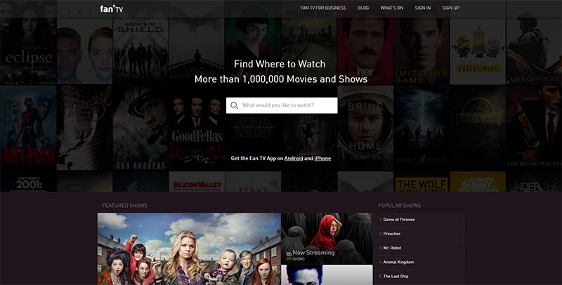 Image source: fan.tv
These are the main elements you should test:
- Main message copy
- Images
- Call-to-action buttons
- Forms
Do research for website design for start ups
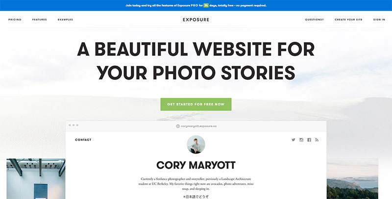 Image source: exposure.co
Use the time spent on the internet wisely, and examine other designs for your own alternatives. You can get some amazing ideas, or learn how to follow the common interface framework most brands are sharing.
At the same time, you’ll get to know your biggest competitors, and you will give your startup website design that little something it lacks to be the best one.
Like this post? Check out more amazing web design content here.