Customers will remain demanding and capricious, regardless of how hard you try to satisfy their needs.
The challenge is even bigger today, when each customer is browsing on at least two devices, and has a considerable potential to purchase a third one.

That makes optimizing your website in different devices an absolute priority, because if your pages don’t display good on each and every device, you’re risking losing your good reputation. Not fair, but true.
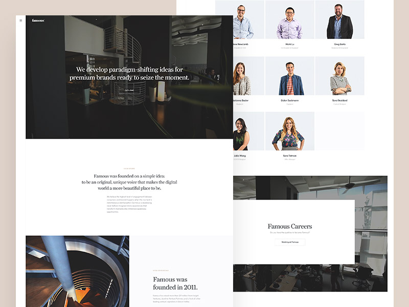 Image source: ueno.
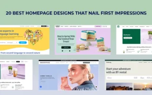
Table of contents
In the past, there was no problem with optimizing websites with 1024 x 768 screen resolutions, as there were just few operating systems and three well known browsers to care about.
Besides, design was not as usability-centered as it is now, and you could easily be forgiven for failing to display here and there.
The odds have changed now, not just because of the large presence of browsers and website in different devices, but also because of all probable issues and variations that can cause your website not to show properly. Mistakes are simply not tolerated anymore.
Also read: How User Experience Plays A Significant Role In Premium Websites
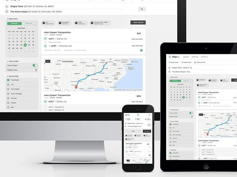 Image source: Matt D. Smith
The worst part about it is probably that this device-inventory trend is nowhere close to its end, and the number of tablets, smartphones, laptops and similar devices will only increase.
Consequently, more and more customers will be looking for standardized solutions, and will test your capability to make a responsive project long before they’ve entrusted you with their assignments.
As you see, you’re probably even late to jump on the bandwagon, and there is definitely no time left to use. We’ve prepared a list of useful tips to optimize your website for multi device browsing, so give them a look, and start preparing.
 Image source: Kevin Yang
Responsive designs or mobile templates? Which one should you choose?
Users nowadays prefer to browse website in different devices, which in web design should be considered as an advantage, rather than a problem.
You can make a good deal of money designing plain mobile apps, especially after Google introduced the so-called ‘mobilegeddon’ ad, which announced mobile compatibility as a compulsory condition for quality searching performance.
The question will simply impose itself: should you design specifically for mobile devices, or save some money adjusting your old design for mobile research?
Statistics are the handiest way to decide: you need to consider both the time visitors spend on your pages and the bounce rates, and you need to help them engage as much as you can. Identifying your best performers won’t be that difficult, so choose the pages you think deserve that title and build responsive templates just for them.
This is a magnificent temporary solution for those running out of time and money, but you should keep in mind that it can’t go on forever – eventually, you will have to create two websites instead of one, and that will be even more cumbersome than redesigning at the moment.
As it can be concluded, the longer-lasting strategy is to make the entire site responsive, because it only requires efforts and investments at the beginning.
As time goes by, you won’t have to spend almost anything to maintain it, and it will suit whatever new device may appear on the market. Before you do it, estimate the current condition of your pages—will you be able to optimize them with few finishing touches, or will they require a complete makeover?
Check out this blog to learn about best practices for website design.
The SEO consequences of running separate mobile sites
This is an important step for website testing on different devices. As one would assume, running separate mobile sites is much more challenging than applying responsive templates, because it requires designers to be 100% sure that each template displays properly, and that there is a mobile specific URL for Google and similar engines to take those pages into consideration.
Don’t be diluted by the idea that you don’t need to do it. If Google can’t recognize your content, visitors won’t either!
The variety of URLs serve to display content in more than one format, using outlined annotations to inform Google’s searching algorithms that those pages need to be considered as one entity.
In case the annotations are not correct, Google will display the mobile and desktop URL versions separately, and while you may think this is not a big deal, it may lower your Google rankings, indicating that content is copy-pasted. It is really simple. The crawler needs to be aware of the relationship in order to let you do your job.
Also read: Mistakes Freelancers Make & How You Can Avoid Them
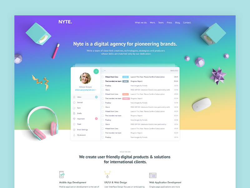 Image source: Boyana Jovic
Yet another important step to view website on multiple devices. Had you chosen mobile templates, there is a list of Google best practices you need to follow in order to avoid the engine treating your content as plagiarism. In fact, Google requires mobile sites that have desktop versions to use multiple annotated URLs, and to make content available to Googlebot agents from the very beginning.
As you see, separate mobile websites won’t necessarily impact your SEO in a bad way, but you need to follow best practices. In fact, you need to stay alert for any change and always look for a long term solution to create the appearance of one site, instead of two.
As it was explained previously, annotate the different URLs for Google to know that the content is the same, and that the page should be treated in that way instead of being constantly divided and observed for plagiarism.
Properly annotated URLs will display both on desktop and mobile search results, and rankings will stay just as high as they were before (and grow higher with time).
Also read: Email Design Trends You Need To Look Forward To
Website in different devices : Responsive designs
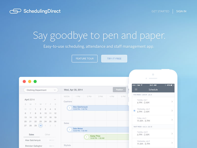 Image source: Ryo Lu
When using responsive design, the website will keep its original HTML code and the identical URL on every device. Then, it will render accordingly to the device screen where it is being triggered.
The easiest thing to do here is to code the mobile versions in advance, and scale them up to fit tablets and similar devices. When doing so, you’re making the code breakpoints independent of the content, and you’re allowing them to become functional even on larger website in different devices.
This is the most secure approach for delivering quality user experience, as it doesn’t make you neglect the rest of your platforms.
The decision of how to distribute content means the world to web design and can either allow you to tap for real in consumers’ browsing habits, or will keep you away from them permanently.
Therefore, be really careful with mobile delivery, and keep pages short, but punchy, filled with organized and important information. Remember that your site is going to attract mostly new users, and make them remember you by a ‘best foot forward’ feeling other sites don’t provide.
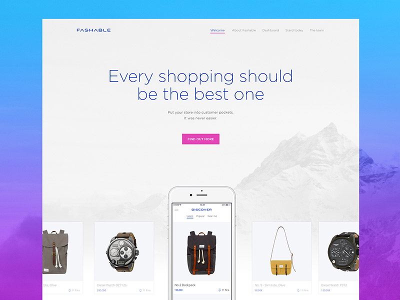 Image source: Ante Matijaca
Website in different devices : Refresh content regularly, and protect it
The more devices your site has to deal with (all the way from pioneer smartphones to ultra HD screens), the more challenging it will become to keep all customers happy.
To start with, you will have to update content regularly in order to show users that you’re moving forward and that you want their attention. In such a way, you will also be able to follow technical progress and stay on the scene no matter what happens.
Also read: How You Can Improve User Login Experience
 Image source: Nathan Riley
There is one common and serious mistake many designers make once they’ve launched their optimized websites: they simply neglect technical maintenance. For the CMS, this means no updating to newer versions and opening of security gaps and patches that can be very dangerous.
Don’t be surprised if you wake up one day and the website is hacked. You literally welcomed intruders with poor data protection, and customers are not that likely to trust you again.
Also read: How Does a Graphic Designer Keep Up With Design Trends?
 Image source: Oykun Yilmaz
The thing with hackers is that they don’t always threaten before breaching, and you won’t have even the slightest idea that they are at your door. In fact, you may not even notice the infection before it starts sending spam emails and nefarious links on your behalf.
Why not setting a monitoring service instead, and protecting data before it is too late for that? If nothing else, this strategy will help you spot errors earlier, and correct them fast for customers to be absolutely satisfied with your service.
Therefore, assign an updating budget from now, and remind yourself constantly to refresh the content on your website. The best way to do it is to conclude a maintenance agreement with a reputable company and to stay proactive when following trends and developments.
Keeping up with technology will liberate you from every security concern, and will definitely result in more traffic for your website.
Like this post? Check out more amazing web design content here.