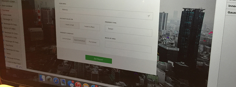
For the vast majority of modern websites, web forms are essential. The most important thing that they are used for is the support of visitors and companies, particularly when it comes to fulfilling distinct objectives by creating a link or aiding communications between the two.
The standard registration or sign up form enables visitors to become official affiliates of internet groups, collectives, and communities. For example, take Facebook – its one billion members all start their journey with the website via a simple registration form.
A checkout form enables exchanges to occur over the internet. For instance, this could be registering your details with a paid service or actually buying a product from a website.
A data submission form is a way for individuals to exchange information, publish data, and interact over the internet. This type of action is seen by the users of blogs, forums, and social collectives.
Image source: Matt D. Smith
Despite their far-reaching influence and impact on the overall quality of websites, it is still common for web forms to be put together in a shoddy or uncaring manner. To create beautiful forms, you can use a form provider with well-designed templates, or enhance your existing forms with CSS. The following tips and tricks will help you to avoid this and create web forms which are always useful and engaging.
Directional clues
Image source: Jamie Barton
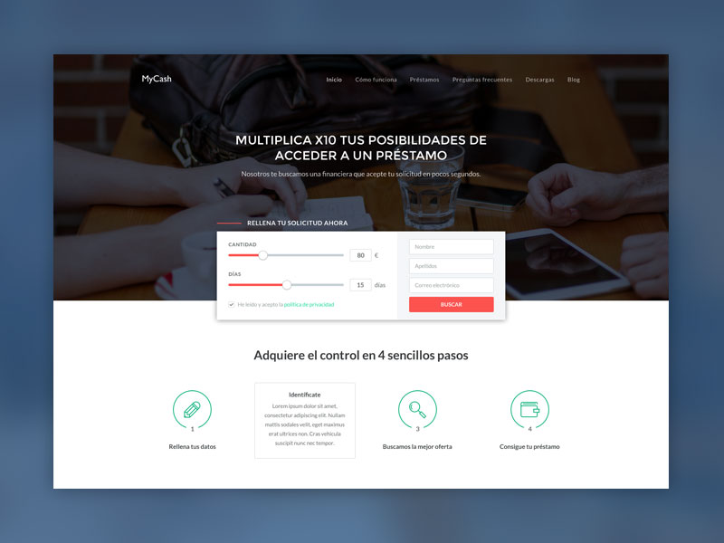
The standard directional clue is a symbol or a sign designed to prompt a user to conduct a certain action. It is possible to coax visitors in the direction of a form by using cues in the form of images, videos, and text-based articles.
Sometimes, a picture of a person gazing at a form is enough of a prompt. As human beings are very curious, it makes sense to think that we would instantly want to know what is so interesting – more often than not, visitors will follow the gaze of the person in the picture.
An alternative is to use arrows instead of pictures of people. We are conditioned, throughout our daily lives, to respond to arrows and similar symbols (on roads, maps, street signs, etc.), so it is natural for human beings to follow the suggested direction of an arrow.
The essential fields
Image source: Joshua Smith
It is useful to always clearly explain which input fields in your form are obligatory and which are discretionary – so, which are needed and which are provided in the visitor chooses to give them. Once visitors push the SUBMIT function, they should not be confronted with (for the first time) with information about what they must do.
To achieve this, and make sure that obligatory fields are always marked clearly, display them in a different color to the optional ones. Whilst most websites use an asterisk for this purpose, they are sometimes not explicit enough.
In-Line Validation
Image source: Tom Petty
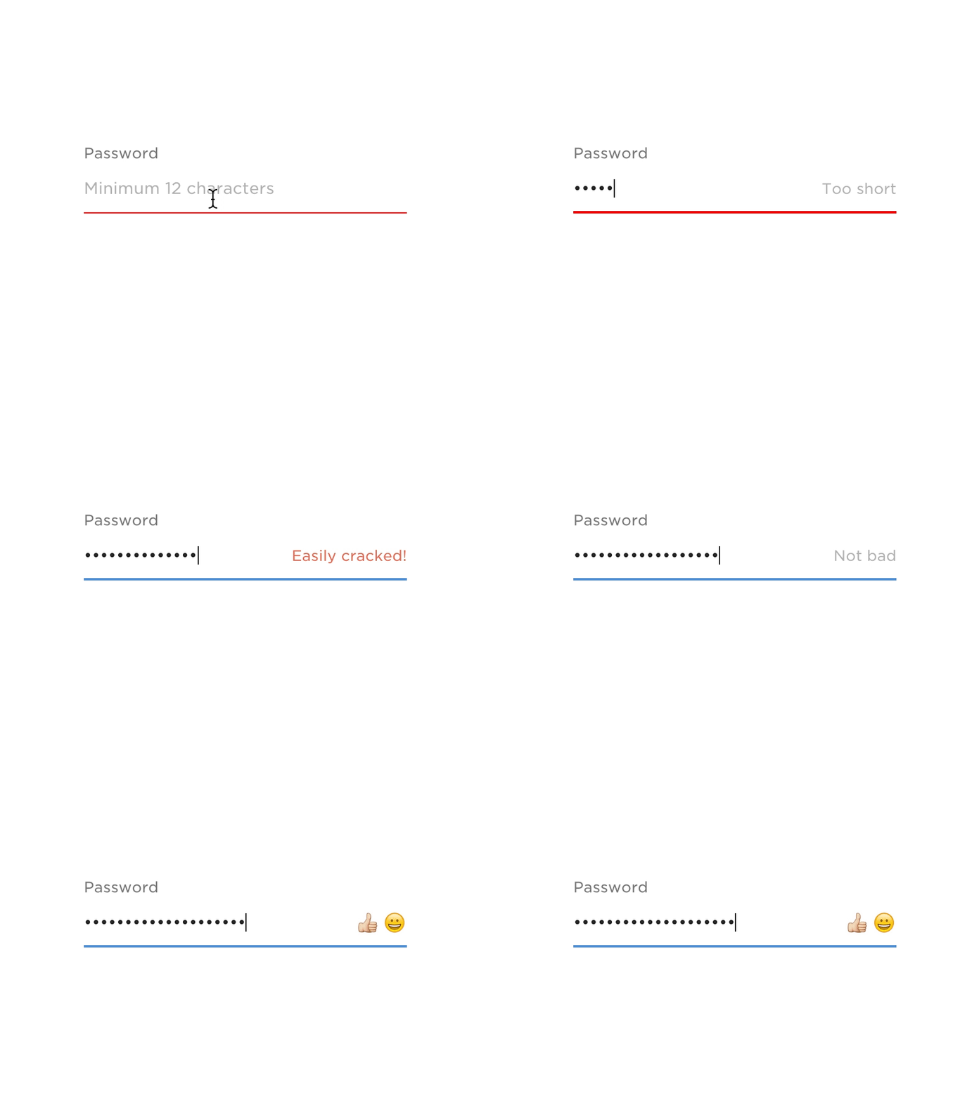
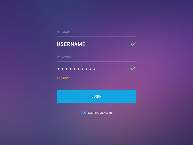
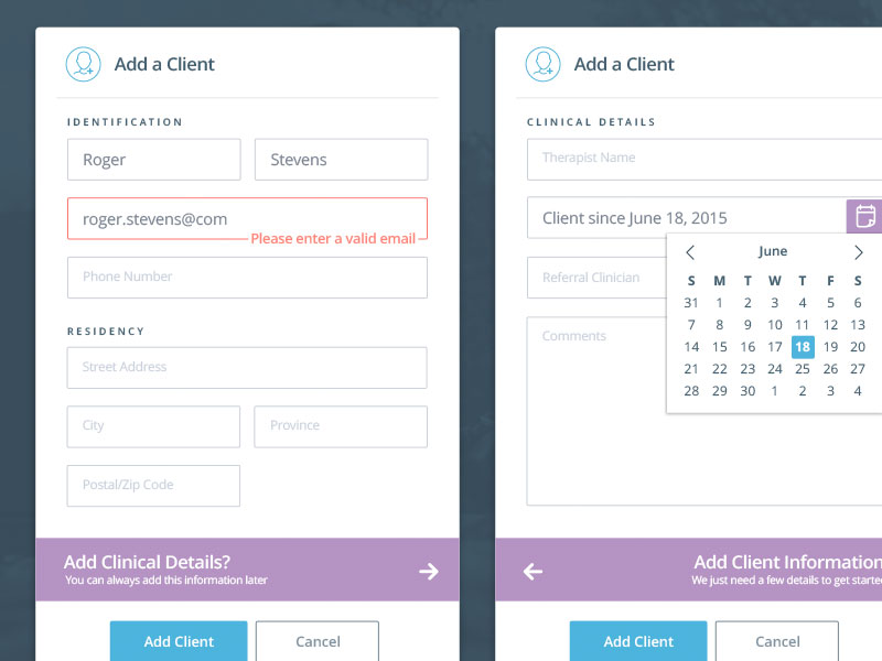
If a visitor makes a mistake whilst inputting data into a form, let them know immediately. The last thing that they want is to be allowed to waste their time filling out the rest of the fields when the submission is not going to work anyway.
Labels
Image source: Ricardo Salazar
The way in which visitors are expected to input data should be similarly obvious. For example, the required length of new passwords and usernames should be made clear at the point of choosing.
The use of labels is employed to clearly title your input fields and let visitors know what type of data they are expected to offer within the various spaces.
Opting for top aligned titles and labels is the best choice because this makes it simpler to fit labels with varying dimensions and localized features within the UI.
Choose left aligned titles if your form is fairly brief and contains lots of similar queries. Also, you should not treat titles and labels as supportive guidelines. They should be brief, informative, and straight to the point.
They should not be treated like placeholders either. In fact, unless you are dealing with certain constraints and limitations, avoid inline titles. If your choices are similarly limited, stick to CSS3 and JavaScript modifications.
Inline titles are most suited to brief forms which contain less than four input fields. For lengthier forms, they are no good, because have a negative impact on usability.
Form Progress
For those who tend to use lengthier web forms or forms which contain more than one page, it is helpful to let the visitor know how much of the process they have completed.
If you want visitors to stick around and actually finish long forms, you need to tell them how much time they should set aside for it. It is possible to demonstrate this information via numbers or graphics if you are familiar with designing web forms for usability.
Hints
There will inevitably be times when a visitor is not familiar with what an input field requires. This is why responsive hints, which appear with the hover of a mouse, can be so valuable. They are great for giving more information on slightly complex fields. In terms of inside help, it can be handy to look for searches related to designing web forms for usability too.
Useful tips
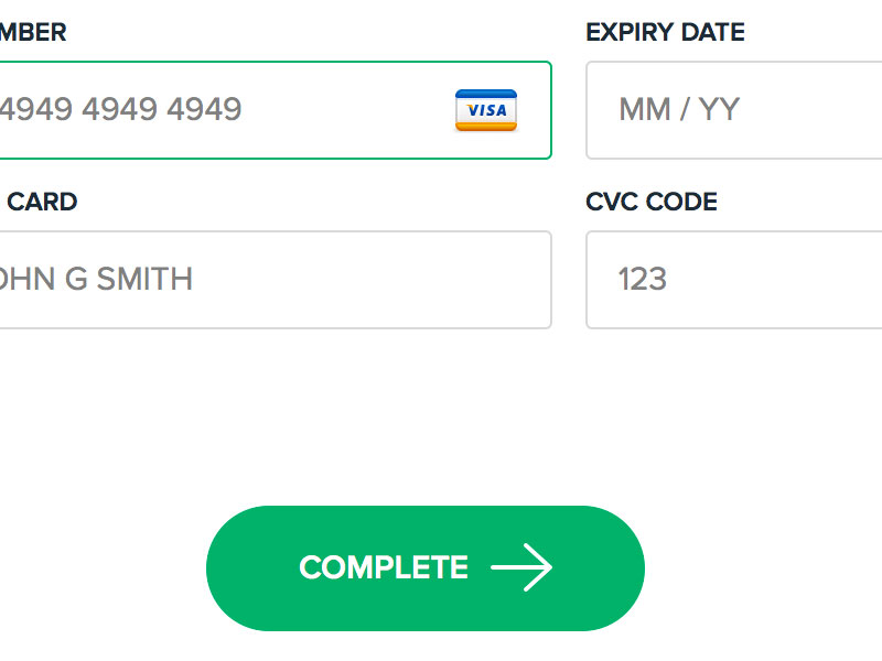
Image source: codyhouse.co
If interacted with, these functions or buttons perform a predefined task.
Try to stay away from phrases like Click here or Complete form, because they do not offer enough information. Instead, be specific and use phrases like Send me weekly deals or Sign me up for the newsletter.
Wherever possible, resist the urge to put more than one action function on a form page. You want the visitor to know unequivocally which button to hit to submit their information.
More often than not, reset functions are a bad idea. If hit accidentally, they can destroy the progress made by a visitor.
Action functions which are not displayed in line with the input areas can be visually jarring.
Once the submission or action button has been pressed, take it ‘out of action,’ so it can not be accidentally clicked a second time. This also shows visitors that they have hit the right button.
Always ensure that error pop-ups and alerts are simple to follow and understand. It is not enough to utilize vague or unspecific error pop-ups because to solve the issue, they need to clearly state what it is.
You are advised to employ cookies to help you store and remember visitor passwords. If visitors prefer to have their passwords stored for next time, allow it to happen.
Don’t make small inputs
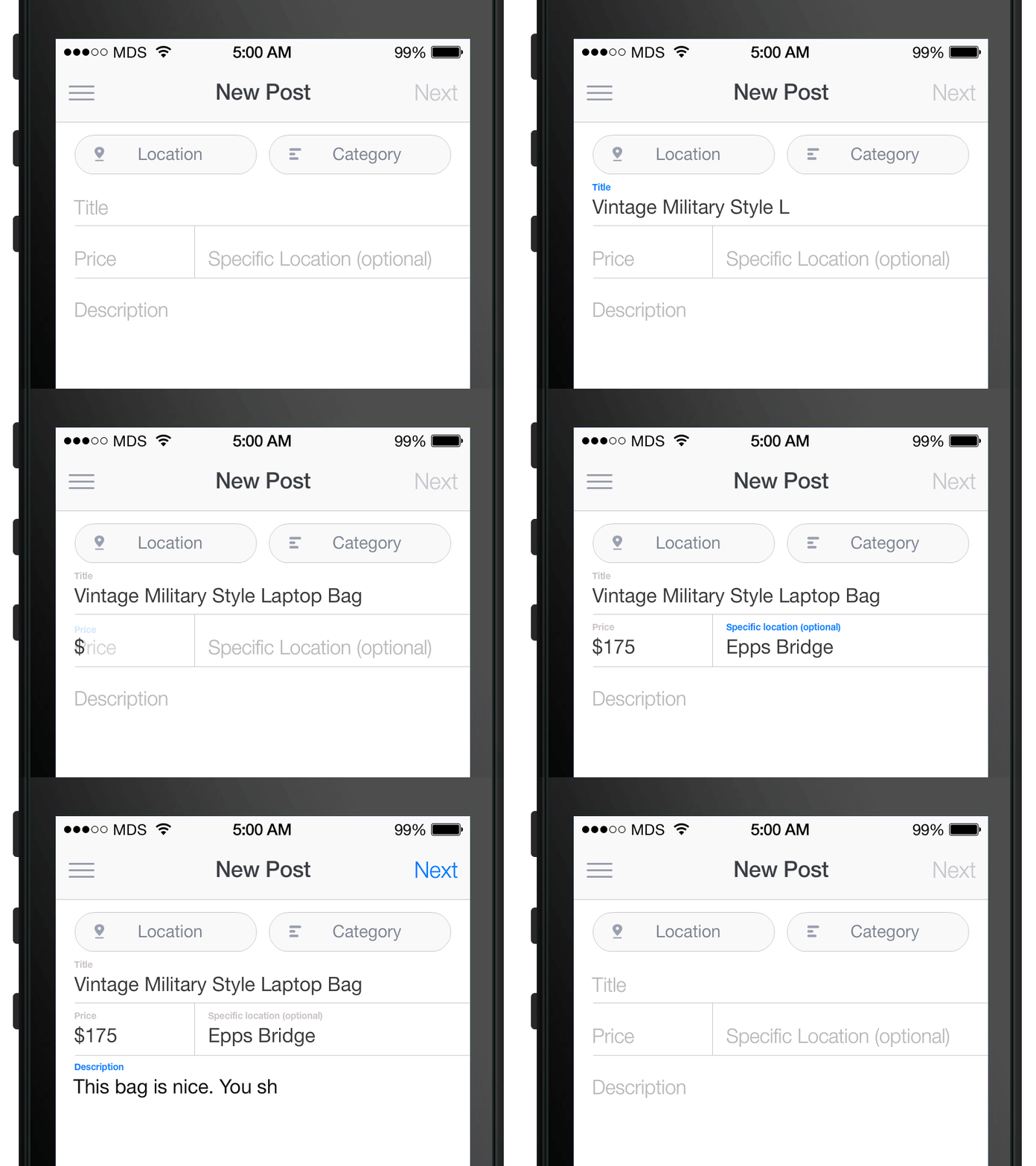
Image source: Vlad Paloiu
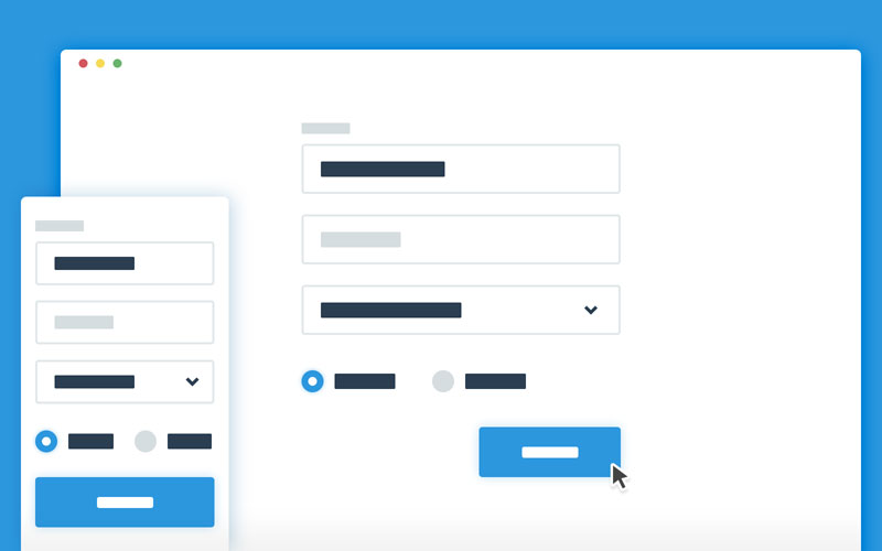
Your visitors should have plenty of space to fill out the input fields, particularly when it comes to things like email addresses which can be very long, in some cases. The first and last name fields must provide at least twenty characters each.
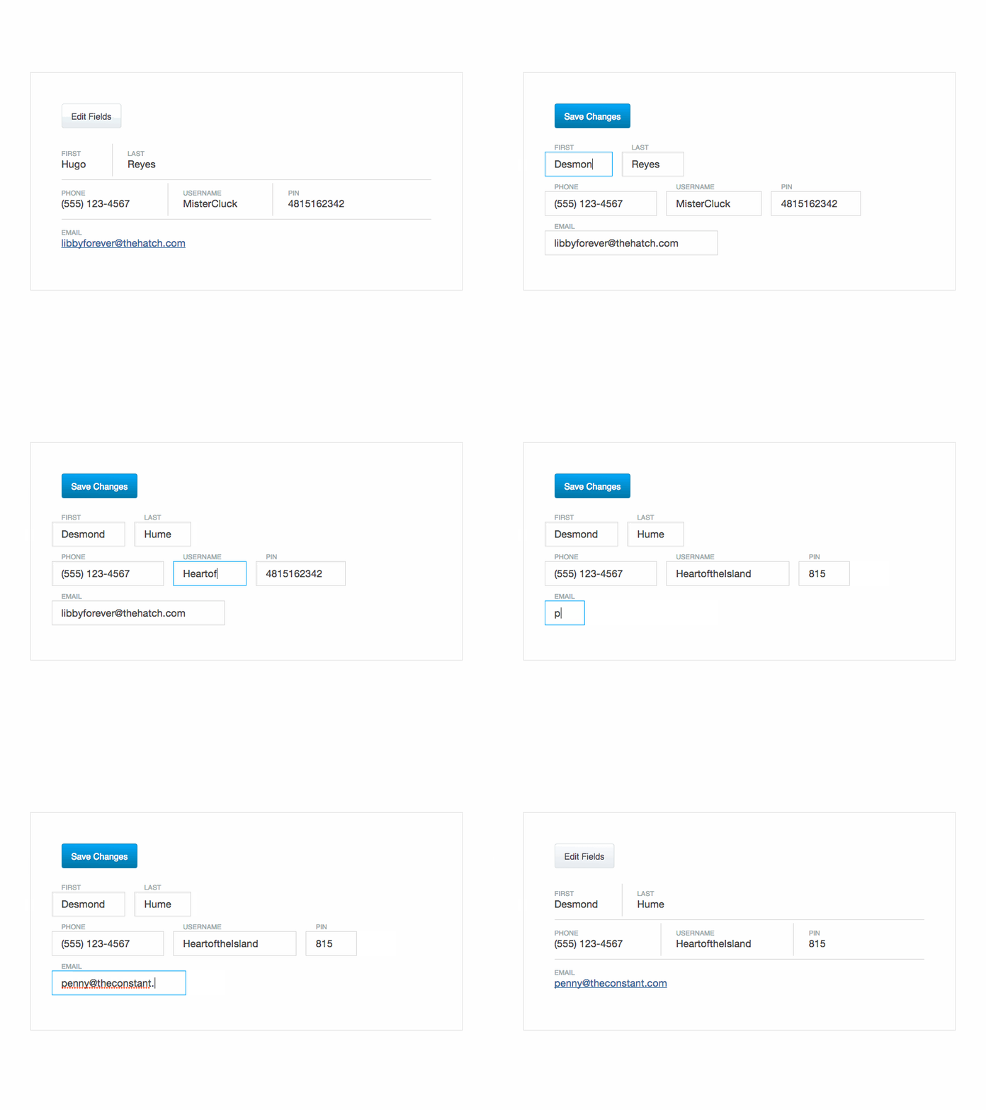
Clearing filled out inputs
If a visitor does make a mistake and fill out a field incorrectly, the last thing that they want is for the correct fields to be erased and restarted too. Where possible, allow only the mistaken data to be erased and prepared for another inputting attempt.
Keep them short
Image source: Mike Tran
For most visitors, brevity is everything and a long form will discourage many from staying and filling out their information. If you must use a lengthy form, try to split it into more manageable pieces.
Conclusion
The bottom line is that anybody can design a web form, but few can create a really good one. With the tips and tricks shared in this article, you should be able to learn how to construct top quality web forms for your online platform. If you have any advice of your own, do not hesitate to share it with our readers.
Credit for featured image: Paresh Khatri
