What are alphabet fonts? It is not easy to learn typography, but you can at least familiarize yourself with the history and types of alphabet typography styles to understand why the font is so large and how they were still made to look so different.
Table of contents
Alphabet Fonts Classification
Alphabet fonts classification depends on the era or specific features of each design and it can, therefore, help you narrow down the font choice to few most attractive options.
Distinguishing types of alphabet fonts styles can have a huge influence on your design decisions and help you discover the most suitable font for your project.
This post is, in fact, a short overview of font classification for serif and sans-serif solutions. It explains quite accurately how these types made it to the most-used list over the years.
Explore this guide on using fonts efficiently in web design.
Garalde Font (Old style)

Typefaces are increasingly being carved to obtain a printable form, which has inspired many typographers to experiment with them and create their own fonts instead of using existing scripts.
Goudy Old Style and Garamond were created exactly in this way, which triggered the entire era of upright letterforms and clean crossbars instead of Humanist designs, which favored thick strokes.
Transitional Font

Among the different alphabet fonts, this style was developed by John Baskerville, an English typographer and printer who decided to deviate from old and traditional styles around the middle of the 18th century. His transitional approach opened the door to neoclassical designs and combined some of their best characteristics to improve printing methods.
Baskerville worked on the so-called calendared paper, which produced finer strokes and characters that could be easily reproduced and maintained. Transitional designs are recognizable by their curve stroke axis stressed vertically and a more pronounced weight contrast. Serifs there are slightly bracketed, while head serifs look oblique.
Didone (Modern)
 Font")
Most contemporary & modern fonts are noticeable by their strong features, such as thick vertical strokes instead of the thin and vertical ones, end-to-end striking contrasts, and lack of rounded elements. All letters are joined vertically, as the fonts appeared during the transition trend in the 18th century.
The Didone groups in France were the responsible developers, while Giambattista Bodoni from Italy was the first executor of the idea.
Alphabet Fonts: Slab serifs

The early 19th century brought slab serifs to the scene. This popular style for advertising and display features heavy serifs with minimal or no bracketing. It is difficult to imperceptibly change their weight, which is why many readers confuse them for sans serifs with heavy additions.
Alphabet Fonts: Sans serifs
In the first few centuries of typeface evolution, it was quite easy to follow developments and updates, but the transition from the 19th to the 20th century was a revolutionary explosion of ideas that produced many of the fonts we are still using today.

The handwritten characteristics disappeared in a glance, and new sans serif styles arrived under the spotlight to completely transform typing as we know it today. The focus was shifted for the first time towards modern and functional reading, where users could understand text even at longer distances.
Sans serifs are precisely a product of the 19th century, but it took them a while to become as popular as they are today. What sans serifs did was to exclude the serif (‘sans’ means ‘without’ when translated from French) and to deliver a flexible, simple, and usable solution entirely abstract to the standard letter alphabet.
Grotesque Sans Serifs

Grotesque Sans Serifs were the first types to gain commercial popularity, due to their stroke weight contrast that can be described as more squared than curbed, and the ‘bowl and loop’ designed lowercase g which reminds of Roman writing styles.
The R is also sometimes curled, while Gs have spurs. Other modern sans serif patterns are also present and arrived a bit later than the grotesque to calm contrast and round the overdone ‘squareness.’ More of the strokes were rounded, and monotone weight was less stressed.
Square Sans Serifs

The grotesque-like proportion and trait are most common in these designs, even if squaring is much more definite and sometimes even dramatic. It was probably when latitude rounding started to disappear, and focus was transferred to character spacing to make texts more clearly displayed.
Geometric Sans Serifs

These typefaces are influenced by geometry’s simplicity. Lines seem clear and strict, and all shapes remind of specific geometric forms. Contrary to what one would expect, geometric types are more difficult to read than grotesques.
Humanistic Sans Serifs

Here, Roman inscriptional proportions are being applied to make stroke contrast really apparent. According to typography experts, humanistic sans serifs are the easiest to read and understand, as they match significantly the proportions and characteristics of original serifs and were designed under their calligraphic impact.
Alphabet Fonts: Scripts
Formal

Formal scripts can be traced back to the writing styles of the 17th century, when characters were connected with strong strokes.
Calligraphic
As you can probably guess, calligraphic scripts try to replicate calligraphic writing and can be both connecting and non-connecting in design. When you look at them, they feel like you were reading something handwritten with a flat-tipped instrument.
Lombardic and Blackletter

Both typefaces were developed based on manuscript lettering long before movable types were invented.
Casual
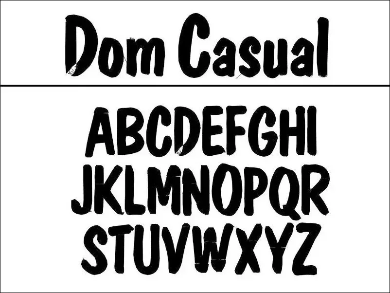
Contrary to their formal counterparts, casual scripts stand for relaxed and informal settings. They are similar to something that was written in a rush and has a specific purpose to satisfy. Most of the time, their letters are tightly connected with character strokes.
Alphabet Fonts: Handwritten

They’re not genuinely handwritten fonts, but they look like they were. Their appearance is casual and entertaining, and their shapes are cursive or rounded. Unfortunately, as fun as they are, handwritten fonts are not that legible.
Novelty (Decorative) fonts")
These are probably the easiest fonts to classify because they can’t be included in the abovementioned categories. They serve to inspire original moods, which is why they rarely appear on web content or in printing.
Ornamental fonts (Dingbats)
Ornamental fonts were designed to remove alphanumeric characters and replace them with creative drawings, symbols, and pictures. Dingbats, in particular, don’t have a concrete purpose – they are just meant to be used wherever and to beautify designs.
Final Thoughts On Types Of Fonts
We can’t be sure that this is the 100% reliable font classification and that nothing else you’ll read is correct, but it is still the result of hard work, experience, and dedicated research. We believe we included all types of letter fonts and particularities necessary to distinguish fonts and assign them to a specific alphabet font family. Still, we would be happy to hear something more from professional users.


