Nowadays, the majority of the magazines out there are available in both print and digital editions. However, for most of us, it is clear that the web version cannot even begin to compare to the kind of reading experience the print edition guarantees. It is true that the website readability of these sites plays an important role in the process, being, in the majority of cases, unimaginative.
In such situations, it is only normal that we should ask ourselves: when will the digital reading experience reach the same level of excitement guaranteed in the present by the printed one?
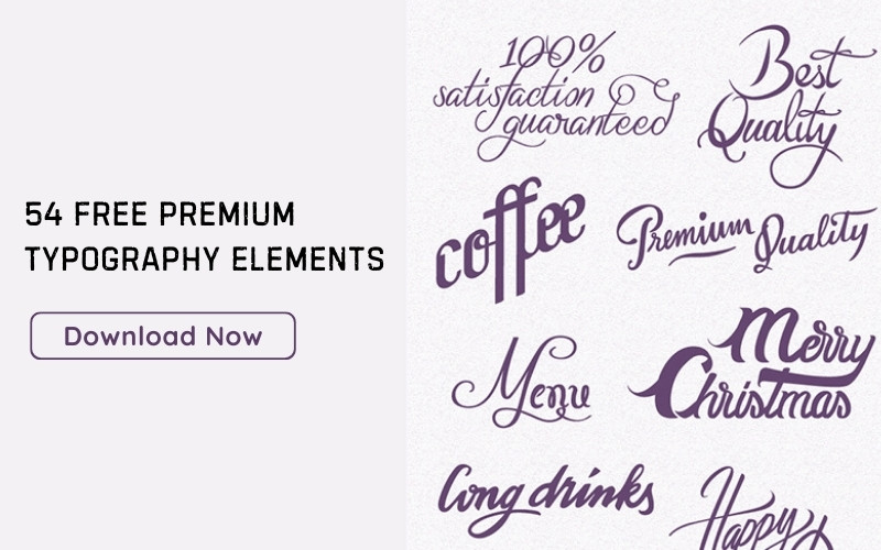
 Image source: Inside Jumeirah
The job of a web designer is not simple, especially when it comes to taking a design idea and turning it into an actual website that is 100% coded. There are a lot of challenges to be overcome as one works on such projects, with many outside factors often changing the course.
 Image source: 12dishes.com
However, things are not as dark as they actually seem. And, in the past few years, the digital reading experience has genuinely improved. The web has definitely become more readable, which just goes to prove that we are closer than ever to the things we have imagined and desired to create.
The importance of readability as a concept cannot be understated. Given the fact that it guarantees a proper understanding of content upon first encounter. Considering such matters, it is only normal that it will weigh heavily in how potential visitors are going to welcome your website. Let’s check out website readability best practices!
Table of contents
Readability 101
Before you find out how to design for readability, you have to be perfectly certain that you have understood the concept. There are a number of factors that determine the readability of website content. Including the length of the line, typeface style, and leading. In fact, every element on your website can contribute to readability, including the contrast, chosen colors, margin choice and padding.
 Image source: uncharted.sunbrella.com
The perfect blend between these elements is what guarantees the readability of the content present on the website. And the good news is that, you, as a designer, can modify all of these elements, exactly as you desire. It should be mentioned that these elements are discussed in reference to the main body text, where readability is indeed the most essential.
While it is true that these elements are just as valid for the other parts of the website, it is also true that they are less important, once readability is ensured for the main body text.
Also read: Why Website Design Is More Than Visuals
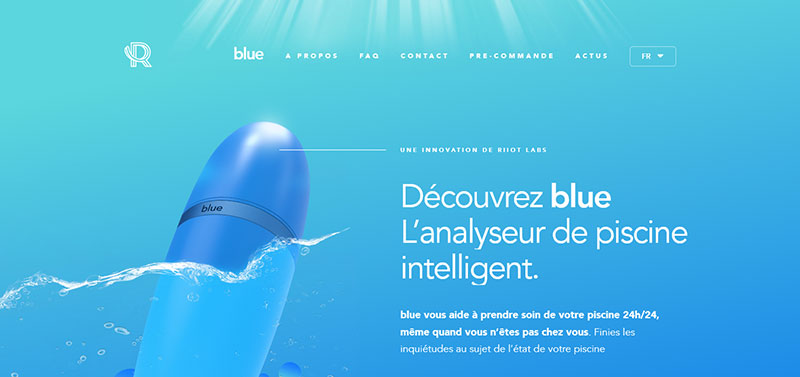 Image source: riiotlabs.com
The concept of readability is clearly influenced by the length of the line. So you need to pay close attention to how many characters each line of text contains. When it is too long, the visitor might find it difficult to read and abandon the content altogether. If it is not long enough, it will generate ambiguity and contribute to an overall stressful reading experience. (line length)
Paying attention to how much space you have left between the text lines matters in an equal manner. Imagine having to read an online article that has no spaces in between the text lines. Comprehending the text would simply not be possible.
Also read: Best Free Graphic Design Websites for Students
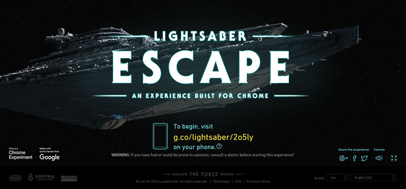 Image source: lightsaber.withgoogle.com
Apart from the leading, you also have to pay attention to how much space there is around or between the different objects present on your website. This is important, because it can determine whether the reading process is going to be simple or difficult. (margins and padding)
Readability can also be determined by the choice of typeface style. You need to be aware that there are certain fonts that are more readable. This allows the website visitor to easily scan the written content (e.g. serif and sans serif). On the other hand, choosing a typeface with a lot of decorations or scripts can guarantee a difficult reading experience. The same goes for novelty typefaces, so make sure that you choose an adequate style for your content. (Typeface style)
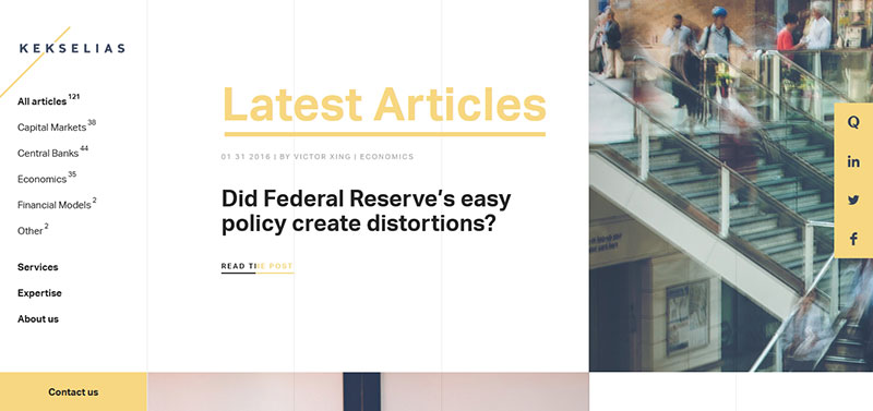 Image source: kekselias.com
You might not believe the text color to be as important as the other elements but it actually is. Moreover, this color always has to be chosen in accordance to the background of the website. So as to guarantee the best possible reading experience. Imagine trying to read text that has the same color as the chosen background.
Impossible, right? When you have contrast, you also have readable content. So, you have two options: light text with dark background or dark text with light background. Choose wisely! (Color and contrast)
Check out this blog to learn about best practices for website design.
Scaling, part of the process
Turning back in time, all the way to the 16th century, we remember about the first sizes developed by typographers throughout Europe. It is amazing how these sizes have withstood the passing of time, with only small alterations or additions. Whether you prefer using the traditional scale or you have designed your own scale, it is important that you pay attention to the impact of scaling over the final result.
Also read: Responsive Web Design: Tips and Best Practices
 Image source: trefectamobility.com
Scaling allows you to divide the text content. And the presence of section heading indicators, such as H1, H2, or H3, is what makes the text readable. The same goes for other separators, such as the paragraph tag (p). At first, scaling might be a difficult concept to comprehend. But once you go over the basics, you will see that it is not actually as complicated as you thought.
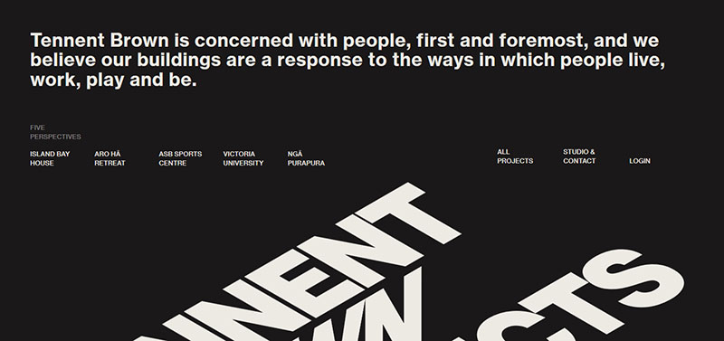 Image source: tennentbrown.co.nz
Moreover, when you are designing for better readability, you can resort to a wide range of tools. This will ensure the proper scaling of your content.
How necessary are hyphenation and other word breaks?
If you were to look at things from the perspective of the reader, you would immediately agree that hyphenation can be quite irritating, especially when it appears in headlines or subheadings. If you do not watch out for such matters, you will cause the readers to have an unpleasant experience.
Also read: What Is Accessible Web Design?
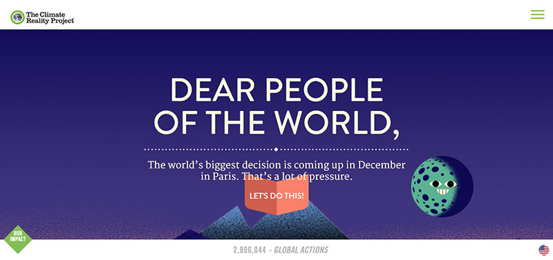 Image source: worldseasiestdecision.org
Reading is a continuous process and hyphens actually cause an undesirable interruption. This is the reason why you need to refrain from using hyphenation when it comes to large type (going over 25 points). As for the small type, use hyphenation sparingly, as it can have a similar effect.
The only situation in which hyphens are acceptable in a reduced quantity is when it comes to copy blocks of a larger size. In general, you have to make sure that you have used few or no hyphens for each of your text paragraphs. If your writing is of reduced quality and there are also many words breaks, the reading experience is going to be more-than-unpleasant.
Also read: Follow These Tips To Become A better Web Designer
 Image source: gitman.com
An agreeable reading experience starts with headlines and subheadings that are succinct. So, make sure to keep things simple and short. This means that long phrases should be avoided at all costs, with the wording being concise. The reader should want to read more, should seek out your content, not abandon it.
When you have a substantial amount of copy to work with, make sure that you add an adequate number of word breaks, not to mention subheadings. This is valid for each and every digital or web project, as it will ensure the proper visual digestion of your text content. Moreover, despite the content being long, the addition of these breaks will make it easier to read.
Optimum Website Readability According To Screen Size & Device
Optimum web page readability is one of the main concerns of web design. When you have to create the written content for a website, it is only normal that you will follow some basic guidelines. These will help you choose the correct number of characters for each individual line, in accordance with the screen size and device that the content is planned for.
 Image source: eginstill.com
Once you are aware of what the appropriate length for a line is, it will be easier to decide on the size of the text. You can start by calculating how wide the body text frame actually is, depending on the device for which it is created (desktop, table or mobile size).
As soon as you have determined the width, it will be a breeze to adjust the size of the content so as to match the recommended count of characters. If you follow these basic guidelines, you are already on the right path.
Also read: How To Use Fonts Efficiently In Web Design
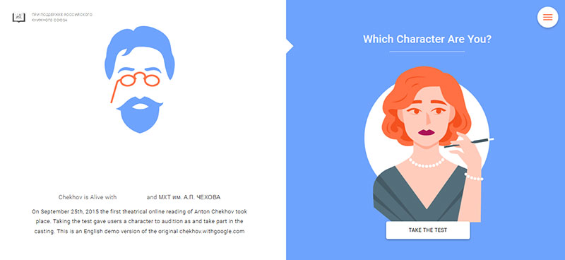 Image source: Resn
For example, when it comes to desktops, the recommended number of characters per line falls between 55 and 75 (spaces included). As for the ideal character count, this is of 65 characters per line. In the situation where you are designing for a mobile device, we are talking about 35 to 50 characters per line of content.
In the situation that you want to improve content readability even further, you should pay attention to both the number of characters per line and the line spacing (leading). When it comes to leading, you have to pay attention to the body text size and the recommended percentage, according to the device that content was meant for. Also, keep in mind that both hard numbers and ems can be used to define leading.
Also read: Effective Web Design Techniques You Should Apply
 Image source: Oblio
For desktops, the recommended percentage is 1.5 times the of the body text. As for mobile devices, you can use between 1.75 and 2 times the existing size.
A Final Word : Readability Of A Website
As a web designer, you have a great deal of responsibility when it comes to the styling and structuring of the website content, as this ensures an effective communication process with the visitors arriving at the website. You need to remember that the majority of Internet users are only skimming the written content. They are looking for relevant pieces of information. There are only a few people who actually take the time to read the content. And in the design process, you need to satisfy both lazy people and those who are interested.
There are a number of measures that you can take in order to ensure the readability of a website. For example, you can optimize the chosen font and make sure that the line height is adequate. You can keep your written content short and easy-to-understand. Moreover, you can be succinct in the information you are trying to transmit. This guarantees readers with sufficient breaks (makes scanning for the desired information easier).
Like this post? Check out more amazing web design content here.


