The minimalist movement was introduced to the Western design sector in the 20th century after design experts started to reduce their creations to the most basic and vital components.
Architects were the first who caught on to the movement and decided to use minimalism as a favored design approach.
There were two principles ruling the work of designers during this period: ‘less is more’ and ‘we can do more with less’.
 Image source: Ales Nesetril
Many designers began to create film posters, catalogs, business cards, and promotional materials using the minimalist approach.
What Does Minimal Mean?

Image source: Jake Sunshine
Designers have various opinions about what ‘minimal’ means and how minimalistic you can make a web design. There are some who believe that even inserting color into a web design takes it away from the ‘minimalist ethos’.
They think that minimal web platforms should never feature more than a handful of aesthetic components.
No matter what opinions you have about the minimalist movement and minimalist design, keep in mind that you need to strip away components and to stop when there is nothing else that can be withdrawn and still see the web design functioning as intended.
This is why so much care and consideration are required for selecting design components for a web design project.
Key Components of Minimalist Web Design
 Image source: Thomas Michel
Less Content
If there is one clear and defining tenet of minimalism it is that you must only use what is vital and take away all the other components. In fact, the primary belief behind the minimalist design is that the fewer components there are to interact with, the more powerful the existing ones will be.
It is important to understand that minimalism is not about a lack of resources – it is defined by a voluntary decision to take away all that it not essential.
White Space

Image source: Olly Sorsby
One of the most common components of minimalism is white space, meaning no components at all. This can also be referred to as ‘negative space’ and it is one of the most powerful tools that minimalism has to offer.
It is generally believed that the more white space there is around an item, the more easily focus will be attracted to it. Plus, white space also creates a feeling of sophistication. This is why it is so frequently used by high profile retail companies and businesses that aim to look exclusive and rare.
With the help of alignment, it becomes easier to implement the correct amount of white space and to make it simpler for visitors to interact with your website data.
Repeated Content

Image source: Hoang Nguyen
The repetition of content actually gives a design a feeling of fluidity and cohesiveness.
This is good news, because this technique can be used for almost all aspects of web design. It is particularly good for emphasizing shapes and symbols.
Grid Layouts

Image source: Visual Soldiers
The value of grids is that they enable minimalist web design components to look more cohesive and ‘whole’.
As opposed to making use just of data, lines, rules, and pictures, this can be a great way to emphasis your objective. In addition, grids support design experts when it comes to fulfilling the minimalistic style with the right amount of white space.
Symmetrical Design

Image source: Arlen McCluskey
If you want a project to be visually powerful, you must remember that it must first demonstrate visual appeal and symmetry. However, it is also possible to make a statement by intentionally disregarding this rule.
As there are fewer components with which to create the aesthetic framework, it is essential that minimalistic platforms are based on a robust system of alignment and a strong grid framework.
Thus, the fastest method is to simply ‘centre the data’, though this is not the only viable option. In some cases, the information is aligned in an ‘off centre’ fashion for a more exciting and arresting aesthetic appeal.
Designers must be familiar with various different kinds of visual symmetry and needs, in order to be able to align the big and little components within a display.
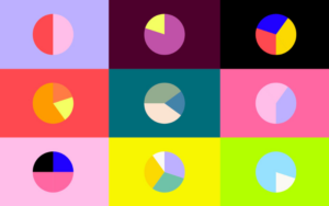
Types of Visual Symmetry
It is possible to classify visual symmetry into four types:
- Approximated – the composition is the same, but the visual weight is distributed evenly on either side of the display. For instance, one big component is evened out by a handful of littler ones.
- Half – the two sides of the display contain dissimilar layouts; these are mostly horizontal, but sometimes they are also vertical.
- Radial – begins at the middle point; the components exist in a symmetrical fashion and within an almost circular alignment.
- No Symmetry – this is planned ‘chaos,’ insofar as there is no visual pattern. It can be a very difficult style to master, but it lends a platform a very ‘dynamic’ and ‘energetic’ vibe.
Summary

Image source: Ranjith Alingal
The bottom line is that minimalism, as a design movement, is a classic and ever popular approach to web design.
The thought of bringing a web design right down to the bare bones – free of fussy details – is one which will always appeal to design experts, even as other design trends rise and fall. If you can learn to master the above described tenets and principles, you will never need to be concerned about keeping up with the trends.
However, it is essential that you not only boil the design down to its basic components, but that you also design an even and organised layout by making use of the existing components in the right way.
Credit for featured image: Owenn Perry