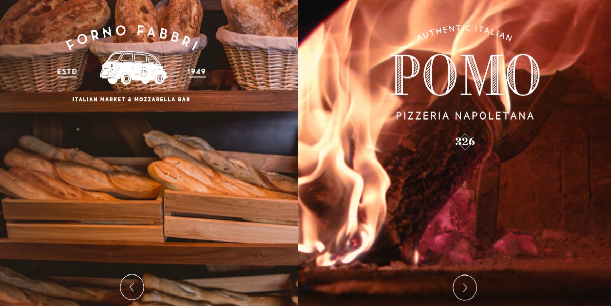
One of the rising trends in web design is the split screen, also referred to as the full screen. This is something that has both its advantages and disadvantages.
Split screens are layouts that can make any kind of website stand out, so there are some important reasons for considering them.
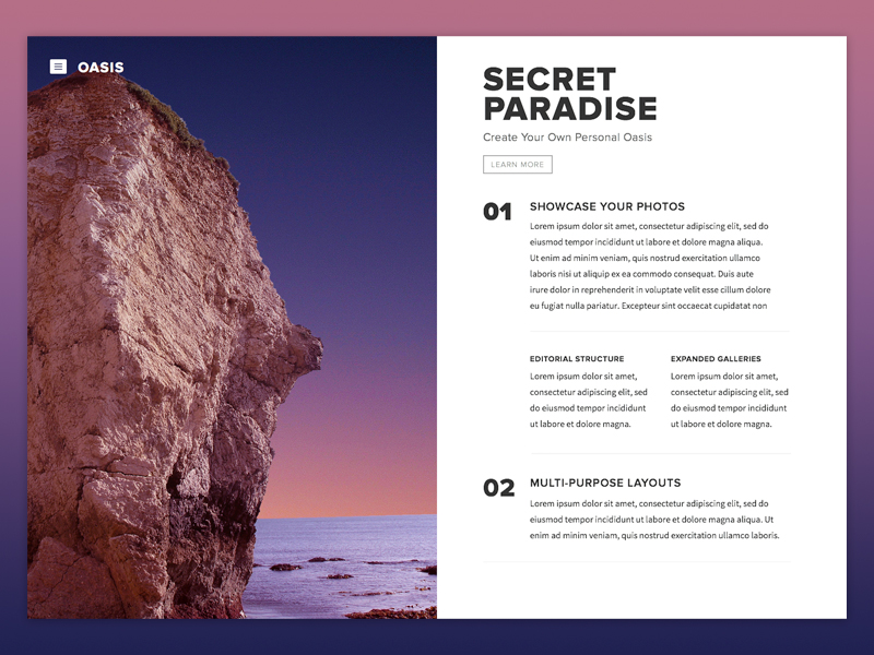
Websites commonly rank various elements according to how important they are, in order to be able to define both the structure and the design order.
So how, where and how should split screens be used?
Dual Importance
Image source: Jonathan Gerlach
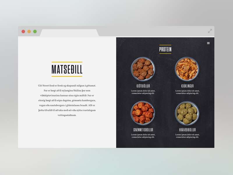
When using a split screen layout for your design, you are able to give equal importance to both elements while, at the same time, allowing the user to choose between them quickly.
This means that you are able to easily convey dual importance. For example, if you run a website for a restaurant, a split screen layout would work perfectly for you.
Consider placing your brand information on the left side of the page, while placing a list of all of the dishes that your establishment offers on the right side of the page.
In addition, a business like clothing line can use also a split screen layout to showcase important information regarding the company itself on one side of the screen, while showing photographs of the latest clothing styles and trends on the other side.
Split Screen and Zig-Zag Patterns
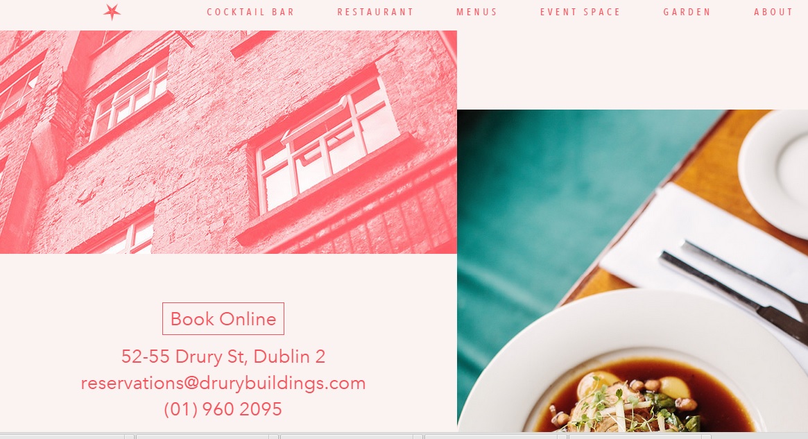
It is simple and easy to make your designs and layouts “zig-zag compatible”, if you think of the splits screen as essentially dividing your page into two different, yet equal, halves. These are supposed to work well together as the zig-zag end is aligned closely to the center of these two halves.
Important elements should always be placed at the end point positions of the page’s zig-zag point.
On Static Pages

Split screen layouts can be used both on single and static pages. Moreover, if a company decides to display more information on its website, the designer can also scroll down the overall content of the dual page itself.
However, there are some instances in which scrolling down on one side of the split screen can result in scrolling down the other side at the same time.
Split screens also provide both ease and convenience to users, who can immediately reach two sections to find different information.
Where Should It Be Used?
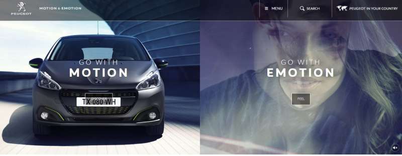
A split screen layout can be used in a preview of a work portfolio or even in an area that showcases the most important services that your business provides.
Users will be able to take notice of these and will stay longer on your website, which can lead to better conversion rates for you and to an improved overall user experience.
The Split Screen Trend
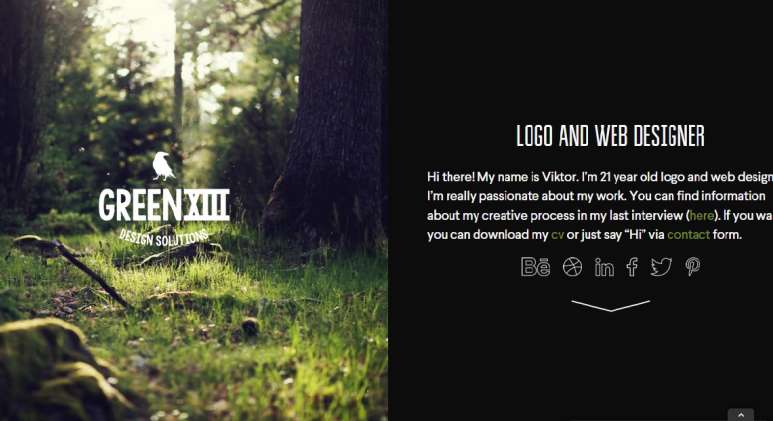
Many different websites are embracing the split screen layout also because it is considered to fall under the category of responsive web design.
This involves adjusting the proportions of a webpage, in order to be viewed on various screen sizes, especially on mobile devices. Regardless of how a website is accessed, a split screen layout is able to completely preserve its proportions.
In addition, a split screen layout also gives a website a more edgy-type look and feel.
Another great aspect of this layout is that you can apply it to virtually any kind of theme that you implement on your website. This is possible with the help of a website builder, which you can use to easily split the page.
Final Thoughts
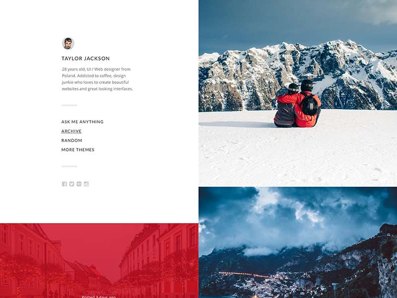
It takes approximately three seconds for an individual to make a decision regarding your website. Consequently, your layouts should always be “skim-friendly” if you plan not only to attract visitors but also to reduce bounce rates.
Consider dividing all your layouts right in the center, placing important features on the aligned endpoints of a zig-zag.
Credit for featured image: pomopizzeria.com
