In simplest words, typography is the art and style of organizing type. It is regarded as one of the core skills of any designer. But lots of designers and creatives just look at the font type and size when practicing design typography.
Even those who have been working in the industry for a long time commit this mistake. That’s a shame since there’s a lot more to it than picking fonts from a drop-down menu. Mastering design typography gives designers total design control over any project.
Typography goes a long way back to the time when wood and metal were the only resources for printing presses. As such, its value is paramount.
Matthew Carter, a renowned British type designer, once said that “a type is a beautiful group of letters, and not a group of beautiful letters.” He was underscoring how typefaces should work. Carter tells designers that types function in context, and not just as individual letters.
Practicing poor typography can cost you resources you could never get back, like time and effort. Not to mention, you’ll be squandering money. Picking the right typeface and the correct layout, grid, and style spells the difference between a mediocre and an outstanding design.
For newbies, there are lots of design typography tutorials and lessons available online. But it all boils down to the best of your intuition as a designer. Here are some practical tips to aid you in making the right design typography choices.
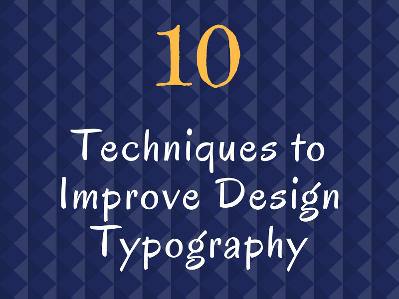
Ten Techniques to Improve Design Typography
1. Give measure enough attention.
Courtesy: Pixelo.net
This may not be a priority element, but measurement is a vital design component nonetheless. A lot of designers have taken measure for granted by using the same handful of fonts over and over again.
A long measure, at times, interferes with the rhythm of the design. It makes it hard for the readers to go over the next line of type. An ideal readability has 40 to 80 characters’ measure, including spaces. For a single-column layout, it’s best to play with around 65 characters.
2. Sync the mood to the content.
Courtesy: Pixelo.net
Every single typeface has its mood or character. It can be vibrant, high-class, ornery, or silly. But most fonts aren’t one-size-fits-all. You have to figure out the personality of the font, and whether that suits your design or not.
An excellent approach is to brainstorm the mood you want the context to convey. If the content is part of a previous project, much better. You can match your font choices using the tone already established in the last context.
The mood of the typeface impacts the readers on how they’ll feel about the content. The right typeface personality can be a dominant force in making the content more compelling.
When its personality fits the persona of the text, readers will be able to grasp the message faster and easier. If it doesn’t, the content becomes confusing. The simpler you make it for your audience to read, the more likely they’ll connect with your brand. Or, at least, follow through on the purpose of your design.
3. Match the mood to the target market.

Courtesy: Pixelo.net
Picking the right typeface based on its mood is lovely. But it’s only half of the battle. Remember, not everyone will translate your interpretation the way it should be. Not all readers will see the personality of the font the same way you did. So, make sure that it also matches your target market.
One demographic may associate a font as cool, while another may see it as gaudy. That’s because social associations mainly determine the way people interpret fonts. These include age and location. You can’t expect Millennials to read your font the same way Baby Boomers will.
So, being sensitive to the demographics’ viewpoint is essential. Ask for a second opinion from someone who’s part of your target market. That person can help you choose a font personality that won’t confuse or offend others.
Now, what if you’re designing a project intended for a broad variety of people, instead of a specific market? The best option is to use a neutral typeface, one that doesn’t present an evident mood or character.
A neutral typeface, often called as a workhorse, blends well into its surroundings. In general, the neutrals are basic serif or sans-serif fonts. These are the types you can use in any design since they don’t pull in a great deal of focus on themselves.
4. Pay attention to the design hierarchy.
Courtesy: Pixelo.net
A well-planned design has excellent hierarchy. The pecking order makes it easy to navigate the content. Typographic hierarchy is vital to produce a great, functional design. This is particularly true for the text-heavy layouts.
The “chain of command” is structured prioritizing the information by value. Based on their importance, the content is sectioned using different text size. A structure that is easy to read and scan has ample spacing and grouping of related texts. The content headings and subheadings are immediately noticeable.
For more details about typography hierarchy, check this out.
5. Learn proper spacing and alignment.
Courtesy: Pixelo.net
Typography details can make or break a design. Features like spacing and alignment are critical design variables. They make a whole world of difference between a messy and tidy output.
Often, a constant level of horizontal space can make the text appear either loose or tight. A standard approach for keeping more design space is to reduce the tracking. Don’t confuse this with the margins. The black space throughout the edges of the design gives a purposeful impact on the text. This deliberate move is enhanced with the proper use of white space. A well-balanced, well-structured design must have adequate white space for easy reading.
6. Get better at kerning.
Courtesy: Pixelo.net
Kerning is often mistaken for tracking, but the two are different from each other. Kerning is the space between a set of letters or characters. It’s usually that last concern designers think about. They check it to ensure the typography looks as professional and refined as possible.
Each font is created with a default kerning. But from time to time, those configurations aren’t suitable for letter combinations. You’ll need to do a visual check several times in the process. Make sure specific sets of letters don’t appear too separated or too crowded together. This is particularly relevant for large, noticeable typography such as headlines. If possible, do manual modifications on the kerning.
7. Check out clashing colours or backdrops.
Courtesy: Pixelo.net
Design typography hardly ever is alone in a design. Think of it as a team player. It interacts and works along with other design elements, especially the background. It’s essential that the text has adequate contrast from the rest of the design. This gives the type excellent visibility. Tone down the contrast by changing clashing colours and backgrounds.
Colours that are too distinct or are too similar are hard on the eyes and are terrible for visibility. Imagine an online pop-up ad with a neon yellow text. Think of a white-coloured text on a light background. Either scenario doesn’t work.
In the same manner, a busy background will make any text difficult to read. And this is something you’d want to avoid. Don’t add anything that can make it a challenge for the readers to understand the design.
8. Imagine type as a specific voice.
Courtesy: Pixelo.net
Hoon Kim of Why Not Smile, practices a creative approach in typeface selection. Kim imagines type as a voice. The details of the type are equal to the quality of the voice.
Create a connection with type in size and volume as vocal tone. The layout of the type is the voice in time and space. Treat design typography as both visible and audible components of the design. After all, when a person sees the design, he’ll read it out loud or inside his head. And his vocal tone will highly depend on how he sees and interprets the type.
9. Don’t edit it…
Courtesy: Pixelo.net
…unless you really have to. If you are to alter a font, make 100% sure it’s with good, valid reasons. Except when you’re aiming for a very particular effect, avoid editing a font. Don’t skew, stretch, skew, or adjust it. Don’t play with its dimensions. You wouldn’t deliberately stretch out a photo, right? You know the result will look unattractive and amateurish. It’s the same principle in editing a font.
But if you really must do it, make sure it’s in the best interest of the design.
10. Check for typos twice or thrice.
Courtesy: Pixelo.net
Font faux pas is that one thing that can make a great design a disaster. Double check text for misspellings and fake quotes. This should go without saying, but still, a lot of designers fail to do so. Double check the content first. Then, take a break. Before moving on to the next element, have another pass at it.
Choosing the right typography for a design project is a crucial step. It requires proper handling. Master the basics. Be updated with the latest trends. Pay attention to how other designers do it. And make sure to practice, practice, and practice some more.