Scrolling vs Pagination. The debate over the merits of continuous, infinite scrolling versus pagination is still on among website designers. However, the problem with contrasting these two options lies in assuming that choosing one or the other represents a coin toss between two equals.

The real question is “Which types of websites make the best use of infinite scrolling or of the pagination user experience design?” This selection is not arbitrary since you run the risk of creating websites that yield a frustrating visitor experience.
Table of contents
Infinite Scrolling: Movement Without End

Image source: CodeGrape
Visitors’ first clue that they have landed on a website that uses infinite scrolling lies in the lack of a conventional scroll bar, or of one that behaves according to conventional expectations.
Sites that include one scrollbar for an entire page and another within it to move through some space-constrained element display one of the core principles of infinite scrolling, which opposes the normative web experience: the scrollbar tells me if there’s more here than I see when the page loads.
Infinite scrolling is used for sites that present an equally infinite “roll” of content, especially those that assemble more results and add them to the page as you scroll through the material initially presented. It is the bottomless cup of coffee, endlessly refilled regardless of whether you want more.
Check out this blog to get detailed insights about user experience design.
Pagination: Bite-Sized Morsels

Image source: Patryk Ciacma
The pagination user experience yields smile among many website visitors for its ability to signal how much information a page contains. Land on a paginated site and you know how long it continues because of the size of its scroll bar.
If you’ve reached a search results page to look for specific information, pagination tells you whether you’ll need to keep scrolling or load another page, even before you see a next-page link.
Some visitors assume that pagination always represents an attempt to add more advertising or score more clicks, but sometimes it simply offers the best way to present large amounts of information and organize it in chapter-style segments.
Also read: Fresh and Inspiring Websites that Use Parallax Scrolling
One-Size-Fits-All Solutions Don’t Exist

Image source: Daniel Myer
Before you add infinite scrolling to your website, think about the type of content you present and decide how best to present it. If you offer a Twitter-like stream of updates, an endless offer of “but wait, there’s more,” then infinite scrolling may make sense for you.
If your content is a great way to fritter away the idle time reading a simple chronology or an hierarchic presentation, infinite scrolling keeps visitors moving through your content without the buzzkill of a “Next Page” button.
These visitors’ presence signals their willingness to discover something unexpected and new, to explore a series of equally important items in search of something that’s important to them. Infinite scrolling helps keep them reading.
Opt for the pagination user experience, however, and you aid conversion.
Also read: Web Design Inspiration: Horizontal Scrolling Websites

Image source: Gülçin Gümüş
Users find what they want and click on it, leading them to a product page and a purchase rather than another half hour of scrolling. Retaining visitors has its value too in enhancing engagement with your site, but that is not the behavior you want on every page you present or site you that you create.
The Downsides

Image source: Aware E-commerce UI Kit
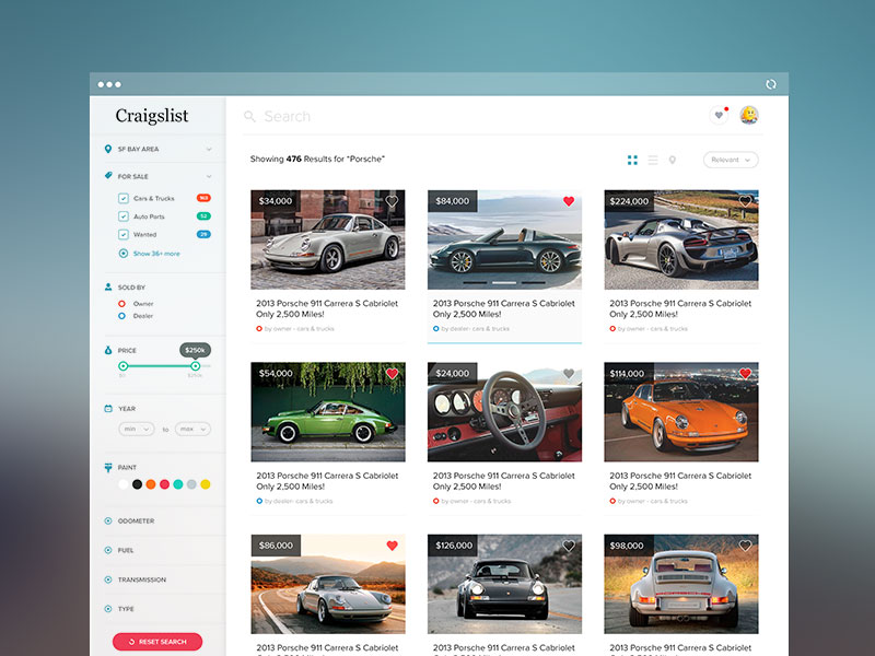
If you run an e-commerce site, presenting product search results on an infinite scrolling page can hinder the ability to sort and filter items based on their options, reviews, or availability. Do your visitors return to seek the same outcome multiple times? Infinite scrolling impedes their ability to locate an item they’ve seen before.
When you present reader comments on an article, pagination may turn visitors away because they don’t want to have to click a link to see more, and paginated results force them to confront the volume of responses.
Does your site present instructions, tutorials, or other how-to content? Pagination may make it difficult to complete a lesson because of the need to reload a page to review a prior step.
Pagination related frustrations typically stem from the loss of information and context occurring when visitors switch pages. On the other hand, infinite scrolling irritates visitors with its sense that they have landed in a bottomless pit of information with no groupings, segments, and sections.
You may think that scrollbars have become bit too old school for your brand of modernism. but remember that many users take valued cues from it. The scroll bar tells how long the journey to the bottom of the page will be. Without it, the encounter with your content mimics a conversation with someone who never stops talking.
Also read: What Is Parallax Scrolling?
The Bottom Line : Scrolling vs Pagination

Image source: artrayd
For sites that present long swaths of user-generated material, sequences of visual results, or both, infinite scrolling makes infinite sense. Consider Twitter and Facebook: these sites go on as long as their content can reach. Infinite scrolling also helps you achieve load balancing, keeping tabs on the amount of content you serve up.
If you present the answers to questions, the pot of gold at the end of the researcher’s quest, pagination chunks results to suit the needs of goal-oriented visitors. Consider how Google’s search results, and look online for the frustrations of people who use other search engines that opt for infinite scrolling instead.
On DuckDuckGo, for example, you must set a counterintuitively located preference to turn off infinite scrolling in favor of pagination.
When analyzing your content doesn’t give you an immediate, definitive answer to the question of infinite scrolling vs pagination user experience, put on your visitor hat and look at your website from the user’s perspective.
After all, your site exists to attract users, not just to occupy web space. Both scrolling vs pagination methods offer advantages and disadvantages. The trick lies in matching the choice to the site.
Credit for featured image: Tanveer Junayed
Like this post? Check out more amazing web design content here.


