It is imperative for designers to familiarize themselves with typography terms. Even the fanciest design needs to be associated with a text that sells the product or informs consumers what they are looking at.
With this need in mind, let’s explore the basic concepts and terms of typography.
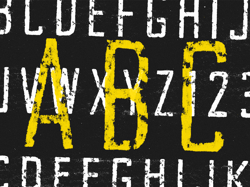
To start: What is typography? In this field of art, designers take careful attention to the aesthetics and arrangements of text. One must be able to read the words, but they should also be drawn into the design.

Image source: Michael Čečetka
First, you select a typeface. Then you must position it correctly within your design. The colors must be carefully thought out to fit well with the overall scheme. The placement of the words is also important.
Like most forms of art, typography is unique to every designer. Yet, even the most renegade designers had to familiarize themselves with its rules before going off on their own. In this blog, we will check out some glossary of typographic terms.
Table of contents
Choosing a Font

Image source: Michael Cattell
Every designer has a large array of typesets in their arsenal. From traditional choices to the overly artistic, there is no shortage of possibilities when selecting a font.
Yet even in typography, sometimes the old adage holds true, “Keep it simple and stupid.”
Experimentation can benefit a designer in this instance, but keep another thing in mind: the classics are classic for a reason.
Also read: Beautiful and Inspiring Typography Quote Designs
Typography Terms
Here are some typography terms and definitions of important terms in typography. As a designer, you must learn these typography terminology and consider them when creating.
You would not be able to create your best work otherwise.
Size

Image source: Adam Eargle
Each typeface has a different dimension. They look different on the page because they often take up different amounts of space. One must consider the dimensions of the typeface before inserting it.
There are two dimensions to consider when selecting a typeface. They are the ‘x-height’ and ‘set width’. If different typefaces are in play, the designer needs to use options within the same framework of these dimensions.
These figures are measured in ‘points’. While most design work is done on computers these days, points have been around for several centuries. There are other measurements used, including inches, millimeters, and pixels.
Points remain the universal system; a point measures 1/72 of an inch, while a ‘pica’ counts twelve points.
Check out this ultimate guide to the basics of typography.
Typeface : Important typography terminology

Image source: Inspirationfeed (Igor Ovsyannykov)
Each distinct group of characters, letters, and punctuation is called a ‘typeface.’
Common typefaces include Times New Roman, Helvetica, Arial, and Courier. Other typefaces, less commonly used in the design are Comic Sans and Calibri.
Also read: Why Website Design Is More Than Visuals
Serif Fonts : Fundamental typography terminology

Image source: Karl Bembridge
‘Serif fonts’ are used with large boxes of text.
They are distinguished by the small lines that come at the end of a letter. These lines, found in fonts such as Times New Roman, make it easier for the eye to absorb a bulk of the text.
Sans Serif Fonts : Basic typography terminology

It stands to mention that if various serif fonts have small lines, then ‘sans-serif fonts’ are typefaces without these lines.
The designer may decide to use a sans serif font when they want the text to stand out. Helvetica is a typeface that you’ll see on magazine headlines and large advertisements. Arial is another common sans serif typeface.
The difference is that Arial was designed with electronic devices in mind. So if you’re reading this on a computer, tablet, or phone, the typeface selected is probably Arial.
Kerning and Tracking

Image source: Derrick Kempf
‘Kerning’ refers to the art of carefully considering the shapes of letters or other characters.
Letters need to be paired in such a way that they complement one another. An easy one for the eye to grasp is the harmony between ‘A’ and ‘V.’ Look at the shapes, and how they are complete opposites.
Designers employ methods of striking the eyes with such pairings.
‘Tracking’ relates to kerning. The difference is that tracking speaks to the space between letters overall, and the best possibility.
Also read: The Complete Guide To Typography In 21 Stunning Illustrations
Baseline and Descender

Image source: Peter Amende
Remember learning how to write? Using the paper with wide lines and marks where each letter should sit? Or even when writing on lined paper?
Now imagine an invisible line holding all of the letters in place when no such line exists. That is known as the ‘baseline.’ Some letters sit below the baseline, and others rise above it.
A character or typeface’s ‘descender’ is the portion of the character that hangs below the baseline. Consider some lowercase letters, such as ‘g’ and ‘y’ hang below the others in a line.
Also read: Must-Know Typography Terms For Every Designer
Hierarchy and Scale

Image source: Dwinawan Hariwijaya
Designers take care to distinguish texts in size, color, and spacing. Some text is meant to draw the reader’s attention.
This ‘hierarchy’ of characters is considered within a ‘scale.’ In general design terms, the larger the text, the more important it is for the reader to see.
X-Height and Ascender

Image source: Samuel Čarnoký
This measurement is compared to others using the size of the letter ‘x’ of the typeface.
This figure varies quite a bit when typefaces are measured against one another. The distance between the mean line and baseline is considered.
The ‘ascender’ of a typeface is the difference between a lower case character and the x-height of the typeface. Designers consider this when determining whether readers will be looking at their material for extended periods of time.
Also read: Typography Rules That You Should Follow
Leading

Image source: Vjekoslav Azenić
The space between lines of text in a typeface is the ‘leading.’ When placing a letter on the line, an invisible line is drawn above the letter to separate it from the line above it.
For a 12 point font, 6 points leading are typical. Meaning an entire line of that text is 18 points.
Bicameral

Image source: Rodrigo Saiani
The Roman alphabet, that is used in English, Spanish, German, Turkish, and many other languages is distinguished from other alphabets such as Arabic and Hebrew.
The difference is that the Roman alphabet has both upper and lower case letters, or ‘bicameral’. Arabic and Hebrew, known as ‘unicameral’ alphabets, have only one case.
Also read: Typography Tips To Improve Your Website’s Legibility
Copyfitting
When designers are ‘copy fitting,’ they incorporate the above concepts in a way that places the characters on their design, fitting the page, without looking out of place.
Final Thoughts : Typography Glossary

Image source: Juri Zaech
The difference between typefaces determines how easy to read the text is.
‘Proportional typefaces’ provide the easiest reading. Even still, when authors submit their manuscripts to an editor, they use ‘monospaced typefaces’. Editors can glance over the page easier and see it in bulk, as monospacing arranges the text into columns.
Know these typography jargon. Learn them, and learn them well.
The study of typography is more than definitions. Yet in order to create the best work, a designer should understand all of the above typography vocabulary.
Credit for featured image: Tom Chalky
Like this post? Check out more amazing web design content here.