Using animations to improve user experience is a great strategy, but only for designers that know how to do animations the right way.
The reason why animations are so great is that you can use them to communicate all sorts of statuses, to instruct behavior, to draw attention and to add affordance, or simply to let users see what the consequences of their actions would be.
The principal rule is: If there is no motion, there won’t be interaction either.
 Image source: Charles Patterson
From a user’s perspective, simple animations are underrated: we rarely consider the fact that when a closing tab disappears, we’re actually dealing with a basic animation and we are receiving instant feedback.
How would we feel if the tab hadn’t disappeared? In fact, it is general usability that makes animations so critical in web design, especially if we’re discussing advanced ones that make our design more human and more real. Some animations go as far as being ‘alive human’ responsive to their users.
 Image source: Ilya Prukko
There are many tactics that can improve user experience, and animations that sooth load times and ease transitions are among the most important ones. We are going to suggest few of them, including as well relevant Disney principles for digital interaction:
Giving users something to do while a page is loading
The reason why all websites are facing loading time issues is that they’ve gone too far with their ambitions outreaching their true technical capacity.
 Image source: Ashish Chauhan
The effect differs from product to product (a beauty blog takes less time than a video game), but it is always present, risking to cause an unpleasant situation.
That’s why shortening load times is a priority for every website, even at moments when designers know there is nothing to do about it. A very popular tactic that can be used instead is to include load-time static animations.
Animations are great engagers and distracters that can stop users from leaving whenever loading is taking too much.
 Image source: James Curran
It may not seem like a big problem to you, but studies have shown that even 1 second more loading time can lead to 7% conversions loss. If the user is occupied during this time, however, he won’t even feel the difference.
The trick is to create an interesting animation, ideally one whose scenario is related to your product or mission, meaning that you’re not only ‘killing time’ but also gaining reputation.
In the worst of all cases, animations are funny and entertaining videos that have nothing to do with your activity, and such can alert users on the fact that you’re hiding something.
 Image source: Nick Buturishvili
Still, if the entertaining animation manages to establish a close, emotional connection, users will be willing to forgive your mistake. Load screen ads with emotional values are not annoying like 404 error pages, and users don’t perceive them as a waste of their time.
This chunky effect is especially visible while the Facebook homepage is loading:
The timeline’s skeleton layout is visible while it loads, and it is instantly followed by an advertising column.
 Image source: Fabricio Rosa Marques
The menu on the left side pops up immediately. The chat column on the right side pops up immediately too.
Users are automatically guided to follow this content while the newsfeed is loading, and they don’t really pay attention to those microseconds the page takes to finish the process. Believe it or not, this has been essential for Facebook’s success and regular maintenance.
The clever transitions of UI experience design
 Image source: Ryan Duffy?
There are many reasons to qualify one website as being better than the other (content, usability, design, etc), and animations certainly count as the ones that make most of that difference.
The mere purpose of animations is not to distract users from dead loading time, but to make content more usable or accessible.
For instance, if the user is switching between pages, you can introduce a dropdown menu to appear out of the blue, as a natural animation that doesn’t draw too much attention on itself. In fact, these animations are known to be the most successful ones!
 Image source: Alty ➔
As you can see, the secret is to balance between speed and purposefulness, and to include animations as integral parts of your fluid workflow. The same as UI patterns, animations should be users’ guidelines towards a better experience. Let’s see how it is done:
Animated scrolling
It doesn’t have to mean that by clicking on a link, you will be automatically transferred to a different page. Sometimes, you remain on the same page, but in a different position.
The lack of transition, however, is confusing, and users don’t understand which part of the site exactly they’re looking at. That’s why you need animated scrolling-to show them that they’ve triggered some action.
Animated scrolling is somehow similar to the browsing method in print media, and it has three essential functions:
- To orientate the user, and to show how much content there is on the site to deal with
- To open browsing opportunities and to reveal new content that was not present in the page-by-page layout
- To simplify jarring page-by-page transitions
Animated notifying
The power of movement is that it attracts attention, which is why you should use animated notifications to draw attention without defocusing users and affecting their overall experience.
Obviously, animated notifications should serve a logical business purpose, mostly providing feedback on the action your user is performing.
Comments and collapsed links
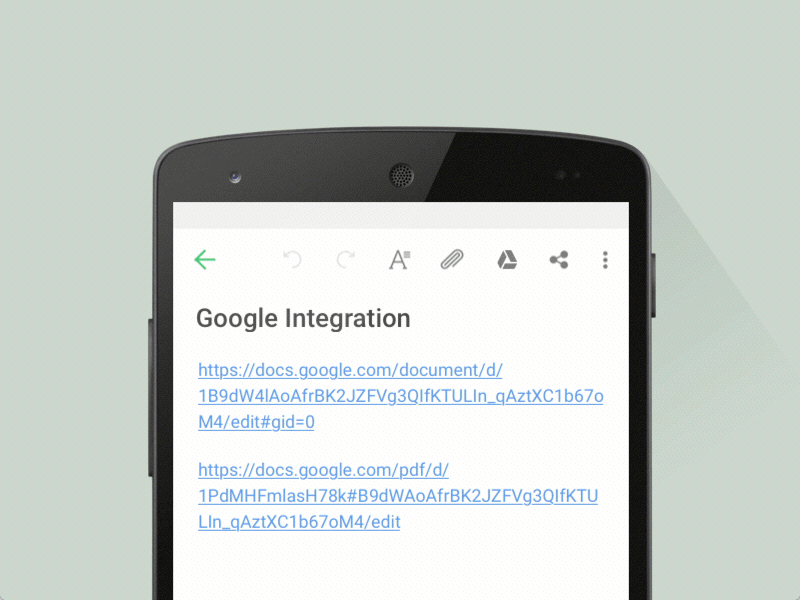 Image source: Vitalii Kramar
You’ve definitely noticed that comment forms on different blogs and websites are not the most positive ones ever. If nothing else, they don’t look friendly. Well, the purpose is not the friendliest one either, when you think about it.
When posting a comment, a person is usually eager not to forget his thought, and he/she can be annoyed by large, typical forms asking all sorts of data prior to it. Nobody likes that.
In order to motivate users to comment on your post, you should restrict the form, and show nothing else but the essential element: the commenting field. Once the user clicks on in, you can expand it, or give some necessary instructions. Don’t do anything prior to it.
By restricting the commenting field, we automatically let our scroll bar showcase only the length of the article, not the entire page. The usual practice is to load comments automatically when the user arrives to the bottom of the page, and you shouldn’t hide them and demand commands unless that is really necessary.
Displaying information
Another good thing animations do is triggering extra information. The two most applied methods for it are click-to-reveal and hover-to-reveal.
Hovering is a fairly straightforward technique, meaning that the user is only supposed to pads over the content with the mouse, and it will appear.
The idea is not to involve him in secondary actions, but to show information relevant to what he is already doing. Hovering, however, is not an option while browsing with mobile devices.
Stay-away warnings
 Image source: Caviar
Sometimes, the purpose of animated feedback is not so pleasant, and it aims to warn users not to perform a particular action. The text used by designers is imperative in nature, something like ‘don’t do it again’ or ‘stay away’. Obviously, this is not a threat-it aims to inform the user that a particular action cannot be performed the way he intended to.
Animated warnings are also used to prevent double action, for example stopping the user from sending a second query while the first one is still being processed. If the message intends to inform him about the status of the query, you can’t classify it as a warning.
 Image source: Sergey
What could be concerning with warnings is that they don’t provide clear disabling information. Therefore, you should also think of a clear and visible way for users to disable the button.
As for feedback, it happens immediately. Once the disabling command is clicked, the button darkens and shrinks irreversibly. There might be an additional progress icon during submission, or a checkmark animation that informs users that the action has been completed.
With a package like this in the toolkit, you’re making interaction much more engaging than the one that doesn’t provide feedback at all.
The future of animations in design
For what we know, animations are here to stay. Their demand is going to grow even more with time, meaning that their absence will be a justified reason to tag a website as outdated.
Animating stands for ‘bringing to life’, and it is therefore the best way to make a website functional. According to the masters from Apple iOS Human Interface, animations are perfect when they can:
- Communicate the status and provide feedback
- Reinforce the feeling of manipulating and being in control
- Reveal the result of a particular action and help people see it.