In the general sense of the word, creative hand lettering refers to letter illustration which is going to be subjected to further configuration, but in the design sense there is much more creativity involved. Rather than hand lettering for beginners to use, designers perceive this process as an artistic attempt to compose a unique masterpiece, and they are therefore checking multiple options before they see which pieces would work the best put together.
For most of them, it takes more than an hour to simply rearrange letters. And make it look professional rather than amateur.
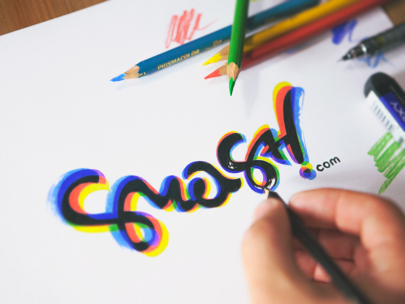
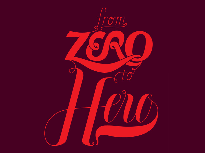
Image source: Eddie Lobanovskiy
Still, we live in a time where calligraphy is seriously falling behind, as we no longer pay attention to the way how something is written, but rather the content. What has remained today from creative calligraphy is just creative lettering, or even more precisely, a bunch of drawn letters produced using different strokes.
Table of contents
What Is Creative Lettering?
First and foremost, lettering is not typography. The main purpose of typography is to examine how different letterforms look and interact on the same surface, and is therefore triggered in press rather than digital writing. In fact, it is described as the arrangement, appearance, and style of typesets, and it hasn’t been anything else for centuries. In the digital world, however, typography often translates into nothing other than beautiful & elegant fonts.
Image source: Adam Trageser
It is questionable whether typography is older than lettering, even if the common perception is that it is its subset, and that studying letters applies to typefaces as well. Letterpress printing has become so popular, that many designers choose it to be their hobby, and utilize the knowledge they obtain for their further projects.
Check out this ultimate guide to the basics of typography.

It is because of that that people often confuse typography with lettering, and while similarities are more than obvious, you should pull a strict line between the two when talking to your clients.
You never know – the client may turn out to be an educated one, and he’ll reconsider his decision of hiring you if you don’t have the right vocabulary to explain your point.
Besides, defining lettering is not so difficult – it is simply the artistic aspect of how you draw letters. People often wonder whether it makes sense to read about it and follow rules. And they have the right to do so because this simple concept is often overdone.
Check out: The Mega Typography Bundle

Image source: Colin Tierney
All it takes is to combine letterforms in a unique way, or to craft original ones, unlike typography where you have designed sets to work with. Originally, lettering is done by hand, but the new trend is to apply arts such as engraving. And to work in specifically developed programs as for instance Adobe Illustrator.
As you saw, typography and lettering are different, even if they both deal with letters. The difference consists in the usage and context of those letters. That is exactly why you shouldn’t mix them, and produce connotations different than the ones you intended at the first place. Needless to say, your clients won’t perceive confusion between the two as professional, and it won’t be well-received.
Finally, calligraphy is also different than lettering. It refers to the way how you write and draft the letters, and as we already explained, it is a disappearing art. In the past, talented calligraphers created many famous books, but today, the art itself no longer serves a practical purpose.
Check out: Lovely Times – 12 Hand-Lettered Fonts Bundle
Image source: Nick Slater
Hand Lettering For Beginners
Before you’ve learned whatever about lettering, start paying attention to letters. That’s the key to a successful lettering career, and probably the most exciting part about it. When learning about different hand lettering for beginners styles, you’re learning how to utilize letters to invoke feelings. And the content of what you’re writing has absolutely nothing to do with it.
Eventually, you will learn the different effect fonts have, and you will start differentiating them by details as simple as the bars which cap the end of each stroke. Scripts can be extremely influential for the tone of your piece, the same as their size, color, or shadows.
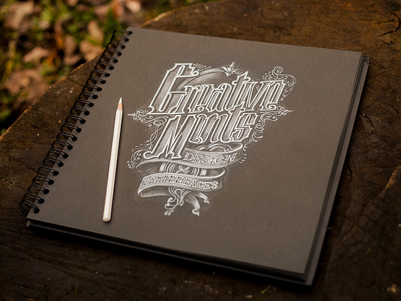
Image source: Mike | Creative Mints
There are many hand lettering for beginners tutorials to consider. But the best starting point is to understand the variations between styles, explained the best in the Little Book of Lettering. We do believe this is a treasure trove for beginners. It also suggests a variety of styles to try out or put directly into practice.
Read it, and think of a simple content parameter to avoid spending time on content considerations. For instance, you can try with song lyrics, movie character, book titles, etc.
Working a bit on different moods is also a cool idea, as drawing the letter that corresponds to your current mood would be your biggest success. Try ‘energetic’ or ‘elegant’, for instance, and see how it works.
Hit-Off Hand Lettering Tips
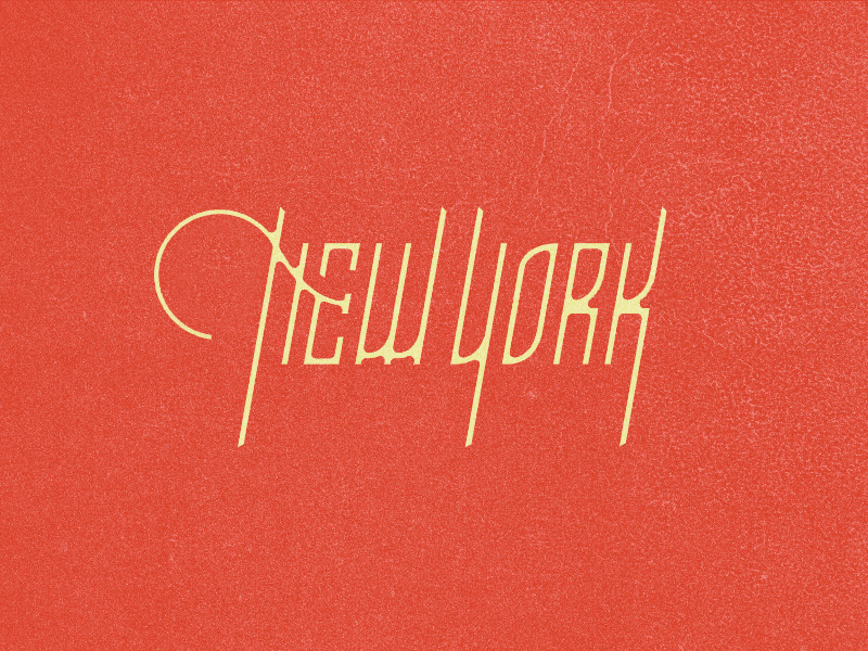
Image source: Jonas
Pick The Pencils/Pens You’re Going To Use For Creative Hand Lettering
When practicing a skill, the first thing you need to do is to make sure you have the right supplies. Still, we’re not saying you need to spend a fortune shopping for pencils and pens. But rather that you need to choose solid quality ones that correspond to the style you’re going to pursue.
The Pencil Types: Lead In Or Mechanical
The basic division of pencils is hard or soft, and they range between 6H ones (hard) and 6B ones (soft). With HB being the middle version most artists prefer. As a beginner, you should start with a harder lead, namely a lighter pencil, and switch to a soft and darker one once you’ve adopted the basics. For absolute beginners, this is not even so important. Just grab the first pencil you see at the supply store, and start sketching.
Check out: The Hand-Lettered Fonts Collection

Image source: Claire Coullon
Using Pens For Creative Lettering
Pens, unlike pencils, are more complicated to choose. You need to examine various types before you encounter the best one for you. But you can still read more about finer types to use. Micron, for instance, is a top-quality international brand that won’t fail you.
The main difference between pens is thickness. And you’ll have to choose between extremely tiny and thick ones before you find the ideal one. It sounds irrelevant, but this will most likely be the most important decision you’ve made once you see your letters are not as clean as you expect them to be. In case perfection is not a priority, go for a brush pen, and sketch freely.

Image source: Eddie Lobanovskiy
Choosing The Right Paper
Once again, there is an incredible spectrum to choose from. Choosing paper will definitely take more time. Because you have to learn the properties of each type to know how the final result is going to look like. For the purpose, we recommend a handy sketchbook, or to smooth, non-absorbing tracing paper.
Exercise A Bit
Take a ruler, and draw straight lines on the sheet. Ideally, start from the angles, and transform the shapes into more complex ones as you move inwards. Try to preserve the same size and spacing, so that you will be able to kern in the upcoming lettering pieces. Most of all – take your time! Accuracy may require you to sit longer behind the desk. But it is more likely to generate the right result than a messy sketch.
Check out: Grand Script Fonts

Image source: Claire Coullon
The reason why we advised you to start with lines and shapes is because those are going to be the basic blocks for your future letters. In particular, curves help you practice pen control. And they reveal the full picture of how different pencils and pens work, as well as what you could do using them.
It Is Time For Some Lettering!
Once you’ve adopted shapes and lines, lettering will no longer be something unfamiliar for you. Regardless of how you feel, you will be completely warmed up to hit off with lettering. And before you know it, you’ll experience an incredible freedom that allows you to experiment and generate new ideas.
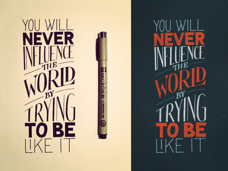
Image source: Sean McCabe
It doesn’t even have to be a sentence – start with a word, or a single letter! Draw it in all shapes that occur to you at the moment, until the first page is completely full. Look at it in the end, and you will certainly see the shape you like.
Create Your Masterpiece
Drawing letters will give you enough self-confidence to start drawing entire sentences. This can be a particularly inspirational task if you take your favorite short quote. And you combine few of the styles you really think stood out from your initial sketch. Choose the most important words, and make sure they stand out. If you want to make the sentence even more entertaining, use a different style for every word.
Image source: Drew Melton
Hand Lettering Guides And Interesting books
Understanding The Difference Between Type & Lettering
The more type and lettering have developed, the more misunderstanding of their meaning has there been. And people are still confusing the concepts even nowadays. This article has the exact purpose of clearing them, and explaining what is typography and what is not.
Hand Lettering For Beginners: Understanding Types of Type

This tutorial will help you understand the various kinds of typography that exist all around us. Such as the typography you see in books, billboards, store signage and everything else in between. You’ll gain a great amount of knowledge to help you decipher typography characteristics and what their usage is in this day and age.
Learn to Create a Variety of Script Lettering
In this tutorial, Jesse will showcase three different approaches, which result in three different script lettering styles. She’ll start with a nice simple basic script, touch on a more athletic inspired lettering style and work her way to a classic, fancy script.
The Beginner’s Guide to Modern Calligraphy

If you find yourself wanting to create beautiful calligraphy but have no idea where to start, then this is precisely the blog post for you. Lindsey will take you through what supplies to buy, how to hold the pen, a couple of hand lettering tips and tricks, and how to practice. Trust me, you’ll be a pro in no time!
The Art of Hand Lettering for Beginners

Originally published in 1978, this wonderfully written guide discusses the history of calligraphy and hand lettering for beginners. From modern-styled letters to the more classical fonts used several centuries ago, Wotzkow offers detailed instructions for numerous types of script. Even delve into a detailed chapter exploring how different types of inks, papers, and writing tools can directly impact the overall visual appeal of your letters.
Little Book of Lettering
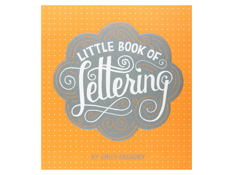
This publication focuses primarily on the most recent advancements in calligraphy and hand lettering for beginners. Despite its compact 192-page count, the hardcover version brims with an abundance of eye-popping examples crafted by today’s most innovative visionaries. For those who have a strong desire to create their own unique fonts and scripts, this is one of the more imaginative books to review.
Drawing Type: An Introduction to Illustrating Letterforms

Fowkes draws from real-life font designers, providing interviews about their individual creative processes. Hand lettering tips for beginners & final examples of each artist’s inspired scripts are provided along with some first-draft examples as viewed in their personal sketchbooks.
Hand to Type: Scripts, Hand-Lettering, and Calligraphy
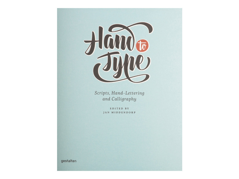
This is one of the rare books that discusses the process of turning handwritten letters into digital fonts. The editors also discuss many of the lesser known styles, like German Sütterlin and Arabic scripts.
Scripts: Elegant Lettering from Design’s Golden Age
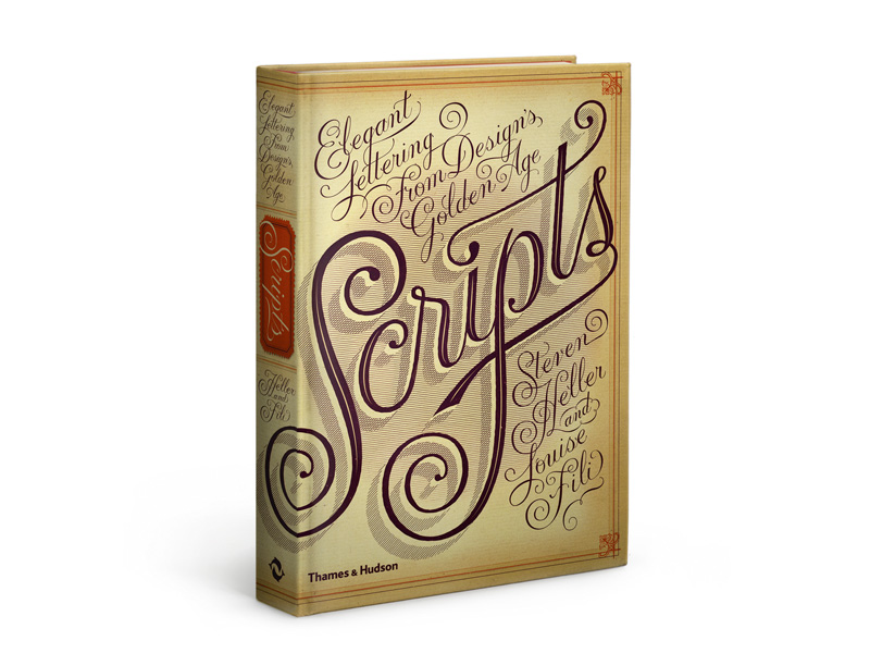
This is one of those books for the true enthusiast of historical calligraphy and creative scripting. Author Fili draws upon the more sophisticated and stylish fonts used in the 1800’s and into the mid-twentieth century that many professional graphic artists might have long forgotten even existed.
Hand Lettering Styles
Block lettering styles are probably the smartest options for beginners, as they don’t require them to make perfect lettering outlines, and can be completed with any tool. You can start with pencil, for instance, until you produce the desired structure. Once done, take a darker pencil or a pen and straighten the outer edges of your letters.
 Image source: Paul von Excite
The reason why drawing letters is more complicated than it seems is that they are comprised of various elements, including straight lines, sharp edges, eclipses, and even undefined forms. The basic shape, however, is simple, and that is most visible on O, A, B, and L.
However you’ve decided to proceed, remember to follow guidelines. They can save your time, and teach you how to sketch properly.
Block lettering will be easy, as its purpose is foremost to be readable. And once you’ve adopted it you’ll find it much easier to rearrange and experiment without necessarily altering the context of the message.
By now, you’re probably thinking lettering is an art and a proper science of its own. And that’s not too far from the truth. There are a lot of techniques and methods to consider before the designer is ready to craft beautiful and exquisite pieces. The materials are also more different that we’d whish they were.
 Image source: Danielle Evans
Still, following the basic methods shouldn’t be too difficult. For instance, you can try the popular Chalk Lettering, Vector Lettering, Calligraphy, or Hand lettering, the way we discussed it here. Each type has its own uniqueness and beauty. This is why you need to know their basics in order to decide which one corresponds to the mood you’re trying to invoke. Let’s check them out:
Hand Lettering
Hand lettering refers to artistic, beautiful letter crafting, mostly applied on important documents, and executed with pens and pencils. Most of the time, hand lettering for beginners is expected to appear elegant and intriguing, which shouldn’t be that difficult knowing how old and well-developed this technique is.
 Image source: Martin Schmetzer
In fact, the method is still developing, as many talented artists focus solely on it, and are looking to make it even more unique. What is more, hand lettering can be performed on a plethora of different materials, which is not something other methods can praise with. For instance, you can use paper (all types), card stock, card boards, and so on.
Brush Lettering
Brush lettering is when artists create letters with thick paint layers, be it watercolor or ink. The main tool is the brush, whose distinctive painting style makes letters appear more curvy and soft. Brush lettering is also very difficult, and requires extreme care, as it happens even to most experienced artists to miss filling their letters, or to fill them unevenly.
Check out: Best Fonts & Font Families Pack
 Image source: Philip Eggleston
In certain occasions, however, playing with shapes is deliberate. And has the aim to make the writing look more amateur and handcrafted. This method is perceived as one of the most elegant and expressive ones. So try to adopt it before you’ve undertaken a very important project.
Chalk Lettering
By chalk lettering, we actually mean constructing letters on non-paper surfaces using a chalk. The surface can be concrete, brick, or a simple chalkboard. This method is one of the most original ones, but requires a lot of experience to be executed properly.
 Image source: Paul von Excite
Low-quality chalk lettering, for instance, will look fuzzy and soft, while the good one will have a much stronger effect and will be highly saturated. Another catch here is that you’re working with an erasable and fleeting material, which imposes the question of whether chalk lettering is actually worth of learning. We’d say it is, because we perceive it to be the funnies and least formal approach for delivering content and information.
Check out: Inspirational Text Overlays Bundle
Vector Lettering
 Image source: Denys Boldyriev
This is the only completely digitalized and software-based lettering method, which nevertheless qualifies as being equally artistic as the other methods we discussed. It refers to using minor geometric shapes, lines, and fine points, all applied to reproduce realistic images on a digital screen.
Practically, vector lettering can be performed even by hand, using pens or brushes and converting them into vectors in order to use them digitally. In fact, this happens quite often with eBook covers, and images that need to be resized.
Like this post? Check out more amazing web design content here.


