
At Visual Hierarchy, it has always been our mission to provide you with innovative products of superior quality, at affordable prices. We know that time is your most important resource. It is for us as well. Our marketplace always offered design tools that are the best in their kind: productive and extra modern. We strive to provide you with the best web design resources.
Our Blog is an extension of this mission. Its purpose is to enlighten and inform our user community of the latest happenings at VH, and keep it up to date on the latest UX, UI, and graphic design best practices and trends.
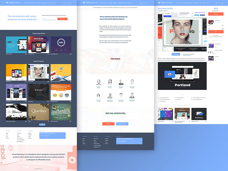
Today, we relaunched the marketplace, which features web and mobile UI kits, extraordinary collections of fonts and icons, mockups, design templates and WordPress themes, and more, including freebies.
What’s new and exciting about our new marketplace is the emphasis we’ve placed on UX. We are more focused than ever on what you want and need in order to design products that take into account modern UI and UX rules.
Table of contents
Where Change is Happening in VH Web Design
We’ve taken new approaches to some old web design standbys: wishlists, search functionality, animation, and choice of colors.
Trends in the application and use of wishlists
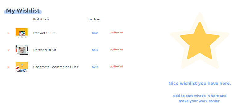
Striving for the most effective use of wish lists in UX design and recognizing their use as a win-win situation for shoppers and retailers alike is a growing trend.
It is useful if you choose not to make an immediate purchase, offering a smart median that you can use for making price and quality comparisons, or just setting your favorite products, and choosing to buy the ones you need later on.
Also read: Best Practices in Responsive Landing Page Creation for Beginners
Trends in search functionality
The search box is highly useful, especially when you already know what you need. Search box prominence is a factor web design needs to take into account. We chose to make the search smaller and non-intrusive to help you reach your purpose faster.
An in-between use of a search box is to place it in the menu bar, giving the user a choice of searching or navigating, as appropriate.
Trends in animations—we like to keep it simple.
Animations are useful design elements and web design resources. Their use, however, can either attract users or repel them. When properly designed and implemented, animations will draw a user toward a product or call to action. When used incorrectly, they can be distracting, and have the opposite effect.
At VH, we prefer simple animations, since they promote a smooth UX.
- Historically, website animations have gone from crude, often repetitive and irritating, to complex, which tends to slow page loading and can be distracting. Complex animations are often used for their entertainment value, which, depending on the project, may or may not be a practical UX objective.
- A new trend is this: Animations can be used to improve. They can help make a website better and easier to use. They can be used as an aid in storytelling. They can be used in material website design to illustrate a product’s size, weight, or flexibility.
When used wisely, animations provide information that is useful to the user.
Also read: How To Design A UX-Driven Mockup
Using Color to Enhance UX of website design

The use of color has long played a major role in marketing and advertising initiatives. Our approach is to use color to enhance the UX. We used the color wheel to select contrasting and complementary colors. Nothing new there. Designers use color to excite the emotions; bright, warm colors energize; subdued colors are more relaxing.
At VH, a blog for web design resources, we’ve chosen very smooth, relaxing nuances of blue, orange and green. Why is that? We wanted you to feel comfortable while browsing the website and to avoid creating a “noisy” context.
Hope you like it and we would love to hear your opinion about our marketplace’s new web design! Drop us a line at hello at visuahierarchy.co.
Like this post? Check out more amazing web design content here.


