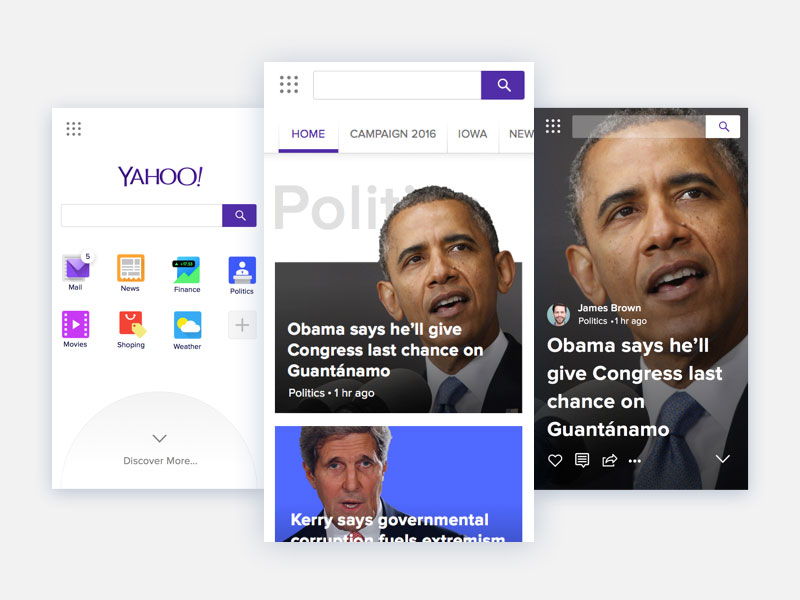
Following these recent trends, many companies have decided to start designing for mobile devices as well. The rest still struggle to design equally functional websites for both stationary and mobile usage. In fact, designing responsive websites is the key to success, since missing the mobile version means missing users and conversions. In this blog, we will discuss more on importance of mobile friendly website design.
Designing a website for mobile usage is not simply a trend – more and more users start to rely solely on their mobile devices, even for the accomplishment of most complicated tasks. It is either their smart phone, tablet, or laptop. What counts is that they can do whatever they want, wherever they want to do it.
What they expect is for a website to be equally responsive on all browsers and platforms, which is exactly why you should ensure your design project is up to the task from the very beginning.

Table of contents
- Mobile represents the future
- Be there for users, wherever they are
- Google recommendations for mobile optimized website
- Be clear with your short-term and long-term objectives
- Importance of mobile friendly website for conversion rates
- Still wondering whether it is really worth investing in mobile-responsive design?
Mobile represents the future

Online marketers and website/app owners may still be unsure whether they need a mobile-responsive design, but the truth is that going mobile-friendly is the only way to secure a better position for the future.
Failing to provide mobile responsiveness will cause users to bounce off your website and go for the competitor’s one, which is actually usable. It is not hard to notice that people are relying more and more on mobile technology, which clearly indicates that you should follow this trend.
Also read: Why You Need A Mobile E-commerce Strategy?
Be there for users, wherever they are
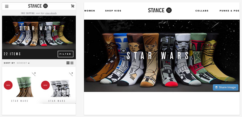
A mobile-friendly website is supposed to be accessible from any environment. To start with, it is not an experience people would go for from their home or office, but rather while they are ‘on the move’.
For instance, more than half of Google’s traffic is mobile, and the percentage is still increasing. Therefore, making a website that is mobile friendly, usable in all conditions is the right way to invest in your business. Think of the following questions before designing your website.
Do you aim to sell your products? Simplify the purchase procedure to the extent that users will be able to buy the product wherever they are. Are you promoting a large-venue event? Give users a map to help them locate a specific place while going around with their smart phones.

Also, do you have a gallery of product photos you need customers to see? Scale them to the size of both smart phones and tablets. Do you want leads to call you on the phone rather than send you emails? Give them straight options to do it from the phone; and include ‘Call’ buttons next to your contact information.
Do you own a business that attracts tourists? Make sure they won’t have to wander for hours before they find your place. Once the GPS on their phones is able to locate you, there will be no need for them to remember your address.
Also read: The Key Elements Of Mobile UX
Google recommendations for mobile optimized website

Google is the master of SEO (Search Engine Optimization) which owns 64% of the search engine’s shares on the market. Due to its power, Google ‘felt’ it was necessary to make recommendations for building search engine-responsive websites on the basis of mobile templates.
The ‘secret’ is to create a responsive design for your website, since having two different SEO campaigns for a mobile version and for desktop version of the mobile friendly design increases the risk of serious SEO errors, and inconsistency between the two versions when listed on different search engines.
Why does Google support responsive design so much? To start with, Google considers crawling and indexing content to be a very efficient procedure. Responsive design guarantees that there will be a single URL for all sites and HTML suitable for all devices. A business that owns a mobile and a desktop version of their site, on the other hand, would have to go with two separate ones. That’s exactly why Google needs to crawl, and then index all versions of the same website.
Besides, the approach has a great effect on usability: a single URL enables users to interact with content easily, engage more, and share the posts they like. This is not so simple on sites with two or more versions. Google claims this is an excellent solution for an optimal web experience for every design. In fact, there is nothing users would like more.
The better the experience, the more users would engage. As a result, bounce rates would lower; and the particular site would rate better than ever. An unresponsive website can cause many headaches. To start with, it would involve on-page errors and external link algorithms, and it would definitely harm the website’s SEO in the long run.
Check out this blog to learn about best practices for website design.
Be clear with your short-term and long-term objectives

As we all know, technology changes constantly. There is a new product every year (gadgets, tools, designs, etc), and new trends that web masters have to adapt to. Therefore, we would dare to assume that after just a couple of years, our technological landscape will be unrecognizable.
Still, what is likely to remain the same is usability. A mobile design would still need to be simple, intuitively navigated, adaptive, and easily adjustable. Keeping things simple will help you stay on the safe side and apply small modifications instead of starting from scratch. Beside efforts, this could also translate to some serious time/money savings.
Also read: The Best Practices For Mobile Typography

It is up to you to define both present and future goals. Remember that every factor counts, and calculate the advantages and disadvantages of transforming current designs versus the creation of a completely new app.
Importance of mobile friendly website for conversion rates
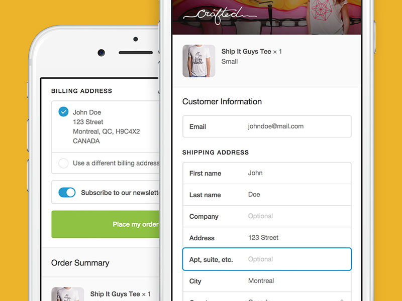
Putting the emotional aspect of making users happy aside, mobile-responsive designs are a powerful method to increase of conversion rates from every mobile user around the world. How does that happen? A non-responsive design will certainly fail to convert when applied to a mobile design, which means users will have no chance to access it.
What about people who rely completely on mobile design? Those who work, study, or shop on their mobile devices? Shopping is in fact a very good example, as almost 70% of tablet users do their purchases while moving around.
Also read: The Basics Of A Great Mobile User Experience

Why would that user make additional conversion efforts, if it takes so much time and work? Isn’t it easier to switch websites? Without the importance of mobile friendly website, your chances of keeping users on board are very small. On the other hand, a responsive site is developed in a way that displays clearly every conversion element, both from tablets and smart phones.
Summing up, knowing the importance of mobile friendly website enables you to have control over your project at any moment. You can do both: mapping and A/B testing. For a proper A/B comparison, you’d need nothing more than appropriate software.
Testing will always be a good idea, as it gives you a clear overview of the way users interact with your content. As a result, you could develop new marketing tactics and strategies, and eventually increase your conversion rates.
Still wondering whether it is really worth investing in mobile-responsive design?

These are the three considerations that will help you decide:
Customers want to access your business, everywhere and anyhow. Their phone is the device they will certainly use to open your website, and you have to provide them with a mobile-friendly experience that inspires them to ‘come’ back.
Customers access your business because they want to interact with it. You need to ensure there will be perfect interaction conditions even when they access the website from their phones. They need to see all of your promotions, news, or contact information, because if they are not able to find those, they will certainly move to another website.
Customers will tolerate no difficulties in locating your business. As Google recommends, you need to deliver timely and relevant results, especially in terms of location. That is why missing the mobile-responsive experience means missing a large portion of your online presence.
Like this post? Check out more amazing web design content here.
