When you visit a website, the first thing you see is website banners in various sizes. Website banner sizes are important because they catch the viewer’s attention and deliver a message. Be it for an ad, a promotion, or just a visual for branding.
Banners come in different sizes, and choosing the right size for your website can make a big difference. This will help you to convey your message in the right way.
In this blog, we’ll discuss the different website banner sizes, how to pick the right banner size, and the most commonly used banner sizes online. By the end, you’ll know exactly what size banner to use, whether for a website, mobile device, or even a Google ad.

Table of contents
What is a Website Banner?
A website banner is an image or graphic placed at the top of a website to grab the visitor’s attention and highlight important information such as promotions, news, or a call-to-action (CTA).
Banners are crucial for making websites look professional and attractive, and choosing the right size is important to ensure your banner looks great on all devices.
Also read: Impact of Slow Loading Website and How to Fix It
Why Banner Size Matters
If you have ever visited a website with a banner that looks too small or too big, you know how frustrating it can be. Too small banners might not catch your eye, while too big banners can slow down the website or make it hard to navigate. The banner size needs to be just right, especially since more people access websites on both desktop and mobile devices.
Also read: 11 Best WooCommerce Themes for Your Online Store in 2024
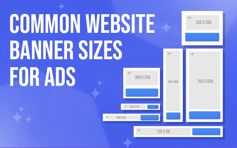
Common Website Banner Sizes
Let’s explore some of the most common banner sizes used for websites. These sizes are generally recognized as the standard for both desktop and mobile devices.
| Banner Type | Standard Size (Pixels) | Best For |
| Leaderboard | 728 x 90 | Desktop sites, wide headers |
| Main Banner | 468 x 60 | Older websites, smaller spaces |
| Large Rectangle | 336 x 280 | Sidebars, content blocks |
| Medium Rectangle | 300 x 250 | Display ads, sidebars |
| Half Page (Large Skyscraper) | 300 x 600 | Sidebar ads |
| Mobile Leaderboard | 320 x 50 | Mobile sites |
| Wide Skyscraper | 160 x 600 | Sidebars, tall ads |
Usage of these dimensions
These banner sizes are used for various purposes. Let’s take a closer look at how each one is typically used:
1. Leaderboard (728 x 90): This comprehensive and short banner works well at the top of a website. It’s often seen on larger desktop screens and is perfect for displaying ads or important announcements.
2. Main Banner (468 x 60): A smaller banner is not used as often today but is still common on older websites. It can be placed in the middle of content or at the bottom of a webpage.
3. Large Rectangle (336 x 280): This square-shaped banner is usually placed within the content or on the sidebar of a website. It works well for grabbing attention without taking up too much space.
4. Medium Rectangle (300 x 250): Another square-shaped banner that fits nicely on sidebars or within blog posts. It’s one of the most commonly used banner sizes, especially for ads.
5. Half Page (300 x 600): Also called the “large skyscraper,” this tall banner is perfect for the side of a webpage. It’s large enough to display lots of information but not too distracting.
6. Mobile Leaderboard (320 x 50): Mobile banners are becoming more important as more people browse on their phones. The mobile leaderboard is a smaller version of the desktop leaderboard and works great at the top of mobile websites.
7. Wide Skyscraper (160 x 600): This tall and narrow banner is similar to the half-page banner but thinner. It’s often placed in a website’s sidebar and is great for ads that need to stay visible as users scroll.
Also read: 20 Iconic 90s Fonts That Will Bring Retro Style To Your Designs
Choosing the Right Banner Size for Your Website
When choosing your website’s banner size, consider the design, placement, and target audience. Here are some tips for selecting the right banner size:
1. Consider the Device:
- For desktop users, more giant banners like the leaderboard or half-page banners are recommended.
- Smaller banners like the mobile leaderboard (320 x 50) are ideal for mobile users.
2. Location of the Banner:
- Banners at the top of a webpage are the most visible, so opt for a broad and eye-catching design.
- For sidebars, choose something tall and narrow, like the wide skyscraper (160 x 600) or the half-page banner (300 x 600), to ensure visibility as the user scrolls.
3. Content of the Banner:
- Use standard sizes like the medium rectangle (300 x 250) for ads.
- For promotions or announcements, larger banners like the leaderboard are more attention-grabbing.
Also read: How To Create a Good User Interface: 15 Essential Tips for UI Designers
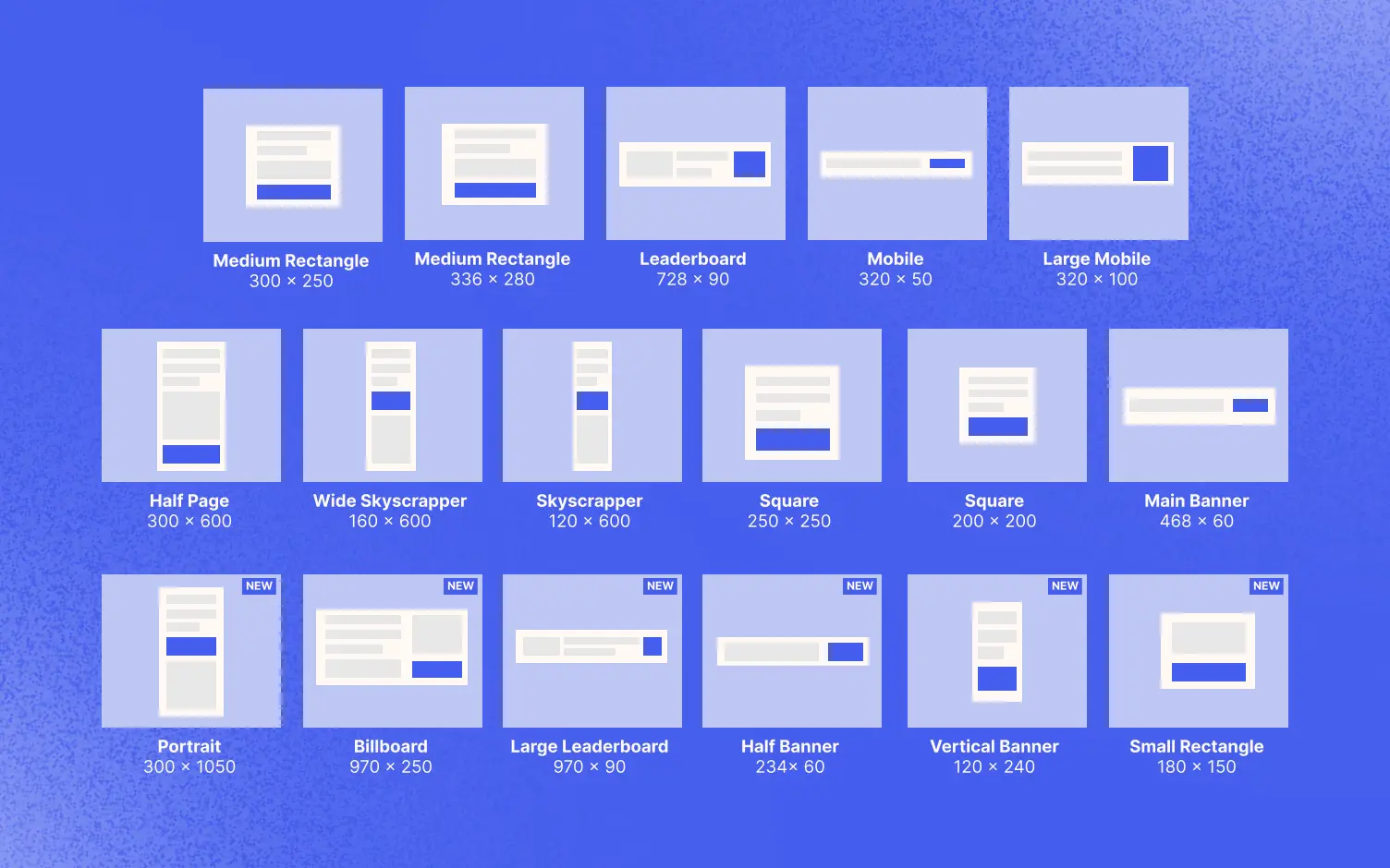
Mobile Website Banner Sizes
More people are using mobile devices to browse websites, so it’s essential to use banners that look good on smaller screens. Below are some standard mobile banner sizes:
| Mobile Banner Type | Standard Size (Pixels) |
| Mobile Leaderboard | 320 x 50 |
| Large Mobile Banner | 320 x 100 |
| Small Square | 200 x 200 |
| Mobile Interstitial | 320 x 480 |
| Mobile Fullscreen | 300 x 250 |
These smaller banners are optimized to look great on mobile phones and tablets. The mobile leaderboard (320 x 50) is one of the most common, appearing at the top of many mobile websites.
Google Website Banner Sizes
If you’re running Google Ads or using Google Display Network, it’s important to use the recommended banner sizes. Here are some of the most common Google banner sizes:
| Google Banner Type | Standard Size (Pixels) |
| Medium Rectangle | 300 x 250 |
| Leaderboard | 728 x 90 |
| Skyscraper | 160 x 600 |
| Mobile Leaderboard | 320 x 50 |
| Large Rectangle | 336 x 280 |
Google recognizes these as standard banner sizes and works well across most websites. Using the right Google banner size ensures that your ads display properly and reach the right audience.
Also read: What Are The Qualities Of A Good Website?
How to Make Sure Your Banner Looks Good
Once you’ve chosen the right size, you must ensure your banner looks professional. Here are a few tips:
- Keep It Simple: Don’t overcrowd your banner with too much information. Stick to one or two key messages.
- Use High-Quality Images: Blurry or pixelated images can make your banner look unprofessional. Always use high-resolution images.
- Test on Different Devices: Before going live, test your banner on desktop and mobile devices to ensure it looks good everywhere.
Conclusion
Choosing the right banner size for your website is essential for grabbing viewers’ attention and delivering your message. Using the right banner size makes your website look professional and works well on all devices.
Following our guidelines and examples, you can pick the perfect banner size for your website and increase its engagement and impression.
Remember, a suitable banner can make a big difference in how people see your website!
If you enjoyed reading this guide, check out our other articles:

