The Disney logo is recognized worldwide, sparking feelings of wonder, nostalgia, and pure magic. But did you know this iconic logo didn’t always look the way it does today? The Disney logo evolution is a fascinating journey through time, closely following the company’s growth, creative direction, and even advancements in animation technology. From Walt Disney’s original vision to the modern-day castle we all know, the Disney logo has changed as much as the stories it represents.
Table of contents
Brief History Of Disney
The Disney story began with one man’s dream. Walt Disney, a young animator from Missouri, started his career with a passion for storytelling and a desire to bring characters to life. In 1923, Walt and his brother Roy founded the Disney Brothers Studio in Hollywood, initially producing silent animated films featuring a character named Oswald the Lucky Rabbit.
When they lost the rights to Oswald, Walt’s next idea changed everything—Mickey Mouse. Mickey’s debut in Steamboat Willie in 1928 became an instant hit and set the foundation for the Disney brand. Over the next decades, Disney expanded its creative horizons, creating animated classics like Snow White and the Seven Dwarfs, building Disneyland, the first-ever theme park, and eventually becoming a powerhouse of entertainment with television, film, and global attractions.
Disney’s journey from a small studio to a world-renowned brand is a tale of imagination, perseverance, and boundless creativity, inspiring today’s magic of the Disney logo evolution.
You might also like: MTV Logo Evolution: A Bold Design That Defined Pop Culture
Disney Logo Evolution
1. 1929-1937: Featuring Mickey Mouse
The original Disney logo was designed to introduce the company’s vision and mission. It featured a giant image of Mickey Mouse with his name displayed in large letters on both sides. Mickey was drawn in classic 80s style, with a warm, welcoming pose that seemed to greet his fans. This logo captured the essence of Disney, showcasing its commitment to charm and character-driven storytelling from the beginning.
You might also like: Microsoft Logo History: A Visual Evolution Of An Iconic Brand
2. 1937-1948: A Simple Signature
The first Disney logo was based on the famous cartoonist’s signature, which designers stylized and enlarged for branding purposes. The lettering combines uppercase and lowercase characters, with the distinctive capital “W” and “D” featuring unique twists. The lowercase “i” and “y” cleverly resemble a mouse’s ears and tail, subtly alluding to Mickey Mouse, the brand’s beloved main character.
3. 1948-1979: Bolder Scripted Font
The company kept the founder’s name as the logo, now in a bolder scripted font. This time, the letters appeared more prominently and in a completely new style. While the thicker lettering added a touch of sophistication and elegance, it also made the logo slightly less legible.
4. 1979-1983: Sleek & Professional Look
During this time, a studio logo was introduced alongside the main logo. This 1937 version featured the word “Productions” added at the bottom in a sleek, sans-serif font, giving it a smooth and professional look.
5. 1983-1985: Sans-Serif Style Font
This time, the only change to the Walt Disney logo was the replacement of the word “Productions” with “Pictures.” Additionally, the new word was displayed in larger, serif lettering, replacing the previous sans-serif style.
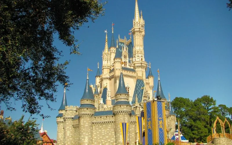
6. 1985-2006: Disney Castle Logo
The iconic Cinderella Castle was first incorporated into the Disney World logo in 1985, and it remained so for the next 15 years. Positioned above the “Walt Disney” name, the word “Pictures” was expanded to create a more compact design. During this time, the company also introduced the shooting star, which became a signature feature of the logo. The castle appeared in various animated forms, further solidifying its place as a symbol of Disney’s magic.
You might also like: The Porsche Logo: Unraveling the Symbolism and Heritage Behind the Icon
7. 2006-2011: 3D Castle For A New Era
In the history of Disney logo, this one stands out. Over time, Cinderella’s Castle has become more refined and detailed, with its towers and glowing windows adding appeal, especially in full-color versions. Meanwhile, the text “Walt Disney Pictures” has been scaled down, making the castle the focal point of the design.
You might also like: McDonald’s Logo Meaning: Symbol, History & Brand Review
8. 2011-Now: Minimal & Timeless Symbol
In 2011, the company introduced a simplified version of the Disney castle logo. It featured a refined castle within a rectangular frame with a narrower width. The company name was also shortened to just “Disney.” These updates paved the way for the iconic Disney Castle in Paris and subtly referenced characters from Peter Pan and other beloved fairy tales created by the studio.
Parting Thoughts On Disney Logo History
The evolution of Disney logo shows us that even something as simple as a logo can tell a story. Each transformation reflects the different eras of Disney’s journey, from Walt’s dreams of a small studio to a global entertainment giant. The Disney logo reminds us of this brand’s incredible storytelling and inspires a sense of wonder that has only grown over time.
So, the next time you watch a Disney film, pay close attention to that opening logo. It’s more than just an introduction—it’s an invitation to relive the magic Disney has created through the ages.
Like this post? Check out more fantastic web design content here.


