When you think of Google, what comes to mind? The search engine that answers all your questions, right? But have you ever noticed how its logo has changed over the years? The Google logo evolution is a fascinating journey that reflects the brand’s growth and adaptability. Let’s dive into the Google logo history and see how these design changes have shaped the company we know today.
Table of contents
Google Logo Evolution
Google Logo Design History
1. 1995-1997
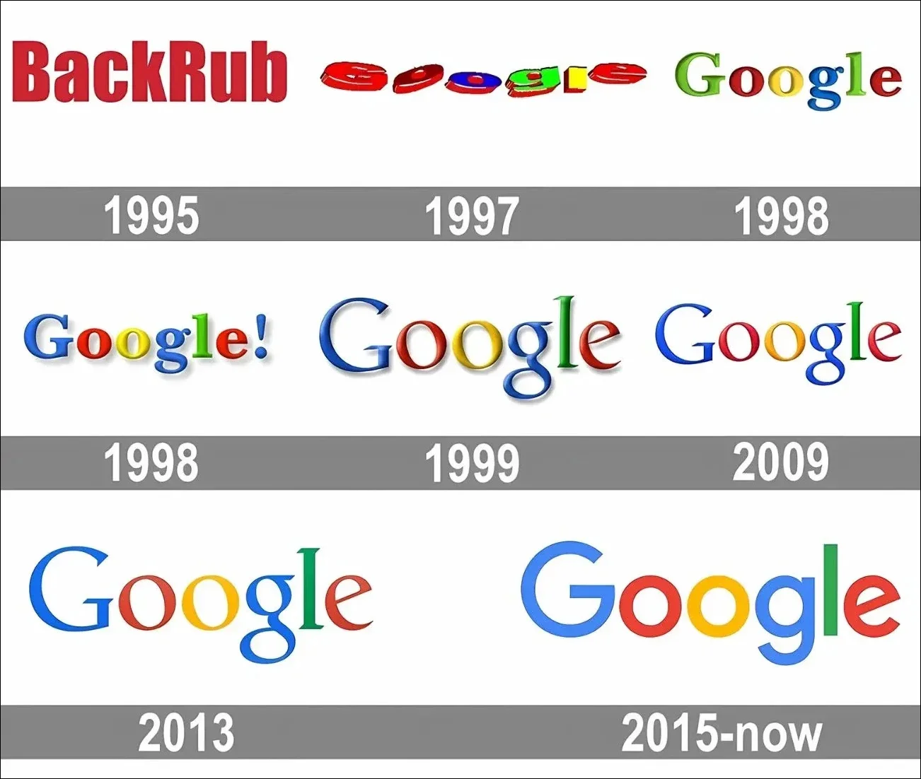
The first logo for the search engine came before the name “Google” was even a thing. Larry Page and Sergey Brin initially called their web crawler “BackRub.” They picked that name because the engine’s main job was to search the internet’s backlinks.
Thankfully, by 1997, they decided to change the company’s name to “Google,” which sounds a lot less creepy! The name was a playful misspelling of “googol,” a Latin term for the number 10 raised to the power of 100 (basically a 1 followed by 100 zeros). The idea was that Google could provide users with tons of results—just like a googol’s worth of information!
2. 1997-1998
In 1997, Google revealed its first official logo, which had a 90s vibe and an exclamation point at the end—maybe it was a playful nod to Yahoo!? The logo used a serif font, giving it an authoritative and trustworthy feel, essential for a company aiming to be the go-to source for the world’s information.
Serif fonts were pretty trendy at the time, too. But Google didn’t want to lose its fun side, so they added more shadows and made the letters a bit rounder. And, of course, they swapped the first ‘G’ from green to blue!
Also read: Top Logos With Hidden Meaning
3. 1999-2010
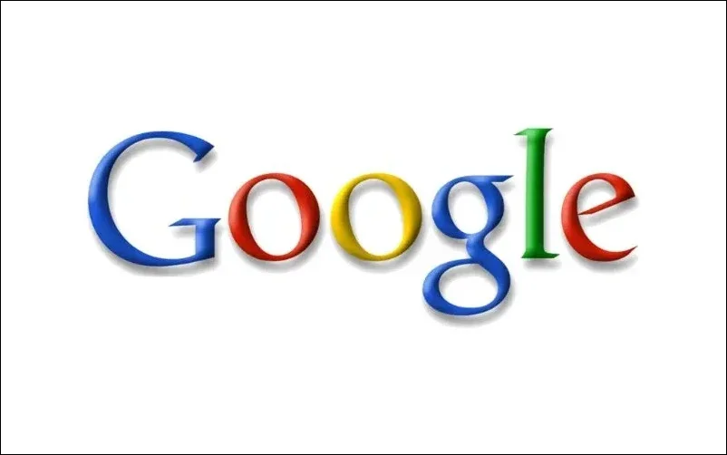
In 1999, Google embraced its playful side even more. The team brought in designer Ruth Kedar to create the colorful logo we know today. This version introduced a new font called Catull, which has sharp serifs and a unique angled axis, giving the logo a modern feel. The bright, bold colors became a signature part of Google’s brand for the next decade.
You might notice the two ‘o’s in the logo lean slightly left while the ‘e’ tilts to the right—adding a fun, quirky touch that highlights Google’s youthful, innovative energy. This version also dropped the exclamation mark for good. After 11 years with this design, Google was ready for another update.
4. 2010-2013
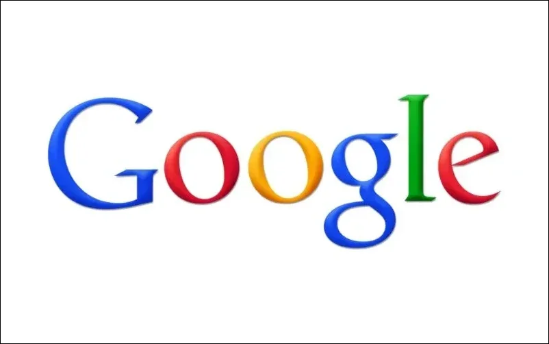
By 2010, Google was no longer just a startup—it had grown into a huge company with 25,000 employees and users across more than 100 countries. The logo needed to evolve to reflect Google’s status as a major internet player.
So, they toned down the drop shadow and muted the colors a bit, giving the logo a cleaner, sleeker look. This change began a more modern design that aligned with rapid technological advancements. It also showed Google’s focus on making things simpler and more user-friendly, embracing the flat design trend that was becoming popular then.
Also read: The Holy Grail Of Dos and Don’ts For Retro Logo Design
5. 2013-2015
In 2013, Google went even further with its modern minimalist look. They dropped the shadow effect and simplified the logo into a clean design.
As Veronika Burian, co-founder of Type-Together, put it: “It made sense for Google to evolve its logo, moving from a fun, start-up vibe to a more serious, globally influential tech giant. Along the way, they ditched the shadows and 3D effects.” This redesign followed the minimalism trend and was practical, as flatter designs look better on smaller screens like smartphones and tablets.
6. 2015-Today
In 2015, Google updated its logo, keeping the iconic color scheme the same. However, the style and shape of the letters were changed.
The new logo features a bold sans-serif font, similar to Muguet, but it was custom-made for Google and is called Product Sans. The two “O”s in “Google” are now perfectly round, so the familiar slanted look is gone.
Also read: Beginners Guide To Business Logo Design
Google Logo Colors
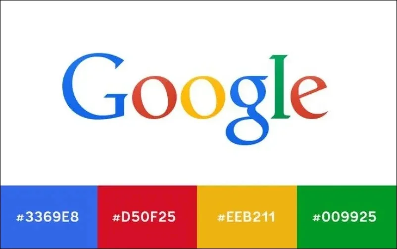
One of the standout features of the Google logo is its vibrant colors. The logo showcases four primary colors: blue, red, yellow, and green. Each color was chosen for its brightness and to convey a sense of playfulness and approachability. This colorful combination helps the logo grab attention and makes it easily recognizable, creating a friendly vibe that invites users to explore and discover.
Google Logo Font
Google’s current logo features a font called Product Sans. This font is notable because it’s unique to Google. It has a geometric sans-serif style, which means it has clean lines and a modern look. This font choice reflects how Google aims to provide information. Product Sans was designed to be easily readable on different platforms and devices, ensuring it looks great using a smartphone, tablet, or computer.
Also read: Famous Logos With Hidden Meanings
Ending Thoughts On The History Of Google Logo
The Google logo evolution is more than just a series of design changes; it reflects the company’s growth and adaptability over the years. Each iteration tells a story of innovation and change, mirroring the trends of the time while staying true to its core values of simplicity and accessibility.
Like this post? Check out more fantastic web design content here.
