Ever wondered how the original Porsche logo was born? Porsche is a German manufacturer that specializes in producing luxury and sports cars. Porsche is well-known for its sleek design and excellent performance, and it has produced numerous classic vehicles, such as the 911. They have become icons of speed and flair.
Over time, the brand has established a solid reputation for quality and innovation, making it a favorite among vehicle enthusiasts and people who value luxury. Porsche continues to merge heritage with current technology, maintaining its position as a global automotive leader.

Table of contents
What’s The Meaning Of Porsche?
The name “Porsche” is of Austrian-German origin and has no particular meaning in German or any other language. In 1931, Ferdinand Porsche started the Porsche company in Stuttgart. And it has become one of the world’s most well-known luxury automobile companies.
Also, check out the BMW Logo’s Meaning And History
The Original Porsche Logo Meaning
Franz Xaver Reimspiess, who was a senior designer at Porsche, created the Porsche logo by drawing inspiration from the Coat of Arms of Stuttgart and Baden-Württemberg to create a symbol that represented the company’s roots as well as its commitment to quality and dynamism.
The Porsche symbol was originally filed with the German Patent Office in 1952. That year, The shield-shaped insignia debuted on the Porsche 356’s steering mechanism horn. Unfortunately, Ferdinand Porsche, the company’s creator, died before this insignia became extensively utilized on Porsche vehicles.
Create your own luxurious logo with 870 Vintage and Luxurious Badge Logos Bundle
What Is The Horse In The Original Porsche Logo?
Stuttgart’s history of horse breeding and stud farms goes back to the beginning of the 10th century. Stuttgart’s city seal, which depicts a rearing horse, has been in use since the 13th century and represents the city’s renowned equestrian past. Stuttgart originated from a tiny ducal stud farm called ‘Stuotgarten’, which was located near the Nesenbach stream in the region. The horse eventually represents the strength, versatility, and goodness of Porsche automobiles.
Additionally, Horses represent speed, durability, and power, exactly like Porsche sports cars. The rearing horse in the logo represents energy and movement, reflecting the company’s emphasis on producing high-performance sports automobiles famous for their speed and power.
Learn about the Tesla Logo And The Meaning Behind It
What Are The Antlers In The Logo?
The antlers and black and red lines on the Porsche logo were inspired by Baden-Württemberg’s coat of arms, which features red and black as state colors. This design pays tribute to Baden-Württemberg, the location where the company’s headquarters is situated, and its rich cultural legacy.
In summary, the Porsche logo is made up of several aspects that symbolize the history and legacy of the place where the business was formed and is headquartered.
Also, check out The Meaning Behind Audi Logo And It’s History
The History Of Porsche Logo
The Retro Messy Logo (1922-1938)
Porsche produced their initial logo in 1922. It featured two deers standing on their hind legs, leaning against the shield and facing each other. The shield also had antlers across the black and red stripes representing the State colors.
The antlers represented the automobile’s strength, while the deer represented the speed of the Porsche automobiles.
Check out the mystery behind the famous hamburger brand McDonald’s Logo
The Horse Logo (1938-1948)
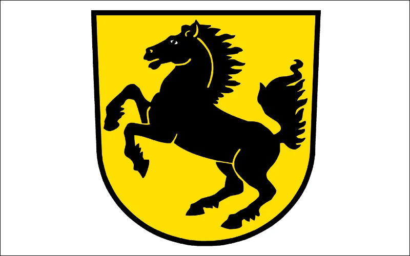
Stuttgart’s coat of arms establish in 1938 and served as the official mark for Stuttgart, Württemberg’s capital. Because of its historical and cultural significance, the Porsche company, located in Stuttgart, chose to include the little shield symbol as the identity of its company. The little shield emblem has now become an iconic sign for Porsche, recognized globally.
The golden crest with a black horse painted against it is the official coat of arms for Stuttgart, the famed brand’s birthplace. It was done in crisp, strong lines with prominent curves, which enhanced the brightness of the color palette.
Also, check out F1 Logo Hidden Details, History & More
The Only Shield Porsche Logo (1948-1952)
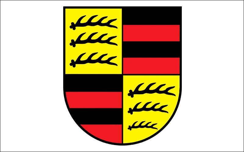
After World War II, Württemberg was divided into three sections. Württemberg-Hohenzollern, which was compelled to separate, has now created its own state constitution, flag, and logo. Württemberg-Hohenzollern uses a black and red two-color flag split into four parts.
These portions are diagonally symmetrical and have a figurative antler pattern in the top left and lower right corners, as well as state flags in the upper right and lower left. The company removed the deer and all other ornamental features from the design. The antlers were incorporated into the Porsche emblem shield to symbolize the power and strength of the company’s vehicles.
Learn about the famous beverage brand Coca-Cola Logo Meaning & Its History
Logo Inside A Logo (1952-1963)
The original Porsche logo was created in 1952, integrating the two previous heraldic insignia. While the origins of the Porsche emblem are partially clear, Germans believe engineer Franz Xaver Reimspiess conceived it. However, North Americans think that Ferdinand Porsche’s son, Ferry Porsche, sketched the Porsche emblem on a napkin while eating with the American Porsche dealer Max Hoffman. After returning to Germany, Ferry Porsche refined the logo design and installed it on the company’s vehicles.
The designers added an extra golden banner with the “Stuttgart” inscription to the yellow crest with the horse and placed it in the center of the Wurttemberg state shield of arms, which they also enhanced with a second golden banner featuring the “Porsche” logo.
Check out: Toyota Logo Meaning: History & Significance
The Upgraded Porsche Logo (1963-1994)
In 1963, Porsche opted to preserve the same logo design that conveys the strength and might of the company’s automobiles. However, the shield of the Porsche emblem strengthened and made more beautiful. It also appeared smaller and more compact in design.
The hue changed from dark to lighter. The company’s name appeared on an arching top banner, and the enlarged characters replaced the previous color scheme of red, black, and gold. They also redesigned the horse in the center of the crest to make it appear more dominant and prominent.
Also, check out: Uncovering Pinterest Logo & Meaningful Evolution
Redesigned Bold Logo (1994-2014)
The company came up with a darker version of the logo in 1994 with a flat and bold version of the iconic crest, strengthening all the black contours of the logo. And using a darker color palette with plain flat shades of all three colors. The brand name appeared prominently at the top in black. It made the Porsche car logo more visible and noticeable.
Explore the significance of the Baskin Robbins Logo
Logo From Old Days (2014-2023)
The logo known to the whole world today is composed of a golden crest, which consists of four segments with a smaller crest in the middle. They made some visible changes to the logo on Porsche’s 75th anniversary, which gave the emblem a new look. They removed the boundary lines completely from the shield and gave the logo a plain look at the edge. The wordmark is written along the upper part of the crest, in black modern sans-serif.
The badge’s four segments contain two separate ornaments: the upper left and bottom right portions display three antlers each. The upper right and bottom left segments have burgundy and black stripes, both of which are based on Wurttemberg heraldry.
The smaller crest in the middle of the logo with a black horse, and the delicate “Stuttgart” writing in sans-serif above it. The unique sans-serif typeface for the all-caps wordmark seems powerful and confident. This made the logo clean smooth lines that slightly stretched and flattened.
Current Original Porsche Logo (2023- Present)
In the current logo, the company has removed the deer and all other ornamental features from the design. They redesigned the logo to give it a down-to-earth look. The company removed the shiny look from the previous design.
In thin and black letters, the brand name appeared on top. The company removed the bulging textured background and used a honeycomb pattern for the red stripes. They also highlighted the “Stuttgart” lettering in black.
There are some minor changes in the shape of the six antlers and the horse looks more assertive.
Also, check out the famous Beats Logo Meaning, History & Significance
Conclusion
Powerful vehicles and a symbol of commitment have been Porsche’s quality for many years. But few know the captivating story behind the rise of this ‘crest’, as the company itself calls the original Porsche logo. These slight evolutions connected to the Porsche quality related with it mean that the Porsche logo has always maintained a modern feel.
So when you’re creating a logo by yourself, even minor changes to the logo could make a big difference. The inspiration from the company’s logo history can give you some ideas on how they improved their logo after years, and how Porsche has become one of the world-known companies.


