
Choosing a website font is always exciting. It gives you and the designer the liberty to project a certain personality, mostly reflecting the brand identity. However, it becomes trickier when you have to select the best font combinations for a website. With thousands of different fonts on the web right now, it can be confusing.
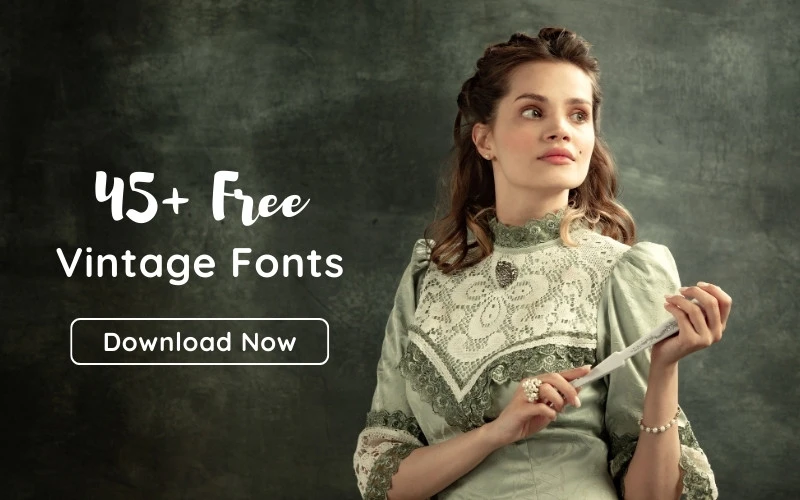
In this article, we will explore the best font combinations to upgrade your design projects.
But first, how do you choose your font combinations? Let’s find out!
Table of contents
- How Do You Choose Fonts That Go Well Together?
- 10 Best Font Combinations To Try
- 1. Fira Sans Black & PT Serif: Best Font Combination For Blogs
- 2. Abril Fatface & Lato
- 3. Rye & Lora
- 4. Archivo Black & Roboto: Best Font Pair For E-commerce Sites
- 5. Exo 2 & Alegreya Sans
- 6. League Spartan & Libre Baskerville
- 7. Playfair Display & Source Sans Pro: Best Font Combination For SaaS Websites
- 8. Merriweather & Open Sans
- 9. Abril Fatface & Poppins
- 10. Merriweather Sans Bold & Merriweather
- Final Thoughts
How Do You Choose Fonts That Go Well Together?
Font pairing is essential for any web design project. There are several fonts to choose from, and not all go well together. The common types of font are:
- Serifs Fonts
- Sans Serifs
- Script Fonts
- Display Fonts
Serif fonts are one of the oldest fonts in the design history. You can identify a serif font with small strokes extending from each letter. Sans Serif fonts lack the extensions.
Script fonts contain some calligraphy but is mostly cursive. Lastly, display fonts, like the name, are used to grab attention. They are best suited for headings or subheadings.
In addition to the different types, other factors must be considered when pairing, such as legibility, readability, comfort, and style.
When choosing modern font pairings, ensure the visitors can distinguish similar letters. Serif fonts are the most widely used in web design and literature because they offer excellent legibility.
However, do not shy away from experimenting with other fonts as long as your text is legible. When selecting your font pairings, you must also consider other aspects of typography, like the brand style.
10 Best Font Combinations To Try
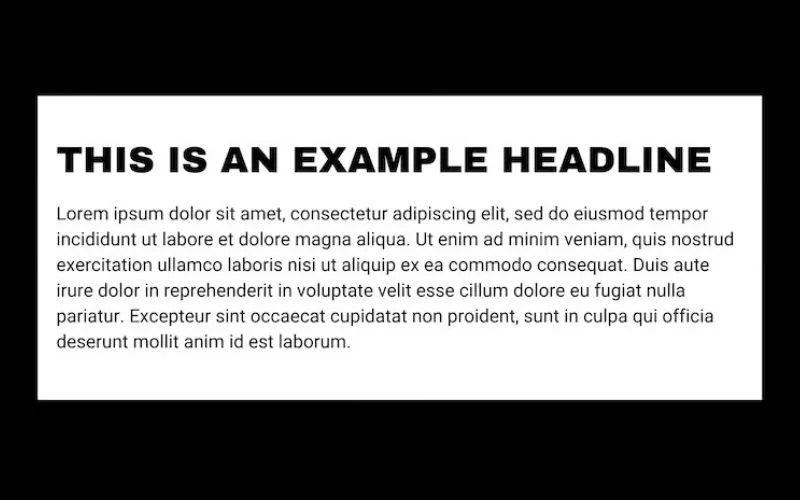
Selecting a font combination is a critical step in website design. It is how you visually convey information to the reader and project the brand identity. Below is a list of 10 best font combinations to choose from:
1. Fira Sans Black & PT Serif: Best Font Combination For Blogs

Fira Sans was released in 2012 by Erick Spiekerman, initially meant for the Mozilla OS system typeface.
PT serif is much older, dating from 2009. It is part of the Public Type family of free and open-source fonts, including PT Sans, PT Serif, and PT Mono.
If you are working on a news website or a more formal design, Fina Sans Black and PT Serif go well together. They are one of the best font pairings for entertainment, sports, and news blogs.
Also read: How To Use Fonts Efficiently In Web Design?
2. Abril Fatface & Lato
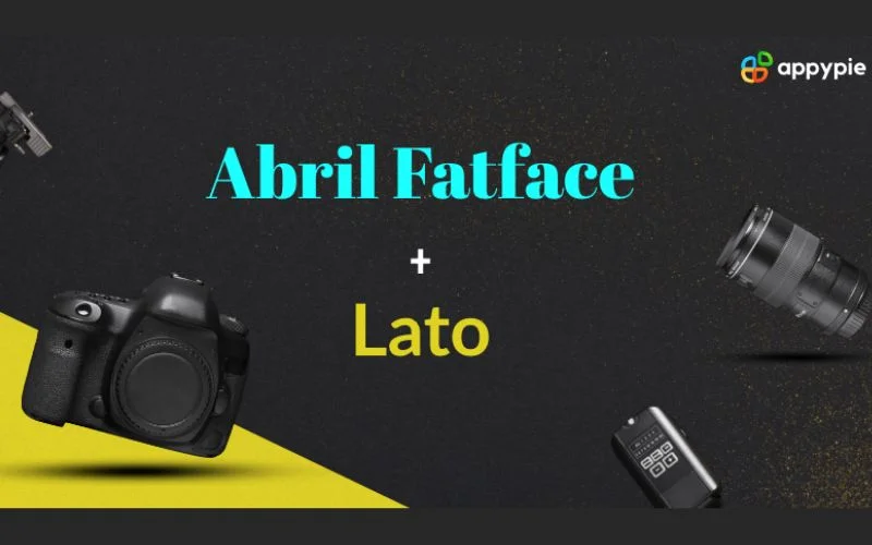
Abril Fatface dates from the 19th century, appearing between 1805 and 1810. It is part of the Abril Font family, which includes 18 texts and display font types.
Abril Fatface is a great selection for headlines and other parts of the website that need larger text. Pair it with Lato, a sans-serif font, to create a balance between text sections.
Designer Lukask Dziedzic released Lato, the Polish name for “summer,” in 2010. It pairs well with Abril Fatface, creating a sense of formality and making it a great font combination for marketing agencies.
Also read: Web Typography Best Practices And Fonts To Use
3. Rye & Lora
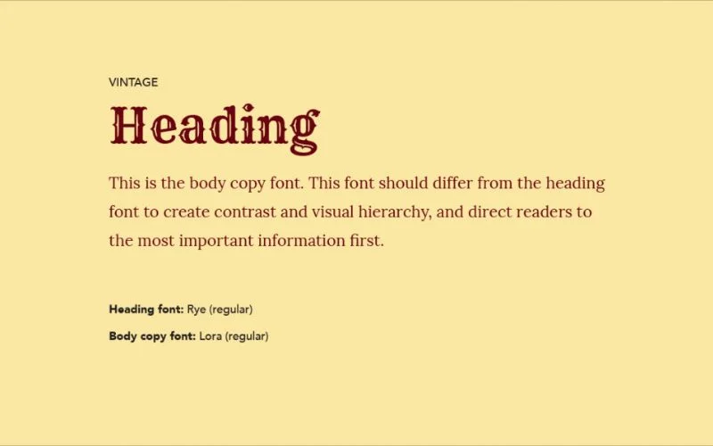
Nicole Fally Studio designed Rye font to help designers achieve fancy decorative designs. Among the vintage fonts, the display font has created a feeling of nostalgia.
Paired with Lora, they bring out a sense of balance. Lora has charming, smoother curves that elevate its legibility and readability.
4. Archivo Black & Roboto: Best Font Pair For E-commerce Sites
Archivo Black was released in 2012. It belongs to the grotesque sans-serif typeface designed by Hector Gatti. Archivo Black works great for headlines and other parts of your website that need larger texts.
When paired with Roboto, a Google Mobile OS system font, it is an example of how similar fonts complement each other. Roboto is largely a geometric font that offers a friendly and calming feel on your website.
Christian Robertson designed Roboto for Google’s Android 4.0 operating system. Archivo Black and Roboto are serif fonts, yet they are fonts that look good together. This combination is a great choice for e-commerce sites for its friendly vibe.
Also read: Best Tattoo Fonts To Make Your Tattoo Stand Out
5. Exo 2 & Alegreya Sans
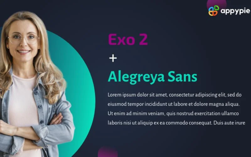
Exo 2 is a Sans-serif typeface with a technological vibe. It comes in 18 different styles. Natanael Gama designed it, and it has become one of the most popular fonts on the web.
On the other hand, Alegreta Sans is a Sans serif that works well for the text body. When paired with Exo 2, it creates a professional and technical feel.
This font combination performs well for tech company websites or blogs.
6. League Spartan & Libre Baskerville
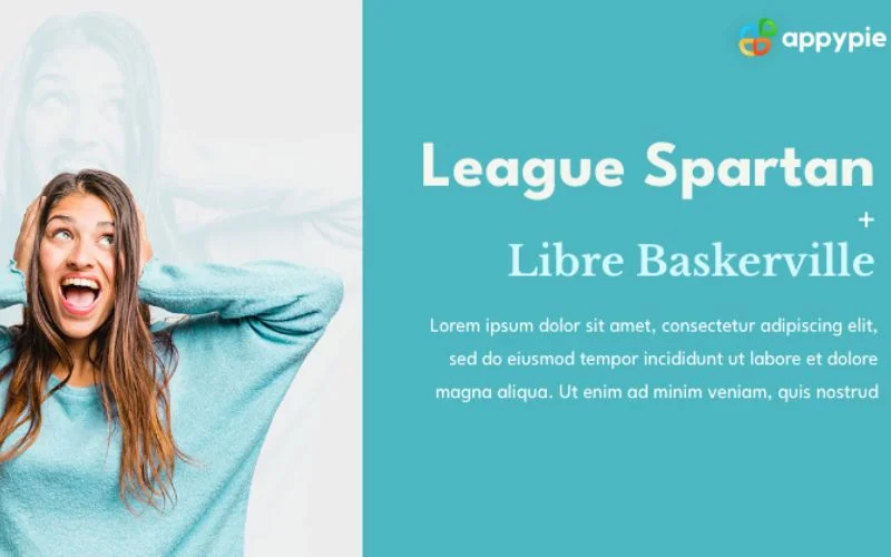
League Spartan is a 20th-century font belonging to the Matt Bailey Spartan Font family. It is a modern, bold display font that combines a decorative style with a sense of strength.
While League Spartan stands out on a web page, you can balance it with Libre Baskerville for the text section. Libre Baskerville presents rounded characters that improve text readability and legibility.
This pairing is always an excellent choice when creating professional and branded websites. For instance, this combination can create great sites for entrepreneurs, consultants, and speakers.
7. Playfair Display & Source Sans Pro: Best Font Combination For SaaS Websites
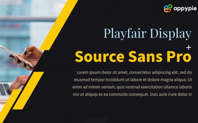
Playfair Display font dates back to the 18th century when it was mostly used in print. However, that doesn’t diminish its appeal for online platforms.
As the name suggests, Playfair Display is an excellent choice for your headings. When paired with Source Sans Pro, it creates a highly legible and readable design.
This is one of the most elegant font pairings that you can use for SaaS websites or sites that sell digital products.
Also read: Typography Visual Hierarchy And What It Means
8. Merriweather & Open Sans
Merriweather is pleasant to read and can be used for headings and text bodies. Thanks to its condensed letterforms, it is also an excellent font for websites needing space.
They present a unified feel when paired with the Open Sans font, a humanist serif. Steve Matteson, commissioned by Google, released the Open Sans font in 2011. It is also interesting that Open Sans contains all 897 character sets.
Merriweather & Open Sans offer various styles and are a great option for blog websites.
Also read: Learn The Difference Between Typography And Lettering
9. Abril Fatface & Poppins
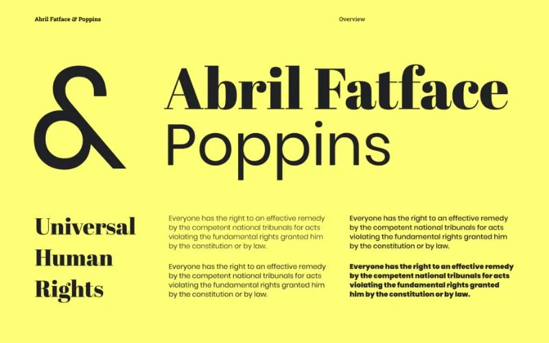
Abril Fatface also pairs well with Poppins, a versatile sans-serif font. This combination is a great example of choosing contrasting fonts for legibility and readability.
Poppin was published by Indian Type Foundry in 2014 and has been a delight for website designers. It gives your designs a style and also impressive readability.
Also read: Typography Terms That You Should Know
10. Merriweather Sans Bold & Merriweather
Merriweather Sans Bold & Merriweather is an excellent choice for a super font family combination. The Merriweather fonts were designed to offer high readability on screens, and these two fonts complement each other.
Whether you are working on an e-commerce or corporate website design, Merriweather Sans Bold & Merriweather is always a go-to font combination.
Final Thoughts
Choosing great font pairings is about finding a balance between different styles, weights, and personalities. By experimenting with these 10 best font combinations, you can elevate your typography and make your designs more effective and visually appealing. Remember, the key is to match the fonts with the tone and message of your project, ensuring that they enhance rather than distract from your content.
Like this post? Check out more amazing web design content here.


