We all know the phrase: you don’t get a second opportunity to make a first impression. When it comes to websites, your homepage design is the online handshake. It is the very first thing that someone sees, so it can either greet a visitor or make them turn on their heels and click away.
So, how do you design a homepage that really nails a first impression? It is all about visuals, messaging, and ease of navigation. Let’s take a deeper look at 20 of the best homepage designs that absolutely get it right!
Table of contents
- Best Practices For Homepage Design
- Best Homepage Design Examples
- 1. Magnolia Bakery: Best Homepage Design For Bakery
- 2. L’Oursin: Seattle Restaurant Website
- 3. Dropbox: Minimalistic Hompage Design
- 4. La La Land: Unique Movie Website
- 5. Airbnb: Best Intuitive Homepage Design
- 6. Plastno: Clean Homepage Design
- 7. Rocco: Best Homepage Design For Appliance Website
- 8. Starbucks: Effective Website Design
- 9. Wagamama: Best Homepage Design For Food Chain
- 10. Outdoorsy: Simple Homepage Design
- 11. Rosetta Stone: E-commerce Homepage
- 12. Félix & Norton: Vibrant Website Design
- 13. Slack: Simple Web Homepage
- 14. Loisa: Design For Online Food Brand
- 15. Revlon: Web Page Of Cosmetics Brand
- 16. Ladurée: Design With Pastel Color Palette
- 17. Apidura: Website With Minimalistic Menu
- 18. Oliver Russell: Elegant Design For Homepage
- 19. Fiome: Fibre Supplement Company
- 20. Morphe: Patterened Layout Homepage
- Final Thoughts On The Best Homepage Designs
- Frequently Asked Questions
Best Practices For Homepage Design
1. Focus On The User Experience

In web design, we use the term user experience (or UX) to describe many things. But the general idea is that you want your users, or potential customers, to have a positive experience browsing through the site so that they are satisfied, happy, and mostly everything is easy to use.
When you create your homepage, think about what users are looking for on your site, as well as what you want to show. Once you determine this, you will want to direct them to the appropriate page in as intuitive and smooth manner as possible.
You can do this by properly organizing the placement of elements, arranging the layout correctly, using copy effectively, and more.
2. Consistent Branding
Your brand guidelines will guide you on all of your decisions, from the copy that you write in your order confirmation email to the label of the avatar on your TikTok profile.
This will make things much easier when developing your website homepage too! Your brand will include a selection of fonts, colours, and assets that you can use to import into your ecommerce website builder.
These consistent elements will help customers recognise your brand wherever they find it. Most ecommerce themes are completely customizable. You will be able to choose from a preset layout and modify that layout to suit your business.
3. Communicate Who You Are & What You Do
Typically, people don’t enjoy being confused. Especially when they’re looking at sites on the web and are most likely short on time and attention! When they land on a site, they want to be able to easily and quickly identify who your brand is and what you do.
Otherwise, they will lose interest or get frustrated and leave your page. This means that if you are not a large brand that people instantly recognize, you can’t afford to leave any room for confusion.
To make it perfectly clear what you are doing, you should consider including a tagline or description of your company, including your intended goal or activity. You may also want to include imagery that either sets the tone for visual language for the brand or depicts your company’s products.
You might also like: Usability Vs. User Experience
4. Clear Call-To-Actions
Consider a call to action (CTA) to be much like an exit sign on a highway – it should be short, hard to miss, and indicate the right direction for drivers. Your homepage design must be centered on that main call to action, whether that be a link to shop a collection or a sign-up for early access to a launch event.
Use design principles: positioning, color, and contrast, to shape the visitors eyes to this point. The practice of psychological design is also valuable in exploring areas where the design could influence user behaviours.
5. Mobile Responsive
Web traffic from mobile devices has grown steadily over the last few years. In fact, nearly 60% of all web traffic is now coming from mobile devices.
With over half of internet users now accessing your site via mobile, the mobile experience needs to be as streamlined as your desktop experience if an online shopper is to do their best work.
Fortunately, most ecommerce themes, like those found in the Shopify Theme Store, come mobile-optimized right out of the box. This means your homepage experience will remain consistent regardless of point of access for users.
You might also like: Creating A Separate Mobile Site Vs A Responsive One
Best Homepage Design Examples
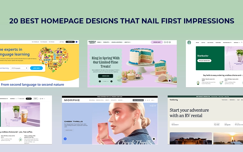
1. Magnolia Bakery: Best Homepage Design For Bakery
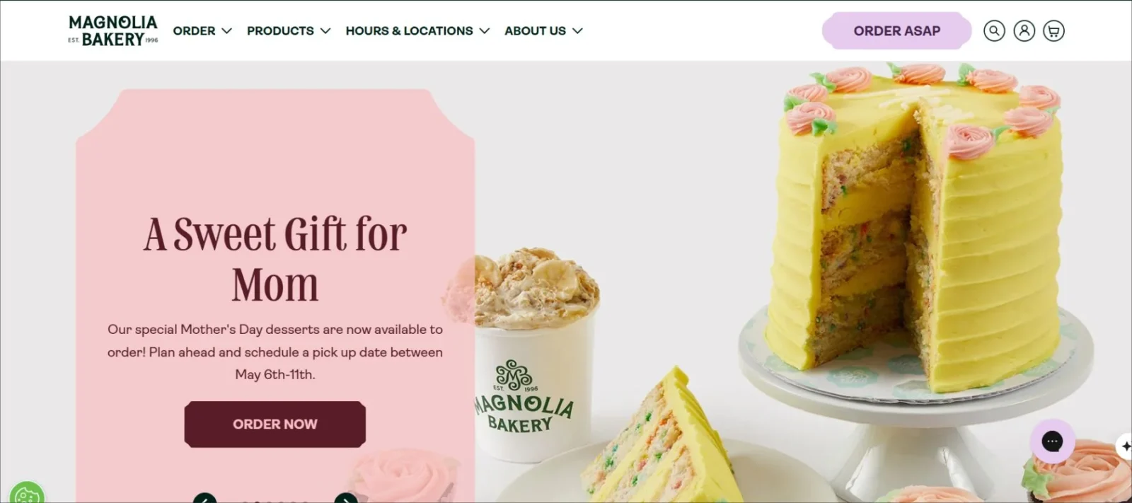
Magnolia Bakery is a popular NYC baked goods shop that expanded its products to the web, allowing the rest of the nation to taste its offerings. The company sells in its stores, through its retail partners, and direct to consumers on the web.
When you arrive at Magnolia Bakery’s website, you will be taken to a wonderland of pastries and baked treats, all beautifully photographed to maximize mouthwatering. Because customers cannot taste the goods of the brand before they shop, photography plays an important role in stimulating customers’ imagination.
2. L’Oursin: Seattle Restaurant Website
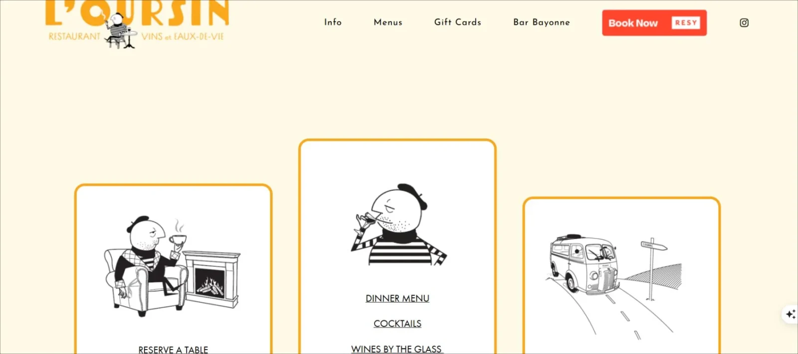
L’Oursin, a wonderful Seattle restaurant, absolutely kills it with the homepage design here. The photos of food instantly activate someone’s taste buds, and you can feel the ambiance of the venue through the photos and the font. This makes it one of the best homepage designs in the restaurant industry.
3. Dropbox: Minimalistic Hompage Design
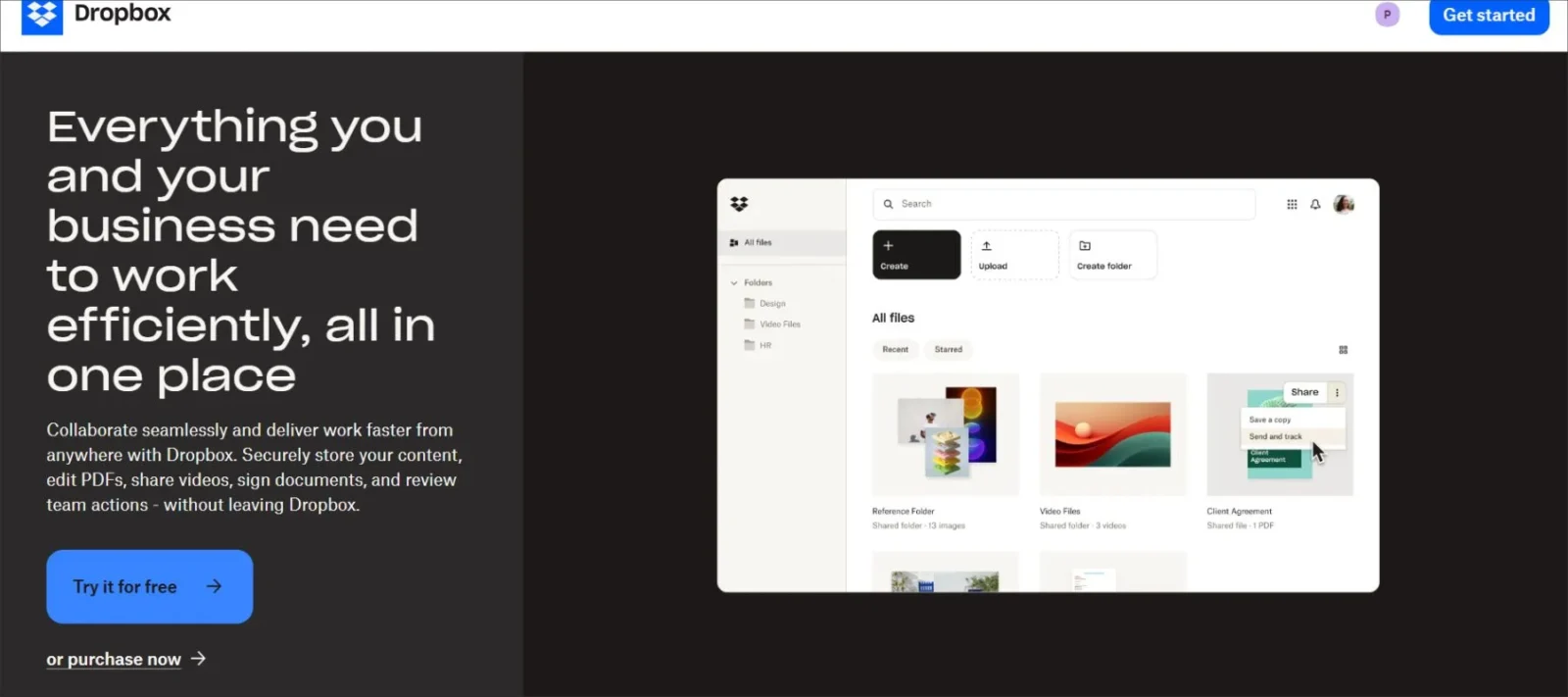
Dropbox uses a somewhat skewed hero image that grabs one’s attention and two CTAs. One of them employs a dark background to further grab people’s attention, as it’s for the paid version of the tool.
The marketing text is extremely straightforward here. Dropbox understands its audience and targets pain points that they experience, such as efficiency and security. And the navigation is quite bare-bones, with a “Compare plans” option.
4. La La Land: Unique Movie Website
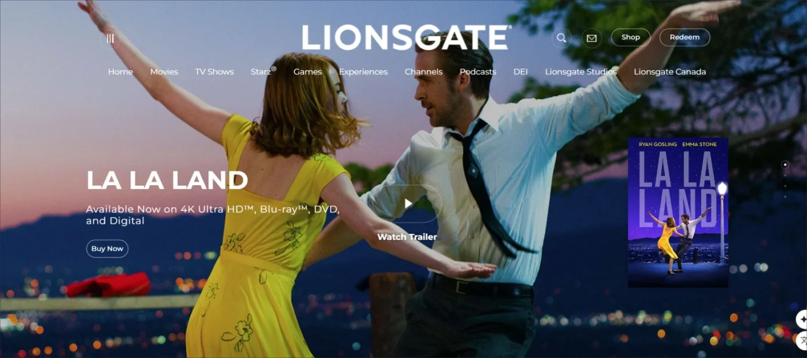
La La Land, a critically acclaimed movie, has its own movie website, with an appropriate homepage. The fullscreen back video on the homepage features select parts of the movie without ruining the entire film.
They’ve included award banners and favourable reviews on the top fold of the homepage, in addition to a unique design of website drop-down menus. There are links to their social platforms and CTAs to purchase the movie.
You might also like: Best Color Combinations For Website
5. Airbnb: Best Intuitive Homepage Design
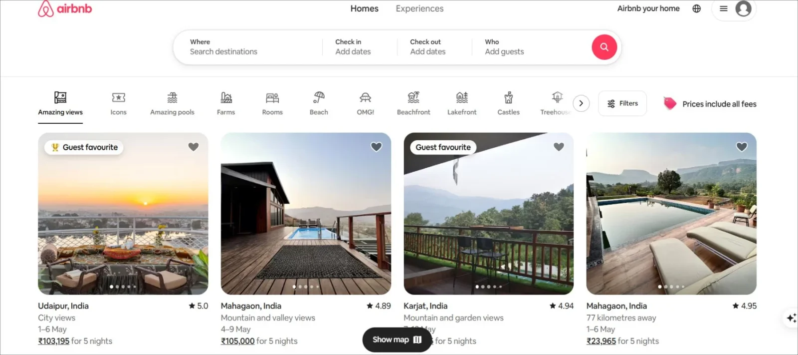
Another example of a simple homepage design clarifying the intent of the brand is Airbnb. The wording at the top of the page outlines their chief purpose. That said, the online form and enticing red ‘Search’ button get the visitor to book a place to stay.
The large background image aids in establishing an atmosphere as well. It’s not your usual perfect holiday resort image but rather an unconventional and exciting place to stay. Even more enticing images adorn the page as you scroll down. This makes it one of the best homepage designs in the e-commerce industry.
6. Plastno: Clean Homepage Design
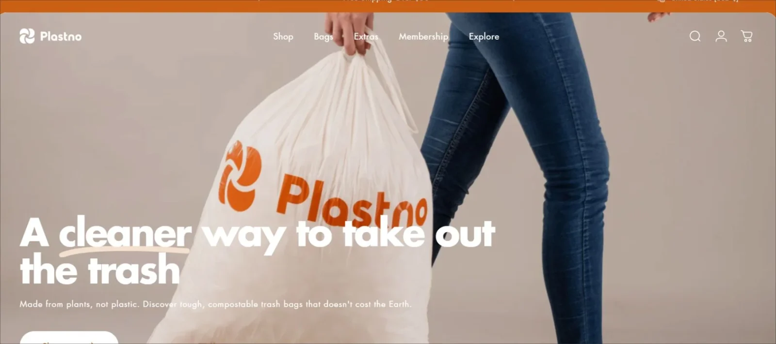
Plastno’s product isn’t very great. It’s an alternative to a common household item: the kitchen garbage bag. Its most notable feature is its composition, a compostable alternative to plastic. Plastno’s brand name and homepage design emphasised this feature and engages conscious consumers at first sight.
You might also like: Best Free Handwritten Fonts For Crafting Unique Designs
7. Rocco: Best Homepage Design For Appliance Website
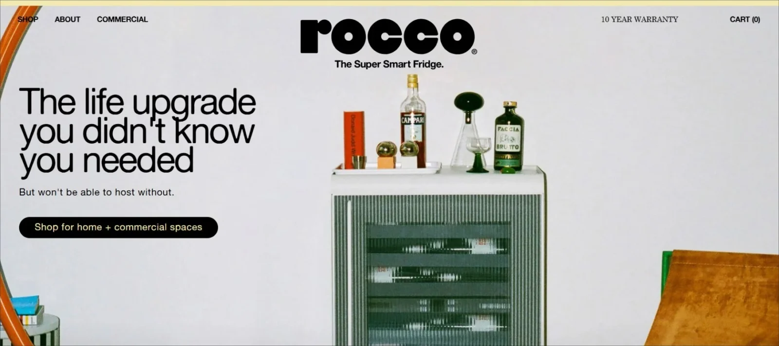
Rocco is an innovative appliance brand that identified a market void—a drink fridge somewhere between a kitchen appliance and a wine cooler—and they filled it with a stylish fixture aimed toward social customers. This makes it one of the best homepage designs in the home appliances industry.
8. Starbucks: Effective Website Design
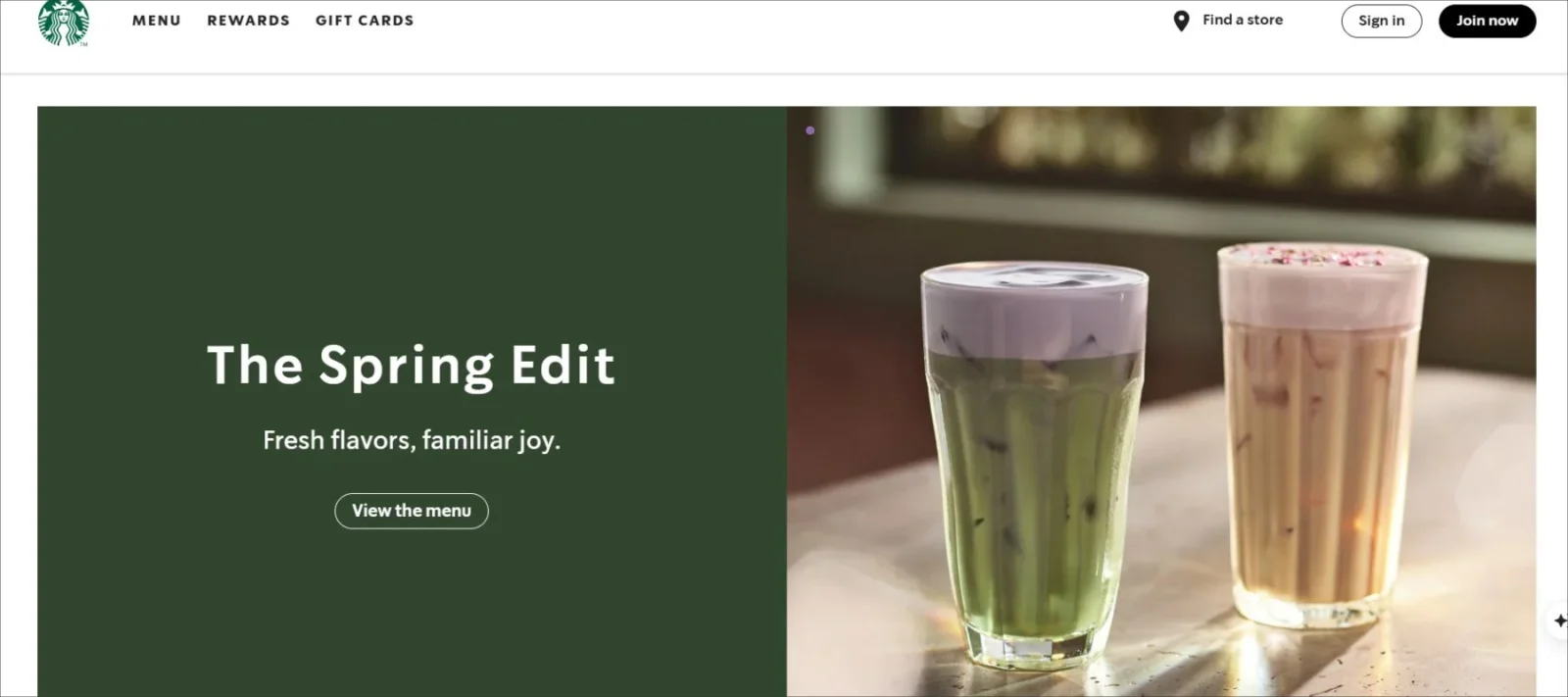
Starbucks is no stranger to marketing. The coffee giant has set the bar high for every other coffee shop and consistently turns over its homepage design based on what product Starbucks wants to promote.
Here, we have two protein shakes that look appetizing and have simple but effective copy. The “New” icons next to the name of the products grab consumers attention, as well.
9. Wagamama: Best Homepage Design For Food Chain
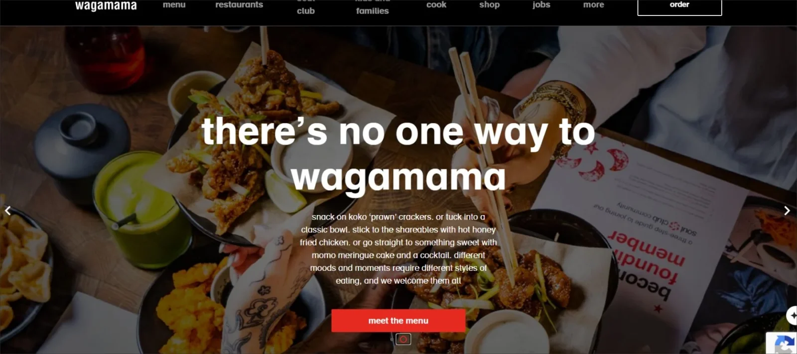
Although the primary website color scheme in this case is black, white, and red, the inclusion of videos and food images brings color to the page, making it more alive. The top-fold video zooms through images of the chillies being thrown around, the broccoli being chopped and friends relishing their meal around the table.
The video effectively captures what the restaurant is about, and this sensation is further reinforced by the text below, encapsulating the chain’s fundamental beliefs. While scrolling down, the homepage elements slide and swirl onto the page, further creating a sense of enjoyment and vibrancy.
10. Outdoorsy: Simple Homepage Design
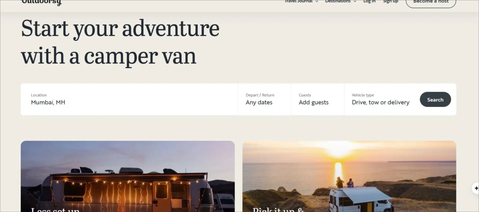
This hompage will persuade you to roll up your suitcases and get into a road trip to virtually any place where there is something good to view. There’s a myriad of irresistible images running all over this page, compiling together to form a feeling of liberty, wanderlust, and homeliness.
The concise message at the top of the page (“Find what moves you”) touches our hearts. Coupled with the question below it and the web booking form, it requires great willpower not to get carried away planning your next vacation.
You might also like: The Dynamic Evolution Of Homepage Of Amazon
11. Rosetta Stone: E-commerce Homepage
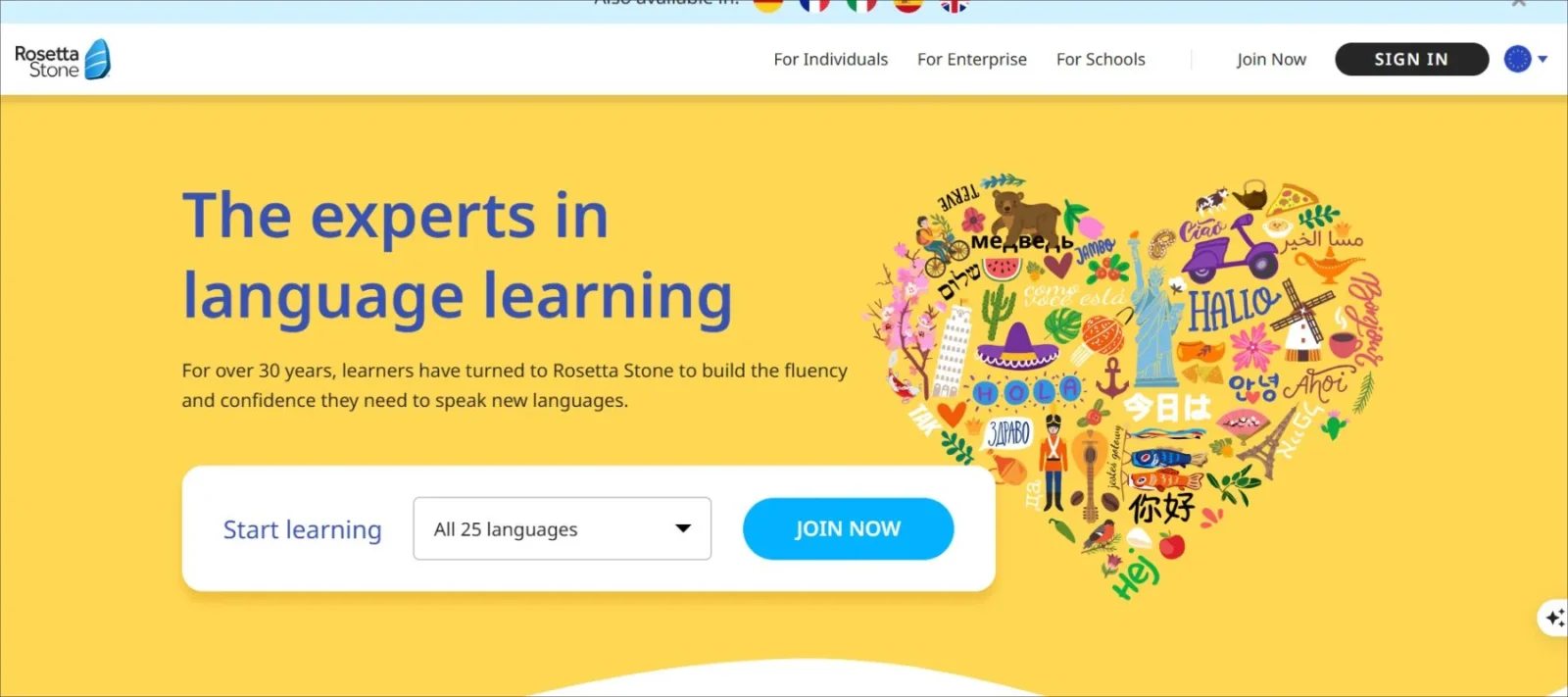
If you’re not familiar with Rosetta Stone, it’s a collection of software to help you learn a foreign language. It’s on the expensive end of the pricing scale, but it is still extremely popular. In addition, it is one of the best homepage designs of an e-commerce site.
12. Félix & Norton: Vibrant Website Design
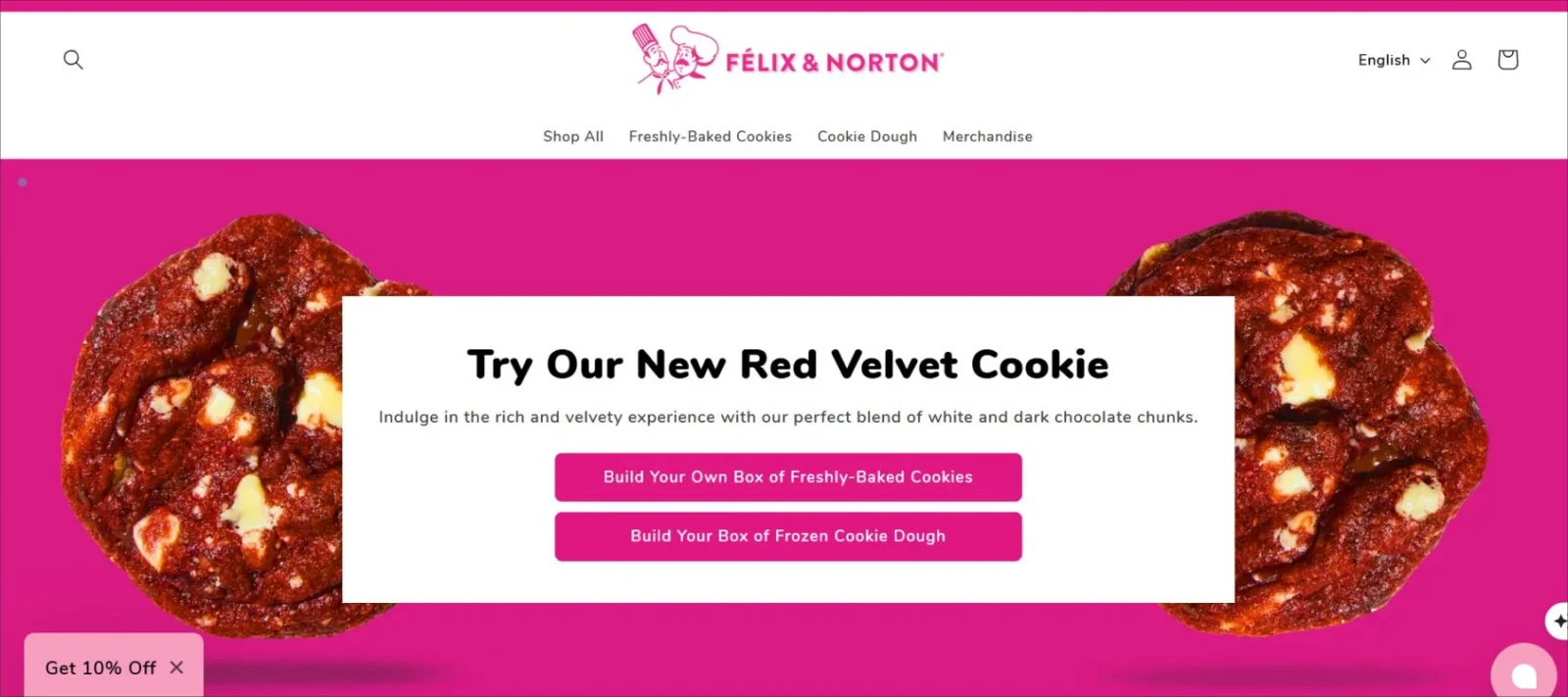
Félix & Norton is a gourmet cookie delivery brand with nearly forty years shipping perishable goods (baked cookies) to consumers and retail channels across Canada. Their homepage knocks you out with vibrant colours and stunning lifestyle photography!
Some great homepage designs take a simple, straightforward layout to let the photography speak for itself. In this instance, Félix & Norton has opted for a full-width photo of its cookies. Since visitors can’t actually taste the offering, the brand instead focuses on photography to help them imagine it.
13. Slack: Simple Web Homepage
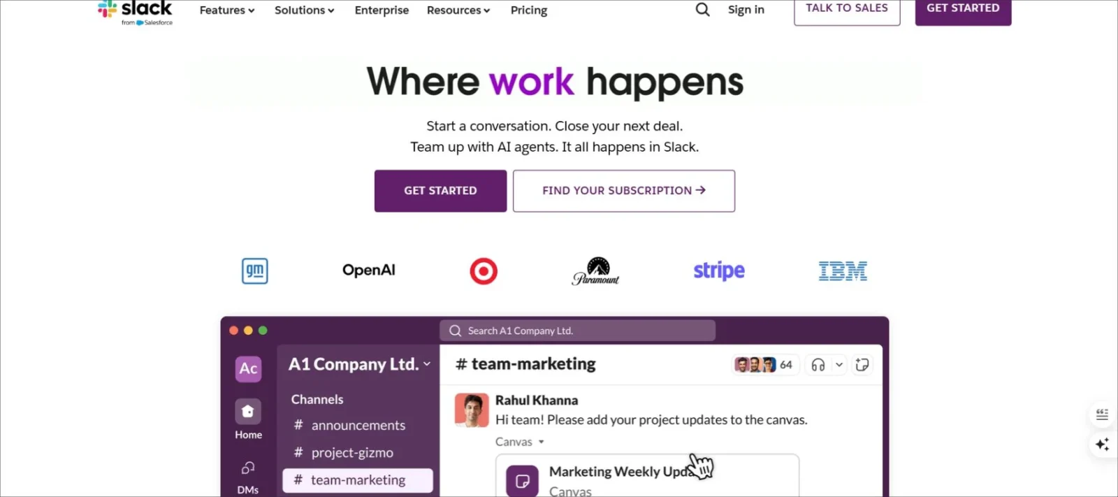
We believe Slack has the best homepage design because of the original illustrations. There is no better way than to utilize custom graphics. Slack exemplifies to the visitor what they can do with your site.
They have the option to sign in or create an account. There are more options for navigation here than in Dropbox, but they all contribute to the visitors finding what they are looking for. This makes it one of the best homepage designs in the software industry.
14. Loisa: Design For Online Food Brand
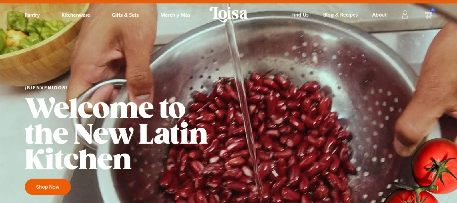
Loisa is an online food brand that sells staples for everyday Latin cooking. I love everything about their homepage design. The full-width, mouthwatering cooking videos, the modern fonts, and the bright colours.
Cooking is one of the few areas of food that you can engage with different senses of the customer who may never try your product until after they buy it.
An amazing-looking video of a family cooking shows the texture (which you couldn’t taste) and even demonstrates the sounds of sizzling – a virtual ASMR!
You might also like: Best Free Handwritten Fonts For Crafting Unique Designs
15. Revlon: Web Page Of Cosmetics Brand
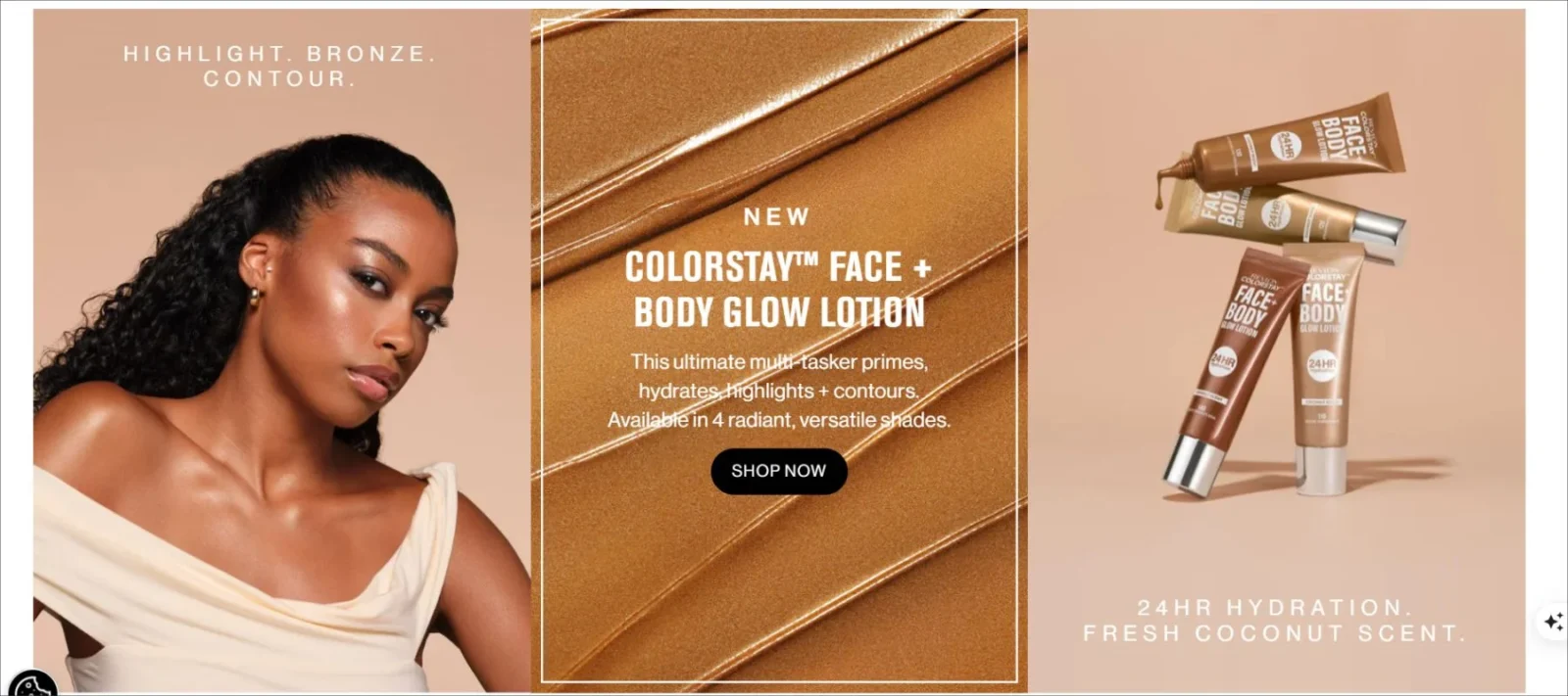
A strong, high quality image with different backgrounds welcomes you as soon as you enter Revlon’s website. Ditching the traditional soft makeup shots, the look here is strong and aggressive, with big red font, crisp rectangular boxes and stark black on white contrast.
There is an extensive dropdown menu, neatly divided into all the major categories, ensuring easy navigation. At the bottom of the page, there are also highlighted products and slight website animations as the images slide in. This makes it one of the best homepage designs in the cosmetics industry.
16. Ladurée: Design With Pastel Color Palette
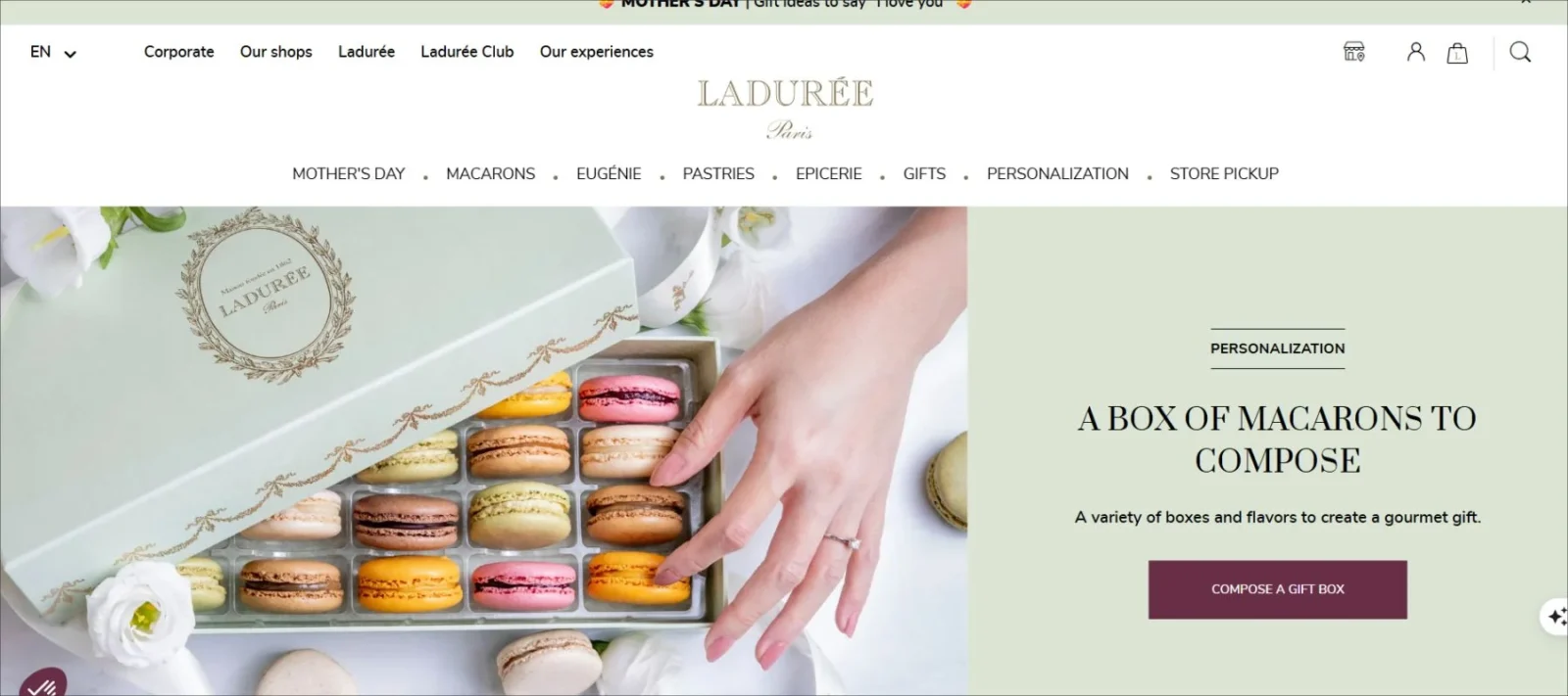
Entire screen images of pale-colored macaroons, flanked by dainty, neatly placed leaves and flowers, dominate Ladurée’s homepage. The menu bar at the top of the page is the brand’s signature pale green background with gold text in a stately, serif font.
Both of these work together to create a feeling of tradition, verifying the idea that the brand is old and has been around for years. The color palette is consistent throughout the web homepage design.
They’ve also embedded their Instagram feed on their website, in order to feature their best images, and tourists can stay current on their latest offerings.
17. Apidura: Website With Minimalistic Menu
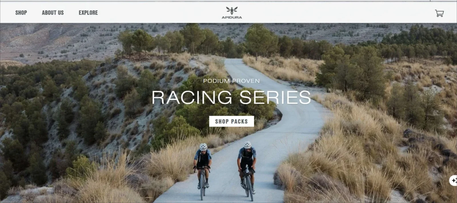
This site has been pinned to more than 10,000 boards. You will discover why as you skim across the homepage. The brand itself shows is a bike and gear company and sells it through storytelling with great photos!
Apidura sells a trip or adventure, and the bike is an afterthought. The great photos are coupled with the subtle, semi-transparent, minimalistic menu, and contour buttons. This is what make this a great homepage design.
You might also like: Interactive Website Examples That Will Wow & Inspire You
18. Oliver Russell: Elegant Design For Homepage
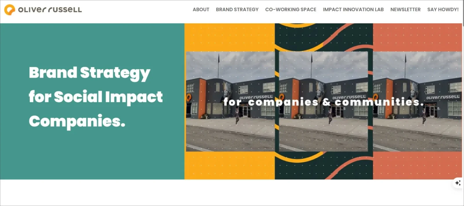
This company helps brands become stronger. They support socially responsible and purpose-driven companies with the vision to become very competitive in the marketplace.
Oliver Russell, judging by the ability to display many great visual effects without taking away from the user’s navigation and content, must be extremely talented. Their support blocks are adaptable and allow a brand to communicate their entire story, which then ends with their contact information.
19. Fiome: Fibre Supplement Company
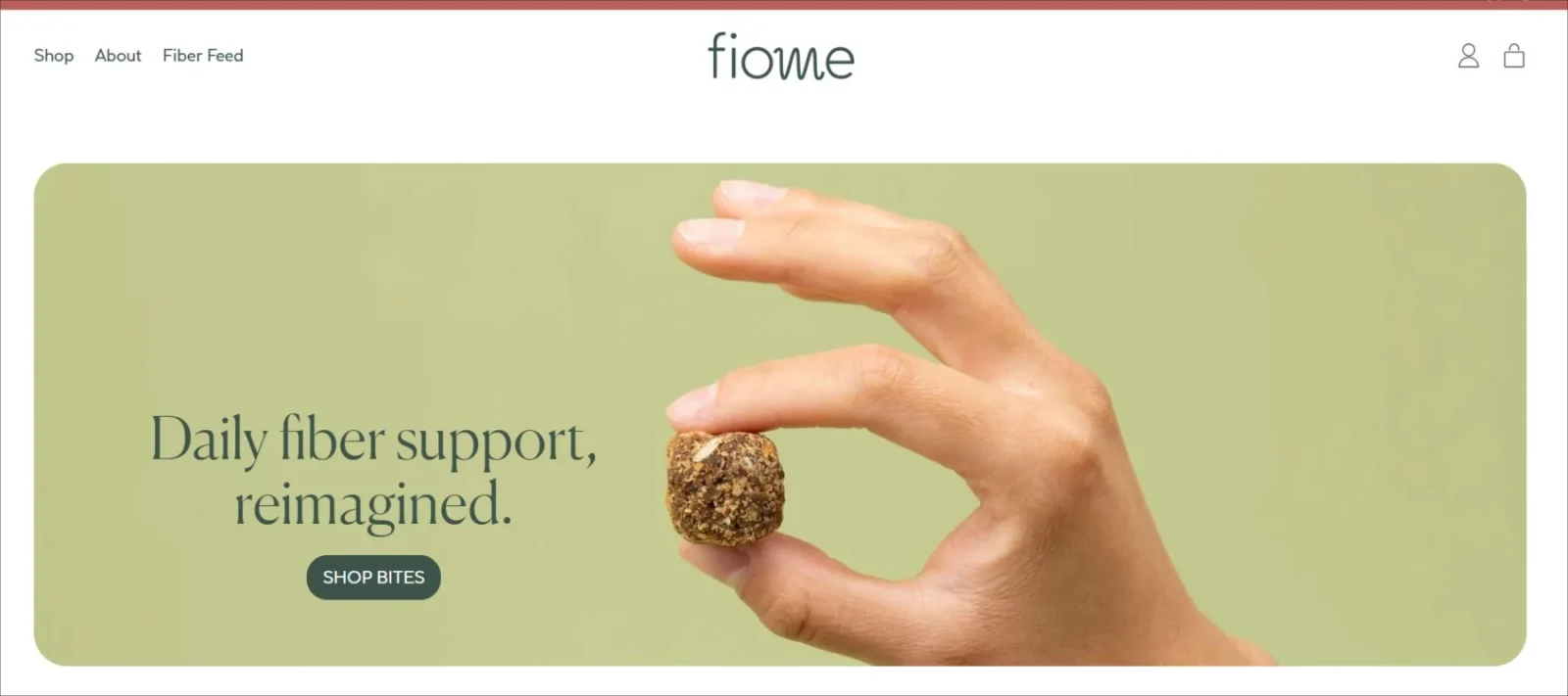
Fiome is a fiber supplement company, offering fiber in new way—with delicious chews. The homepage header is simple with direct copy and clear call to action, and the remainder of the homepage is dedicated to customer information about fiber.
With any health or wellness product, it is important that potential customers understand the risks and benefits. Fiome does not bombard visitors with this information right away, but rather focuses on clean homepage layout and navigation to get customers to the appropriate part of the website. This makes it one of the best homepage designs in the health supplements industry.
You might also like: Best Website Footers: Top 15 Creative & Functional Designs
20. Morphe: Patterened Layout Homepage
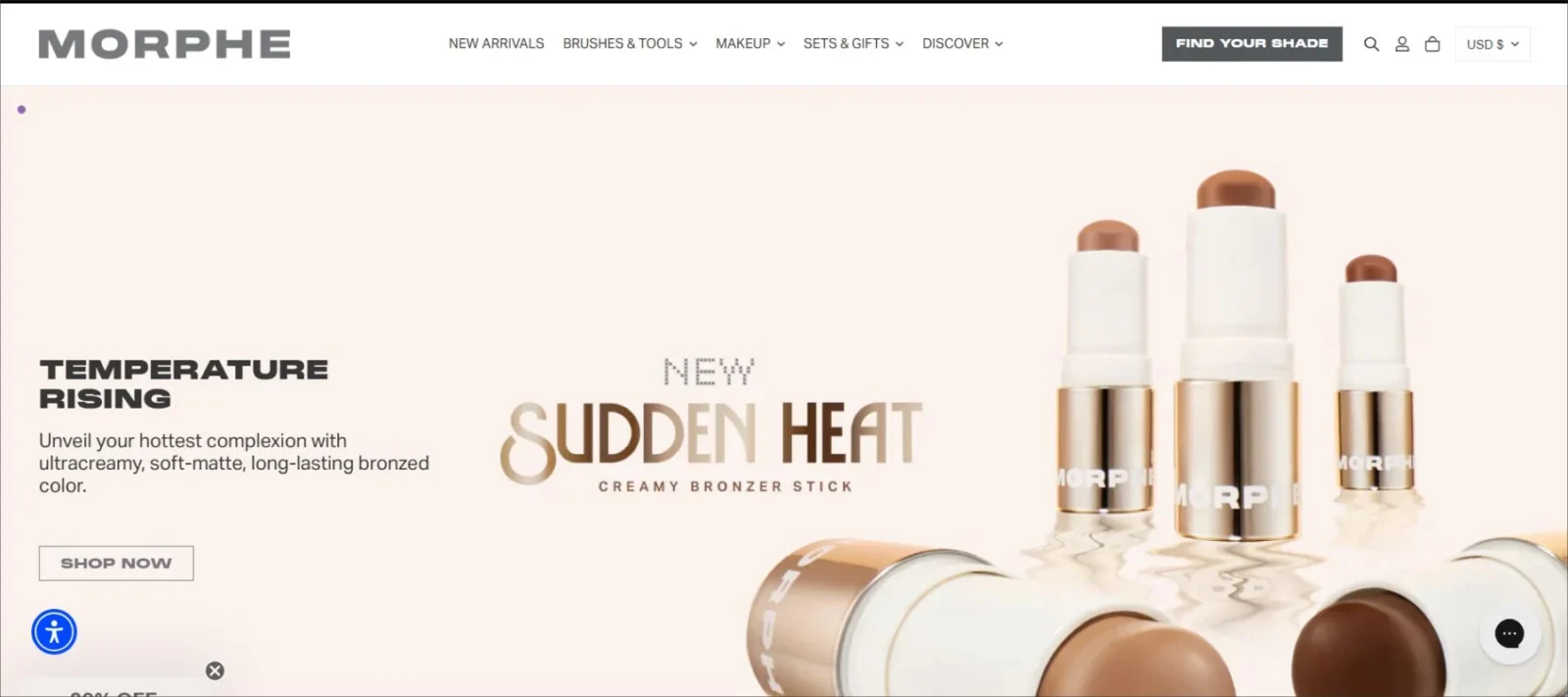
With 15 years in business, Morphe is a make-up brand with offices in LA, created specifically for beauty creators and influencers. It sells cosmetic products and tools and often works with make-up artists on limited edition collections.
Morphe follows a classic web design patterned layout, they have headers and collections that change constantly to feature trends, events, new products and featured collections.
This creates a dynamic website for both new and returning visitors with relevant shopping suggestions and offers.
Final Thoughts On The Best Homepage Designs
A great homepage doesn’t need to be over-the-top. The best designs balance clarity, creativity, and purpose. Whether you’re running a personal blog or launching a new product, your homepage sets the tone for the entire user experience.
So if you’re working on your own site, take a cue from these examples. Focus on clean visuals, strong headlines, and a clear path forward for your visitors. First impressions matter, and your homepage is your biggest chance to make one that sticks!
Frequently Asked Questions
Q1: Why is homepage design so important?
Ans. Your homepage is the first thing visitors see. A strong design grabs attention, builds trust, and encourages people to explore your site further.
Q2: What makes a homepage design stand out?
Ans. A great homepage is clear, visually appealing, easy to navigate, and tells visitors exactly what to do next. Good use of layout, typography, and strong visuals make all the difference.
Q3: Do I need fancy animations to impress visitors?
Ans. Not at all! Clean design, smart layout, and a clear message matter more than fancy effects. Simple, thoughtful design often leaves the strongest impression.
Q4: How can I improve my current homepage design?
Ans. Start by making sure your headline is clear, your images are high-quality, and your navigation is easy to follow. Small changes like button placement and font choices can also make a big impact.