
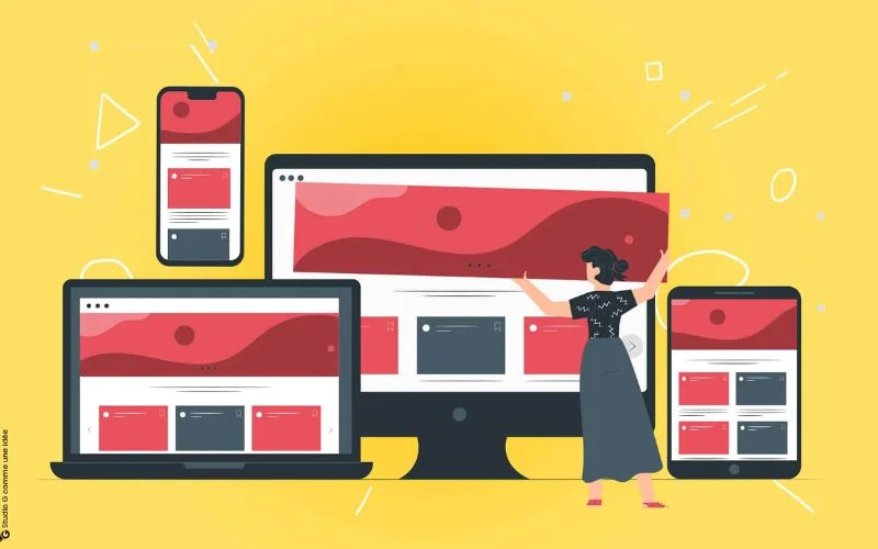
In today’s mobile-centric world, websites must deliver a smooth experience across all devices. According to DOIT Staffing, global smartphone usage will exceed 80% by 2025. This tendency means a website’s ability to adapt to various screen sizes is no longer optional.

The challenge lies in creating a functional website that maintains functionality on desktops, phones, and tablets. Two primary approaches address this issue: adaptive vs responsive design. Both aim to create websites that adjust their layout and content based on the device used. But understanding the key difference between responsive and adaptive design is crucial. In this article, let’s explore the essence of both web designs as well as their strengths and weaknesses.
Table of contents
- What Is Responsive Design?
- Core Principles Of Responsive Design
- Advantages Of Responsive Design
- Disadvantages Of Responsive Web Design
- What Is Adaptive Design?
- Core Principles Of Adaptive Design
- Pros Of Adaptive Design
- Cons Of Adaptive Design
- Adaptive Vs Responsive Design: Key Considerations For Choosing The Perfect Fit
- Summing Up
What Is Responsive Design?
Responsive web design is a modern approach to creating websites. It ensures they look and function smoothly across a wide range of devices. The design adapts the website’s layout, content, and images to fit the user’s screen size.
Responsive web design was first introduced in May 2010 by Ethan Marcotte. In his paper “A List Apart,” he discussed how mobile users were reshaping design.
The key criterion of responsive design is an optimized experience. By adjusting to different screen sizes, the website eliminates the need for users to scroll horizontally or zoom in and out. This flexibility provides a clean, uninterrupted journey across gadgets.
The technical foundation of responsive design is CSS media queries. These are customized style sheets that detect the characteristics of the user’s device, such as screen size and resolution. Website code provides optimal viewing by displaying the best layout and content for the user’s device.
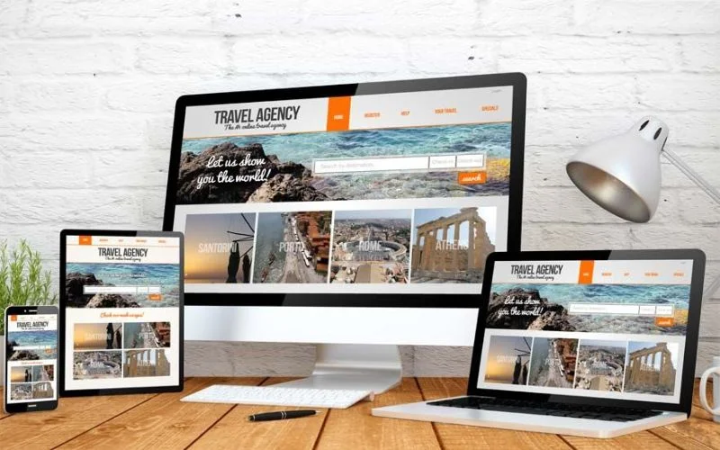
GitHub stands as a prime example of responsive design implementation. On a large desktop monitor, it presents a clear layout with navigation menus and code repositories spread out for easy browsing. But switch to your mobile device, and GitHub transforms. It resizes elements, stacks menus for easy touch interaction, and adjusts font sizes on a smaller screen for optimal reading.
In short, responsive design lets websites bend and adjust to any screen size, from phones to desktops. Now, let’s explore the core ideas, advantages, and potential limitations of this approach.
Also read: How To Create Clean Website Designs
Core Principles Of Responsive Design
- Fluid Layouts: Responsive web design centers around a flexible, grid-based layout structure. Designers used to build websites with exact pixel sizes, kind of like a fixed picture frame. Now, they use tools like percentages and EMs to create flexible layouts. The components within these dynamic grids can then adjust proportionally. These aspects allow the overall design to adapt smoothly to different screen sizes.
- Flexible Media: Images and videos are also designed to be flexible, resizing or even swapping out for different-sized versions. This factor ensures optimal loading times and avoids blurry or pixelated visuals.
- Media Queries: Media queries are like questions your website asks itself about the user’s device. The website applies specific styles to adjust the layout and content accordingly based on several factors. These include screen size, orientation (portrait or landscape), and resolution.
- Responsive Typography: Typography impacts readability and user engagement. It employs relative units, such as percentages or Ems, for font sizes and line heights. This approach allows the text to scale appropriately and remain legible across various gadgets. On top of that, designers select font styles and adjust spacing to preserve an accessible reading experience.
- Tap-friendly interactions: Responsive web design needs to account for touch-based interactions, not just layout. Designers must properly size and space buttons and links to work well for easy tapping on mobile devices.
Also read: Creating A Separate Mobile Site Vs A Responsive One
Advantages Of Responsive Design

- Enhanced User Experience: With a smooth experience across all devices, users struggle less with navigation.
- Reduced Maintenance: Responsive design uses a single codebase, making updates and bug fixes quicker and cheaper.
- SEO Advantage: Responsive design keeps your web address the same across all devices. Search engines like Google favor consistent URLs, making it easier for them to find your site. This factor can potentially improve your search rankings and drive more organic traffic.
Disadvantages Of Responsive Web Design

- Complexity for Intricate Layouts: Highly complex layouts with intricate details might require more development efforts. Such attention is crucial for ensuring effective adaptation across all screen sizes.
- Limited Control Over User Experience: Responsive websites bend to fit any screen. But the trade-off is that you can’t control the exact look on every device. It can sometimes lead to unexpected layouts or usability issues on certain screen sizes.
- Potential Performance Issues: Responsive design layouts with a lot of media may load slowly on low-power/bandwidth devices.
Responsive design can involve some complexities. But the overall benefits make it a powerful choice. Let’s move on to exploring an alternative approach.
Also read: How To Create a Good User Interface: Essential Tips for UI Designers
What Is Adaptive Design?
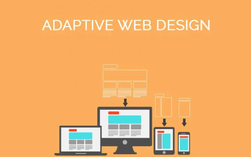
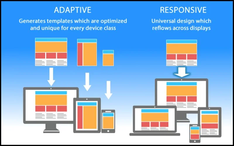
Adaptive web design (AWD) tackles the challenge of multi-device websites by offering a unique approach. Instead of a flexible layout that adjusts, it uses pre-built designs specifically made for phones, tablets, and computers. To make this happen, a designer must create different versions based on varying screen widths. The most common widths are (in pixels):
- 320 (for smaller smartphones)
- 480 (for larger smartphones)
- 760 (for smaller tablets)
- 960 (for larger tablets)
- 1200 (for laptops/desktops)
- 1600 (for high-resolution desktops)
In 2011, Aaron Gustafson introduced adaptive design, following responsive design. He detailed this concept in his book “Adaptive Web Design: Crafting Rich Experiences with Progressive Enhancement.”
Designers consider the distinct capabilities of various devices to generate optimal layouts for each. This approach provides a consistent user experience, quicker page load times, and improved navigation.
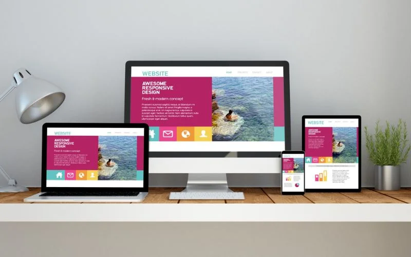
IKEA is one of the adaptive design examples. On your phone, images shrink to fit the smaller screen while staying crisp. Menus transform for easy touch navigation, and essential product details remain readily available. This consistent user experience, regardless of device, lets you browse with ease.
As we can see, adaptive design offers an alternative to the bendy solution and creates custom-built versions. That said, let’s unpack the key features of this approach.
Core Principles Of Adaptive Design
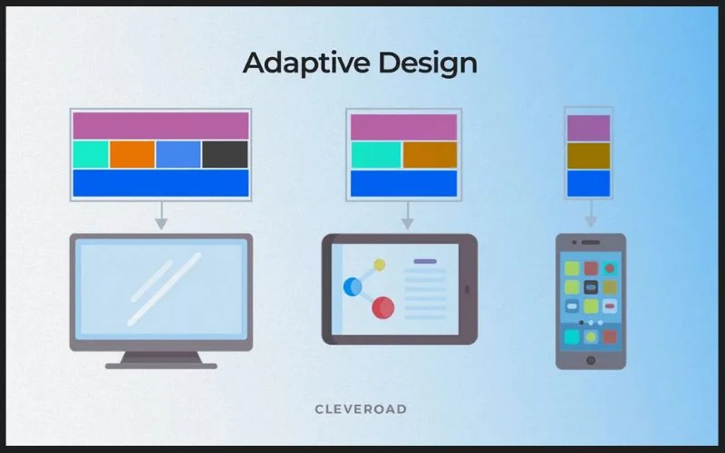
- Device-Specific Breakpoints: Adaptive design defines specific points (breakpoints) based on screen size and characteristics. When a user’s device reaches a breakpoint, the website switches to a pre-designed layout optimized for that device type.
- Targeted Layouts: These pre-design versions are built to provide the best possible experience. Imagine a custom website layout adapted to either a tablet’s touchscreen or a desktop’s larger screen.
- Optimization of Visual Media: This principle focuses on the importance of delivering images and videos in a format fit for different devices. Optimizing these elements enables faster loading times and prevents potential lag or delay.
- User-Centered Design: This user-centric approach designs websites tailored to users’ behavior, motivations, and preferences. User-centered design aims to create intuitive and user-friendly experiences. These efforts allow you to resonate with the target audience, making navigation easier.
Pros Of Adaptive Design

- Device-Optimized User Experience: Adaptive design allows for optimized user experiences by catering to specific device categories. For example, a tablet layout might prioritize large buttons and simplified menus for touch interaction. In contrast, a desktop layout might offer more complex navigation options.
- Potential for Complex Layouts: Adaptive design helps complex websites display properly on various devices.
- Faster Load Times: With adaptive design, websites load faster because they deliver only the necessary code. This factor benefits users on slower internet or mobile data connections.
Also read: How User Experience Plays A Significant Role In Premium Websites
Cons Of Adaptive Design
- Multiple Codebases: Adaptive design requires maintaining separate codebases for each device layout. This factor can increase development and maintenance complexity.
- Potential for Inconsistencies: Maintaining a consistent experience and design across gadgets is difficult with many layouts. Testing thoroughly is important to prevent interaction issues on different screen sizes.
The main differences between adaptive vs responsive design are explored. Now, it’s time to review some factors to help you decide on the right option.
Also read: Must-Have Elements of a Complete Ecommerce Product Page
Adaptive Vs Responsive Design: Key Considerations For Choosing The Perfect Fit
This section equips you with the knowledge to choose between adaptive vs responsive design. This way, you can ensure your website thrives on any screen. Consider these factors when making your decision:
Project Complexity
When it comes to responsive design vs adaptive design, the first is better for simple layouts with basic structures. Responsive design uses fluid grids, flexible images/media, and CSS media queries to adapt the layout to different screen sizes. It provides a single codebase that flexibly adjusts elements based on the viewport size. This works well for straightforward layouts and content prioritization.
Complex layouts may benefit from adaptive design’s tailored approach for gadgets. Adaptive design serves different layouts/codes for specific device categories rather than fluidly adjusting. Also, AWD allows for optimized experiences adapted to different device types and capabilities. That said, as the number of layouts increases, so does the complexity of maintaining them.
Target Audience

When considering responsive vs adaptive design, the first might be enough if your audience mainly uses desktops. However, suppose you cater to a broad range of devices; in this case, adaptive design can offer a more optimized experience.
Development Efforts

From a development perspective, adaptive vs responsive design presents trade-offs in terms of complexity. The former can be more resource-intensive but offers optimized experiences.
In contrast, the latter is generally easier to implement. However, it potentially can lead to performance issues on lower-end devices.
Also, the choice between responsive vs adaptive web design can impact development costs. The second often requires more upfront investment. In contrast, responsive design can be more efficient to maintain in the long run due to its single codebase. This factor can be a significant advantage for smaller teams or projects with tight budgets.
On the contrary, adaptive design can be a viable option if development resources are abundant. However, ongoing maintenance of multiple codebases should be factored into the equation.
The decision between adaptive vs responsive design can also influence the approach to testing and quality assurance. Responsive designs potentially require more comprehensive cross-device testing. In contrast, adaptive designs may allow for more targeted testing efforts based on specific device profiles.
Also read: Follow These Tips To Become A Better Web Designer
Desired User Experience

Responsive design shines if consistent user interaction across all screen sizes is a top priority. One flexible layout adjusts to different screens, keeping things familiar. However, if prioritizing a highly optimized experience for each device type is crucial, adaptive design is a better choice. It can tailor the content and functionality of the specific gadget’s capabilities.
Plus, the way you present content can be influenced by whether you use adaptive vs responsive design. The latter encourages a “one-size-fits-all” approach. In contrast, the former allows for tailored content and functionality based on the device’s capabilities.
What about e-commerce websites? In this case, adaptive methods may allow for more targeted product displays and checkout flows. With responsive design, the content and user flows would need to be designed to work consistently across all screen sizes.
Also read: Effective Web Design Techniques You Should Apply
SEO Optimization

The choice between adaptive vs responsive design can also affect search engine optimization (SEO). Responsive sites typically offer a more unified codebase and URL structure. Such websites do not require managing and optimizing many versions of the same content for different devices. This unified approach can help search engines crawl and index websites more easily, improving rankings. In contrast, adaptive design uses separate code and URLs, making SEO more complex.
Check out this blog to learn about best practices for website design.
Summing Up
As technology advances, the decision between adaptive vs responsive design remains important. Responsive design uses one flexible layout that adjusts, providing a consistent device experience. Meanwhile, adaptive design creates separate layouts tailored to smartphones, tablets, and desktops.
There is no universal “best” solution. The optimal approach between adaptive vs responsive design depends on your website’s needs. Consider the target audience and desired level of customization for each device. For simpler websites, responsive design may be efficient. For complex sites needing highly optimized experiences per device, adaptive design can be better.
Businesses can make informed choices by understanding the pros and cons of adaptive vs responsive design. Careful evaluation is key for optimizing the multi-device experience.
Like this post? Check out more amazing web design content here.


