Do you know the type of font Amazon uses? If not, you’re at the right place. The types and where does Amazon uses it.
Founded in 1994, the world’s 2nd largest e-commerce company that provides almost every kind of e-commerce services. There’s no doubt why this company is so well known, it provides the best in the field of e-commerce and also a great prices for a wide range of quality products.
The Amazon font is one of the best when it comes to readability and clarity, or lets say that’s what the company says. The font that Amazon uses provide clarity and readability on all screen types, may it be mobile screens, Monitor, Tablet, etc. The quality of the font is noticeable that only Amazon has.
Amazon only uses it’s custom made font that is Ember Amazon font which was designed by Dalton Maag Ltd.
To learn more about the Amazon company, check out the evolution of Amazon.
Amazon Ember Font

Being one of the most used font in Amazon website as well as Alexa, Amazon Ember holds a collection of 34 styles.
The style Amazon Ember is more like an informal font with a touch of formal style, making it elegant and subtle. Its not like other informal fonts, with bindings and ties of each letter, instead the Amazon Ember is a bit subtle than other informal fonts. Amazon Ember has its own style, as said, its custom made exclusively for Amazon. Ember font is an inspired font from Arial font. But it does has some similar stylistic. It is sans-serif font, which first released on Kindle Oasis. Later now, Its the primary font of Amazon website.
Bookerly Font for Amazon Kindle
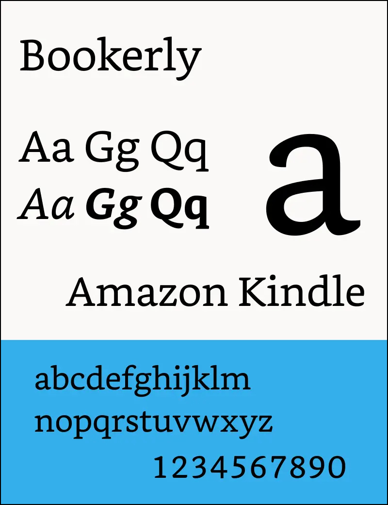
It is used in Kindle and it was used in Amazon website before it was released and later on shifted to Amazon Ember.
It used to be the primary font of Amazon. Bookerly was also designed by Dalton Maag Ltd. It allows users to read easier with not much eye strain, its easier on eyes improving the readers’ readability. It’s a serif font that has some ligatures and kerning pairs. Bookerly has done wonders when it comes to readers, making it readable even on tiny screens or low quality screens.
It is now a default font for Kindle along with Ember font. The font was created organically, improving the users experience by the visibility in low quality or tiny screens. Overall, its still considered one of the best font after Ember font when it comes to readability and clarity.
Amazon Logo Font
Old (1998-2000)

The two fonts that were used for the Amazon logo between 1998-2000 is ITC Officina Sans Book and ITC Officina Sans Bold. The fonts were originally created in 1990, but it didn’t gain any popularity until 1998. The old Amazon logo was composed of two parts, one part used ITC Officina Sans Bold font which was “amazon” and the other part was ITC Officina Sans Book which was “.com”
The font is actually a changeable font, if you wanna make your own logo design, and can also be used for different purposes. It can be used for creative designs, creating brand logos, layouts, covers, brand designs, etc.
The Amazon font family for the logos is a very flexible font, as it supports 21 different languages from around the world.
Present Logo

The current Amazon logo has its own font which was designed specifically for Amazon. The font is pretty simple but it looks great with the logo. Sadly, the font is not downloadable, but you can have a pretty similar alternative with Franklin Gothic Medium font. For the “amazon” part Franklin Gothic Medium font has been used, and for the “.com” part Helvetica Neue Light was used. It has a black rounding stroke around the edges to soften the logo a little.
Check out how to use fonts in web designing efficiently.
What Font Does Amazon Uses Now In It’s Website And Where?
So now Amazon uses only one font in its whole website and that is Amazon Ember Font. Making it one of the high quality readable font on the web. The font is used for Amazon homepage and anything included in the website. It is exclusively designed for Amazon and can not be used or downloaded, otherwise legal action might be taken.
Fonts that you must try: Top 31 modern picks
Similar Fonts to Current Amazon Logo
Franklin Gothic Medium Font
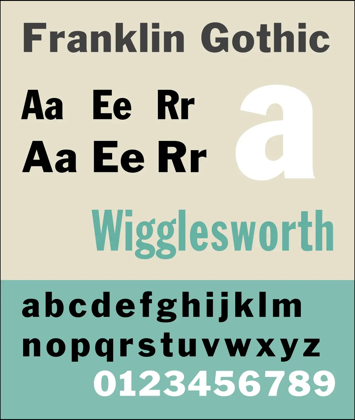
The Franklin Gothic Font is one of the famous font. It’s a sans-serif typeface. It was developed in the early 20th century by the American Type Founders (ATF) and credited to its head designer Morris Fuller Benton.
Franklin Gothic font has been used by many advertisements and headlines in newspapers. This typeface continues to have a high profile. It has appeared in variety of media, from books to billboards.
Helvetica Neue Font
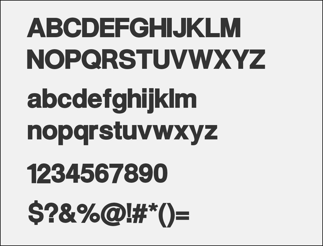
It is a combination of aesthetic and technical that gives a superior design, gives more range of using it than Helvetica font. The design was originally developed by Max Miedinger, and was released by Haas Type Foundry of Switzerland, then by Germany-based Stempel in 1983.
Since its launched, the font has been used across many designers for a successful composition from print to digital designs.
Alternative Fonts
If you are unable to download these similar to Amazon logo font, here are some alternative fonts that you can use.
Benton Sans
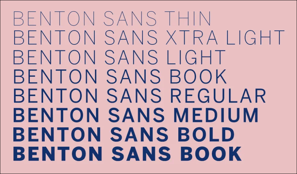
Benton Sans is a flexible font and has 8 different styles, thin, extra light, light, book, regular, medium and bold.
Tablet Gothic

Tablet Gothic was designed by Jose Scaglione and VeronikaBurian and was introduced on TypeTogether platform in 2012. It offers a huge selection styles and weights that you can use.
Maple

Its another alternative for Amazon font, designed in 2005. Its a comic-styled font.
Univers
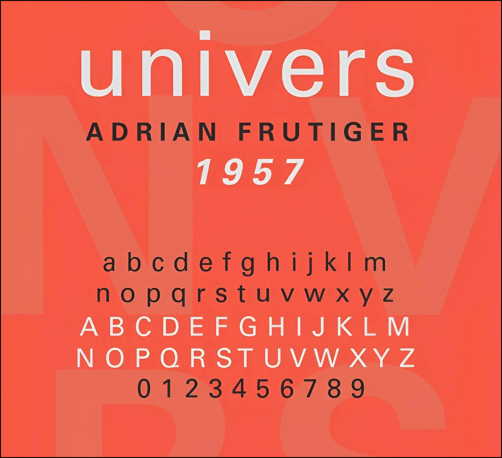
Its a similar font to Helvetica, but with a bit more styles. Univers font was designed by Adrian Frutiger and was later published by Linotype in 1957.
Suisse Int’l
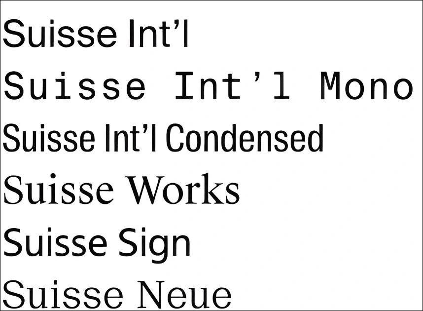
This is another alternative which you can use, it has slight changes. It was first released as Suisse BP Int’l in 2011, designed by Ian Party in eight weights with roman and italic styles. Later it was redrawn and released in 2013.
Conclusion
Its amazing how the 2nd largest e-commerce company has its own font as well as its own typography. To deliver packages world wide, and everything and anything you need. The logo or font is simple, but the creativity is on another level.


