Now that data is becoming larger and easily accessible, the design is becoming more and more focused on data visualization techniques. The common trend is to display information in a coherent way so that users will discern important relationships and leverage trends, patterns, and outliers for their further decisions.
Table of contents
Generally, there are 2 different data visualization techniques: exploration, which makes you understand the meaning and purpose of your data, and explanation, which retells the data story to the users. In order to meet most of your audience’s expectations, you must consider both techniques. Luckily, there are many practical and entertaining ways to make data visible:
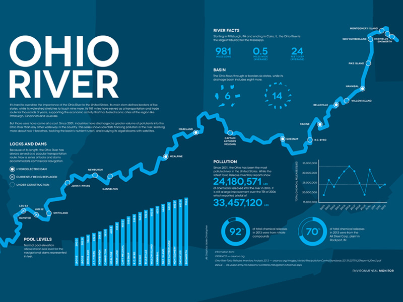
The way towards quality data visualization techniques – What should you have in mind?
Wireframes are your best allies! While many designers nowadays refuse using paper, sketching ideas as they come along is still a smart practice. At the end of the day, technology makes it possible to transfer and alter all wireframes in the digital environment.
An important tip is to stay aware of users’ expectations, in particular when it comes to aesthetic and visual considerations, colors, and associated links to make the most of the embedding possibilities.
The best way to proceed here is to involve professionals and to invest all of your creativity in order to display data in a beautiful way. Once you arrive at the outlining phase and kick off data in public, make sure you’ve performed all necessary testing and received feedback that approves your design.
Image source: Bureau Oberhaeuser
Finally, keep it simple: the best data visualization examples follow the rule of simplicity, as they introduced only those elements users particularly confirmed they liked, instead of following their own perceptions of what is desired or not.
Check out: Signs Of A Professional Website Design Company
Use interactive widgets
Managing data online is not only an analytic task but a chance to interact with users, getting links and enhance functionality. There might be cases where attractive static infographics are enough to make data visualization techniques interesting, but that’s not a reason not to skip user comments which help to brand the way no other method can.
Image source: Jing Zhang
Quirky and sensible are equally important
We all browse the internet here and there, and that’s how we learned to appreciate entertaining messages and comedy references instead of raw facts. Powerful images and related comparisons intrigue users, and motivate them to like, share, and comment on your content, but more importantly – to remember the experience!
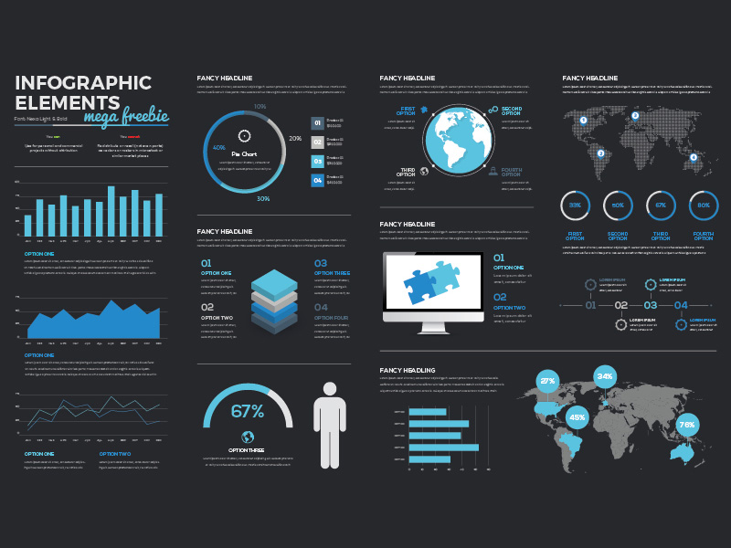
Why is data visualization such a powerful method?
Because it reveals what users genuinely want.
In order to be qualified as a successful one, web design data visualization has to be based on users’ wishes and expectations, answering three essential questions:
Which is the audience you’re targeting, and how is that audience going to accept the information provided? Are these people familiar with the concepts and terminology you’re using, and will it be easy for them to navigate your interface? In most of the cases, you’ll have to target a specific group that would like your content. Rather than following generalized practices that may not work in your case.
What do users expect from you, and which type of information is most valuable for them?
What is the purpose of the data you’re presenting; is it practically accessible; and can users interact with it? In case the last answer is positive, consider exploratory visualization technique where users can get more information in case they need it.
Once you have the answers to all of these questions, your framework is ready.
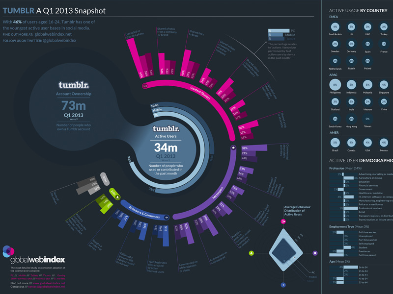
Your task from then on will be to ensure compliance between the visualization method. And purpose and to confirm users react positively to it. Clarifying the framework’s syntax and semantics will help interpret information correctly, both in terms of structure and meaning.
Note that this doesn’t only refer to textual content, but also graphics and icons which must resemble their meaning in every aspect (size, shape, color, and position). Long story short, everything that appears on your website is a communication mean. And you can’t let elements simply slide through the cracks.
The best data visualization techniques use simple lines, schematic bars, and common geometric figures. Most of these elements can be combined to resemble a connection. While bars are usually separate from each other, supposed to serve a different purpose.
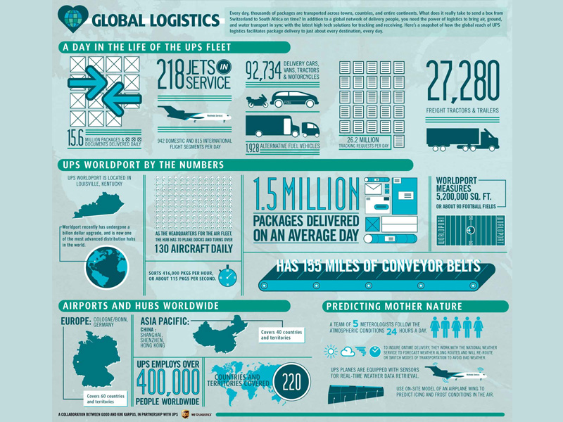
Many studies were performed to test how people interpret unlabeled graphs and bars. And the most common conclusion was that they understand the visual relationship between them even when the underlying data is not in line with their expectations.
What matters is the story
As we already mentioned, visualization can have a confirmative and educational role. Assuming which it persuades people to check content in a dynamic way. There are almost no other communication forms that have the same compelling and persuasive nature. Which explains why visualization is the mean asset for telling a story.
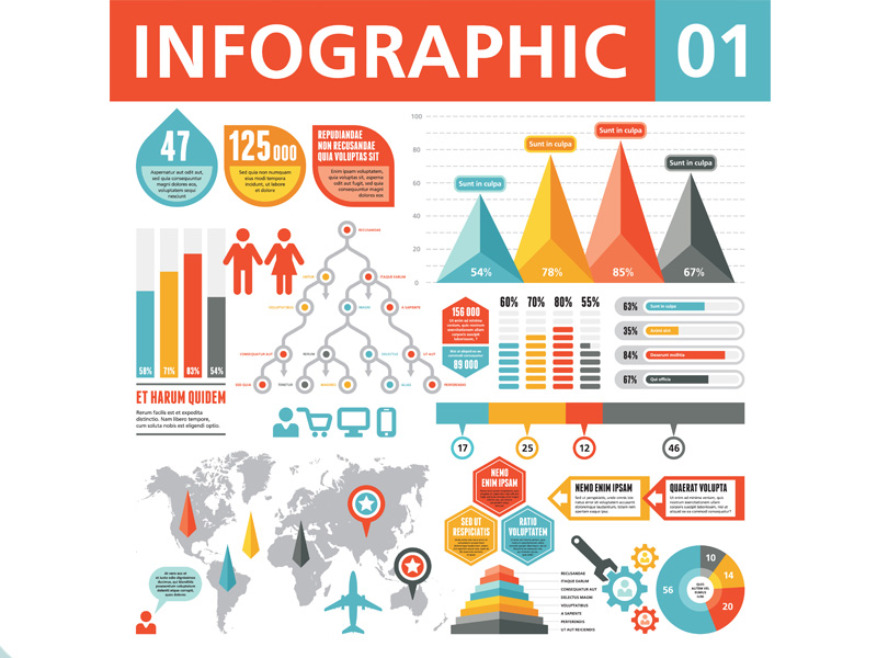
Experienced designers know information delivery is a pure organization process. This is where structure and ‘packing’ are just as important as its quality and the peers used to share that information.
An especially good way to make people remember data is to present it in an interactive way. Namely to introduce a collaborative scenario where decisions are not made by analysts but are based on surveys revealing users’ expectations. The importance of data visualization techniques is a communicative medium is even more important on large websites.
Check out: Premium Powerpoint Infographic Templates
Data Visualization Techniques
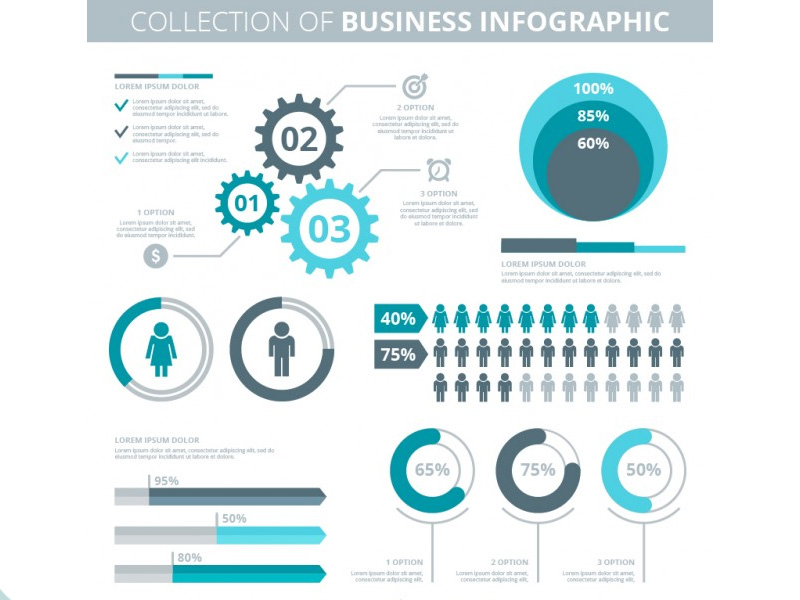
Regardless of their power, data visualization techniques are easy and understandable, and articulate insights across complex organizations in less than no time. Being completely frank, you don’t have to be an experienced analyst to be comfortable around them. And to display data the right way.
Clicking on this link, you will see some quality samples of the impact of data visualization for designers outputs. And get the idea of how much is going to impact your customers’ satisfaction.
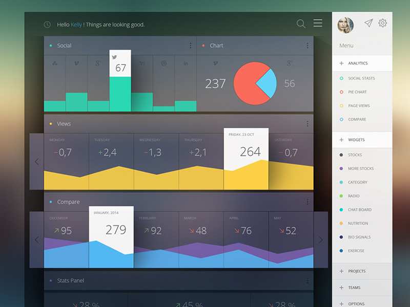
Generally, the easiest to read and least time-consuming assets are dashboards. This is where you can manage your information systems without all at ones. The main indicators are displayed using their graphical representations, in order to make data views as global as possible. But still, identify problematic issues in a way which makes them easy to tackle and fix. The charts and graphs are interconnected. Meaning that a single click can redirect you to a relevant chart filter of another table.
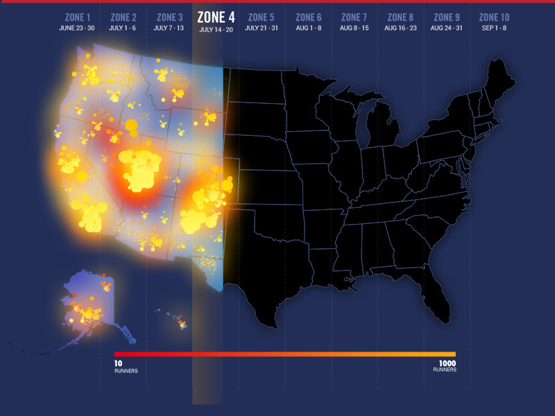
The data relationships are much clearer when displayed in maps, matrices, and co-occurrence charts than with words. As words can’t explain the repetition rate, and detect negative trends. For companies, this means they will get to track popular concepts. But also to discover new ones that have to do with users’ expectations and overall behavior.
Check out: How To Achieve Visual Hierarchy In Web Design
At the same time, you can use a Correlation Matrix to detect words which are related to your content in a positive or negative way, even if the correlation is obscure and confusing. It is exactly in such situations that website owners discover the most critical operation bugs and opportunities.
Mirror Charts, on the other hand, are the fastest and most effective tool for discovering customers’ sentiment rates. And relating those to the baseline average to detect the most distinctive weaknesses and strengths.
The purpose of Star Charts is to calculate the average importance of website elements in their categories, in order for you to focus on ones that can genuinely affect sentiment.
Heat Maps is another Sentiment asset that classifies elements into 4 quadrants: positive, negative, strong positive and strong negative.
Word Clouds are tools for graphical visualization which measure words’ frequency to understand their impact. But are not enabled to detect the specific
relationships between them.
Time-Series Data
Time series is the common name for datasets whose value changes with time. But they’re commonly used to record and save data on more than one domain.
Therefore, they are believed to be a real varying phenomenon applied for science stats, finance, public policy indicators, and many more. The ideal usage scenario is the presence of a huge number of challenging time-series that need to be compared. And which require a variety of designing visualizations to be displayed in the best possible way.
Index Charts are in fact simple interactive charts where you can compare changes in specific time series, compared using selected index points.
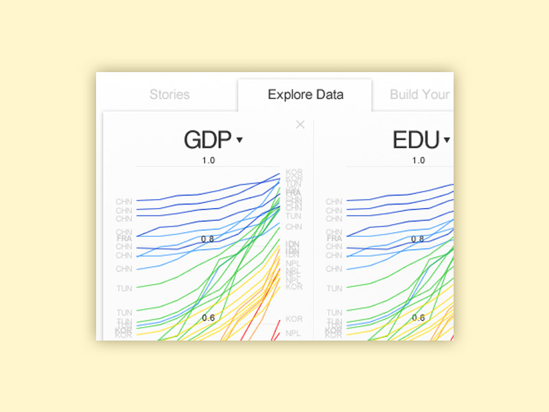
The name Stacked Graphs denotes chart areas that stack all-time series’ values for viewing and comparison. Some designers call them stream graphs because they use them to identify aggregate patterns. And reveal the very details on subsets and individual series.
Small Multiples, on the opposite, use stacking to plot selected time series on the same axis. And compare them in the same index charts. Still, we recommend you to use them gradually and with care. Because some of their curves may overlap and jeopardize legibility. Instead, you can examine each series in a separate chart, even if that’s more time-consuming.
Horizon Graphs are not exactly graphs. But techniques you can employ to boost data density in each time series without necessarily compromising their solid resolution.
15 Outstanding Data Visualization Examples
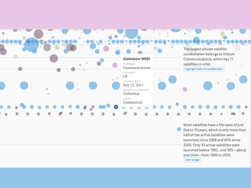
The graph was composed using data from the Union of Concerned Scientists, and on it, you can see the trajectories for each of the 1,200 active satellites orbiting around our planet at this very moment. For each of them, there is a separate circular icon, coded with colors representing their size, country, and launch mass.
Scrolling down the graph, you will be able to observe the path of each satellite, both individually and aggregated with the rest. At the same time, the graph will let you know what type of satellites are the ones that enable GPS, broadband Internet, and Sirius XM.
Check out: GA3 Exporter – Universal Analytics Data Exporting Tool
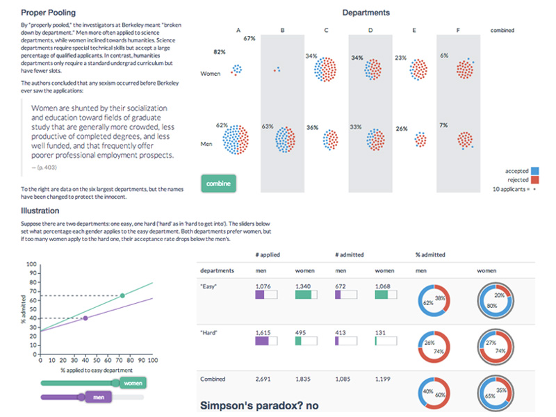
This link will lead you to Berkley University’s Visualizing Urban Data Idealab (VUDlab) where they display data disapproving the charges of sex discrimination they dealt with in 1973. 44% of the applicants were male, whereas only 35% were female. The graph revealed that we had not properly pooled the data and had neglected a percentage in favor of the feminine group.
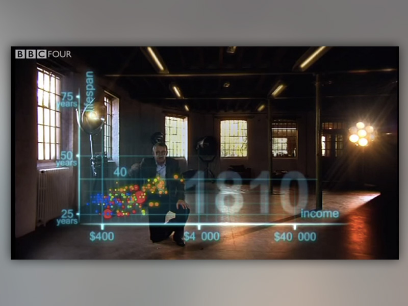
Here, you can check Hans Rosling’s popular health data documentary called The Joy of Stats. Six years ago, the BBC featured it, but it remains extremely popular.
The segment that is particularly exciting about it is that Rosling explored the publicly available health data of over 200 countries for a period of w00 years, involving more than 120,000 indicators.
Logically, you’d perceive this as a lifetime challenge and see nothing that special about it. But the ‘wow’ moment here is that the expert managed to do the comparison in only 4 minutes! His focus was the relationship between life expectancy and average income starting from 1810. And the main discovery was the closing gap he identified between Western and non-Western states.
Check out: Premium Infographic Sets with awesome graphic elements
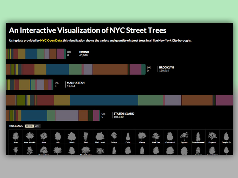
This link leads to an interactive visualization released by NYC Open Data, and which displays the quantity and variety of planted trees in the five main NYC boroughs. The institute used color codes to specify species and cross-referencing to compare the boroughs. The results surprised us, revealing that the part with the most trees is Queen.
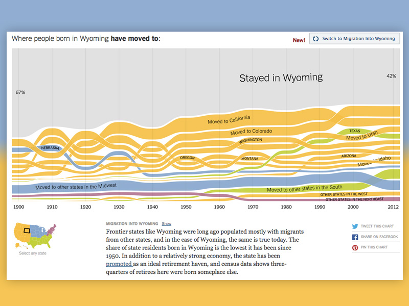
This is an NY Times chart that maps out the migration patterns in the States ever since 1900 to present day. The chart is probably not as fascinating as its results are: You get the person’s complete info. Including their birthplace and moving destination (color-coded regions), and you can see how patterns changed year by year. The data comes from U.S. Census records.
The availability of free streaming services inspired us to look for music data visualizations. And we decided to check the stats for one of the best bands of all times: The Beatles. Here, you can access their complete career information, including hit songs, popular lyrics, and the albums they released between 1964 and 1970.
Check out: Beautiful Graphic Illustrations
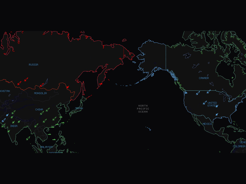
This extraordinary War Games map of the world was the unique discovery of mapmakers Allan Walker and Anya A’Hearn, who seem to have known plenty about digital aesthetics even in the 1980s. The chart features open-source data related to nuclear weapons whereabouts for multiple countries in the world.
Missile ranges close to few Eastern European cities.
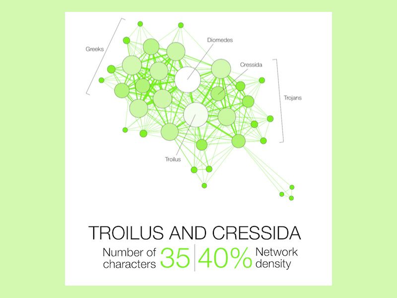
Most probably connected are two characters when they appear in the same setting. For the purpose of depicting that connection, their weighted degree has to be proportional to their color intensity and size.
By network density, we refer to the work that needs to be done for the graph to be 100% completed. Only those graphs where all edges are between the nodes can be considered as complete graphs.
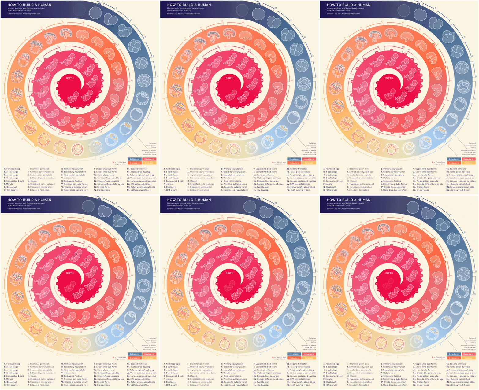
Eleanor Lutz introduced her mobile/mini visualization called How to Build a Human, where all stages of fetus development are displayed in a chart. Following the process between fertilization and birth with more than 40 animations, 9 frames each.
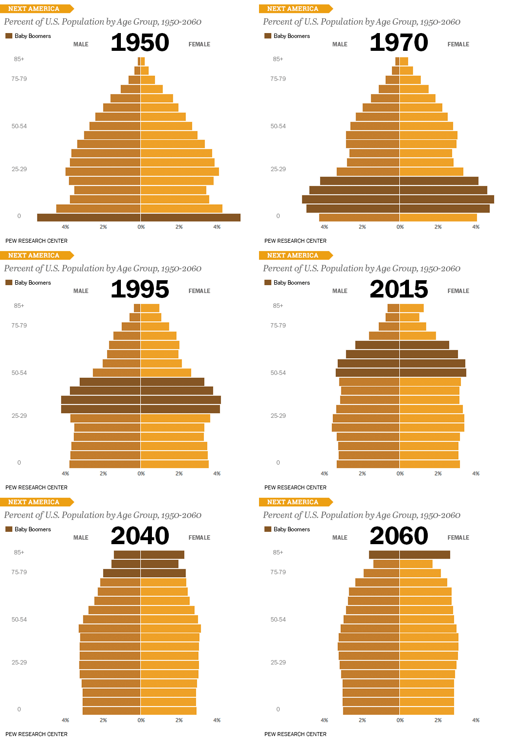
Let’s have a look at Next America’s U.S. Age Pyramid. The current visualization made by Pew Research Center illustrates the most prominent changes of the U.S. nation over the years. In order to depict trends and forecast challenges that may appear in upcoming years. There are five year age cohorts in each bar, the youngest ones (0-4) being the lowest, and the oldest ones (85 and above) being on top.
As far as we could understand, the original idea was not to make a pyramid. But the authors claim the pyramid simply imposed itself as they were breaking population numbers. Even more, they believe that the pyramid will transform into a rectangular shape by 2060. Just as many Americans aged 85 plus will exist as Americans aged less than 5.
Namely, their conclusion was that despite the lack of scientific confirmation, lower birthrates and longer life spans can’t have a result different than that one.
Check out: How To Create a Good User Interface : Essential Tips for UI Designers
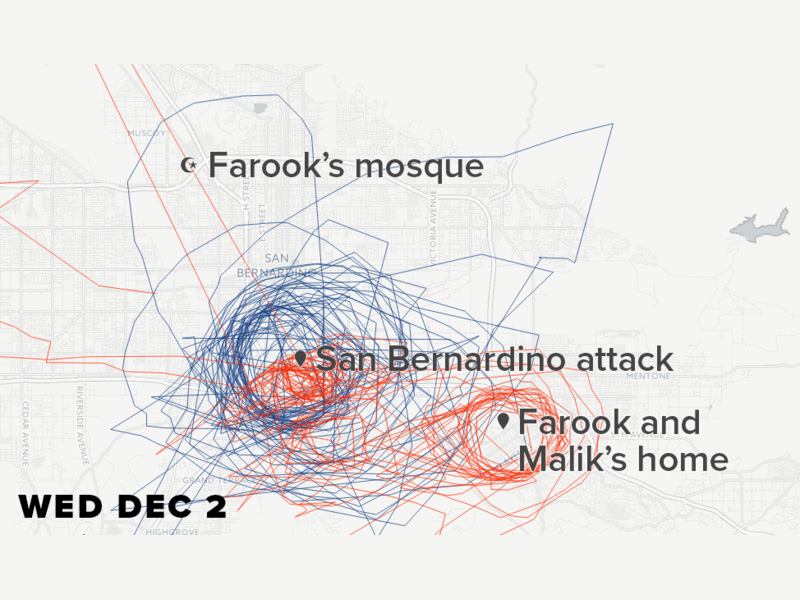
Upon examining this visualization, we can only praise the work of Charles Seife and Peter Aldhous (Buzzfeed News editors), who received the prestigious Data Journalism Award for it in 2016.
Their reports tackled Sky Spies and were based on FFA domestic surveillance and traffic records for which they obtained a special U.S. government permission.
It seemed like a dead-end street, but Seife and Aldhouse were persistent. Using the R language to draft their visualizations, they used the most of their tools’ flexibility to render reliable results. And display those in a visually pleasing studio, even if R language is not such a common choice for complex analytics. The award they received only proves how experienced they actually are.
Check out: Ways Design Thinking Enhances Customer Experience
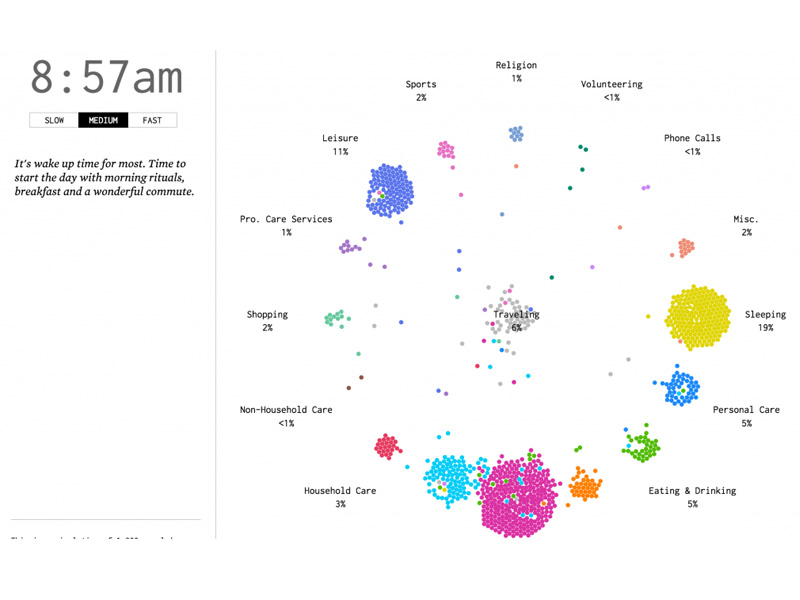
Flowing data pleased us with another great visualization which displays American Time Use Survey data to reveal common citizens’ trends for different periods of the day.
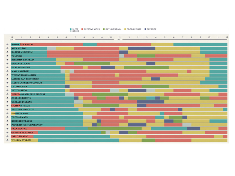
Obviously, there is little one could do with information such as ‘What do your breakfast habits say about your personality’. But there are few excellent reads that can entertain you, and reveal a couple of smart data visualization design practices. The previously mentioned Podio is a great example.
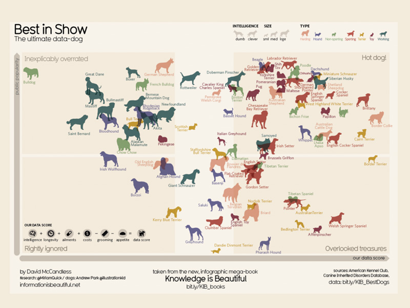
This is another beautiful intelligence-based data visualization displaying the main characteristics of few dog breeds. Whose main idea is to plot against the popular visualizations provided by the American Kennel Club.
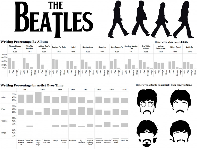
In this case, Mike Moore revealed the approximate writing percentage for multiple Beatles album, trying to detect the one that contributed the most to this band’s popularity.


