The Internet has evolved from a simple information portal to a powerful media sharing platform, and a major transformation has occurred only recently. Modern Web designers have adapted to the previous decade’s evolutionary leap, but the internet has not stopped or even slowed its progressive change.
Web designers are no longer limited by technology, as high resolution screens, text rendering, and high resolution screens have allowed for elegant web typography that can be stylized in an all but infinite number of ways. The expert web designer can express personal ideas very well by carefully selecting from the wide variety of available typography design elements.

Typography, the art of arranging type, should be a priority for a web designer. Visitors viewing websites often overlook the colors, images, and sounds on the website and go straight for the text so that they may accomplish their objectives using the webpage. Thus, all the bells and whistles should take a backseat to quality, thoughtful typography when creating a useful website.
The text of a page is the communication source, thus typography is important to deliver a message that is easy to read and in a tasteful manner. Great typography is accomplished using several elements.
Message
Before plunging into design elements, you must carefully consider the message you want to convey to the reader, and you must constantly be considerate of that message.
A page announcing a fundraiser to benefit a non-profit organization would use typography and graphics that convey confidence and hope. Through this the organization will accomplish its goals of increased donations while a page for a sporting event will need typography that expresses excitement, fun, and aggressiveness to convey to the visitor that this event will be worth attending.
With your intended message in mind, choose font elements that express the intended message and use that message to control the direction of your typography.
Textual content
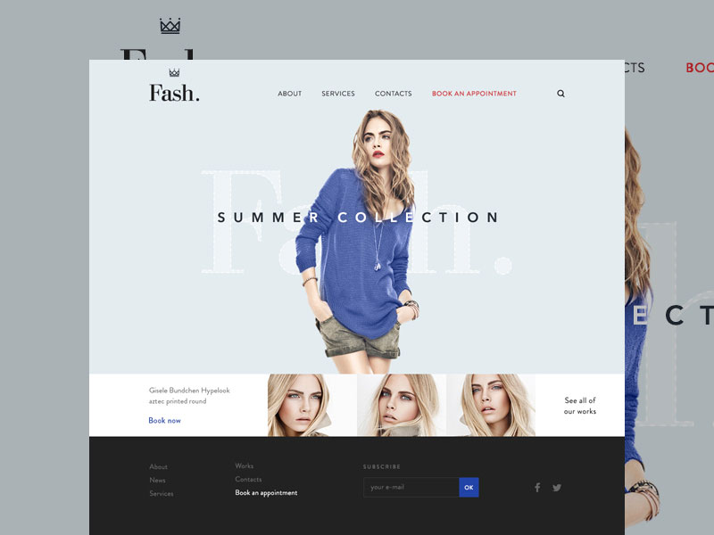
The typeface of the text will determine the tone that the reader senses from the content, thus you can use it to convey a tone that will help to communicate your message.
With the proper tone, the reader is primed to receive the message as the designer intends, and the typeface will reinforce the tone throughout the content, which will reinforce the intended message.
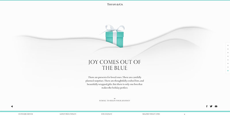
Quality web typography is consistent in its tone, and a designer should be reevaluating the textual content throughout the construction process to ensure that the tone does not deviate throughout the page.
Impression

Visitors to a web page will likely form a first impression, and it is the job of web typography to make that impression correspond to the message within the text.
A page directed at conservative professionals must immediately formulate the impression that the text to be read is serious, professional, and competent while a page directed at creative young artists should form an immediate impression of creativity and free thinking.
In order to accomplish the appropriate tone, a designer must research and understand the message’s intended audience.
Hierarchy
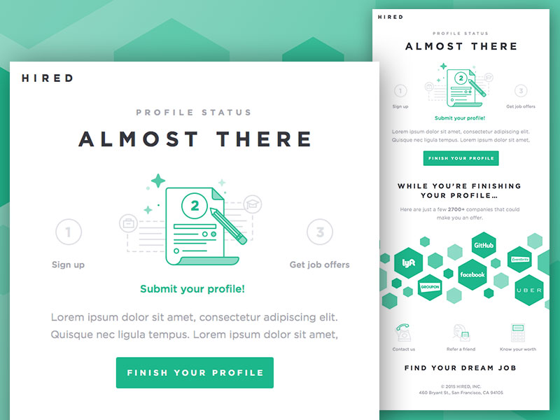
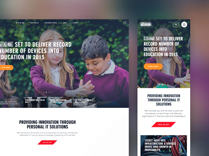
A well developed hierarchy is crucial for nearly any website, and typography can provide a map that tells the visitor where to start reading and how to navigate through the content. A web designer should know the intended hierarchical order prior to laying out the content.
By using different sizes and typefaces, you can direct the reader to be more considerate of the more important statements in your message and sections in the content that warrant closer inspection. Typographical hierarchy can actually convey a message better than other design elements when it is conducted skillfully.
Placement and size
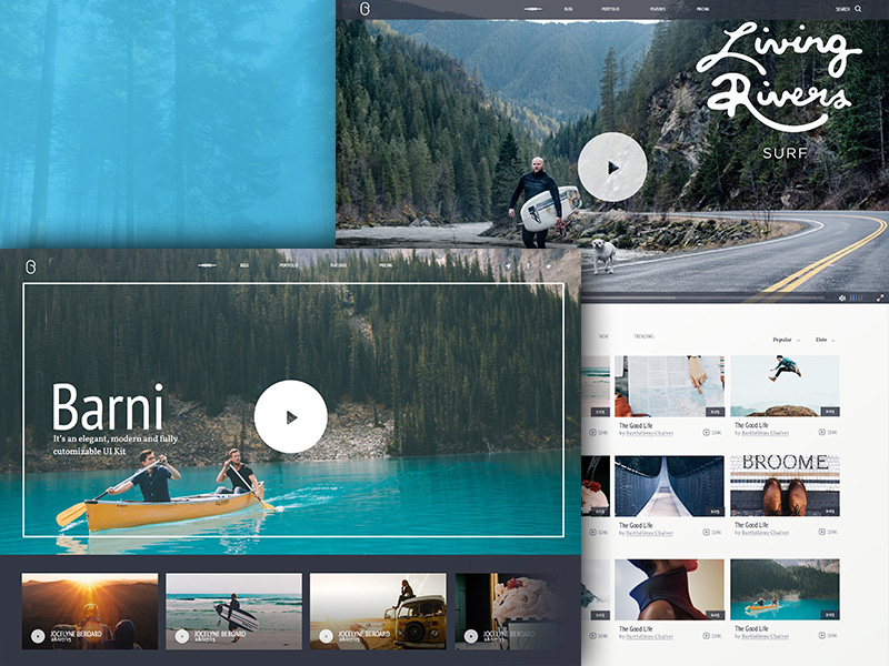
The placement of the text as well as its size are extremely important in creating great website design, and you must understand how to create a balance between the extremes of large and small text.
Content that is too small will cause eye strain while excessively large content can be laborious to read, and most readers will avoid type that is unpleasant to the eyes. Creating text sizes and placements is a skill and it may take some patience and much experience in order to properly execute these elements effectively.
Large headers

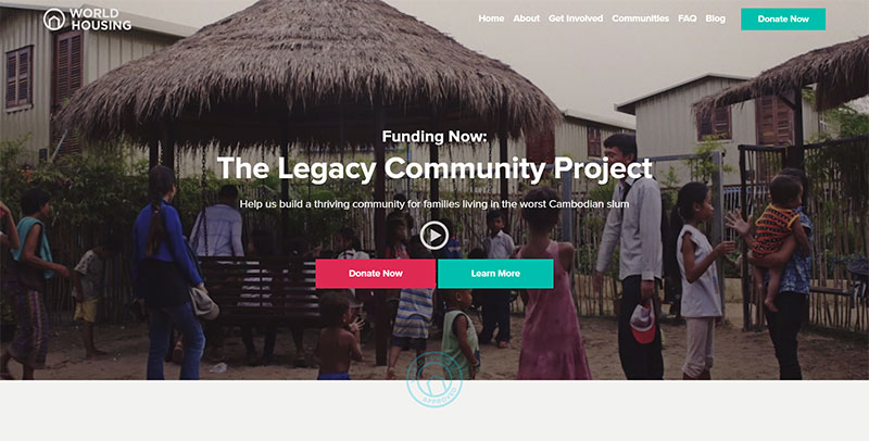
One very important and effective web typography element is large, oversized headlines and tags. These are use quite extensively in modern website design because they grab the viewer’s attention and create an introduction for the rest of the text within that section.
Search engines regard these tags as important, which make them all the more critical in effective design. Default settings on most word processors place these headings in bold and large font size, which further underscores the importance of creating large, noticeable headlines and tags.
The paragraph content should work well with the large header and be a large enough font size to hold its own place without being overshadowed by the header.
Colors
The color in typography is one of the more easy elements to understand and one of the most fun for experimentation. At its basic level, the text color should contrast with the background and make it easy to read.
Contrasting colors, such as yellow and purple can add to interesting typography, particularly in headers and tags, and different color intensities can make them more interesting. Experiment with various color schemes and patterns to create attention-grabbing design that compels the viewer to read the text within the headlines.
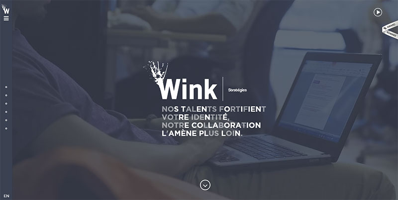
While you may want to use different fonts to make the text more interesting, avoid the tendency to use too many, as they may obscure the intended impression and become distracting, thereby reducing the reader’s focus level on your message. While 2 or 3 different fonts are ideal, 5 or more can become problematic.
Typography as an art of arranging type to convey and reinforce a message is often overlooked as an unnecessary design element. Many consider it to be far too labor intensive with little to no return.
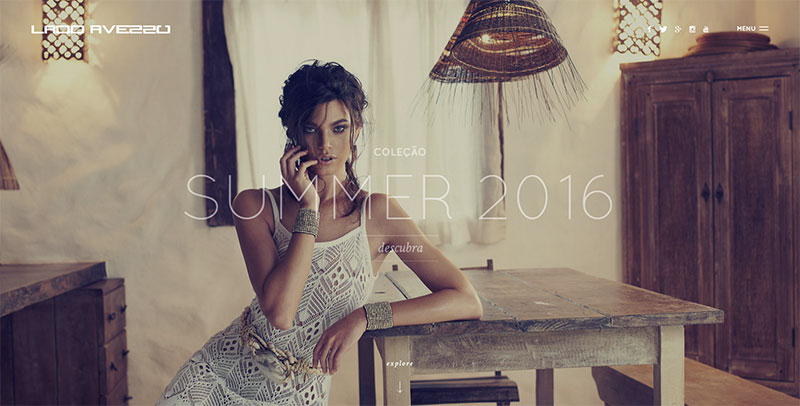
However, many people visiting a website commonly jump right to the text, overlooking the other design elements on the site in an effort to get the message and knowledge they need from the content. This makes typography very important in creating an appropriate tone and catching the eye of the casual viewer to read the entire message.
Through font elements like size and color as well as hierarchy and placement, typography can set the mood and style of the content to match the intended viewer and very effectively convey the intended message.
When executed skillfully and with great care, typography can transform textual content from words thrown on a page to a beautiful centerpiece that adds to and enhances the design of the entire site.
