User interfaces are vitally important for websites, apps, software, games, and more. After all, they’re how users interact with underlying code!
Because of this, a UI can heavily impact whether a user or site visitor has a good time and can find what they need or clicks away disappointed. UI designers need to know how to create a good user interface from scratch. This article will list 15 essential tips to help you do just that.
Do Your Research
First, research your target audience or the expected user for your app/platform. Different users have different expectations and design appreciations. For example, young users might be a little more tech-savvy than their grandparents, so you don’t need to make large buttons.
On the flip side, if your target audience is indeed elderly folks, the UI should reflect this by being simplistic, streamlined, and easy to see.
Organize Information by User Expectation
Come up with an information hierarchy early in the design process. You should organize all the information on a page logically.
For example, users expect contact information to be at the bottom or top of the page, not smack dab in the middle where a page’s main content is supposed to go. Keep this in mind when designing headings or buttons as well.
Keep It Simple
When in doubt, simplicity trumps complexity, at least when designing an effective user interface. Focus on keeping things simple and easy to use instead of coming up with creative but complex buttons, systems, or user pathways.
For instance, say that you need to design three distinct pages for a company’s three different services. Instead of putting all three services underneath a tab, which a user has to move a cursor over and then down to click on each service, consider putting a button for each service at the top of the screen.
Then prospective users can simply click on the service they want to view. Keep it simple above all else to benefit yourself and your clients.
Elevate your UI design prowess with the help of these UI Design archives
Focus on Intuitive Access
Similarly, intuitive access is important when designing successful UIs. Usable and intuitive UIs:
- Allow people to complete tasks quickly
- Are pleasant to use
- Have very smooth learning curves
The last point is especially critical. An intuitive UI is one that someone can quickly learn and engage with after a minimum of trial and error. The more someone has to work to learn a UI, the more likely they’ll drop your app or platform in favor of a competing experience.
Keep Mobile Users in Mind
Over half of all Internet traffic comes from mobile users these days. Therefore, every UI designer needs to design their experiences with mobile users in mind. Good mobile UIs:
- Can fit on smaller screens common to smartphones
- Have large and easy-to-touch buttons that don’t crowd one another
- Are responsive and load quickly
Make All Areas Easy To Find
Every area on a website or app must be easy for users to find. Otherwise, they could click away to another site or delete an app/software program entirely. Therefore, don’t hide site pages or other areas in folding lists, at the corner of the screen, or in unexpected areas.
Make all the primary areas of your website easy to find at the top or bottom of the screen. Furthermore, take the earlier advice into account and organize the areas logically – primary services, for instance, should come before secondary services, which should come before an “About” page or similar content.
Prioritize Visibility
Highly visible buttons and pages are key to creating an enjoyable and easy-to-use UI. If it’s easy for users to see all the major design elements of a mobile app, platform, or website, they’ll be more likely to browse the site in detail and flip through all the pages you’ve organized.
This is doubly true if you keep mobile users in mind, as mentioned above. Mobile users need to be able to see all the major buttons and site elements to tap on them readily. For example, GetWeave’s UI is visually easy to grasp from the get-go.
Use Highlights and Shadows
UI designers should use highlights and shadow elements to convey depth and realism to a page. By default, each UI has an ambient light source. You can add shadows to the experience to simulate physical pages on the screen or make a site seem more “real” and three-dimensional.
This, in turn, makes your UI connect more easily with the user and can elevate a site or platform in a subtle yet noticeable way.
Use White Space Smartly

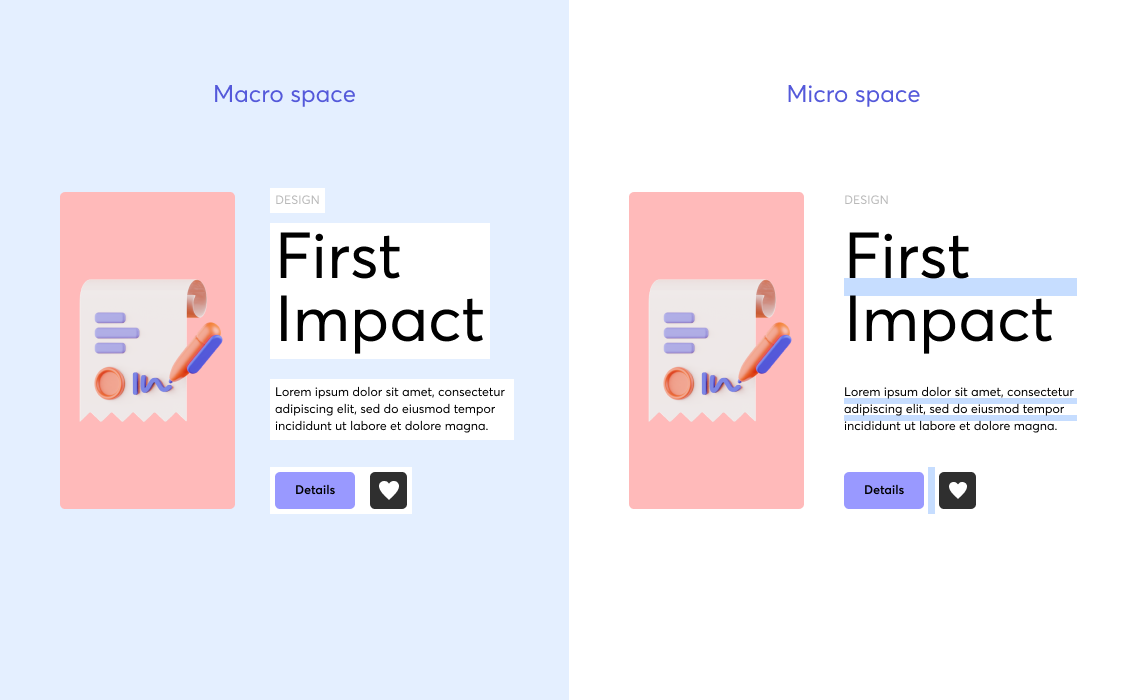
By the same token, UI designers should use white space logically and wisely. Also called negative space, white space is heavily useful for visually separating elements or pages. You should use white space to:
- Direct user attention to sections of the UI you want them to focus on
- Associate or dissociate different elements with or away from each other
- Make certain elements stand out by isolating them from others
Stick to Recognizable Icons/Symbols
If your UI calls for symbols for buttons or pages, use well-recognized symbols rather than creating your own. For example, an “X” is almost universally recognized as a proxy for “no.” Therefore, use “X” when offering visitors the option to say no to an offer, rather than some other, more confusing symbol.
Pick a Comfortable Font

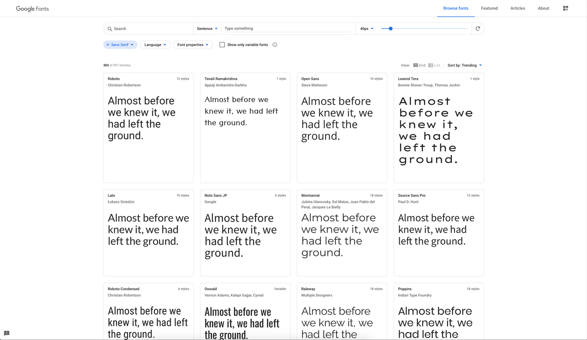
The font you choose for your UI can significantly impact its comfort and ease of use. Font and typography should be legible, simplistic, and stark against the background. Black text against a light or white background is usually ideal. You should also ensure that the font and typography are large enough so that viewers don’t strain their eyes when browsing your pages or apps.
Be Careful With Dark Themes and Colors
In keeping with the above advice, you should only sparingly use dark themes or colors. Dark-themed UIs can be tricky to use properly. When in doubt, use your best judgment.
For example, entertainment or gaming user interfaces pair well with dark themes since these activities usually occur in the evening. In contrast, professional or work-related UIs benefit more from bright themes and colors for added visibility and focus.
Make Any Forms Short
Should your UI call for user submission or response forms, keep them short, simple, and to the point. Don’t require users to take multiple actions or respond several times for the same form. The more times a visitor has to complete an action, the greater the likelihood they’ll abandon the form and not fill it out in the first place.
Keep CTAs Brief and Sparing

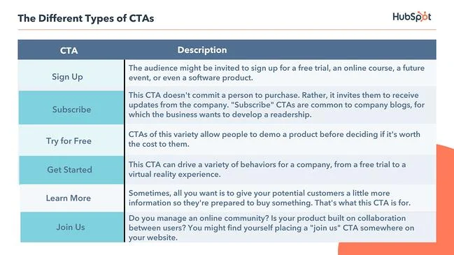
Calls to action or CTAs are major parts of websites, apps, and other digital experiences. But you should not inundate any of your UIs with CTAs. One or two CTAs (at most) are appropriate for most user interfaces/webpages.
Always Test Your UI
Lastly, be sure to test your UI with real people before launching it or giving it to a client. Real-world tests are the only way to ensure that your ideas or decisions are practically effective.
Wrap Up
Creating a good user interface ultimately relies on testing, following tried-and-true practices, and sticking to intuitive and streamlined designs. By following the tips above, you’ll create effective and easy-to-use UIs every time.


