Want to know the mystery behind the NBC logo meaning? You’re in the right place!
NBC started in 1926 and is the oldest big TV network in the US. It owns 13 famous TV stations and works with 200 others.

NBC has been around for nearly 100 years, always pushing boundaries and being very successful.
This article will explore NBC’s history and the story behind the famous logo.
Table of contents
Brief History Of NBC
Established in 1926, NBC stands as the oldest major broadcasting network in the United States, boasting a captivating history and narrative.
Under the ownership of Comcast through NBCUniversal, this American television network is renowned for its elegant and minimalist logo.
Yet, what truly captivates the imagination is the fascinating journey behind its iconic symbol, which has left an indelible mark on the global stage with its beautiful and sleek design.
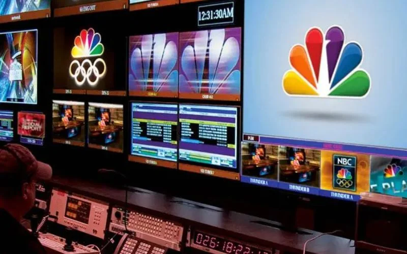
The renowned peacock logo has transcended mere fame, imprinting itself not only in the annals of the network industry but also in the collective consciousness.
While NBC is now synonymous with its multicolored peacock emblem, the evolution of the logo to this iconic status is a narrative worth exploring.
Also read: The Holy Grail Of Dos and Don’ts For Retro Logo Design
Significance Of The Logo
The NBC logo is famous, creative, and clever. It has changed a lot over time, starting from something completely different to the shiny peacock we see now before the news and on our favorite TV shows. The modern version of the peacock symbolizes NBC with bold colors.
This logo is powerful, stylish, and contemporary. Its colors represent the brand and its parent company, recalling the time when NBC was at the top of its game in the industry.
It’s an easy-to-understand and attractive logo, with lots of meaning packed into it. The peacock remains white, with its beak in purple. The colors also stand for the six divisions of the company.
This simple, modern, and adaptable logo is very exciting and attention-grabbing. Its simplicity draws you in, while its brightness keeps you engaged.
Also read: The Importance Of A Well-Designed Business Logo
NBC Logo Meaning
Just by looking at the logo, you can tell it’s special because of its many different colors. The logo is made up of different parts that come together to make a beautiful design, but what really makes it pop are the bright colors.
When you see the logo, the first thing you notice is the mix of different colors and the movement it creates. Each part of the design shows something about the company and helps promote it.
Modern logo design has lots of cool features, and each one in this logo was chosen on purpose to represent the company.
Here’s what each color means:
- Purple stands for stations.
- Green represents productions.
- Orange is all about sports.
- Blue is for the network itself.
- Red is for entertainment.
- Yellow is for news.
Also read: Amazon Logo Meaning : History & Significance
Popular Slogans Of NBC

Here are a few popular NBC slogans:
- Have the Time of Your Life with NBC
- The Year of the Peacock
- If It’s Really Special, It’s on NBC
- It All Adds Up on NBC
- It’s Happening on NBC
Also read: Here’s Why You Should Use Eye Candy Color Schemes
To Sum It Up
The NBC peacock logo goes beyond just different colorful elements. It represents a rich history and a story of innovation.
From its beginnings in 1926 as the oldest major broadcasting network in the US to its iconic peacock emblem that symbolizes different aspects of the company, the NBC peacock logo meaning has been significant.
As we continue to watch our favorite shows on NBC and see its logo displayed proudly, let us remember the significance behind its design and the journey it has taken over the years.
The NBC new logo is not just a symbol; it’s a reflection of the network’s legacy and its commitment to bringing quality entertainment into our homes.
Like this post? Check out more amazing web design content here.