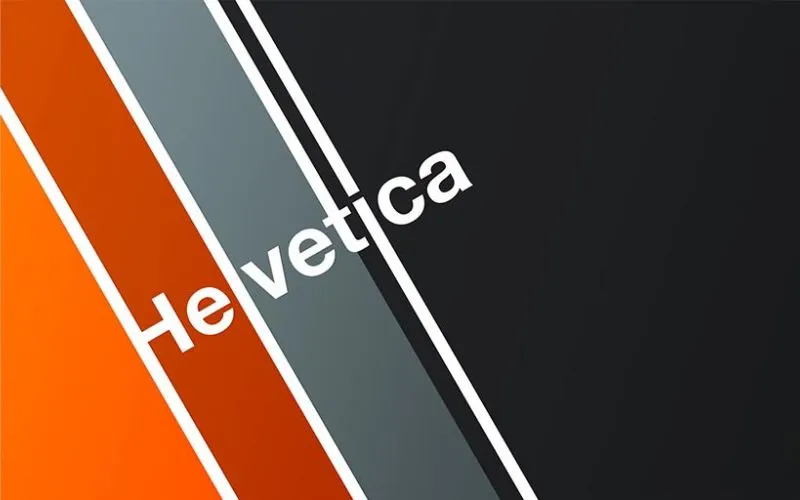
Ever wondered why Helvetica is one of the most famous fonts in the world? Today, we’re diving into the story of one of the most iconic typefaces ever created: Helvetica. The history of Helvetica is just as fascinating as its simple, clean, and universally recognized design.
Helvetica’s designers crafted it with sleek lines and a neutral style, making it a versatile and universal typeface that perfects everything from street signs to corporate logos.
In this journey through the history of Helvetica, we’ll explore how this font went from a Swiss creation to a global design staple everywhere today.
Table of contents
- Who Designed The Helvetica Font & When?
- History Of Helvetica Font
- Famous Brands Using Helvetica Font In Their Logos
- What Are The Types Of Helvetica Fonts?
- Why Is Helvetica So Popular?
- What Is The Difference Between Arial And Helvetica Font?
- History Of Helvetica Regarding The Technicalities
- History Of Helvetica Font Classification
- Popular Usage Of This Font
- Commercial Usage Of This Font
- What Is Helvetica Neue ?
- What Font Is Similar To Helvetica Family?
Who Designed The Helvetica Font & When?
In 1957, a talented Swiss type designer named Max Miedinger brought the Helvetica font to life. Miedinger and his colleague Eduard Hoffmann set out to create a clean, modern, versatile, and timeless typeface.
They aimed to craft a font that could be used in various settings while looking effortlessly stylish.
Little did they know that Helvetica would go on to become one of the most iconic and widely used fonts in the world, leaving a lasting mark on design and typography!
History Of Helvetica Font

As one could conclude by the name, Helvetica has Swiss origins (at first, it was called Neue Haas Grotesk, even if that probably sounds like a 1980s German factory instead of a font).
It has become one of the most popular fonts in the world. Since then, it has been modified into a range of languages and has various variations. The typeface is used in many modern operating systems and other electronic displays.
It appeared in 1956, and Eduard Hoffman and Max Miedinger deliberately created it to cherish the new Swiss Style. This gave it extraordinary importance, almost like a postwar utopian mission.
Explore this guide on using fonts efficiently in web design.
While modern architecture was slowly stripping away superfluous architecture, Swiss typography followed and snipped off stone-carved and frivolous serifs. The era of modern industry was starting, and communication had to be clean and fast!
Expand your font knowledge with these insightful resources:
- Alphabet Fonts: The Ultimate Guide
- How To Use Fonts Efficiently In Web Design
- How To Choose The Right Font For Your Website
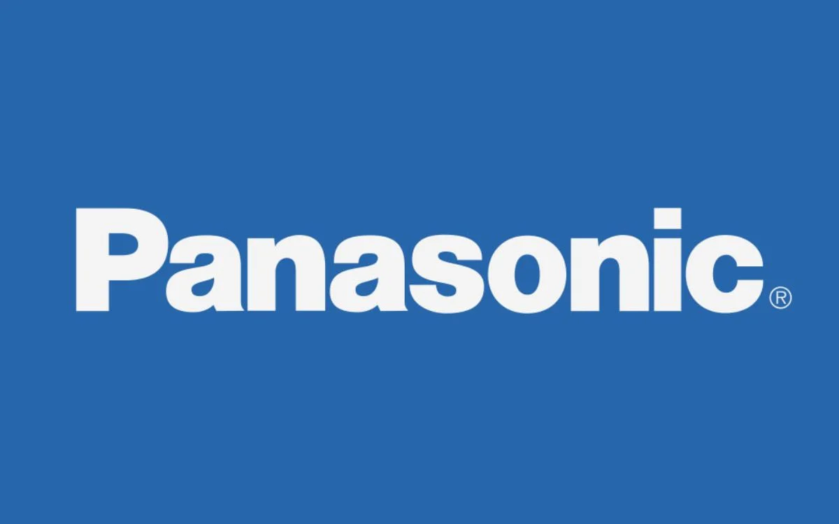
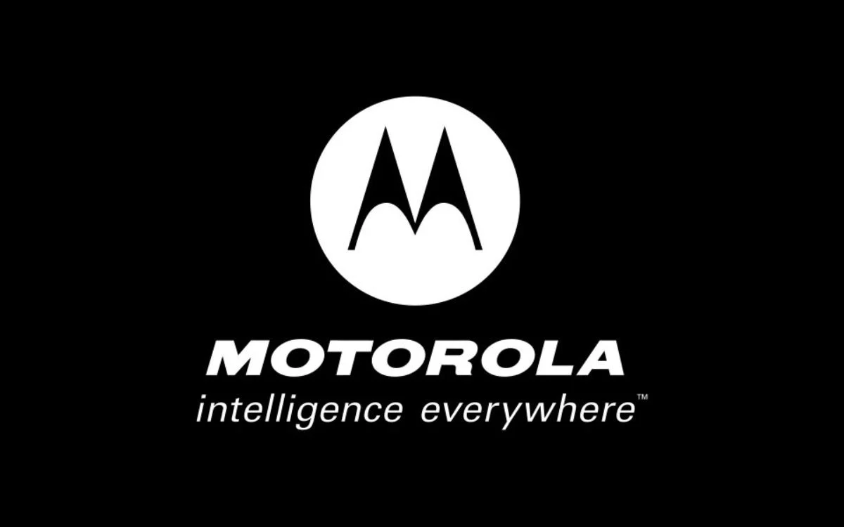
Famous Brands Using Helvetica Font In Their Logos


What Are The Types Of Helvetica Fonts?
Helvetica types varied many times, resulting in multiple font types and Helvetica variants available (Korean, Hindi, Cyrillic, Japanese, Vietnamese, Greek, and many others). The alphabet was not the only distinguishing criterion, and the Helvetica type soon evolved to:
- Stempel’s Helvetica Light, designed by Arthur Ritzel and artistic director Erich Schultz-Anker
- Mathew Carter’s Compressed quite similar to Inserat, but still not identical
- Helvetica Textbook, a product of altering characters for informal design
- Helvetica Rounded, designed in 1978, is comprised of rounded stroke terminators. It can be used only in its black and bold version (oblique and condensed included) and has an outline version that was never available online.
- Neue Helvetica, a modern 1983 version with unified character width and height, is considered the most legible due to the enlarged space between numbers and the bigger punctuation marks.
Also read: Learn The Difference Between Typography And Lettering
Why Is Helvetica So Popular?

Many experts agree that the biggest factor influencing Helvetica’s popularity was Steve Jobs’ decision to use it as the basic font of the Apple operating system, even though the font had already become a design classic years before computers appeared.
As we already mentioned, the creators developed Helvetica after the war, imbuing it with a symbolic value of change for the better—a belief held by many companies. At the same time, it was a way to escape from overdone, kinetic typography and to develop unique advertisement strategies.
Companies understood the font’s power to convey a professional statement and transform their identity because of its modern sensibility and sleek lines that have nothing to do with the past.
Years went by, and it reaffirmed its leading corporate position, being recognized by leading businesses such as American Apparel, which used the font to add playfulness to America’s corporate culture. Besides, there is hardly a texts on picture app where this font is missing
Check out: Is There A Place For Serif Fonts In The Digital Age?
What Is The Difference Between Arial And Helvetica Font?

Typefaces, the same as people, vary from one another due to their features. Sometimes, they look so similar that we can’t notice the difference, but a closer inspection would still deny the presence of casual perusal. It would reveal subtle but essential differences.
They can be so tiny that one must take out his magnifying glass to notice them.
Check out: Best Calligraphy Fonts To Spice Up Your Writing
A good example is Arial, a typeface developed in 1982 with incredible similarities to Helvetica. If you haven’t trained your eye to see their differences, you’d probably think you’re looking at the same typeface.
The dissimilarities are small, but very important, especially 3, r, t, a, R and G.

If we had to generalize, we’d say that Helvetica looks more sophisticated and refined, which would again be difficult to notice because of the identical character width.
They are so similar because Arial was created to be a competitor (following the example of Helvetica and Akzidenz-Grotesk), even if the original idea was not to design an identical twin.
Developers worked with the Monotype Grotesque® typeface to create Arial, which means they intended to ‘soften’ Helvetica with fuller, rounded curves and more open counters.
This is especially visible on the stroke ends of ‘e’, ‘g’, and ‘c’, which are not horizontally cut as in Helvetica but are terminated naturally following the stroke direction.
Check out Modern Fonts To Express Your Ideas

We can’t say if there was a battle between the two, but Arian and Helvetica managed to stay on the scene and become the most popular fonts one could use nowadays.
For the sake of truth, Arial is more frequent because it is associated with Windows. At the same time, Helvetica maintains leadership in the print design world and is still releasing new versions and types (Linotype, for instance).
History Of Helvetica Regarding The Technicalities

Observed through the technical prism, this font offers many interesting advantages. It is the most recognized and appreciated sans-serif font, and there are a few good reasons for it:
- Characters always have their strokes horizontally/vertically terminated; diagonal is out of the question.
- It pays attention to the negative space around the letters and uses it to make character lines more impressive.
- The negative space visible on the ‘a’ character was a design mistake which became a popular ‘teardrop’ symbol.
- Stroke weights are monotone.
- Automakers and airlines highly appreciate Helvetica’s readability even in motion.
It will continue holding the throne because it deserves to.

Consider it: even the most innovative and passionate designers prioritise Helvetica as good enough to become timeless. As of now, we cannot replace Helvetica. And the only trend one could expect is for Helvetica to become even more ubiquitous in every sphere.
What is undoubtedly out of the question is that this font looks fantastic and uses such a reputation to dominate the commercial sphere and ‘speak’ of business. Arial is a fair substitute, but not that much in terms of quality. But because people don’t distinguish the one from the other.
Besides, it is being promoted on Windows, too, and it is more than likely to replace the far more neutral Arial typeface.
Also read: Typography Visual Hierarchy And What It Means

Overall, Helvetica is a good choice for those looking to write a formal and elegant piece but also for those who prefer to balance conservative and edgy, modern and traditional, or elegant and casual. This amazing font can do it all!
Once again, generalizing once again, this font tends to look more modern than classic. But that’s only because it belongs to the sans serif family. How it will work for you will depend on the elements you want to include. You can use it for a more traditional scenario whenever you decide.
Also read: Typography Terms That You Should Know

Meanwhile, Helvetica helps you stay on the safe side. You can use it as your fall-back option when blowing hot and cold on particular typefaces and their impact on your design.
No wonder this font is so popular among beginners and design students. They all use it for a safe ‘kick-off’! However, this font lacks the daring to complement unique projects sufficiently. One can’t use it to stand out from the crowd.
Check out Beautiful Web Typography – Best Practices And Fonts To Use
History Of Helvetica Font Classification
Helvetica is a sans-serif font, meaning its letters lack rounded tips or tails. Serif fonts like Times New Roman have these tips and tails. Books and other printed materials often use them. Sans-serif typefaces like this remain the most popular choice for websites and other digital material because their clean look is easier to read on screens.
Popular Usage Of This Font
The Linotype Corporation originally owned the rights to the Helvetica typeface. And then licensed its usage to companies like Xerox, Adobe, and Apple at the start of the personal computer revolution. The font became one of the primary typefaces in Apple’s Mac OS operating system. Until 2015, iPhones and iPads used it as the default system font.
Helvetica lost some popularity in the 1990s as desktop publishing software became more complex and offered substitute typefaces with more variation.
Check out Techniques To Improve Your Design Typography
Commercial Usage Of This Font
Let’s explore the commercial usage of this font in the history of Helvetica. Monotype, the company that acquired Linotype and its assets, now owns this font. To use the font in commercialized projects, you must subscribe to a package through Monotype’s licensing system. Subscription packages are available for monthly or yearly pricing.
Large corporations like General Motors, Jeep, Target, and Verizon use this font for printed branding and in computer operating systems and word processing software. Transportation signage, including for the MTA in New York and the Washington DC metro system, also uses it.
Discover Pixelo’s New Free Fonts and Designs For Commercial Use
What Is Helvetica Neue?
Helvetica Neue is like the cool, updated version of the classic Helvetica font, giving it a fresh twist while keeping its beloved charm. Released in 1983 by the Swiss design team that brought us the original Helvetica, Helvetica Neue refined the font’s classic look with a more modern and versatile touch. It offers a range of weights and styles, making it a go-to choice for designers who need a stylish and adaptable font. Whether on a trendy website, a sleek app, or a bold billboard, Helvetica Neue keeps things looking clean and contemporary, proving that sometimes, even the classics can get a fantastic upgrade.
What Font Is Similar To Helvetica Family?
The history of Helvetica is rich. The official Helvetica font family includes a range of variations that offer light, bold, and compressed options. For designers looking for other Helvetica alternatives, the most common are Arial and MS Sans Serif. Both have gained popularity through the Microsoft Windows operating system and Office applications.
Several license-free substitutes have also emerged in recent years. These include Nimbus Sans L, FreeSans, and Liberation Sans, which is one of the default system fonts for RedHat Linux. Google widely uses the font Roboto on the Android smartphone platform, which was commissioned explicitly. We hope you enjoyed this exploration of the history of Helvetica.
Enrich your design palette with a wide range of fonts to express your unique style:
- Modern Fonts To Express Your Ideas
- The Classy Fonts Bundle Review
- Best Calligraphy Fonts To Spice Up Your Writing
- Is There A Place For Serif Fonts In The Digital Age
Like this post? Check out more fantastic web design content here.


