
As more and more designers and clients line up in halls of vintage, drooling all over its chic and memorable designs, the trend of creating retro logo designs does not give any sign of fading away. In fact, you’ll find more and more bloggers and designers (like us) dedicating their spaces to talk about retro logos and retro designs in general.
But to nail the retro design, it isn’t enough to just add a bit of grain to your logo image; there are rules and guidelines which have been placed to help you get your retro logo exactly right.
So let’s dive straight in and explore the dos and don’ts of retro logos.
Dos of Retro Logo Design:
Retro is not a style of design belonging to times gone by; its design that’s inspired by vintage art. While vintage refers to actual pieces of design belonging to the 20s, 30s or other previous decades, retro design refers to attempts to recreate designs that are throwbacks to that era.
Therefore, as the first rule of retro logo design, it’s important to get the era right.
- PICK AN ERA
As we’re designing a logo, it’s important to remember that our primary purpose is to create a design that’s easy to identify and has swift recall value. So whichever era you pick, make sure you use elements from that era that are relevant to your brand and which can help elevate your brand message.
For example, for a luxurious boutique brand, the art deco would be a perfect design choice for its brand logo. Art deco symbolizes extravagance, luxury, and packs a whole bunch of shine within its lines. With clean geometric shapes, you’ll be lending a very naturally sophisticated feel to your brand message with an art deco-inspired retro logo.
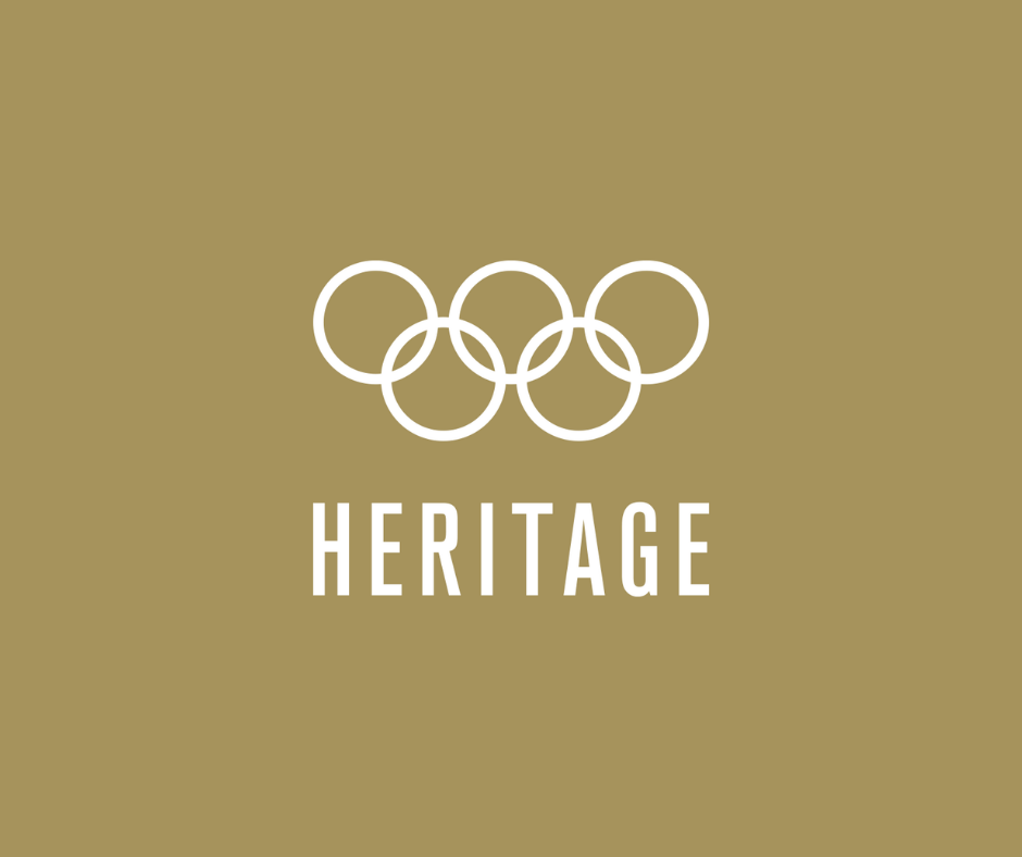
Image: Heritage
- GO WITH RETRO CHOICES THAT GEL WITH EACH OTHER
It’s unavoidable to completely stick to one vintage era when selecting elements from years past. So when you spot a few of the eras mixing up, always make sure that naturally gel together. For example, the 30s and 40s go on well together but if you’d try to include steampunk vintage with 30s conservative design, you’ll create a hot mess.
Similarly, incorporating emblems and badges reminiscent of the 30s and 40s with bright and primary colors that were all the rage in the 70s retro logo design will have a very impacting and stop-in-the-track effect.
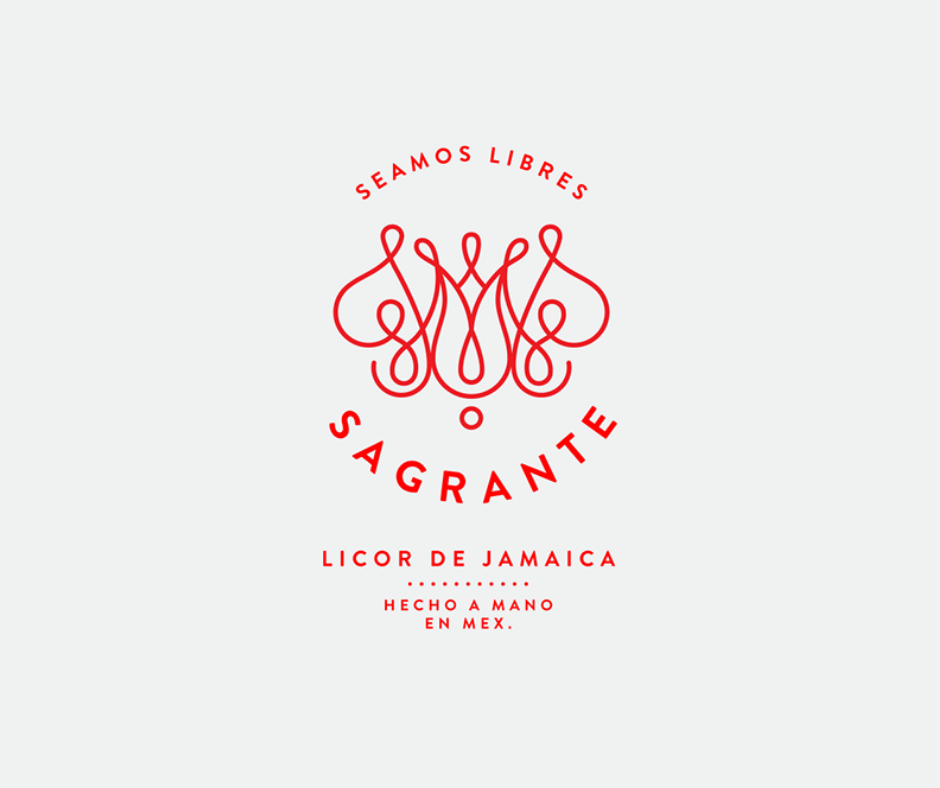
Image: Behance.net
- USE CLASSIC SHAPES: DIAMONDS AND TRIANGLES
Human beings recognize and process colors and shapes faster than they do words, according to research. Therefore, in terms of logo design, it’s important to be more strategic about the choice of shape you’ll give to your logo, the color you want to add in the design, and lastly the font.
In vintage designs, the most popular shapes have been geometrical shapes, most prominently, diamonds, triangles, and squares. Circles have also been used but they’ve been more or less restricted to badge or emblem designs.
When creating your own retro logo, think of what you want to convey and find the perfect shape that can carry that message forward.
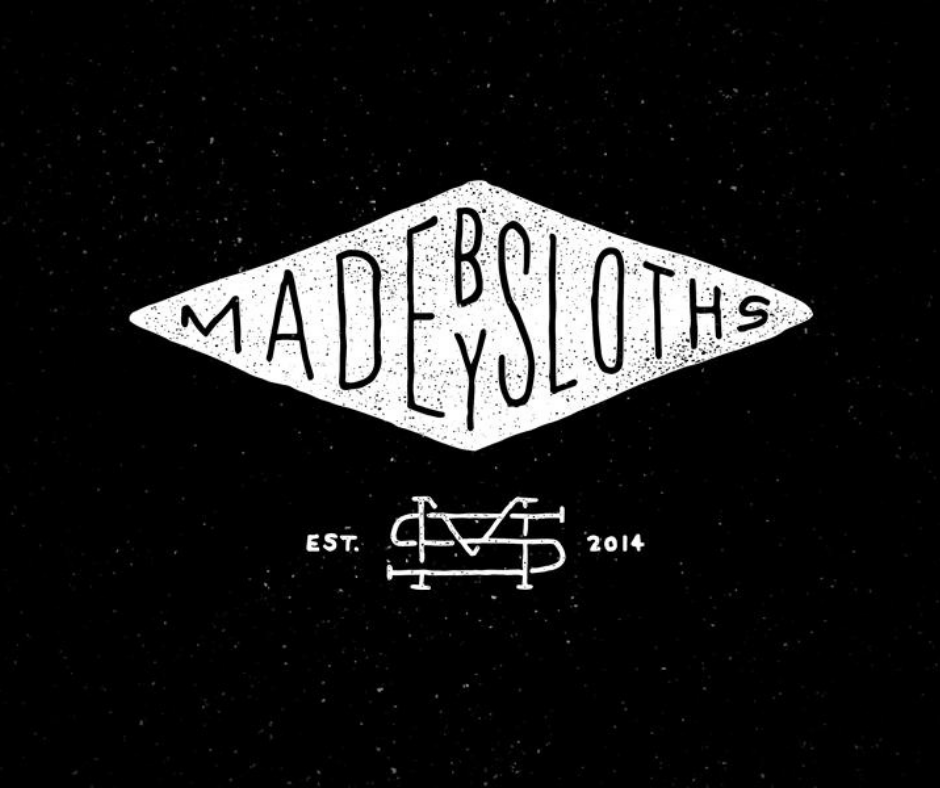
Image: Dribbble
- PAY ATTENTION TO TEXTURES
Retro logos are known to have a ‘lived in’ look. This look can easily be achieved by adding textures, grains, and details that can give the logo image a look of having been around for a while. This ‘grunge’ texture also lets the design feel quite nostalgic and intimate – like a favorite shirt which after having been worn repeatedly acquits some wrinkles that won’t ever go away.
Image: Behance
- HAND-LETTERED FONTS
Nothing is more vintage or retro than a hand-lettered something. Away from the mass production age of modern technology, it’s the hand-lettered note that has the most voice. When designing a retro logo, always make sure that you’re using a hand-drawn script or a computer-generated font that closely matches the hand-drawn letter.
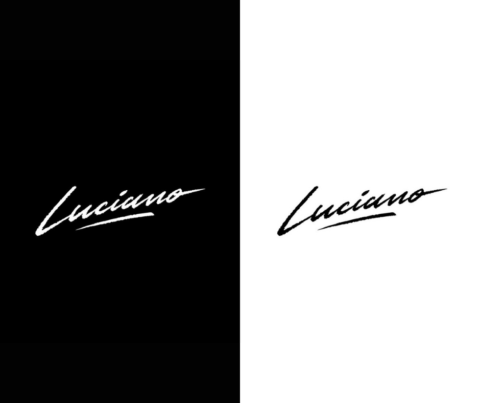
Image: Behance
Don’ts of Retro Logo Design
Following are the don’ts, beware of them:
- DON’T SKIMP ON RESEARCH
No matter how proficient a designer you consider yourself to be, you’ll always be limited if you’re not into research. Getting the retro design right especially demands that you make sure you know everything about the design era you’ve chosen as your inspiration. Go look at the real design pieces from that period, explore the flea markets, and visit a few vintage stores to get the feel of the time.
- DON’T OVERDO THE ELEMENTS
Avoid piling up one element over another in a single retro logo design. You’ll not only overwhelm the design itself but confuse the viewers too by giving them too much to look at and process. Remember to keep it simple. One point that cannot be emphasized enough is that no matter how much in love with vintage you are, your goal is to design your brand’s logo, so every design choice needs to be strategic and in service of your larger design strategy.
- DON’T MIX TIME PERIODS
As we’ve said before, sometimes you’ll see more than one vintage time period bleeding through in your design. When that happens, pay some careful thought of whether it’s happening because of a lack of knowledge or due to natural associations. If your design research is not thorough, you’ll forever struggle with spotting which trends are indicative of which past decade and that ineptness will translate into your designs.
Therefore, be conscious when choosing elements from two different vintage eras and make sure it’s a deliberate design choice intended to uplift and design your retro logo to perfection.
- DON’T FORGET COLORS
Remember to not forget colors. While you’ll see a lot of retro logos featuring black and white designs, don’t think going colorless will inherently make your logo feel vintage. Use the power of colors to its maximum effect in your vintage logos. If you are featuring a 70s or 80s theme, especially, using bright, neon colors in the logo will maximize your brand appeal. But even if your retro logo is more Art Nouveau, using pastel shades with clean lines will lend your vintage logo design an added effect.
- DON’T MESS WITH SUCCESS
This is the most important rule. When you’ve got a good thing going, don’t mess it up just because a trend that you like is all the rage right now. Compare the examples of Coca-Cola and Pepsi. While the former has been consistent in its logo design progression, never giving up the red or that nostalgic hand-lettered wordmark, Pepsi has had millions (ok, not millions, but still too many) brand redesigns that make the audience unable to associate any lasting attachment with the brand.
So when thinking of rebranding, be very careful and figure out if you really need one.
Conclusion:
So here are the dos and don’ts (five of each!) to help you nail your retro design inspirations. Just be strategic in your design choices, get your research down with all the details, and make sure you aren’t making any changes just for the heck of it. Do all this and your retro logo design will be sorted.
Author Bio:
Ayesha Ambreen is a creative content strategist, graphic designer, and featured Quora author. Best known for her creative visuals and viral content ideas, Ayesha’s work has been featured on blogs such as Smashing Magazine, HubSpot, Icons8, Lifehacker, and more. When she is not writing, she loves spending her time drawing snap art and reading books. Connect with her on Twitter: @AyeshaAmbreen