There are many interesting things to discuss about the current color landscape in web design. At first sight, it seems that web designers are not that keen to experiment, and they hold onto similar website color schemes, but the truth is that the use of color in web design is the key element that has to be considered.

Obviously, we are not indicating that you should reinvent the wheel, or combine colors in a revolutionary way that has not been used before. Our point is that there is a lot to mess up when using color in web design, such as making it rainbow-filled and overwhelming.
In the end, everything will be pretty, but nothing will stand out. And that’s where you’ve made your biggest mistake.
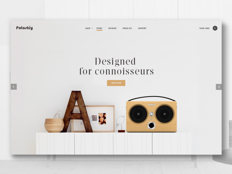
Image source: Roman
Table of contents
Regardless of whether you prefer monochromatic or playful solutions, you have to know what you’re doing when given color to work with. The website color palette doesn’t only have to be nice. It has to be strategically placed to provoke reactions. Here is how you can achieve that:
Your brand
The reason why most people launch websites is that they have a specific emotion or message to convey. That’s where colors come in handy: you can always relate them to your mission, so that people can guess what you’re doing even without reading your content.
For the sake of clarity, green companies’ websites make use of nature-inspired website colors, while toy-producers use a vibrant and colorful palette. Remember: there is no such thing as a ‘wrong color’! Every color is good for as long as it fulfills its purpose.
Check out this blog to learn about best practices for website design.
Image source: Ramotion
When it comes to branding, colors are equally important as logos. Nowadays, when revenue depends seriously on online retail, your business is literally left to the mercy of web designer to create an effective image that reminds of your traditional work line.
There is a lot to replicate and recreate in order to make visitors feel the same way as if they were shopping at the physical location of your company. As a business owner, you have to convince them that the innovative experience is equally effective, or even better.
Once customers recognize your business and the brand they’ve followed for many years, you can rely on this familiarity to increase the revenue of your company. The ultimate goal is to make loyal customers feel like home, and the only way to do it is to keep the real-time and online brand consistent.
Also read: The Secrets Of Color Filters In Web Design
The message you’re trying to convey

Image source: Jess Caddick
Conveying a ‘colorful message’ can be a really entertaining experience, especially while comparing colors to see which one looks most attractive. Guessing your customers’ taste shouldn’t be difficult – you already know this people, and you have a clear statement to make (a lighting fixtures producer who attached neon writings to his website).
The web design color palette will simply impose itself.
Intuitive navigation
You may have many interesting ideas on how your website should look, but there is a certain navigation scheme that you have to follow. Customers have to be given an intuitive path to move from one place to another, so that they won’t struggle trying to perform some basic action.
There are many visual tricks to ‘send’ users to the right point, as for instance colors and contrasts. This is the well-known diagonal balance, performing pretty well in Europe and the States, where visitors are simply used to scroll from to the top to the bottom, and to look for basic options in the upper right corner.
The colors for website design, on the other hand, create a hierarchy between the options, and indicate which actions should be performed/ avoided.
You decide what is important

Image source: Robert Berki
Is there something really important you want users to know? Tell them! Central elements on the page and bold colors are just cut for the purpose, because that’s exactly where users would go.
In order to attract attention, many websites use a basic grayscale appearance (black text on white backgrounds). Obviously, the page would be too plain without accent colors to break the monotony, which brings us to the next trend that has imposed itself during the years: filling buttons, links, and headlines with catchy colors that indicate what users should do.
Also read: Ways in Which Colors Affect Your Creativity Backed by Science
The degree of importance of color in web design
There are more and less important tasks on every website, ‘Sign up’ and ‘Buy Now’ being the most meaningful among them. ‘Cancel’, on the other hand, is not a priority. You don’t want visitors to use it, and it should therefore keep its profile lower than the other tasks.
Image source: Webshocker
In order to indicate that ‘Cancel’ is a secondary action, you should transform it into a small link, or use a neutral color that will blend into the overall picture. For instance, imagine ‘Cancel’ being the central part of the page, and ‘Sign up’ being a small link placed in the corner of it?
Doesn’t look so effective, does it? ‘Sign up’ should definitely be bigger, as it is a so-called ‘Call to action’ that indicates what the user should do next.
Primary actions should pop out, and the best way to achieve it is to use a contrasting color or size. Another useful trick is to change the background, so that nobody misses the button he’s supposed to push.
Images and color
Image source: uixNinja
Color can also be applied through images, in order to make the entire UI experience even more exciting. It can either be a large background photo or interesting shots of the product you’re selling. However you decide to design it, the composition will still manage to capture attention.
Does color really matter that much?
Well, we’ve seen colorless websites, and they were interesting. Color is, in fact, undesirable on professional websites which manage to look sophisticated without blues, reds, or greens. As we already explained, many designers rely on the grayscale rule, and they are still very successful when it comes to making a statement.
Also read: Basic Principles of Color Theory in Web Design
Considering color limitations
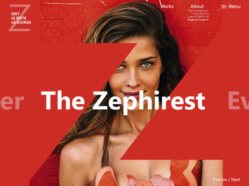
Image source: Kina Bayra
As you know, there are people with impaired sight ability who can’t distinguish colors. The state of color-blindness can appear in many forms. Most of the time affecting people in a way that they confuse red for green. These people are a part of your audience too.
Therefore, it is imperative for every designer to avoid using red/green on actions that are so important that they could spoil the entire interface.
Also read: Websites for Finding Color Mix Inspiration
Cultural norms of color in web design
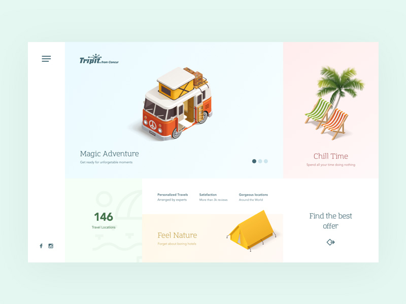
Image source: Wojciech Zieliński
There are many cultures around the world that interpret colors in a specific way, either as their national symbols or religious connectors. As a designer, you have to know your target audience and make sure that the way you’ve used colors is appropriate for their understanding of those colors.
At times, the difference doesn’t seem that important (red stands for luck in China, but for love in the US). But there are also situations where you can mess up seriously (the religious meaning of black and white, for instance).
Also, check out 10 Green Website Designs for Your Inspiration
Final thoughts – Color in web design

Image source: Petras Nargėla
Do we need to repeat how important colors can be? Colors can do miracles for your design, as long as you use them properly. They can help you create an intuitive interface, to reinforce your brand, and to convey a powerful statement.
The reason is that colors have a lot to do with personality. And designers invest a lot of efforts because they love how playful and reviving this experience can be.
Like this post? Check out more amazing web design content here.


