A landing page can generate conversions and if you really want to increase your ROI, you need to optimize that landing page. These are a few tips that will help you optimize landing page for lead generation and create a more successful business.
Table of contents
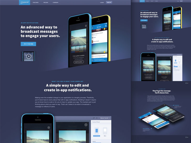
Simple Design For High Converting Landing Page

Image source: Greg Wilkinson
People have short attention spans and your window has only a few seconds to grab them. You want your high converting landing page to be very simple while getting users’ attention right away. You want your message to be “above the fold”, which is anything that can be seen without making them scroll down.
As simple as this may sound, it is amazing just how many businesses mess up at this first step.
Also read: Design Tips To Build A Top Converting Landing Page
Make Sure Your Traffic Is Going to A Relevant Page

Image source: Amanda Saffer
Traffic (visitors) come from a wide range of locations. You want to make sure your page has one clear message that everyone can relate to. You do not want your landing page to only favor one specific traffic source.
Check out this blog for an in-depth look at web design basics.
Keep Everything Consistent

Image source: Meray UYANIK
If your visitors sign up with your landing page for one service or product and your webpage is for something totally different, you will lose your customers and then there will be a major lack of trust in the future.
Avoid all this by keeping your messages consistent from the landing pages that convert, to the main website, to the product you sell. Keep the river flowing in the same direction!
Also read: Mastering The Visual Game Of Landing Pages
Your Headline Is Everything

Image source: Matt Pringle
You only have a few seconds to grab your visitors attention. Making a catchy headline or one that sparks curiosity will entice them to want to keep reading.
Segment Your Traffic

Image source: Jordan Flaig
To keep your page reliable for all traffic sources, however, you can also segment your traffic.
You can create separate landing pages for each traffic source and link them to different lists in your autoresponder. You will still be able to send traffic to your main site, but now your follow up emails will cater to specific sources.
This will you still help create a closer bond with your customers.
Message Matching

Image source: Denise Villanueva
When people click on a link in your landing page, you want them to feel like they made the right decision. The message after the click should entice them to want to keep clicking.
Also read: How Great Landing Pages Boost Conversion Rate and Aid Customer Retention
Remove All Distractions

Image source: Liam Tucker
Take a look at your landing page and if there is anything that moves your attention from the focus of the page, then remove it. You want your message to be the focal point at all times.
Don’t Add Useless Links

Image source: Naim Chayata
The vast majority of your traffic will be paid traffic. Therefore you do not want to distract them with links that will take them away from your site.
Social media links can be useful, but in this case, they provide a distraction because once users go to their social media to see your page, they can start interacting with other people and you will lose that customer.
Keep Your Page Short And to The Point

Image source: Andruw Cruz
You do not want to make your landing page a novel! Try to write as little as possible but still get your message across. You do not want people to lose interest midway through your page and never get to where your sales point or sign up are.
Tips for optimizing landing page designs:
Simple Navigation and Whitespace

Image source: Nick Ano ≠
Keep everything simple and to the point. Keep all distractions to a minimum, and make sure your message is the highlight of the page.
Instead of paragraph format, use bullet points. Readers like to skim and this will let them go through all you have to say quickly.
Your page does not have to be cluttered with information and images. Focus on keeping their attention on your message, call to action, and benefits. You will get more conversions if you leave empty space.
Also read: Essential Tips to Help You Create an Effective Landing Page
Use Images

Image source: André Oliveira
People love to look at pictures. A really catchy photo can be shared across social media and generate lots of buzz.
Use images that are directly related to your page and that do not distract visitors too much. This might take a little testing, but once you find the right one, then you will see the results in your conversions.
The colors for landing pages that convert

Image source: Toi
Use complementary colors to make your page visually appealing. Then when you make the call to action, use a contrasting color to make it really stand out.
The rule here is light color writing on a dark background or dark writing on a light background.
Keep Everything above The Fold

Image source: Soňa Psotová
The fold on a website is everything you see before having to scroll down. You want all of your information to be above the fold.
If there is anything extra, it can be below the fold, but as long as the call to action is above the fold, you will be OK.
Also read: Websites with Brilliant Landing Page Videos + Tips
5 Second Rule for High Converting Landing Page

Image source: Kyson Dana
The average amount of time a person spends on a page is about 5 seconds.
This means that you have to grab them immediately with your landing page. Give it an interesting title, have an attractive image or a very compelling call to action. A combination of these would be ideal!
Using Videos for High Converting Landing Page

Image source: Sheik Gama Aman
Videos can help you keep visitors engaged. It is easier to watch and listen to a video than do a lot of reading.
However, if the video is too sales sounding or does not deliver good value, it will hurt your page.
When making a video, make sure that you give it lots of high value, include a walk-through of your product or service. Let viewers know what this product or service can do, without making it overly obvious that you are selling it.
Also read: Great Examples of High Quality Landing Pages
Final Thoughts : Optimize Landing Page For Lead Generation
Landing pages are your very first impression on customers. Therefore, you want that create high converting landing pages.
If you followed this guide, hopefully, you learned a few new things to try on your landing page and will see an increase in conversions.
As with everything, keep trying, keep testing, and optimize landing page for lead generation, and you will find the perfect combo!
Credit for featured image: Julien Renvoye
Like this post? Check out more amazing web design content here.


