Wondering how to make your website look better? Good web design is typically centered around two different concepts: simplicity and clean structures. If you want to make website look better, there are some small tasks that can help you make this happen.
For instance, consider getting rid of any clutter and using design elements that are as consistent as possible. You should also take the opportunity to ask friends, family members, or even to carry out a focus group about the specific impressions visitors are getting as a result of using your website.

Use the input you obtain from them to determine what you think your users should look at first. Additionally, focus on what elements you personally think should be highlighted the most, and if you come across anything that looks unnecessary, remove it.
In this blog we will discuss how to make website look better. Here are some other ideas and tips to help you improve your website and learn how to make your website look better.

Table of contents
Fewer Pages
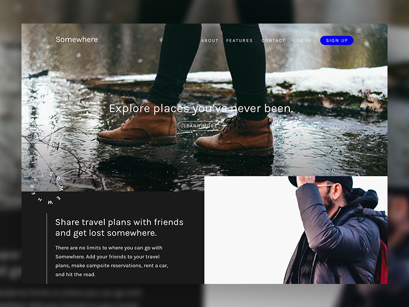
Image source: Trevor Rogers
This is a tip that is not only important for a web designer, but it is also extremely important for your visitors.
On one hand, it will help you make your website strong, fast, and very easy to design while allowing users to access immediately any main content, without having to venture through the entire website to track down what they are looking for.
This is where creating a sitemap is essential.
Also read: Popular Trends In Web Design
Use Whitespace
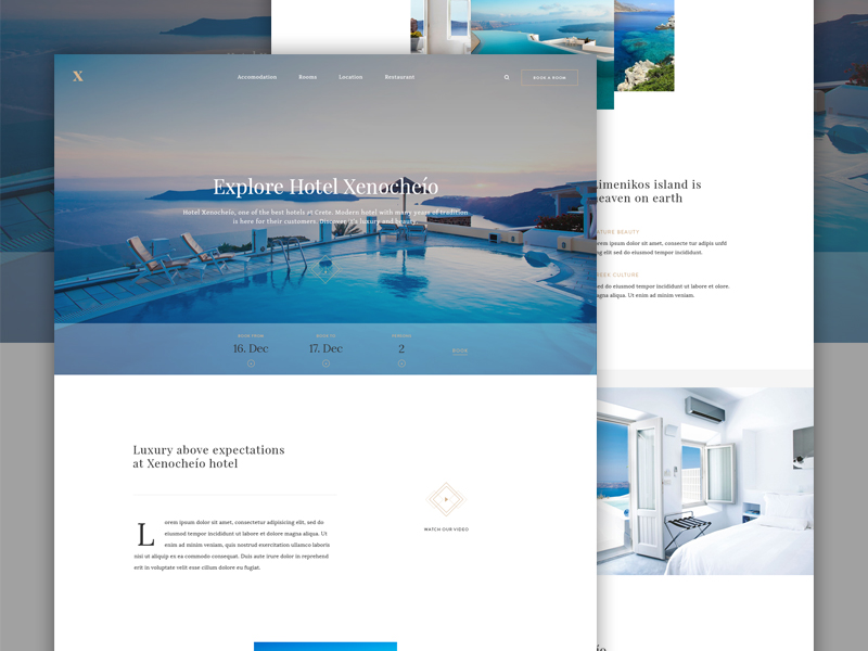
Image source: Martin Ehrlich
Whitespace is typically defined as the empty space between various elements in a design. If users are already accustomed to something like this, they might not mind dealing with a website layout that appears to be somewhat cramped.
However, it is important to keep your target audience in mind and also the fact that some of them may not be as experienced with computers as the rest. Thus, you can also consider conducting split A/B testing in order to obtain feedback from users.
Also read: Sleek Web Design Trends and Strategies
Use Various Web Fonts
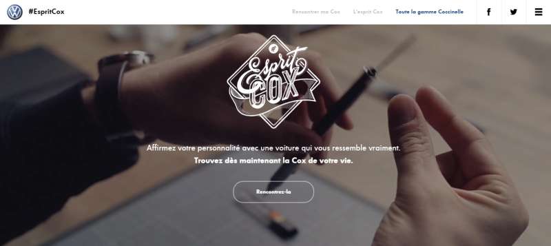
Image source: www.volkswagen-coccinelle.fr
Many designers opt to use dynamic web fonts to build their websites because these allow them to do so without having to be restricted to the more traditional font styles.
And now that most internet users have a much better connection, this is a trend that is growing increasingly popular.
Check out this blog for an in-depth look at web design basics.
Fitted Typography To Make Website Look Better
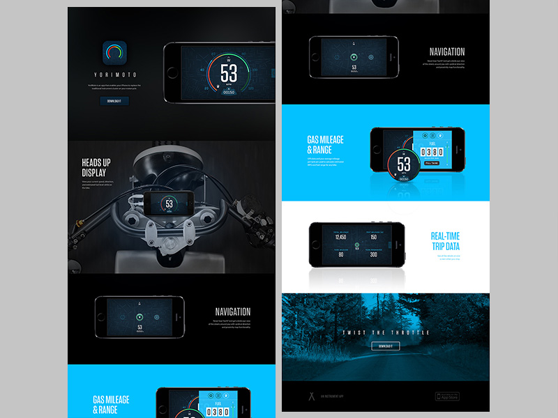
Larger-sized typography will fit into layouts much easier, although old layouts may still use other text styles in an efficient manner.
Not only will more space be taken up on larger screen resolutions, but the text will also be much easier to read as well. “Fitted typography” refers to text that fits snugly into your website when it is styled to do so.
Also read: Online Resources to Learn Web Design
Shadows
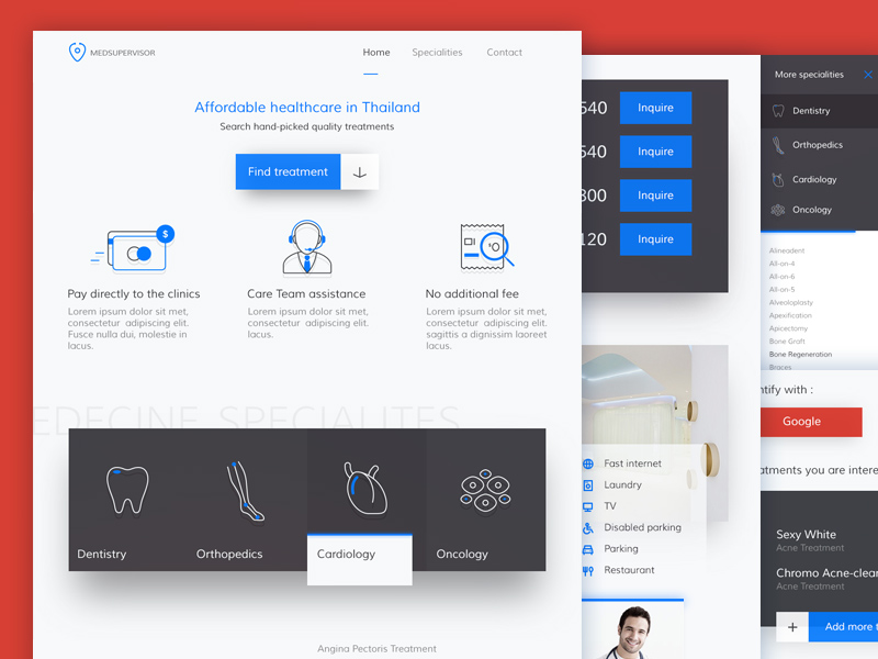
Shadows are great ways to help improve your website layouts, especially when used in two distinct properties:
- The box-shadow, used mainly for boxes and divs within the layout. A shimmering 3D effect can be used on your website when this technique is applied directly to inner page boxes, containers, or wrappers.
- Text-shadow, which is used mainly for typography and is another awesome 3D effect, which can make the text look like jumping off the page.
Use Icons To Make Website Look Better
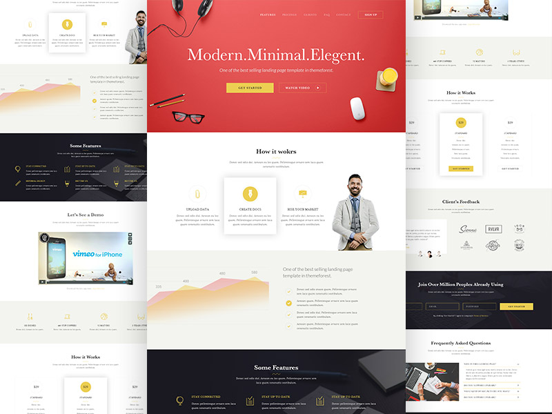
Consider implementing a small icon set on your webpage as a way to help draw more attention from its visitors.
Standard menu links function properly enough and allow users to navigate between different pages easily. However, customized icons for each separate menu link are even more impressive.
Wide and Full-Screen Content
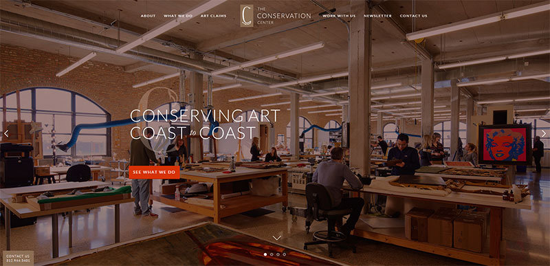
When using full-screen content, it is extremely important that you place it just above the dividing line on your website, since this is the very first impression that visitors to your website will receive.
If they instead see something, such as advertisements, they might leave your website and head somewhere else. Accordingly, consider placing a photo or quote to help grab their attention long enough to convince them to stay on your page and visit it longer.
Also read: How to Start a Freelance Web Design Business
Textures and Patterns
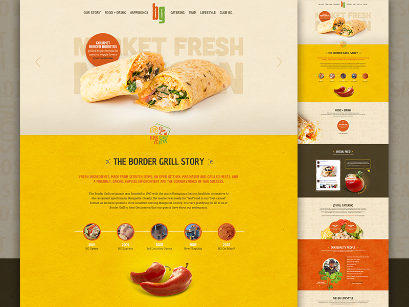
Many websites resort to simply using standard color schemes, but if you want your website to stand out, you can also use textures and repeating patterns.
CSS3 Gradient Backgrounds
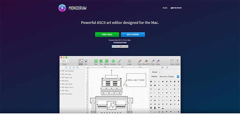
CSS3 gradient backgrounds are also extremely popular, as they are a great benefit for keeping web developers out of programs such as Photoshop in search of great backgrounds for their websites. Even better is the fact that these gradients can also be applied to areas like navigation bars and footers.
In addition, you should always consider carefully the colors and color palettes that you use. Using a few colors is likely to leave your visitors with a positive impression, more than using an excessive amount of colors.
Overusing colors can make everything on your website appear jumbled and confusing.
Also read: Tips to Write an Effective Web Design and Development Brief
Conclusion : How To Make Your Website Look Better
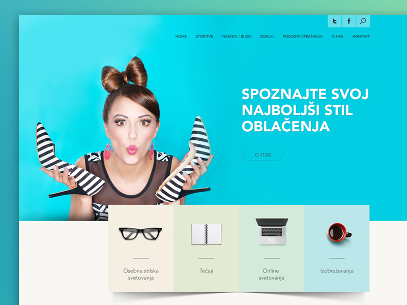
Image source: Bojan Herceg
If you are wondering how to make a website look better, this guide is for you. The aforementioned techniques have proven themselves to be extremely useful to many web developers and designers over the years. They take little time to implement, meaning that you will able to quickly improve your website.
Credit for featured image: andershede.com
Like this post? Check out more amazing web design content here.

