When you look at a navigation menu on a website, it can be just like looking at a directory map in a mall. Without first knowing exactly where you are, you won’t be able to reach your destination. Web design is certainly no different. Designing a navigation bar is especially important in this case, as it helps both the usability and user experience of a website.

Navigation menus are important because they help us find the information we are looking for on the website. Without a navigation menu that meets some expectations, the website can be ineffective and unsuccessful in the long run.
Designing a navigation bar should always focus on the same goal: helping visitors find information as quickly as possible. Here are some navigation bar design ideas that you can consider and implement.
Table of contents
- The Overall Information Architecture
- The Position of the Web Navigation Menu
- User-Friendly Terms
- Don’t Overwhelm Your Users
- Keep Everything Simple
- Standardize the Navigation Bar Design
- Show Users Where They Are
- Place Calls to Action on the Right
- Limit the Number of Categories
- Colors For Navigation Bar Design
- Final Thoughts on Designing a Navigation Bar
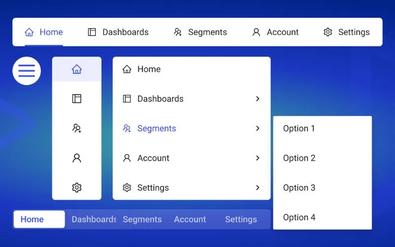
The Overall Information Architecture

Image source: headsupguys.ca
Information architecture is the first thing to be considered regarding navigation planning.
Begin by sitting down and brainstorming about this as much as possible, determining what exactly your website offers, what aspects are the most important, and what should go in the lower levels of the informational hierarchy.
The Position of the Web Navigation Menu
 Image source: Sam Thibault
This is extremely important, as users follow different patterns when visiting a website. Most people generally follow a pattern similar to the “F” letter, so keep this pattern in mind when analyzing where exactly you should place your website navigation bar design.
Typically, you will want to place it at the top of the website or on the top left-hand side for easier access.
Check out this blog for an in-depth look at web design basics.
User-Friendly Terms

Image source: amalthea.be
It’s best to use simple and easy-to-understand terminology in your navigation bar rather than one that is difficult to comprehend.
If your users have to spend longer than a couple of seconds trying to figure out what one single word means, they will likely move on to another way to find the information they are looking for and leave your site.
Also read: Showcase of Effective Navigation Menu Designs
Don’t Overwhelm Your Users
Keep in mind that a navigation bar’s basic role is to provide all users with a choice.
If you give them too many options, your users will likely become overwhelmed and not be able to make a simple choice. Typically, you will want to include five to seven items for individuals to choose from.
Keep Everything Simple

Image source: compliments.dk
When designing your website navbar, always use simple rather than complex terms and phrases. Typically, you will want to ensure that each navigational item is limited to 12 characters or less.
Just leave out anything that may be unnecessary, and that doesn’t add anything to your navigation bar.
Also read: Improving Customer Loyalty Through User Experience
Standardize the Navigation Bar Design

Image source: franceschetta58.it
Always use the same navigational model on all pages of your website. If you don’t, a user may get the impression that he is visiting a completely different website.
Using the same navigational model will essentially prevent visitors from getting lost.
Show Users Where They Are
 Image source: Ian Rob Lambert
Your users need to know where on your website they are at all times. You can achieve this in several different ways, from changing the color of the background to making the text bold in the navigation bar.
Place Calls to Action on the Right
 Image source: likeastore.com
People often read from the right side, which means that when visiting websites, they often expect to see various action links on the right side of the page, especially when it comes to a web navigation menu.
This is because the right-hand side suggests moving forward. On the other hand, the left side should be reserved for more informational links.
Also read: The Basics Of A Great Mobile User Experience
Limit the Number of Categories
 Image source: sosh.com
Giving your users a lot of information is never a bad thing. Yes, this should be done in the smallest number of categories possible. Typically, seven is the highest number that you should add in terms of important categories in the navigation bar.
Colors For Navigation Bar Design
 Image source: portfoliocreative.com
Color is one of many ways to make your navigation bar more effective. For instance, you can use color to highlight a particular active menu item or even construct a color scheme for various categories.
This is a great way to help your users become very familiar with different areas of your website while integrating your navigation bar into your overall design layout.
Also read: Importance Of E-commerce User Experience And Usability
Final Thoughts on Designing a Navigation Bar
 Image source: sleekapp.io
When designing a navigation bar, starting as simple as possible is essential. Evaluate all your content and ask what your users will need to access more quickly than anything else on your website.
When you follow these and other principles, you will be able to create a user experience that is extremely enjoyable.
Credit for featured image: Google Images
Like this post? Check out more fantastic web design content here.

