The marriage of vivid color and intricate typography has resulted in the creation of unique flat interfaces. The minimalist movement is a crucial aspect of this design style. You can understand why these trends are so popular now—flat website design emphasizes content.
In previous years, web designers placed a great deal of emphasis on demonstrating their talents by designing platforms with fancy images and animations. Then, there was a change of direction towards a more skeuomorphic design.

Also, Flat design exists at the opposite end of the spectrum to everything it considers ‘fake’ or ‘artificial.’ It leans towards basic digital designs.
The term skeuomorphic refers to the art of portraying real life on a screen using ‘realistic’ textures, drop shadows, and other real-life object attributes. It paved the way for flat design.
This article was created as a small guide to flat design.
Table of contents
What Is Flat Design?
Image source: kikk.be
Let’s understand flat design’s meaning. In simple terms, flat design is a minimalistic method of design that focuses on usability and user experience. It is associated with basic, unrestricted, crisp, vivid, two-dimensional, flat images and designs.
Some experts see flat design as a deliberate attempt to oppose Apple’s and the iOS interface’s popular skeuomorphic designs. Rather than transforming a real-life image into a minimal but accurate depiction, flat design fans are likelier to represent it with a basic icon.
They are not interested in giving their symbols features of real life because they want to emphasize the distinction between technology and tangible objects.
Also read: UI Design Principles – Some Of The Best Practices To Keep In Mind.
The Importance of Simplicity
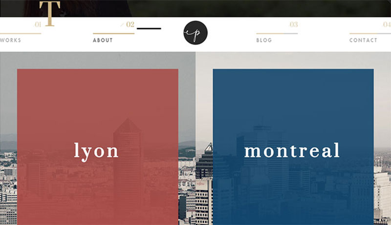
Image source: paulineosmont.com
First, basic designs remove drop shadows, strokes, and other complicated design attributes. They do this because users have started to prefer simple and easy-to-interpret design trends. Basic images are an excellent way to make the most of the limited pixels available on mobile screen areas.
This minimalistic style emphasizes broad spaces between symbols, pictures, and other components of online platforms. Basic and flat illustrations load quickly since the browser is not obliged to load many intricate design components pushed together with a single primary image.
Moreover, standards of readability are also closely linked with minimalistic web design. The more empty or white areas you have, the easier it is to interpret written content. The absence of drop shadows, strokes, and gradients ensures readers can easily read the content on the page.
Check out this blog for an in-depth look at web design basics.
Key-Components Of Flat Design
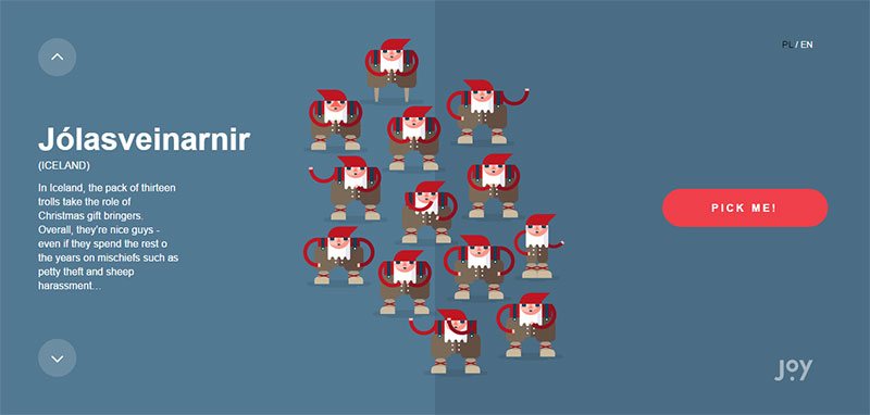
Image source: christmaswithjoy.com
Flat web design is set to continue growing in popularity, as it plays a significant role in our online platforms, apps, software, and computers.
Employ these five critical components of the flat design style to take full advantage of screen areas:
- Lack of depth
- Use of basic components
- Typography
- Color
- Minimalistic features
The End Of Depth
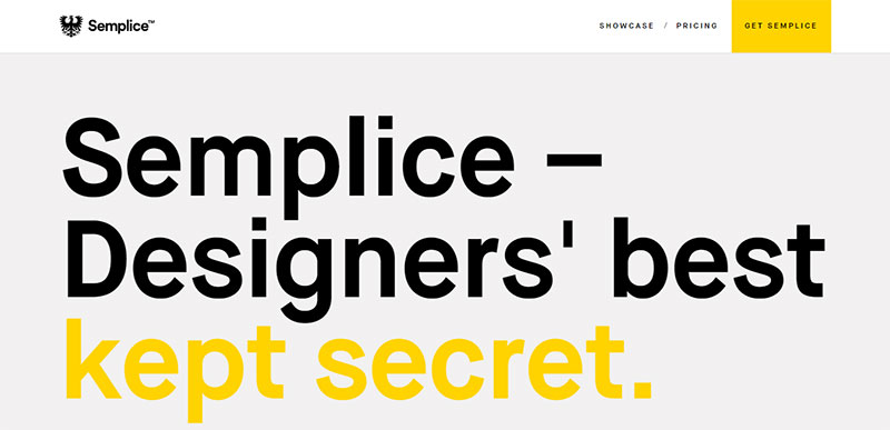
Image source: semplicelabs.com
We have now experienced the end of real depth, replaced by a fresh new design style. In this manner, beautifully simple flat designs emphasize carefully constructed two dimensional blueprints.
Moreover, the main aim of flat design stands in complete opposition to skeuomorphic design, which creates illustrations that replicate the form, tone, and functions of real life objects. The typical skeuomorphic website or app is defined by real-life background illustrations, based on textures found in the real world.
In flat design, designers eradicate these features and leave out three-dimensional components—discarding shadows, gradients, and strokes.
Also read: How To Create a Good User Interface: Essential Tips for UI Designers
Minimalism Does Not Have To Be Dull
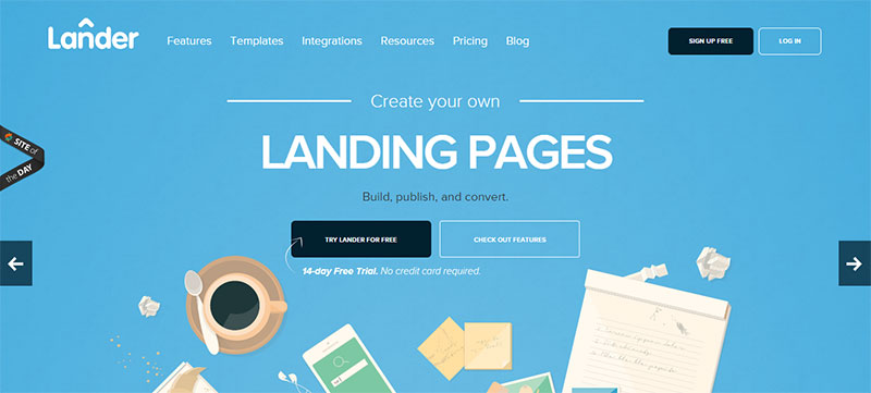
Image source: landerapp.com
In flat design, people perceive purely decorative components as a luxury. If a feature does not have a practical use, it represents a diversion from the user objectives and a distraction from the user experience.
Yet, fewer complexities do not make flat design dull. In fact, vivid and attractive colors can be employed to make pictures and features jump out from carefully designed backgrounds. They catch the interest of users and keep them intrigued. The key functions of minimalistic design work closely with the tenets of flat design ux.
Appealing Simplicity Of Flat Design
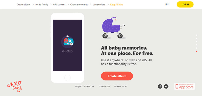
Image source: hell-o-baby.com
If you get rid of depth, illustrations, symbols, and others, design components will naturally become much more minimalistic. The symbols will work well as flat features, as they are based on simple geometric patterns like circles and squares.
Also, these patterns form an easy-to-interpret graphic user interface. The typical user should face no problems with understanding the content at first glance, since the simplicity of icons speaks for their function.
For instance, if you spot an F symbol in a blue square, it is not difficult to come to the conclusion that it must represent Facebook. Hence, if you spot a tiny picture of a cog or gear, you are likely to assume that it leads to a settings section. The more basic and clean the symbol, the easier it gets to recognize.
Also read: 5 Ways Design Thinking Enhances Customer Experience
Final Thoughts: What Is Flat Design?
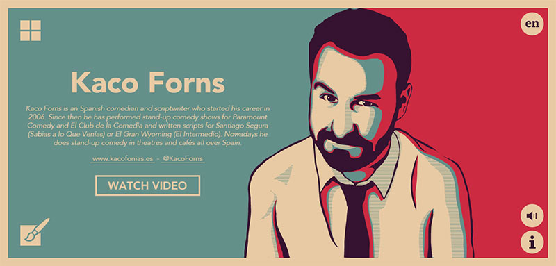
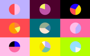
Image source: humoristas.com
At last, we hope you have understood what is flat web design. It goes back to the fundamental principles of design; it is and should be a functional resource. The typical online platform should be created and assessed according to how well it functions, rather than how attractive it appears.
This very minimal functionality narrows the focus and brings it back to the user, making online platforms that use this design style more likely to be judged as ‘user friendly.’
Therefore, just remember that users appreciate an honest web design and that if less is more, lesser is most!
Credit for featured image: FireArt Studio
Like this post? Check out more amazing web design content here.