Designing for emotions is a designer’s most powerful strategy to provide excellent experience for his users. That’s why users consider every factor in their design, and try to meet both visual and functional standards. Their ultimate goal is to provide simple navigation, and pick the best fonts and layouts for their website.
Experienced designers know that excellent design means more than creating something that looks beautiful. The design concept has the main purpose of invoking an emotional response. Basically, an excellent emotional design is supposed to make us feel something, mostly excitement, trust, or happiness.
The importance of this concept should never be underestimated. Starting with the homepage, every aspect of every website should wake up the emotions of its audience. Regardless of whether you’re providing news or promoting a specific product, you need to make sure users will feel something from the first encounter with your design. And you need to stay in control of those feelings!
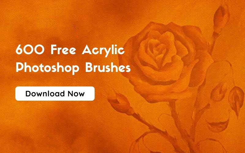
 Image source: Hungry Boys
Table of contents
- Using Illustrations To Add Personality
- Avoiding Common Annoyances While Designing For Emotions
- Sophistication Lies In Minimalism
- Use Parallax Scrolling While Designing For Emotions
- Creative Storytelling
- Provide Free Interaction While Designing For Emotions
- High-Resolution Portraits Create Bonds
- Detail-Accuracy & The Power Of Surprise
- Conclusion : Designing For Emotions
Using Illustrations To Add Personality
 Image source: MediaMonks
You might think that there is no strong connection between user experience and personality, but the truth is that personality can make an enormous difference. In fact, personality is better for expressing emotions than any other marketing tool.
Giving your brand personality will remove any barrier for the interaction between your users and your products/services.
Also read: Some of the Best Drop-Down Navigation Menus
Avoiding Common Annoyances While Designing For Emotions
 Image source: Vivek Ravin
The worst that can happen is for a user to be annoyed by downtimes or error pages. Most of the time, such annoyances are connected with the product/service itself; and could therefore affect the user experience very seriously. Designers are supposed to predict these annoyances; and find a friendly and creative way to communicate with their users once they happen.
A good idea would also be to apologize to your users, and to offer some special compensation to cover the inconvenience. Errors have a destructive effect on user experience, and could completely transform positive design and emotion into negative ones. This strategy is constantly applied by many outstanding websites (Tumblr, for instance, reminds users that a site outage is not the worst thing that could happen).
However site outages are not the only problems designers are facing. Sometimes, the problem is extended loading time (especially when the app is collecting information); which unfortunately cannot be avoided easily.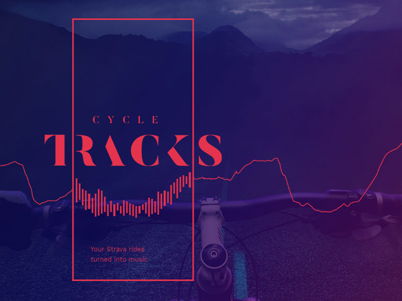 Image source: amplifon.co.uk
The best thing to do in this case would be to display some type of distraction on the screen that can defocus users’ attention from the annoying waiting. Humor (CAPTCHAs, for instance) is an excellent choice to invoke positive feelings.
Check out this blog to learn about best practices for website design.
Sophistication Lies In Minimalism
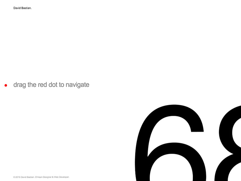 Image source: David Bastian
Being familiar with all recent and interesting trends in web design, designers certainly appreciate the benefits of minimalistic design. There are two reasons for applying it: Firstly, it looks elegant and sophisticated. Secondly, it takes you a step closer to your users’ feelings and emotions.
A carefully designed interface should give users nothing else, but what they really want and expect to see. Every other piece of content on the website is irrelevant.
Use Parallax Scrolling While Designing For Emotions
![]() Image source: Tomer Lerner
Image source: Tomer Lerner
The reason why parallax scrolling is so popular in web design is its visual power to grab and maintain attention on a particular page. Take the emotional web design examples of Nizo: users love it simple because it has wonderful single-page layouts that help them navigate without scrolling.
Nizo is not only attractive-it also creates a 3D illusion of depth, which makes users feel like they could almost touch the design.
Also read: Must-Have Elements of a Complete Ecommerce Product Page
Creative Storytelling
 Image source: Alexander Engzell
As we know, people like stories. There is nothing as powerful as a story to attract people’s attention, and incite emotions. Think about Ben the Bodyguard (the iPhone app that takes care of your personal data): the app introduces a character called Ben, one that ‘walks around’ whenever you scroll down.
The app was very successful exactly because it ‘told’ the story of entrusting data to a personal, strong bodyguard.
Provide Free Interaction While Designing For Emotions
 Image source: Apt
It’s really human to fidget while getting lost in your thoughts; or even feeling anxious and nervous. The same as in real life, people fidget when interacting with user interfaces.
This is an interaction moment you have to think about, and you have to leverage the behavioral pattern with a free interaction element (something users could play with while using another element of your app). The choice is huge: you can add roll-over animations, entertaining carousels, exiting videos, etc.
Also read: Modern Web Application Design – Top Trends
 Image source: UNIT9
Let’s take a look at a particular example: Rog.ie is a website with an entertaining navigation bar, which keeps users interested. For instance, when you roll the navigation down, icons and logos start floating up to grab your attention.
High-Resolution Portraits Create Bonds
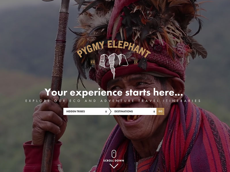 Image source: McArnolds
If you want your website to provoke an emotional response, think about ways to improve the connection between your elements and the final users. High-resolution portraits could be a great idea to replace ‘face-to-face’ conversation and to make a user feel as if he were interacting with a real person.
Detail-Accuracy & The Power Of Surprise
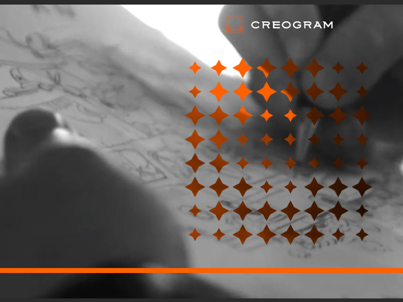 Image source: Creogram Studio
Most of the techniques we discussed above demonstrated detail-accuracy; and attention to a specific element. As we could see, everything revolves around details; since details can really show that designers care about the quality of their products; and are willing to perfect the experience they are providing to their users.
The thing is, they make interaction so smooth that we never even consider the trouble they had to go through to ensure such perfection.
Also read: How conversion-focused landing pages help a business?
 Image source: park-resorts.com/
Therefore, detail-accuracy is a secure shortcut to ensuring an ‘emotional web design’. Still, as important as they are, details should not compromise usability.
When it comes to surprise, a mere word says enough. Surprises are always fun and intriguing; and they will ensure users will remember your website. Besides, incorporating surprise in your design elements will not be difficult: it can be a joke daggering appreciation; or simply a positive quote to start the day with.
Conclusion : Designing For Emotions
 Image source: sydney.edu.au
The secret for incorporating emotions in your design/brand is to strike a balance between the elements you’re using; and the personality of your users. As convinced as you are to receive a particular response, remember that personality shifts in all directions; and so do tastes and interests.
Still, this should not be an excuse to avoid emotions, since apathy can be of no good in web design.
Like this post? Check out more amazing web design content here.


