Whilst aiming for visual appeal and beauty is always a good idea, it does not necessarily equate to increased usability. Plus, it is not a viable marketing or product framework. As with the descriptive terms ‘basic’ or ‘attractive,’ the word beautiful has nothing all that substantial to say. That’s where color palette come in!
Table of contents
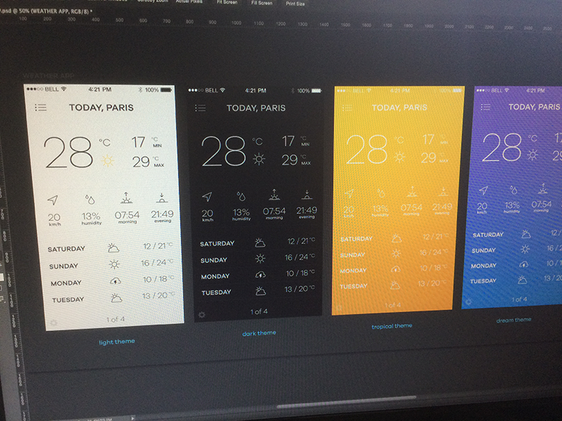
Using Eye Candy Color Palette
As the number of apps on the market continues to increase at a rapid rate, it is vital that designers spend time thinking about how to make their own prominent and appealing.
The question is, what are the best ways to ensure that an app design does stand out against market rivals?
Image source: Jakub Antalík
Well, a vibrant and skillfully chosen color palette can be a great way to achieve this. Fortunately, there is no finer place to look for this kind of inspiration and advice than the experts themselves; The Designers Republic.
It is a much better idea to swap the old ‘trial and error’ strategies for something a little simpler, such as utilizing sources of design inspiration to quickly put together website color schemes that you know will be appealing and attractive.
Also read: How to Sell Web Design Services to Small and Local Businesses
App Design Trends & Ideas
Image Source: Cosmin Capitanu
The truth is that app design trends do come and go, and fluctuate in popularity, all the time. As with high street fashion, there are some which disappear as quickly as they arrived, and others which seem to be a little more enduring.
However, here are no temporary diversions within the five key app design ideas that we will provide here. These website color palette choices are solid, robust, and promise to be making a big impact next year.
It is important to remember that the most popular design trends can be inspired by an endless array of different factors. There were some very innovative developments in hardware last year, and they look set to be having a big impact on UI and graphic design very soon. The ever increasing use of mobile apps clearly inspires other ideas.
Big Trends for App Design & User Experience
Bigger Screens
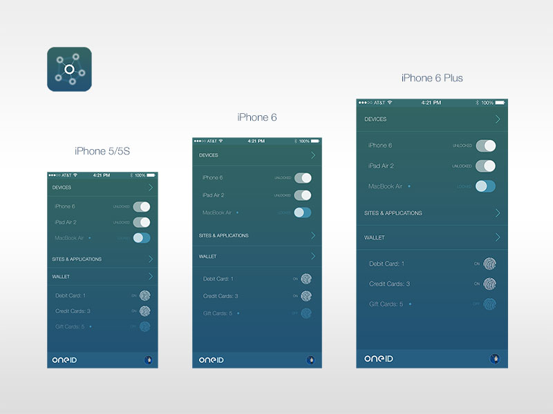
Image source: Parker Ehret
The so-called ‘phablet’ is more popular than ever right now, which proves that big screens are what consumers want. Market experts predict that the sale of devices with big screens will soar by as much as 200% over the next few years.
Also read: Responsive Web Design: Tips and Best Practices
Developing Dimensions
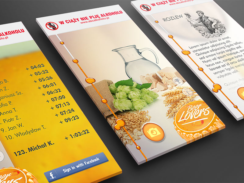
Image Source: Michal Kosecki
Whilst flat screens are everywhere right now (larger and flatter displays are the number one choice for modern consumers), it seems like skeuomorphism will never be truly defeated.
This is because there, of course, plenty of ways in which flat screens can be given the look and feel of extra dimensions. To imitate gravity in this way is to transform UI resources from flat components into responsive and exciting features.
Concealed Interfaces
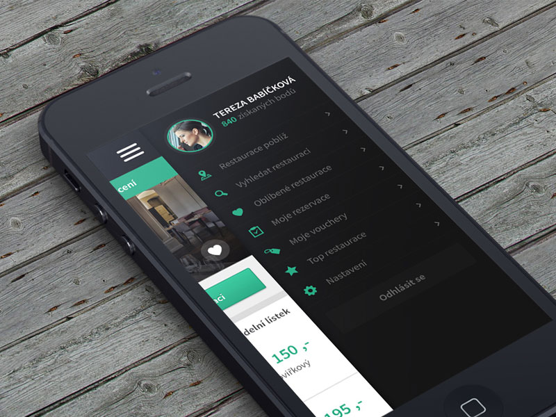
Image Source: Pavel Huza
Not all of these trends have been given the opportunity to develop as quickly as the rest, but they continue to lie in wait for the chance to really explode. The preference for hidden menus has developed rather sluggishly, but it promises to pick up speed next year.
Better Connectivity With Color Schemes
Right now, the industry is on the brink of something so important that web designers will have no choice but to acknowledge it. The apps on the market are able to connect to the wider environment in an increasing number of ways, and it is no longer just tools like GPS and Bluetooth that we rely on. Our apps are more aware, more advanced, and used to faster and stronger connections.
Also read: What Is Accessible Web Design?
Vibrant Website Color Palette
Blue-Black-White
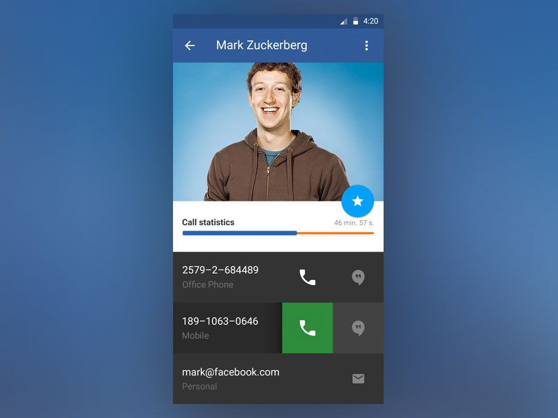
Image source: Dovydas Vystartas
Color combinations for websites also continues to get more and more innovative, and the best color combinations are those which appeal to the eye but do not put visitors off by being frustratingly bright or jarring. The combination of blue/brown/black/white is a good way to make an app look serious and sensible, but not so severe that it seems intimidating.
Orange-White
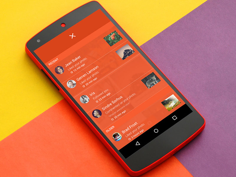
Image source: Amrit Shahi
One of the best website color schemes. If you like your app color scheme with a little more flair and pizzazz, it could be time to turn to the addition of a single bold shade.
You really do want to avoid putting lots of bright colors together, because they could clash, but pairing a bright tone with a more sober one is a good way to make sure that this does not happen. In fact, use the bold color as an accent tone, and you find that it gives your app a stylish visual appeal.
Blue/Green and White
Image source: Nikolay Ivanov
Red and White
Image source: Simon Ward
These are just a handful of the carefully put together good color combinations from the experts at The Designers Republic. If you would like your app to stand out among the market rivals and appeal to users on a visual level, do spend some time thinking about color themes for website.
Also read: How To Increase Your Visibility As A Web Designer?
The Bottom Line – Importance Of Eye Candy Color Palette
Over the last five years, we have seen the triumph of flat screens and devices over more skeuomorphic choices. Yet, the virtual display is not the only resource which influences and inspires users of technology.
In fact, the physical display, the keyboard, the mouse, and all of the other literal components are just tools that have been created to make interaction with the medium easier. And the true medium is the user.
It is this medium that holds all of the keys to design success, and it is an endlessly unpredictable and quirky one. This is a medium which changes without warning, which can be expected to do certain things, but never guaranteed.
The user is everything when it comes to app design, and to ignore this fact is to condemn your products to a place where they will always struggle to keep up with the market.
The truth is that good design is a melting pot filled with the synthesis of art and science, with the visual, with usability and dimensional appeal. Good color palette is not always a simple thing to achieve, but it is always a worthwhile one, and great app design is only going to continue to grow in importance.
Like this post? Check out more amazing web design content here.
Credit for featured image: Ludovic Riviere