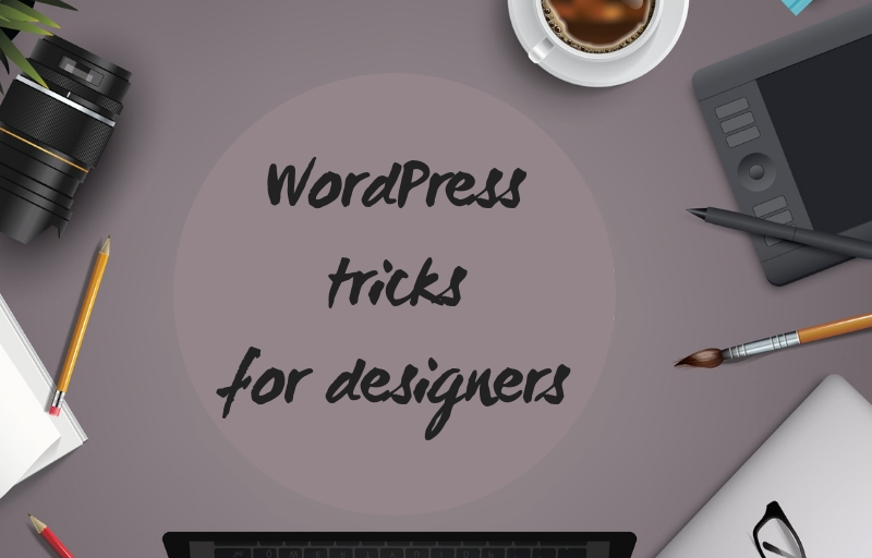
Among several other essential aspects, WordPress is much appreciated for the flexibility and a gamut of customization options that a designer can make use of. And, undoubtedly, a major part of these customization options is interlinked with the design. So we bring to you some basic WordPress tricks that will help you a lot.
For designers who don’t belong to a high-end background or are just starting, this connection can prove to be both a curse and a blessing. Despite the risk, it’s quite exciting to create a website with cautiously chosen colors, images, patterns, fonts, etc.
However, with never-ending client requirements and several options at hand, sometimes, it becomes a tough task to create something that would woo the audience instantly. Moreover, when the possibility of mistakes is even higher, creating a professional-looking website becomes even more difficult.
Keeping that in mind, here are some basic WordPress tricks to help every designer. With these WordPress tips and tricks, you’ll surely be able to fulfill all of your clients’ requirements.
Table of contents
Unique 404 Error Page
One of the most important WordPress tips and tricks for beginners. For netizens, experiencing a website breakdown isn’t anything new. But, what if you turn that unpleasant experience into a quirky one? Of course, everything is possible with WordPress. Although this platform comes with a basic 404 error page, you always have the opportunity to add a personal touch to it.
Having an attractively designed error page would not just attract people but also pass out a message of reassurance, saying that everything is under control.
With WordPress, you always have an upper-hand when it comes to customizing the 404-error page, thanks to an array of plugins available, such as Redirection, the SEO Redirection plugin, All 404 Redirect to Homepage and more. By choosing the right plugin, the process of customization can become easier for you.
Also read: How To Add A Retina Logo To Your WordPress Website
Keep A Tab on Current Designing Trends
As much as you consider this one a simple trick, it can turn out to be an effective one. Being in touch with the outer world and keeping a tab on the latest trends in the design community will help you create something marvelous.
These days, Parallax scrolling is taking the website design by storm. It’s a kind of technique that is primarily used in computer graphics. This technique makes the background image move slowly as compared to the foreground image. Hence, it creates an illusion of immersion and depth.
With this Parallax scrolling, users can swiftly navigate through web pages. Furthermore, this technique is even easier to implement. Likewise, there are several such trends that can make your website stand out from the rest. Keep your eyes and ears open.
Check out this blog to learn about best practices for website design.
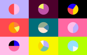
WordPress Tricks And Hacks For Choosing Colors
Generally, when selecting a WordPress theme, a majority of people only concentrate on a handful of features, such as usability, features, customization, and price. However, while doing so, one important aspect that you shouldn’t be missing out on is the target audience.
Out of all the aspects, the psychology of your audience should be put into consideration when finalizing the color scheme for the website. As per the research, humans are almost 90% visual beings. And that’s the reason why colors matter the most.
There are two major rules that can help you choose something better:
Using a limited color palette:
You don’t have to use every existing color and create a rainbow out of your website.
On the contrary, keep it as limited as you can. In addition to dark grey and black text, you can use two different primary colors. Once selected, be consistent with them and use those two colors on every page of your website.
Select an accent color:
If you’re using the two primary colors constantly, you can come up with an accent color whenever you’d like to draw attention to something special. This can include using the accent color on offers, CTA buttons, links, announcements, etc.
Also read: WordPress Membership Plugins To Create a Subscription Site
WordPress Tips To Make Content Accessible
Content is, undoubtedly, one of the most most important aspects of your website. If your visitors have a tough time understanding words that you’ve published on the site, they won’t even consider twice before closing the tab.
There are several things that can make your content inaccessible altogether, such as bad choices of layout, low-quality or irrelevant content, or poor options to search.
Therefore, to fascinate your visitors, make sure that the information you’re adding has value. Since a majority of people just scan through the content, keep the text structure correct, smooth navigation, and highlight CTA buttons,.
Furthermore, there are some content blunders that you must avoid, such as:
- No paragraphs
- Right alignment
- Large fields of text
- Wrong ratio of color-contrast
- The complex structure of the text
- Difficult-to-see subheads
- Wrong spacing.
These blunders may end up causing a lot of trouble. Hence, they are best if ignored.
Check out: What is WordPress? Ultimate Guide For Beginners in 2023
Pictures Should Be Eye-Catching
Images are no less than the soul of every website. Generally, designers don’t leave any stone unturned in using high-quality pictures to create attractive designs. However, they may not even realize when they commit a grave mistake just by looking at pictures.
So, to be on the safe side, when you’re designing a page that requires picture addition, you must go with the BII rule. With this rule, you’d have to accomplish at least one of the three things, which are:
- Brands
- Interact
- Inform
Since humans prefer images over content, it becomes your responsibility to depict your brand, interact with visitors, and inform them about your products or services with the images that you’re using.
Also read: How to choose the perfect WordPress theme?
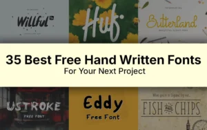
WordPress Tricks To Make Typography Advantageous
One of the best WordPress tricks for designing a website is to use visual content more than written content. However, amidst everything else, you must not forget the typography part, as it also plays an important role in the visual hierarchy system.
When talking about excellent design, everything might not revolve around typography, but it surely is important. If you aren’t willing to create customized graphics or typefaces, you can simply follow some guidelines that will allow you to use existing fonts to the best of your ability.
So, when you are ready to choose fonts for your site, here are some things that you can consider:
- Keep your readability standards higher. Your visitors shouldn’t and wouldn’t play the guessing game just to figure out what you’ve published on your site. For this, you can keep the body text between 12 and 16 pixels. Although most designers prefer 14px, you can use as per your requirements.
- You must always remember that simplicity is the best thing. Don’t go overboard. You can even try mix-and-match. Try matching your sidebar text font to the body text font and the headline font to the navigation link font and likewise.
Also, pay attention to little variants as well, such as color, weight, style, and more.
Further, it has even been proven that fonts do convey messages to your audience. All of them have their own style.
- Modern is smart and sophisticated
- Serif expresses esteem and custom
- The script is imaginative and stylish
- Sans-serif is modern and worldwide
- Slab serif establishes dependability and authority
Also read: How WordPress Sliders Is Going To Change Your Website Strategies
Conclusion
As a designer, you’d have several responsibilities lingering on your head. So, if you just want to make your website attractive, try to keep it uncluttered, easy to read, and simple. Keep these WordPress tricks mentioned above in mind and put in a bit of extra effort. The website will surely turn out to be unique and amazing.
You also might want to check best essay writing service UK
Like this post? Check out more amazing web design content here.