The written word can be very powerful. However, it is even more influential when paired with the right type of visual presentation. In fact, aesthetic attraction increases the influence of written content and makes it more satisfying for readers. There are lots of different ways to make written content more engaging and enhance its overall value, with kinetic typography being one of the most effective.
The term kinetic typography describes the presentation of concepts through animated text. It is also called as motion typography. It is a very common method, which is used on everything from website opening pages to television advertisements, and more. This level of commonality could be related to a variety of different factors, but the most important is that it is uniquely eye-catching – consumers find the text to be appealing and they tend to be pleased by it.
The principles of kinetic typography bring these concepts together with basic typography animation, in order to produce designs which feature moving text. This text is designed to capture the imagination and encourage readers to interact with it. It is time to take a closer look at this design approach and learn some design tips and tricks for how you can use it within your own creations.
Table of contents
What is Kinetic Typography?
As aforementioned, kinetic typography is a word used to describe animated text. It can be used to make written content grow, shrink, soar, dance, bend, and change in an almost endless variety of ways. The choice of kinetic typography can be fairly simple and basic, or it can be a lot more complex.
The practice has rapidly increased in popularity over the last five years, primarily due to its abundant use within web design. It was, once upon a time, a technique which was only employed in video and television advertisements, but it is now a very common aesthetic resource.
In fact, it is being used more and more as a background tool on web platforms and online videos. This is only possible because internet speeds have gotten so fast over the last ten years. The approach is employed for scores of different reasons, but the main one seems to be because it adds extra appeal to written text.
Also read: Ten Techniques To Improve Your Design Typography
The Power of Kinetic Typography
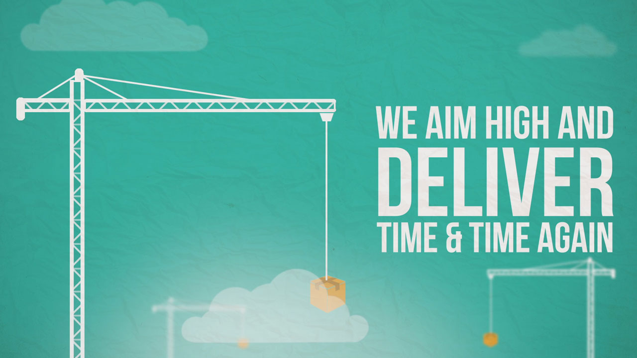
The best kinetic typography can take any form, be it wriggling, stretching, soaring, flying, speeding, or anything else you can imagine. If necessary, it can be further enhanced with images or audio features. Due to its versatility, it can be found everywhere, from movies to television ads and websites. Because its power to engage and captivate can be extremely useful.
The impact of kinetic typography ideas, particularly as a platform for personal creativity and expression, simply cannot be ignored. If utilized in the right way, it can make visitors and prospective customers crave news and updates from your business.
Check out this ultimate guide to the basics of typography.
Origins
The history of kinetic type examples actually stretches back to the early 20th century. Since this point, the written word has longed to break free of its paper prison and become fully animated. It was the Futurists, in fact, who were the first to experiment with the capabilities of written text. They introduced speed, movement, and dynamic motions to written content.
The development was groundbreaking because it signaled a departure from the rigid typefaces and borders used by typographical publications. In many ways, the birth of animated text was the perfect representation of the energy and vitality which the Futurists expounded.
Also read: Typography Visual Hierarchy And What It Means
Soviet Propaganda
This experimentation with the written form was later used to create propaganda materials for the Soviet Union of the 1930s. The constructivist approach relied upon rigid alternating angles combined with bold and strong text. These new design choices ended up adding a great deal of interest and appeal to the words. And therefore, their message was seen by a lot more people.
The life and vigor of the animated text increased the overall satisfaction and happiness involved with reading the words. However, it was only after a lot of experimenting that kinetic typography really came to life as a visual medium, and its development has the movie industry to thank as much as it does the futurists. It was the increasingly popular frame by frame ‘stop animation’ sequences which eventually gave way to fully moving text.
For example, the classic movie North by North West (shot by Saul Bass was a particular inspiration. The idea that letters, and even whole words, could now interact with the space around them was a novel and very exciting new idea at the time, and it promised great advances in typography. Fortunately, the development was more than just a passing fad, and amazing kinetic typography continued to flourish.
In fact, rapid developments in software and filming technologies meant that the nineties were a very fertile time for the development of kinetic typography. It suddenly became possible to utilize movements like panning, zooming, ranging, and rotating to create interesting visual pieces. Whilst these kinds of kinetic type examples were once state of the art, it has now been replaced with more sophisticated techniques.
When Should You Use Kinetic Typography?
It is important to understand that amazing kinetic typography can be a fun and valuable tool. But only if it is used in the right places. For example, it should not be used to cover for a lack of visual stimuli within an online platform. As with most other aesthetic techniques, there is more chance of success if you know what you are going to use it for and why, before you do so.
The most effective uses for kinetic typography are as follows:
- for producing emotive content
- for constructing characters
- for grabbing focus
Visual Interest
The motion of written content, regardless of the type of motion, naturally makes the text more emotive and engaging. And provides a kinetic and cinematic encounter rather than a static experience. The truth is that even very simple movement can offer an appealing aesthetic which is likely to grab the attention of audiences.
Also read: How To Design A Website With Great Typography
Embedding Emotion
The decision to employ a variety of kinetic approaches is one which is able to stimulate a broader range of emotions from an audience. If the moving text is rapid, bold, and very eye-catching (like the Soviet propaganda), the content can be seen as representative of power, strength, and durability. On the other hand, slower and more subtle kinetic typography ideas are indicative of softness and intricacy.
Also read: Basic Principles of Typography Theory
Kinetic Typography Applications
We hope that you are starting to see the appeal of the best kinetic typography. And that you now recognize and better understand its main uses and benefits. The question is, what platforms and mediums it is most suited to?
Firstly, it should be clear that motion-based text can be both a video and an online technique. However, unless you have plans to work with clip art, there is little advantage to employing kinetic typography within static print work. In order to be successful, you must try to keep your animations short and relevant. If they feel unnecessarily fussy, they could put audiences off.
The bottom line that entertaining and interesting kinetic typography can be employed as a valuable tool for adding emotion, personality, and excitement to written content.
Like this post? Check out more amazing web design content here.


