
When it comes to choosing the right font for your project, the debate between serif vs sans serif has been around for centuries.
Serif fonts, with their decorative strokes at the ends of letters, have a rich history dating back to ancient Roman times and are often used in print media like books and newspapers.
On the other hand, sans serif fonts, known for their clean and modern appearance without those extra strokes, gained popularity in the 20th century and are widely used in digital media, branding, and minimalist designs.
In this blog, we will explain the differences between serif and sans-serif fonts, which can help you make the best choice for your needs.
Table of contents
- What Is Serif And Sans Serif?
- Famous Brands With Serif Font Logos
- Famous Brands With Sans Serif Font Logos
- What Is The Difference Between Serif And Sans Serif
- Where Are Serif Fonts Mostly Used?
- Where Are Sans Serif Fonts Mostly Used?
- When To Use Serif vs Sans Serif?
- Serif vs Sans Serif – Which One Is Better?
What Is Serif And Sans Serif?
What Is Serif Font?

Let’s discover the serif meaning. Serif fonts have a history that stretches back to ancient times. Originating with the carved letters on Roman monuments, serif fonts are characterized by their small, decorative strokes, or “serifs,” that finish off the ends of letters.
These fonts became the standard in print thanks to their elegant and easy-to-read style. In the world of books, newspapers, and magazines, serif fonts have long been the preferred choice for body text because the serifs are believed to guide the eye along the lines of text, making large blocks of writing easier to read.
Their classic and timeless look adds a touch of sophistication to any design.
Check out this ultimate guide to the basics of typography.
What Is Sans Serif Font?

Sans serif fonts are the sleek, modern faces of typography. The term “sans serif” literally means “without serif,” referring to the absence of the small decorative lines at the end of letters that characterize serif fonts.
Sans serif fonts first gained popularity in the early 20th century as a break from the traditional, more ornamental serif styles. They became the go-to choice for modernist designers drawn to their clean, uncluttered look.
The simplicity of sans-serif fonts makes them highly readable on screens, which is why they’re widely used in digital media today. From iconic brands like Nike and Apple to your favourite app’s interface, sans-serif fonts are all about minimalism and clarity.
Also read: Modern Fonts To Express Your Ideas: Top 31 Picks
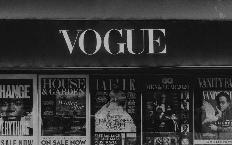
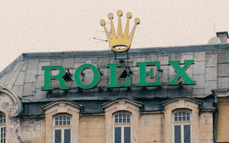
Famous Brands With Serif Font Logos


Famous Brands With Sans Serif Font Logos


What Is The Difference Between Serif And Sans Serif

When it comes to choosing between serif and sans serif, there are several key differences to consider:
Also read: How To Choose The Right Font For Your Website
1. Aesthetic Style
Regarding style, serif and sans-serif fonts have very different looks. Serif fonts have those little extra lines or “feet” at the ends of each letter, giving them a classic and formal feel. They can make text look more traditional and elegant, like something you’d find in a classic novel or a formal document.
On the other hand, sans-serif fonts don’t have those extra lines. They’re all about clean, straight edges and a modern, simple look. So, while serif fonts can feel timeless and sophisticated, sans serif fonts come across as modern and straightforward.
2. Serif vs Sans Serif Readability: Is Serif or Sans Serif Easier to Read?
In print, serif fonts are often considered more readable for long-form text because the serifs create a flow that guides the reader’s eye. On the other hand, sans-serif fonts are generally preferred for on-screen reading due to their clarity and lack of intricate details.
Also read: Modern Fonts To Express Your Ideas
3. Versatility
Sans serif fonts are versatile and work well across various media, from websites and apps to logos and advertising. Serif fonts, while elegant, are typically used in more traditional or formal settings, such as in book publishing or legal documents.
4. Emotional Tone
Serif fonts convey a sense of tradition, reliability, and authority. Sans serif fonts, with their clean lines and simplicity, evoke a sense of modernity, openness, and approachability.
Also check out: The Trendy Duo Script Fonts
5. Usage Context
Serif fonts are often used in printed materials where a classic and professional tone is desired, such as in newspapers, academic papers, and formal invitations.
Sans serif fonts are more commonly found in digital spaces, where their straightforward design ensures easy readability on screens.
Also read: Is There A Place For Serif Fonts In The Digital Age?
Watch This Video – Explains Serif Vs Sans-Serif
Also read: Fonts Like Helvetica To Spruce Up Your Designs
Where Are Serif Fonts Mostly Used?
Serif fonts are typically found in print materials, bringing a sense of tradition and professionalism. They are the go-to choice for books, newspapers, and academic journals because their design enhances readability in long text passages.
Serif fonts are also used in formal contexts, such as wedding invitations and certificates, and an elegant and classic look is desired anywhere else. Brands that want to convey a sense of history and reliability often choose serif fonts for their logos and branding.
Where Are Sans Serif Fonts Mostly Used?

Sans serif fonts have become popular in the digital world. Because of their clean and simple design, they are ideal for websites, mobile apps, and other screen-based media where readability is key.
Sans serif fonts are also popular in branding and advertising, where their modern and straightforward look helps convey a sense of innovation and forward-thinking. From tech companies to fashion brands, sans serif fonts are often chosen for their versatility and contemporary appeal.
Also check out: Grand Script Fonts Bundle
When To Use Serif vs Sans Serif?
Choosing between serif and sans-serif fonts can depend on what you’re aiming to communicate. Serif fonts, with their small lines or embellishments at the ends of letters, are often used for traditional or formal settings, like printed books or classic brands because they can enhance readability in longer texts and convey a sense of elegance and stability.
On the other hand, sans serif fonts are clean and straightforward, with no extra lines, making them great for modern and digital use, like websites and tech brands. They give a more contemporary feel and are easy to read on screens.
So, go with serif if you want a classic, formal vibe. If you prefer a modern, minimal look, sans serif is your friend.
Serif vs Sans Serif – Which One Is Better?
Summing up the difference between serif and sans serif, Serif fonts have small tails around the letter edges. In contrast, Sans Serif fonts are relatively minimalistic, with no such lines projecting out. Traditionally, designers have considered Serif fonts more suited for printing and Sans Serif fonts better for websites. However, traditional printing has changed so much recently that this isn’t true.
So, which typeface is better? It comes down to what mood you want to convey on each project. The best answer to this will most likely be the least easy one to answer. Some projects can even use both of them, whether print or digital.
Serif and sans-serif will work in numerous applications. The best way to decide which to use is to know the purpose and intent of the content your project is trying to convey.
So, what do you prefer in the battle of serif versus sans serif? We hope you have understood the meaning of serif vs sans serif.
Like this post? Check out more fantastic web design content here.