What does typography visual hierarchy mean?
Visual hierarchy matters in the case of typography more than anywhere else, because it has a critical influence on the design project in general.
The reason for this is that visual hierarchy in typography displays text in a way which explains users what the key information is.
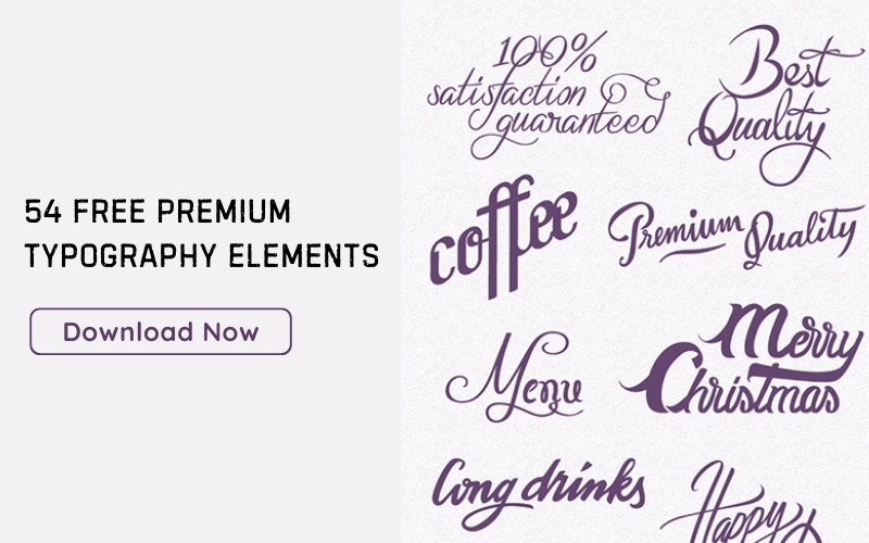
 Image source: Kirill Zakharov
With no type hierarchy established, letters, words, and sentences would all look identical, and that won’t exactly help users scan content and read what they want. Where are they supposed to start? How can they know what the article is about?
Following typography hierarchy rules is crucial for the performance of every dynamic websites, because that’s exactly what makes the biggest difference between displaying blocked and meaningless content and conveying clear and important messages to readers out there.
Table of contents
The elements of typography visual hierarchy
 Image source: Armantas Zvirgzdas
Typography is still a design element, meaning that you need to develop a specific structure to follow. Before anything else, you have to be aware of the meaning typography has, and learn which words have priority over the others.
Check out this ultimate guide to the basics of typography.
Typography Size
Is there a simpler way to highlight elements than size? Naturally, the human eye is attracted towards bigger elements first, meaning that the user will start reading right where the text is the largest.
 Image source: Max Stasiuk
Scaling, however, is different with various different fonts, which can make sizing them quite challenging. For instance, you need to take special care when enlarging or minimizing some of them, because they may not display the way you expected them to (take Thirsty script as an example).
Resized fonts may often look unprofessional and hard to read, but that doesn’t make size experiments impossible. For instance, body text fonts make for perfectly elegant headlines, as it is the extra bold version of Open Sans.
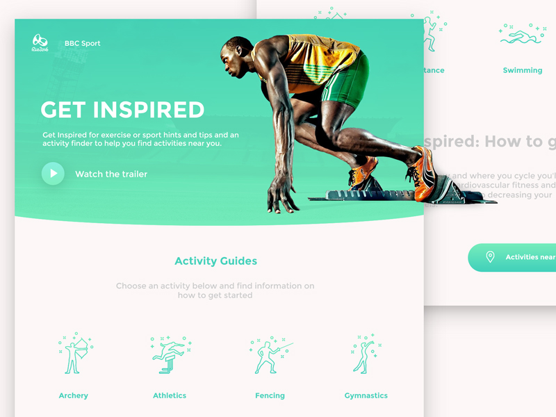 Image source: Kyran Leech
But how can you actually know you’re right when resizing your font? Start with the body instead of the headline, and the main font will simply impose itself. You already know fonts have the power to engage people, so why not using this knowledge to your advantage?
Let some percentages do the job for you:
- Main body fonts should be no bigger than 14 points
- Main headers should be no bigger than 35 points (250 % more compared to the body font).
- Secondary headers should be no bigger than 25 points (175 % more compared to the body font).
- Navigation elements should be no bigger than 23 points (165 % compared to the body copy).
- Menus and secondary navigation should be no bigger than 20 points (140% more compared to the main font).
Check out: Typography Tips To Improve Your Website’s Legibility
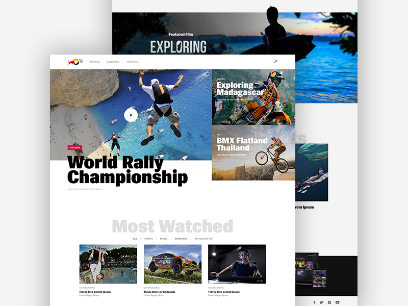 Image source: Jenny Johannesson
Weight in Typography
In the font sense, weight stands for text thickness, or how bold the letters will be, and how much space you have to increase them. Obviously, weight doesn’t have the same importance as size, but it can still make important lines stand out, especially if you’re applying a tertiary type.
When deciding on both size and weight, you have to think of all typefaces you’re going to use at once. In fact, it may be pairing that will finish the hierarchy task for you, as when you’re using thick and thin typefaces together. This is a very well-known styling approach to convey the importance of your text, even when the text is small or displayed on small screens.
 Image source: David Stinnette
Italics
Italicizing letters is one of the most dramatic strategies to grab attention, sometimes even stronger than bolding them. Being a subtle touch, italicizing will work the best with tertiary fonts.
Lowercase or capital letters?
Someone has definitely told you that writing messages in capitals sounds like shouting, and there is no reason not to believe the same for web design. Therefore, be careful when using caps in your projects, as their hierarchy power is so big that they will make lowercase letters blend with the background and become almost invisible.
 Image source: Ionut Zamfir
Typography Colors
Much of your type’s weight will depend also on color, so try to create a palette in a smart way. A good course of action would be to recall the basics you learned in Art class, as for instance the effect of cool, warm colors, and color pops on neutral backgrounds.
Colors mean the world to typography visual hierarchy, which is why you have to consider all of them, including the ones that appear on the type. Contrasting shades will also play a critical role, as the lightest and most vivid ones will take over their subtler counterparts, and indicate that something is more important than something else.
 Image source: Prakhar Neel Sharma
Contrasts
Contrasts matter literally everywhere, and can be applied in terms of color, weight, and size. The most common and classic contrast to make use of is the one between the body text and the main headline.
Check out: Best Kinetic Typography Examples And Ideas
Typography Spacing
Leaving white spaces between sentences and paragraphs will showcase what is actually important to read. Thanks to it, letters may become tighter or larger, so be careful how you’re using it.
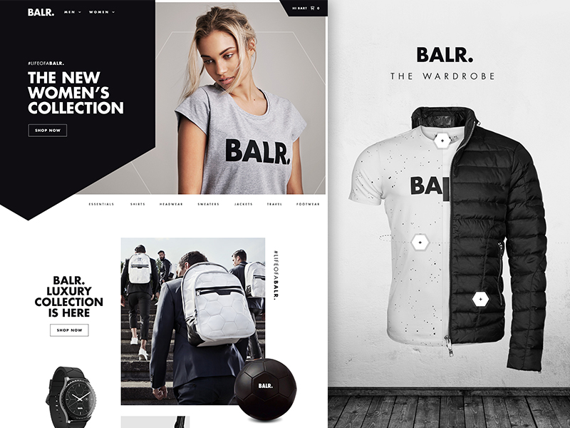 Image source: Bart Ebbekink
The first aspect to consider is the space between lines, where you have to think of an appropriate special relationship for different sizes, colors, and styles.
Space will affect the hierarchical order wherever it is applied, so remember to keep similar fonts grouped in one place, leaving less space between them than you’d do with unrelated ones. Still, make sure space falls into a clean and distinct order scheme, instead of looking artificial and deliberately added.
If you can, balance how much space you need for bolder and more important paragraphs, compared to the one used on simpler text boxes.
 Image source: Jamie Ritchie
Positioning
The key factor here is proximity, being able to convey meaning in a simple and fast manner.
Orientation
Orientation refers to the way your text will look in its layout, once it is related to other text. Sounds like an intuitive thing, but it is a very important moment in the process which can either make or break your hierarchy. Most of the time, you’ll see text placed horizontally with straight s lines crossing the screen, and there is a good reason for that.
Check out: Importance Of Typography In Web Design
 Image source: Robert Berki
If you orientate text vertically, you’ll draw attention towards all blocks and paragraphs instead of the most important one. The effect will still be good with twisting and tilting shapes, which we believe is the privilege of few that know very well what they’re doing. What we’re trying to say is that you should avoid these tricks, unless you’re absolutely confident about your skills.
Textures
 Image source: Gil
Textures in typography are a highly subjective matter, being among the most cumbersome elements to master. The difficulty derives from the fact that we’re not discussing the texture of the font itself, but rather the typographic patterns that are going to appear on the page.
As you probably already know, fonts are different when used in a web creator, and each text block will thereof have a different typographic pattern. In order to implement texture properly, change elements and break the patterns. Still, make sure what you’re doing has sense; otherwise you could make your design too distracting.
Check out: Beautiful Web Typography – Best Practices And Fonts To Use
Hierarchy levels
Unless you’re completing a really complex project, three typography levels will be perfectly enough to differentiate what is really important on your website. The levels are as follows: primary, secondary, and tertiary hierarchy types.
Primary types are the ones being most striking and noticeable on the page, usually oversized and enriched with bold colors to make them more attractive that the rest of your text layers. Knowing how powerful primary types are, you should restrict them to the so-called ‘furniture’ on your website, namely the decks and the headlines.
 Image source: Martin Strba
Secondary types are less striking than the primary ones, but still noticeable enough to take lead over the main body type. They will be distinctive in their basic elements (size, colors, spacing), and applied on subheads, pull quotes, captions, or any other supportive content block which has the purpose of separating the header from the body content
Tertiary types are applied for the main content, used most wisely, and being most difficult to notice. The fonts used here are simple and nothing like flashy, because they don’t aim to grab attention, but to keep it instead. With a readable main text type, the reader will continue exploring without being distracted by other elements on the website.
Final thoughts
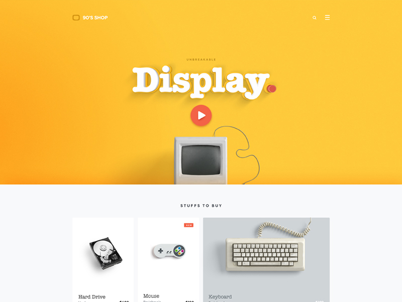 Image source: Goutham
Visual thinking is the fine art of creative designers, who simply love what typography can do for them. As we already know, every visual element in web design can be a critical factor for user experience, and that counts in particular for websites that have plenty of content to display.
Making fonts work for you can either be daunting or fun, and it all depends on how well you know techniques and combinations. If you’re experienced enough, even one font will do.
As a final recommendation, keep in mind that there are many variations you can apply to make text look imperative, and colors, sizes, and shapes are only few of them. Once you’ve picked up the tips you need, try implementing some of them, and keep following the language of typography: making it look poor will have the same negative effect on your readers’ perception as grammar mistakes do.


