There is no right or wrong way to create a high-quality web user interface. If you hit upon something which works for you and results in increased conversions, you have got it right.
If you see the same or even worse results, you might want to alter your tactics.
The bottom line is that there is no single template which can be used to construct a good UI because every website has unique needs and different website UI design tips will work for different businesses.
The good news is that there are a handful of rules and guidelines which will work to give you the best possible chance of success. They can be used to help you learn how to design a good web user interface and high-quality website UI patterns in no time.
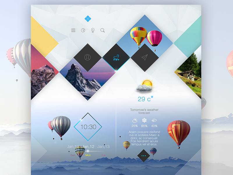
Clean Navigation

Image source: Dmitriy Kharaberyush
The presence of a fully operational navigation system is similarly vital.
In fact, it is essential for every single website, because no matter how wonderful your platform or website UI patterns appear to be, all your efforts are useless if visitors cannot find the information that they need.
Make Links Easy to Click

Image source: Anton Avilov
The use of links (or specific anchors) is considered to be an inline component. This means that their clickable regions encompass no more than the given dimensions of the text.
This interactive region represents the space which visitors can click to go to the location linked to it. If the region is made bigger, the level of usability tends to expand too.
Guide your Visitors
 Image source: Rico Monteiro
In some cases, default functions can make visitors uneasy, because it means that they have less influence. However, the power of suggestion can be employed to coax them into certain actions and make them feel like they are still in control at the same time.
The use of suggested functions enables you to push for more integration, communication, and constructive critique.
It will always be successful so long as the functions that you are suggesting are not troublesome or do not require a great deal of effort.
The LinkedIn platform is one of the finest examples of successfully employed default functions.
If you launch a LinkedIn page, you are confronted with a plethora of possible choices – for instance, the option to input data about your employment history.
A similar rule can be used to explain the popularity of LinkedIn endorsements. In other words, it is a natural instinct anyway to want to support friends and colleagues – LinkedIn just prompts users to do so on a more practical basis.
Use Settings That Are Familiar to Your Visitors

Image source: Amro Shahbari
As research has shown, visitors almost never alter default settings, even if given the power. This means that it is the job of the website designer and developer to make sure that they are right from the start.
This can feel like a big job, but there is an advantage to having full control. You can pick the settings for the suggested functions that you would prefer your visitors to interact with.
Yet, you should resist the urge to take ultimate control of user settings. For the sake of UX, it is a good idea to allow your visitors to have a certain degree of influence.
If you construct a complicated system, just to trap visitors within a narrow series of predefined settings, you could end up irritating them.
You are encouraged to spend some time thinking about input fields too. The best approach is to avoid using default functions for tasks which need to involve visitor input, choice, or control – for instance, signing up to mailing lists or approving terms of service.
Color Schemes

Image source: Javin Ladish
If utilized properly, color can be a good way to get visitors to focus on actionable functions and important parts of the website.
For instance, throughout the last American election, almost every candidate platform colored their donation button in a bright red tone.
As red is one of the boldest tones, it commands attention and draws in the eye. It looks even more vivacious when paired with colder tones like blue and green. This means that a yellow shape on a (colder) blue base will appear to be jumping right off the webpage.
White Space

Image source: Alfred Xing
It is often disregarded, but one of the most valuable parts of an online platform is the white space between the different components. The term ‘white space’ is as simple as it sounds. It refers to the empty space which surrounds buttons, headlines, functions, taskbars, and the like.
If manipulated carefully, it too can be used to represent links between the various components and to make clear which ones are connected.
For example, if you place a headline close to an article, but further away from a button function, the assumption should be that it is more closely related to the article than the button.
Hover States

Image source: Anton Zotov
There are some online platforms which employ additional utility functions, like modification and deletion buttons. These are functions which do not necessarily have to be present on a webpage at all times and can be concealed until needed. It is a good idea to hide them away, particularly if they add mess or clutter to the UI.
Better Copy
 Image source: Alex Collins
It is possible to make options dialogues a lot more user-friendly by just giving some extra consideration to the labels and titles that you attach to buttons and links. So, a good example of this is if a visitor receives a pop-up message containing just the options YES, NO, and CANCEL.
In order to make the right decision, they will have to scroll through the whole message. However, if the options were RENAME, DO NOT RENAME, and CANCEL, they could make a decision in an instant.
Input Functions

Image source: Scotty Simpson
The main aim of input functions is to enable a visitor to communicate more efficiently with your online platform.
Yet, there is a problem – visitors are always looking for more personal influence, but the greater the degree of control, the more complicated and fussy the UI. There is a way to deal with this though and it involves opting for input functions on demand.
It is an answer to the problem which cannot ever really produce negative outcomes. This is why almost all commercial business websites now use input functions on demand.
To put it simply, a function can be uncovered or concealed at will by passing a mouse over the relevant information, or it can be positioned neatly within a collapsible drop down menus, accessible via tabs.
If your online platform is focused on just one input field, or if the input is a top priority, establishing an automated task system for that input is advised.
This kind of ‘autofocus’ approach incorporates circumstances in which the mouse if set to function automatically, once it reaches the programme area.
It is commonly used by big corporations like Google. Once you have navigated to the Google search page, you do not have to click the mouse in order to start typing a query or string of words.
Conclusion
For high-quality UI, you need solid design components robust like input functions, navigation, default settings, and suggested options. Yet, it is entirely up to you how you create these things.
This is a diverse and adaptable process and it can be achieved in any number of different ways. The choices that you make are going to have a big impact though, so take the necessary time to think them through carefully.
Credit for featured image: Tintins
