The visual part of website design matters, sometimes even to the extent that a considerably disproportionate portion of the overall attention is focused on it, instead of content. That means that the visual aspect can make or break the design, and you have to treat it with care.
That’s why clients will never understand the burden of requests such as: ‘Provide me with three unique designs, and I will choose one!’ This might be a feasible strategy for a logo, but we wouldn’t say the same for website design entrusted to an experienced professional.
 Image source: Kreativa Studio
The importance of visuals, however, can be understood: do you know how many designers out there are designing per se? All they want is to finish on time, to handle the product, and to let the business hit the learning curve.
With a top dollar investment in stake, businesses find this to be a top problem, and they are constantly calling for attention to the fact that beauty doesn’t matter. They are not art admirers; they want to make money out of it!
This is the ideal division of developers’ efforts to make a website work, and make profit for every brand. At the same time, this is extremely challenging.
Table of contents
- Design explained through website design
- Think of end users in website design
- A learnable interaction
- Developing informative content
- Multiple device support
- You think conventional design is boring? Guess what? You’re wrong!
- There is nothing good in the lack of a testing culture
- A website is not done when you think it is done
- The most common website design mistakes
Design explained through website design
Let’s dismiss the myth that website design is about colors, shapes, textures, fonts, and multimedia. For the sake of stats again, this is only 1/5 of a website’s design.
Yes, you read well, that’s one fifth!
Also check out: Website X5 – Professional Website Builder
 Image source: Forefathers
These are the 5 essential competencies that an effective user experience design should have in order to deal with important business problems:
- Proper information architecture
- Interactive design
- Engineered usability
- Visual design
- Engineered prototypes
Think of end users in website design
 Image source: Focus Lab
Let us dismiss another myth: the project you’re working on is not supposed to satisfy internal stakeholders-it is supposed to satisfy end users! Users should always be in the focus of your attention, and you should try your best to make their onboard experience pleasant and effective.
Obviously, you shouldn’t neglect business requirements completely, but rather to find a balance between them and the users. What we are discussing here is the symbolic, number one relationship in website development, and you have to explain your contractors that they will get only what they are giving. They might have their dreams and whims, but you are the professional here!
Also check out: Figmatia – Responsive Web Design System
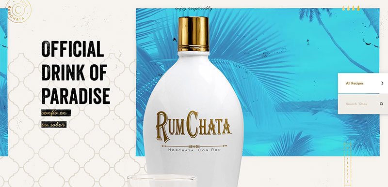 Image source: rumchata.com
Thinking from a user’s perspective won’t be easy, but you have to do your best. We recommend you to establish direct communication, and consider feedback for the entire period while the product is being prepared. The answers to all of your questions are rooted in what users are saying, so make consistent lists, and take them to the office.
With website design being nothing more than a decoration, users are going to do nothing more than to watch it (potentially, not even that).
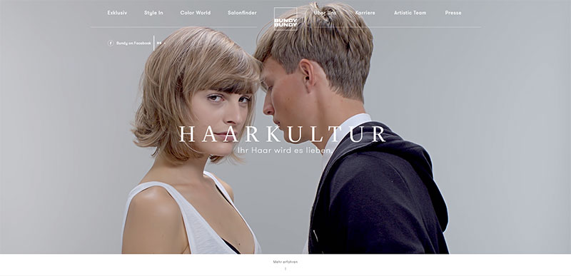 Image source: bundy.madebywild.com
Yes, the website should be beautiful, but it should serve a purpose too. If you want the website to act like a website, provide for some real-time human interaction:
- searching
- tapping
- clicking
- scrolling
- reading
Your moment of truth are new users who are not familiar with what they should/shouldn’t do. It is a designer’s wall of shame or hall of fame, everything depends on his willingness to respect basic principles of interaction design (usability, goals, learn-ability, feedback).
A learnable interaction
 Image source: grannyssecret.com
The best comparison to make here is the Watermelon Crawl dance. You look at people clapping, toe pointing, and shimmying, and you think that is something you’ll never be able to do. Guess what? It takes a single verse to learn, and everything else will simply repeat itself. It is only a routine, but routines are awesome for instilling confidence.
That’s why we leaned on simplicity so badly, because we know how important it is to provide a learnable experience in few clicks. Don’t expect visitors to wander for hours trying to navigate your website, and use techniques such as card sorting to evaluate the best of your options.
Nomenclature is not such an issue, you can experiment with it, but for a large architecture change, you should really stretch a learning hand and provide proactive instructions. User will appreciate it!
Also check out: Wunder UI- Design System & UI Kit
Developing informative content
This is another product of modern design strategy, which requires you to lift your brand awareness a step higher, and to offer informative content for novice users.
Some websites call it Public Relations, others Content Marketing, but it is the absolutely same thing: combined set of modern knowledge supposed to inform readers and to intricate them to dive deeper in your ocean of content.
Multiple device support
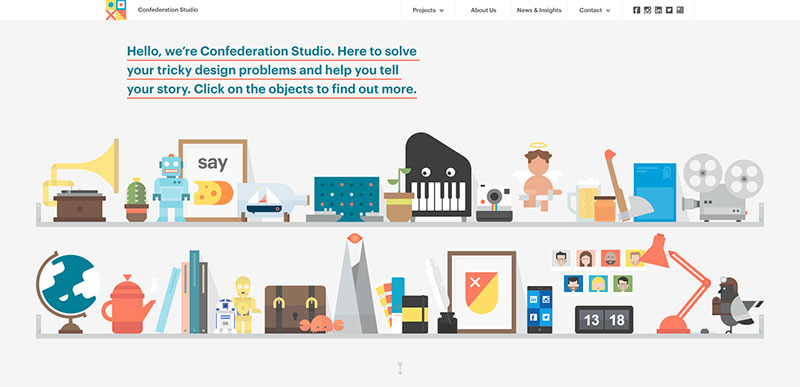 Image source: confederationstudio.com
Speaking of modern website design, there is another critical aspect to be considered: responsiveness of the website across multiple devices and screen sizes.
Nowadays, many users are relying on their mobile devices to browse for content. While not having this was just a small disadvantage few years ago, today, it is a mortal sin for your business.
Don’t fool yourself that migrating is easy-it is still the biggest and most critical challenge for web designers. They must keep an eye on how every element is performing, and to consider all mobile forms and devices to develop a successful migration strategy.
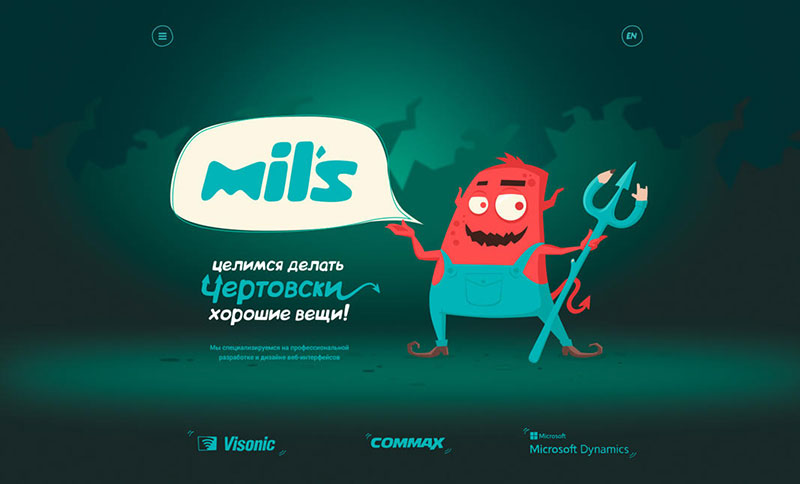 Image source: milsdev.com
These are the basic steps for a website to become mobile responsive:
- Don’t underestimate the importance of mobile traffic, and adjusting your website to ideal touch target-sizes.
- Make layout adjustments
- Compress/resize your images
- Go back to native control
Also check out: Landing Page Templates Bundle
You think conventional design is boring? Guess what? You’re wrong!
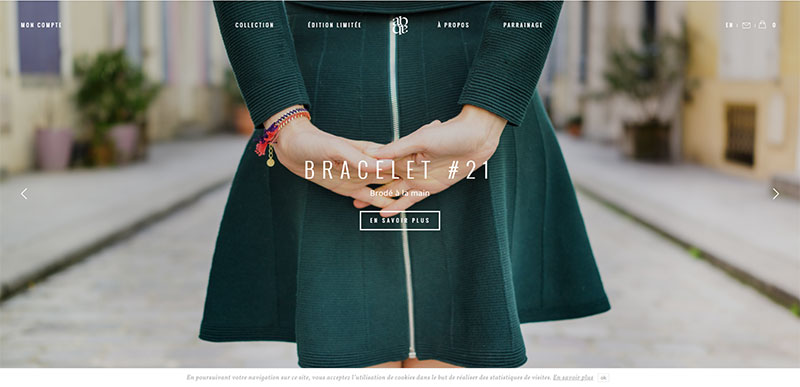 Image source: alixbdanthenay.fr
Experimenting from time to time is refreshing, but where would our living order get without conventions? Living is governed by rules, and like it or not, website design too.
The application of standardized web conventions will allow users to use your website even if they haven’t seen it never before.
They will recognize your logo, locate the main menu, and find the exact button that can lead them to the operation they want in seconds. They will also expect the same consistency on every page.
This strategy saves them time, and thinking. No one likes to think what to do; we all wish we were born taught.
As a good designer, you need to predict human behavior, and to accommodate functions in accordance with it. There is much more to a beautiful website than its appearance.
There is nothing good in the lack of a testing culture
When a business is ready to pay, and a designer is ready to deliver, the lack of testing culture can be really harmful. It’s not just about the feverish need of boasting with what you have done, but about delivering a solution that won’t do more bad than good to the business that paid a crazy amount to obtain it.
Whatever you do, make a sample size and test the assets you have, especially the marketing ones (emails, landing pages, websites). Expand the resources I every possible occasion.
Studies have shown that failing to test a website has negative influence on conversions, so most businesses will require a testing sample to know how far the outcome can get with the product you’ve provided.
Of course, the product may perform well even when not tested, but that’s pure chance. To be completely honest, success is a measurable variable, and you need to observe it as an advantage rather than a waste of time. If nothing else, you’ll estimate your capacity to design something that is actually effective.
If a business had to choose between an extremely beautiful website with limited performance, and a modest one with amazing results delivery, it would choose the later. Businesses don’t mind your attempts to create a piece of art, but they will certainly complain if the piece of art doesn’t convert.
Here comes one extra tip: Gather a small group of customers and let them have a sip right before the product goes live. Ideally, those should be unbiased people who know nothing about you or your work, since they can provide you with precious insight on the good and bad sides of your design.
Also check out: Essential Web Design Bundle For All The WordPress Ninjas
A website is not done when you think it is done
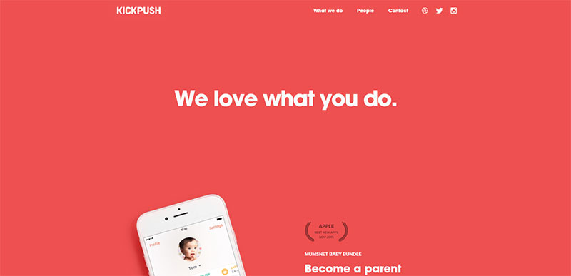 Image source: kickpush.co
Don’t forget a website once you’ve delivered it. We already discussed that websites are ‘living organisms’, and that they will continue evolving forever. SEO is only one of the reasons why websites need to be updated regularly, and the best way to do that is to use relevant feedback, to estimate relevant user experience, and to refresh with new features and utilities. Whatever your strategy may be-make it work!
We understand this is a complex path to follow, but success never comes easy. If you want to stay in the game, you have to step ahead of it.
Also check out: Bootstrap Admin Templates For A Responsive Dashboard
The most common website design mistakes
Web design failure is not as much connected to what you don’t know, as it is to what you know you shouldn’t do, but you’re still doing it. A critical mistake, for instance, is not to neglect the urge to make the website pretty and let functionality take the toll for it. The second biggest mistake is sacrificing simplicity, just because you think a simple site is boring.
We have few other ideas on common common mistakes in web design that should be eliminated:
- Overdone and cluttered pages. If a user has too many choices, none of the choices will be good enough. You’ll just appear too lazy to organize things properly.
- Unfamiliar navigation. Who told you that ‘cute’ is always ‘smart’? The path from one page to the other can be as beautiful as you want, but if users don’t understand it, you’re done ‘fulfilling expectations’.
- Paying too much attention to graphics and forgetting your long-term goals. The things you perceive as beautiful are not necessarily the things end-users perceive as beautiful. There is almost no chance that all tastes will match, but there is one thing that you, as the designer, the business, and the customers have in common: the need to work on the ultimate aim that the website is trying to achieve!
Like this post? Check out more amazing web design content here.