The hamburger menu and the hamburger menu icon were first designed for the Xerox “star” system in the early 1980’s and were used to show where there was a list.
The hamburger menu became more popular and was expanded to a variety of systems. Today it is present on nearly every webpage and app, so most likely we have all seen many times, without realizing it.

Norm Cox, a Xerox system operator, created the hamburger navigation and menu to make information easier to get to, enabling users to access various links without having to perform a search. Users were thus able to click on the icon and the hamburger menu would pop right up. Everything they needed was right at their fingertips.
Later on, Ethan Marcotte came up with responsive website design, which did not exist before 2010. This presents user the needed content when actively searching for it – hence the term responsive. This results in a better user experience.
Therefore, both the hamburger icon and hamburger menu make navigation less complicated and faster for the user.

Image source: Brett
Table of contents
Website Design

Image source: Kreativa Studio
When you design your website to be responsive, using the hamburger menu, you make it easy to use and navigate from any device.
A hamburger menu allows your users to tap once and have your most important links available. It shows them how the site should be navigated and sends them right where you want them to go.
It is a win-win situation. The users are happy because they easily find what they are looking for, and you are happy because the user sees what you need them to see.
Also read: Best Websites using Fullscreen Menus
Re-focusing User Attention

Image source: Oleg Frolov
User attention should be directed to the important things: certain links and content are more important than others on your site, while calls to action help focusing users attention and so do menus.
Therefore, the hamburger menu becomes the main focus of your website, leading users to more valuable content.
Check out this blog for an in-depth look at web design basics.
Website Goals Of Hamburger Icon

Image source: Jon Sutherland
One of the main goals of any website designer or owner is to keep users on their site as long as possible. If visitors quickly click away from your site, they are not likely to return; they might become someone else’s customer.
Customers may click away from a website when they experience frustration for not finding what they are looking for or for dealing with an unresponsive website, which they cannot use from different devices.
Also read: Some of the Best Drop-Down Navigation Menus
Does Your Site Need A Hamburger Icon?

Image source: Corey Haggard
If you want to give your users a better experience and to have them coming back to your site, then the answer is yes.
However, a very simple webpage could also be successful without the hamburger icon, but only if all the links are placed at the very top of the page. Without a hamburger menu, a website can be complicated, confusing and hard to navigate.
App vs. Responsive Website

Image source: Jordan de Koning
There’s a fine line between the app and the responsive website since, in many ways they are very much alike.
Apps tend to have a more limited number of navigation options and are more likely to offer users a smaller amount of repetitive options. Websites are more expansive, allowing users to navigate further, and to do more things.
However, you can find hamburger menus both in apps and responsive websites.
Also read: Showcase of Effective Navigation Menu Designs
Flyout Menu
Rather than overwhelming your page’s UI, add a flyout menu, which can successfully replace a toolbar.
E-commerce websites can particularly benefit from implementing a flyout menu. When you add items such as a shopping cart, a wishlist or a profile link to the flyout menu, you are giving your users easy access to these items, while keeping your page “clean”.
This also makes navigation more comprehensive.
A Good Conversion Strategy
 Image source: Kasper Christensen
Besides having a friendly and easy-to-navigate home page, having a conversion strategy is incredibly important. Therefore, if there are not several “calls to action” on your homepage, it is definitely best to avoid off-canvas navigation.
When the content of your website is not built around conversions, navigation should be kept on-canvas. Otherwise, the user may end up running into dead zones.
A good marketing agency will help you to understand conversion strategies and to create an interactive page design that allows your user the freedom of both on-canvas and off-canvas hamburger navigation.
Also read: Free Unique jQuery Navigation Menus
Conclusion – Web Hamburger Menu

Image source: Michael Dunn
Despite the fact that the burger menu icon has been around for so long, it is still questioned and some people criticize it for not being intuitive enough for users.
Yet, research has shown though that the hamburger icon menu is in demand and that users have become accustomed to using it.
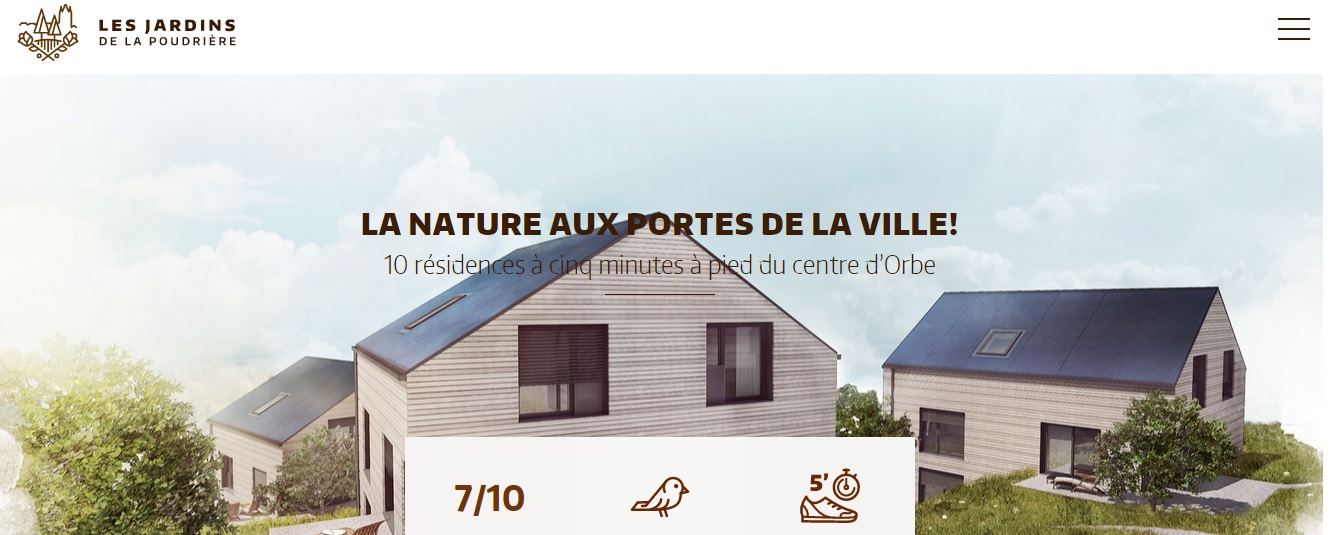
Credit for featured image: jardins-poudriere.ch
Like this post? Check out more amazing web design content here.


