Kodak is officially known as the Eastman Kodak Company. This US company specialized in image equipment and controlled the photographic market for a century. George Eastman established Kodak in 1888, transforming the industry with revolutionary goods and services that made photography accessible to everyone. Kodak logo history plays a significant part in the company’s whole journey which makes the brand completely different from any other company.
Kodak had a near-monopoly on photographic film and equipment for decades, becoming synonymous with photography. Kodak’s story is fascinating about patience and transformation in an ever-changing technical context.
Table of contents
- How Was Kodak Founded?
- Kodak Logo History
- The First Kodak Logo (1907)
- The Introduction Of Color In Kodak Logo (1935)
- Modern Touch In The Logo (1960)
- The Birth Of Present Logo (1971)
- The Change Of Font (1987)
- Minimalistic Typeface Of The Kodak Logo (2006)
- Back To The Epic Kodak Logo
- Every Photographer’s Trusted Company: Kodak
How Was Kodak Founded?

George Eastman, a teenage photographer who had dropped out of school, began producing dry plates for cameras in the United States in 1880. These dry plates were significantly easier to use than prior wet plates, which required immediate development.
Eastman and Henry Strong started “The Eastman Dry Plate Company” the following year.
Their new firm was rapidly profitable. They introduced roll film in 1884, making people’s photography easier and more enjoyable. This resulted in the invention of the Kodak camera in 1888, which revolutionized the way people took and stored photographs. Eastman’s ideas and hard work popularized photography for everyone.
So let’s get right in and begin exploring Kodak logo’s incredible past without keeping you waiting.
Check out these Top 18 Logos with Hidden Meanings.
Kodak Logo History
The First Kodak Logo (1907)
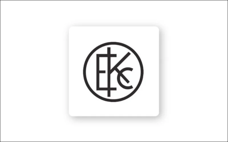
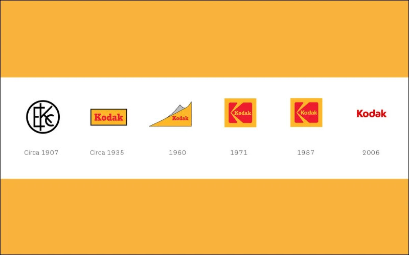
Kodak designed its original logo in 1907, which included the initials EKC (Eastman Kodak Company). The Kodak old logo was basic, straight-lined, and had geometric cuts.
The black circle around the logo made it look complete and softened its edges. Although the logo appeared to be complete, it was ineffective due to the creators’ lack of thought in design or branding.
Also, check out: Barbie Logo History: A Journey Through Time And Design
The Introduction Of Color In Kodak Logo (1935)
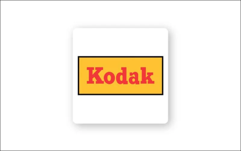
In 1935, Kodak drastically altered its logo design by changing its form and adding color. They introduced their signature colors, yellow and red, around this period. Red evokes thoughts of energy, passion, excitement, and comfort, whereas yellow denotes friendliness, brightness, optimism, and happiness.
By the 1940s, Kodak’s logo consisted of a yellow rectangle with a thin black border and a prominent red logotype in the middle. The text was set in a bold, beautiful typeface with smooth lines and powerful square serifs.
Check out: Instagram Logo: Brief History, Evolution, and Meaning
Modern Touch In The Logo (1960)
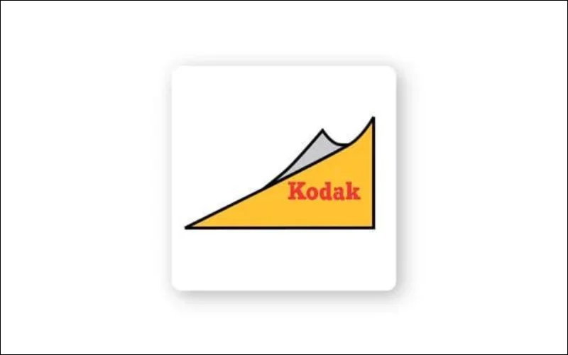
Kodak updated its classic rectangular logo with a triangular form to give it a distinct and fresh look. This change not only made the Kodak company logo more elegant but also unique. It also had the appearance of the currently used Kodak logo.
The new design had a prominent red logo on a yellow backdrop with the same style as the previous version of the logo. The triangular form made the emblem appear more lively and distinct from others.
Check out McDonald’s Logo Meaning: Symbol, History & Brand Review
The Birth Of Present Logo (1971)
In 1971, Kodak launched a new logo design, which had a similar base to the present one. They replaced the triangle with a square box which is also the main component of the Kodak emblem today. The revised design also has a yellow arrow cutout that resembles the letter ‘K,’ which represents Kodak.
This substantial modification gave the Kodak emblem a more unique appearance. The square form and yellow arrow made the design stand out whilst conveying familiarity and brand awareness.
This new logo of Kodak efficiently conveyed trust, stability, and openness. When you create a logo, changing the shape or design is important, which will allow you to explore more ideas.
Learn how you can Use Creative Typography To Create A Brand On The Web
The Change Of Font (1987)
When the company redesigned its logo, it decided to change the typeface. You may have noticed that previous versions featured a serif typeface, giving the logo an old retro vibe.
Kodak chose a sans-serif font rather than the more conservative serifs. This design provided the Kodak emblem with a more minimal but attractive look. This changed the look of the Kodak logo giving a message to the public that it’s a sign of upgrading, the company is getting modern according to the time.
Learn about Le Tour De France Logo Meaning: History & Design Highlights
Minimalistic Typeface Of The Kodak Logo (2006)
In the 2000s, the company Kodak adopted a completely different appearance, no more rectangles or squares. The logo didn’t have any particular design. The logotype was designed in a bold and clean custom typeface, with the letter “A” revised, making the entire nameplate unique.
Red has always remained the primary color in the brand’s palette, but yellow was replaced with white in the logo, which provided a contrast to the logo. Even though the Kodak logo changed to white and red, the company ensured that they kept the colors “red” and “yellow” consistent throughout their website.
You can also check out the 130+ Sans Serif Fonts Bundle that you can use to create your own logo.
Back To The Epic Kodak Logo
The corporation started to release items to reintroduce the brand to a new generation of artists. The company needed to figure out how to keep itself relevant in the eyes of consumers.
During CES (Consumer Electronics Show), Kodak Chief Marketing Officer, Steven Overman, said, “I don’t think of what we’re doing as ‘bringing back’ the iconic identity of Kodak because, in people’s hearts and minds, I don’t think it really went away….The latest iteration needed to feel fresh, yet classic, yet sit harmoniously alongside a range of logos that you still see on signage and packaging around the world. Our goal is to amplify what is already memorable and resonant around the world.”
Like any other company, Kodak also tried various logo designs to come finally with a design that represents the company well.
Kodak didn’t want to change its original branding to something else that people wouldn’t recognize.
And so they chose to change it to the logo design which has a long history. The logo from 1987, isn’t much different from the current one. The current Kodak logo design has the letters written vertically instead of horizontally.
Create your custom logo with the Logo Creation Kit: 850+ Creative Elements
Every Photographer’s Trusted Company: Kodak

Over the years, there have been several changes to Kodak’s logo. Each logo is designed in a way to capture the spirit of that particular era. From its simple black and white logo to a red and yellow color logo that is known worldwide. Despite the changes, the logo has always conveyed the company’s commitment to the world of photography.
So you could learn one thing from Kodak logo history, is that you always have to be up to date with the era and what people like. And that’s how you’ll know, to create a logo that resembles your brand.
Kodak logo history also holds the main point that no matter how many changes you make to the logo, you need to always understand how people will know your brand.


