While mobile technology is huge right now, typography always appears small in size. There are certainly many challenges that need to be overcome in terms of creating legible and visually appealing text on smaller screens. This begs the following question: how will you be able to use mobile typography best practices in order to make the most out of aspects of mobile design, typography, and responsiveness?
Well, the answer to this question comes in the form of a few different steps.
First, it is important that you understand and familiarize yourself with the actual type. Next, think about how people actually read different forms of type. When you put these two steps together, you will be able to essentially create great looking mobile designs.
A vast majority of screens on mobile devices are rather restrictive in the sense that they are not only small but also difficult to read at times. This is mainly because they are used in areas that are brightly lit.
This means that in terms of typography, careful consideration and thought must be given putting something like this onto any kind of mobile device.
There are three major components that many people find to be the best when it comes to mobile typography best practices:
- Size
- Contrast
- Spacing
Table of contents
The Basics of Mobile and Responsive Typography
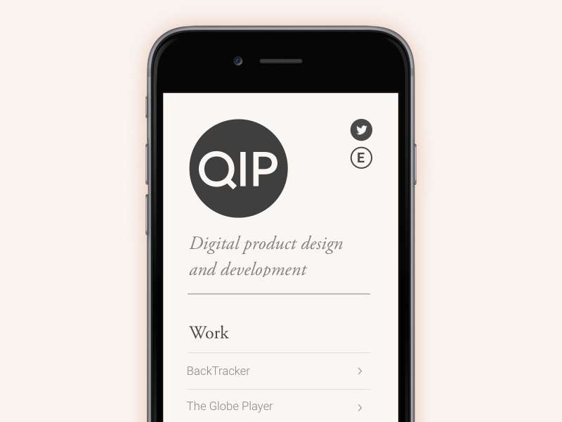
Image source: George Shapter
Mobile and responsive typography are usually not measured using the traditional point system, meaning that it is not similar to the type that is designed for print and different desktop web design projects.
This particular kind of type is designed using pixels, as well as either ems or rems. Many designers prefer this method because it is based solely on percentages, which allows them to create various forms of the type for multiple mobile devices.
Also read: How To Enhance Your Website Design With Web Typography
Size and Space
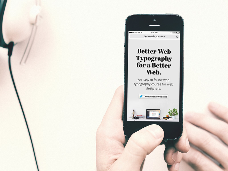
Image source: Matej Latin
There are two aspects to keep in mind when designing type for different mobile devices: size and space.
Obviously, type needs to be large enough to be legible to the viewer. In terms of type on mobile devices, all someone has to do is zoom in closer to read something if the type is too small or if they generally have trouble seeing what is on the screen.
The point, however, is that they should never have to resort to this. So when you are designing a page, you should consider using the type that is slightly bigger than what can be traditionally found on a website on a desktop computer or laptop.
In addition, the type must contain enough space to make the text not appear too visually cramped together. There is no real kind of model that can be used in terms of sizing and spacing of type.
Yet, it is common knowledge that all mobile type should be larger in proportion to type contained on traditional desktop computer screens. In addition, it should also include more line spacing than traditional type.
Normally, the number of characters per line in print and on desktop computers is approximately 60 to 75, but many designers feel that these numbers should be cut in half in terms of mobile type.
Also read: Typography: The Importance Of Getting It Right
Readability and Contrast
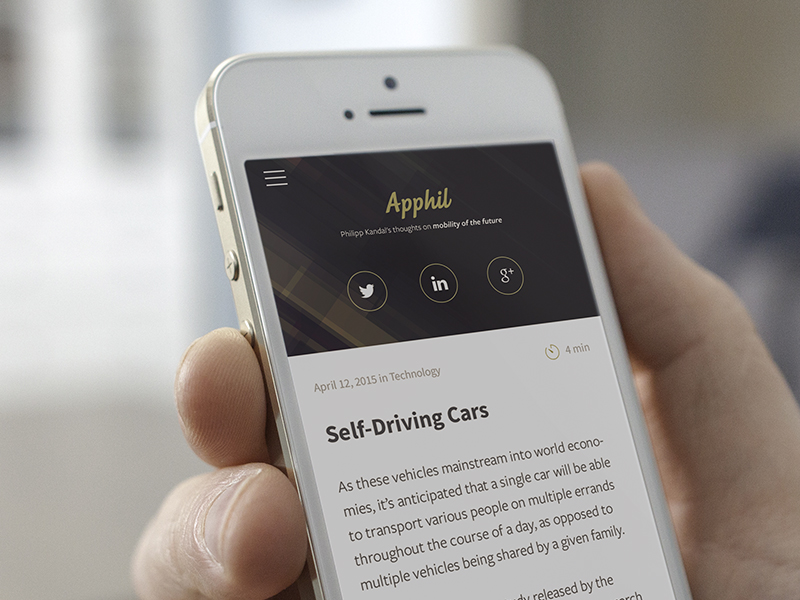
Image source: Michael Varga
Generally defined, readability in mobile typography, refers to the overall amount of effort an individual should put forth in terms of being able to both read and understand the text.
The text is the top way that information is communicated across the entire internet. This is an aspect that should never be underrated.
If you have ever seen something such as red text on a blue background on a computer screen, you know that this is a major issue. Not only can it make the text itself illegible, but it can also cause major issues with your sight in general.
This exact same issue most definitely applies to mobile devices.
However, it is also important to keep in mind that mobile screens are much different than traditional computer screens. Because mobile device users view these screens in many different environments.
This is where it is especially important to utilize good contrast. As this can help your readers see everything a lot better.
Also read: Learn The Difference Between Typography And Lettering
Make Room!

Image source: Nguyen Le
Many people think that mobile typography is all about arranging squiggly lines on a screen. However, the opposite is also true.
In fact, typography involves the space both around and within these characters.
Perhaps the best way to understand this is to see exactly where type itself comes from. For example, the hole that shows up in the middle of the letter “o” is referred to as a “counter.”
During the time in which printing presses were used, counters were created by a metal punch that was carved before being driven into the plate.
In terms of hierarchy, we often mean “through to” and “on to,” but there is actually another form of hierarchy that involves how the flow of things such as lines and paragraphs are affected.
This hierarchy is considered to be special because the space between letters is much less than the space between lines.
Also read: How To Use Large Web Typography To Stand Out
Consider Functionality
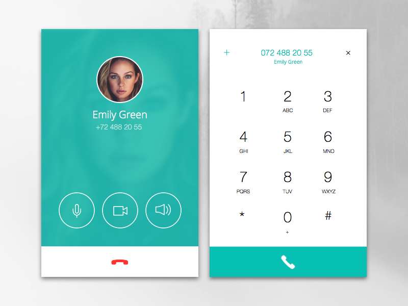
Image source: Sandra Mircevska
Another thing to consider in terms of designing mobile typography is how the typography itself actually works.
Some desktop computer typography is designed to be clicked on and linked to other pages, while mobile typography design system actually allows for more activities, such as the following:
- Making phone calls
- Playing games
- Purchase products
When designing typography for mobile apps, it is important to ensure that your users know exactly what it will do. They also need to sure that it is large and legible enough for them to successfully complete these kinds of actions.
Furthermore, you will also want to ensure that all the active text boxes are big enough to be tapped on. And separated so that everything does one thing at a time.
Check out this ultimate guide to the basics of typography.
Also read: The Best Strategies For Achieving Typographic Hierarchy
Conclusion – Mobile Typography Best Practices
Mobile typography best practices are perfect ways to get started on a project, regardless of what that project actually is.
Many designers are more and more involved in mobile app typography and in creating new trends every day.
Credit for featured image: Joseph A Barrientos
Like this post? Check out more amazing web design content here.
