The web is today’s essential source of content, which makes good typography pretty much essential for designers to attract attention. Knowing the basic typography principles is what ensures proper communication between designers and their audiences, and makes websites far easier to use. In this blog, we will discuss importance of typography in design.
Experienced designers certainly know how to get typography right, but starters could use a comprehensive list of Do’s and Don’ts, especially for their first project. This article is in fact a fundamental guide with check points which you could use for every of your next points. Lets check out importance of typography in design:
Table of contents
- Importance of typography in design: The DOs
- Importance of typography in design : Deciding on your typography structure
- The body text must be written with an appropriate font
- Typography importance: Taking advantage of line height
- Importance of typography in design : Large and attractive headlines
- The importance of typography : Adjusting the text color to the background
- Importance of typography in design : Leading with ample measures and ‘breathing’ space
- Importance of typography in design: The DON’Ts
Importance of typography in design: The DOs
Image source: Cara Bell
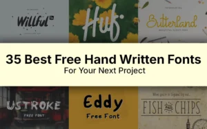
Three is the maximal number of typefaces per page/design
Three digital fonts are perfectly enough for a good design, because applying more of them makes the site appear disunited, and there is nothing to indicate users that they’re still reading the same portion of text (for instance, different fonts for the paragraphs in the same article).
Check out this ultimate guide to the basics of typography.

Image source: aaron stump
Even if the fonts are significantly similar to each other, the entire picture will still be odd, and there will be a strong disturbance effect that may send viewers away from your website.
Also read: How To Use Large Web Typography To Stand Out
Importance of typography in design : Deciding on your typography structure
Image source: Jay Fletcher
Remember to structure your typography using different sizes, colors, contrasts, shapes, and effects. This way, you’re providing viewers with visual cues for locating information and understanding what is really important in your content. Had the entire text been written with a single size, they would not be able to judge even between the heading and the main body.
The body text must be written with an appropriate font
In fact, the entire readability of your text will depend on the body font. That’s why it of critical importance for every designer to consider usability prior to his own preferences: Satisfy may be a good typeface to serve aesthetical purposes, but the body text will be far more effective when written with an average font (sans serif, for instance).
Typography importance: Taking advantage of line height

Image source: Steve Wolf
Staying on the safe side with default height may be appropriate for the moment, but it will do more harm than good on the long run.
 Image source: Allan Peters
Being completely honest, reading without enough distance between lines and without a good baseline grid is not easy: instead, you should keep the line height at least 5px larger than the size of the font (for instance, if the font is 13px, the line height should be 18px).
Also read: Learn The Difference Between Typography And Lettering
Importance of typography in design : Large and attractive headlines
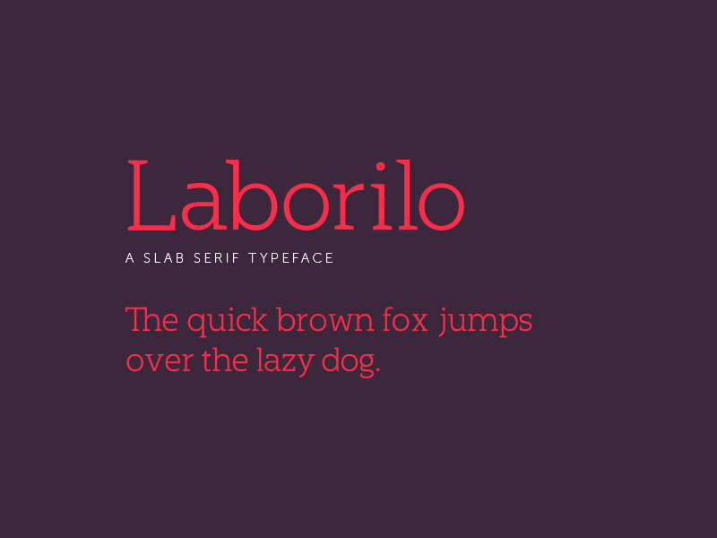
Image source: Chase Turberville
For quite a while, designers lacked the courage to go big with their texts, and articles appeared rampant with nothing more than 10px for the body, and a slightly larger headline that couldn’t attract attention unless read carefully.
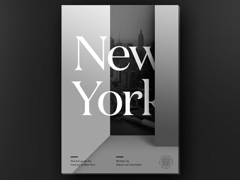 Image source: Tobias van Schneider
Luckily, both developers and designers seem to have finally understood the vitality of their headlines, as well as their power to guide the eye towards a new page. However, headlines are not only supposed to be large. They also need beauty, grace, and outstanding styling with unobtrusive lower-tier headings.
The importance of typography : Adjusting the text color to the background

Image source: Steve Wolf
The most appropriate way to do this is to use an off-white font with a black background, or a dark grey one with a white background. This way, contrast won’t be too strong, and visitors won’t have their eyes strained when reading your content.
Also read: Typographic Trends That You Must Check Out Right Now
Importance of typography in design : Leading with ample measures and ‘breathing’ space
 Image source: Nick Slater
Think about your own experience: is it easy for you to read a text where there is no white space between the lines? The mistake of ‘sticking’ lines together is simply unforgivable, since the problem takes few seconds to solve: all you have to do is to increase the line-heights, but try not to exaggerate because you could still damage readability.
Also read: The Best Strategies For Achieving Typographic Hierarchy
Image source: Jonathan Schubert
At the same time, don’t expect readers to dash with their eyes and to follow your jerky, short lines, because they will end up lost in your content, and they won’t know how to proceed. Too long is not good either, because you’re risking affecting the understandability of your content.
As you can see, getting typography right is all about balance: there should be enough space between lines and characters, but they still need to look connected.
Importance of typography in design: The DON’Ts
Limit writing in Caps
Caps are both desirable and necessary in certain situations, but using them for the entire text is the quickest way for a user to lose focus.
For the sake of explaining caps’ aggressive appearance, note that some people even perceive caps as if you were shouting at them, or, in the better case, they will think that the product you’re offering is worthless spam. Therefore, try to stay in control of the caps and use them only when necessary.
Also read: Typography Terms That You Should Know
Importance of typography in web design : Forget papyrus and comic sans
This is not a recommendation, but a rule: these typefaces are tacky and deserve to be lumped together with IE6. We don’t need to explain the effect of IE6, do we?
Keep leading, kerning, and tracking in mind
Leading refers to leaving space between the lines, which you can achieve easily with any design program.
The practice is visually appealing, the same as kerning, which refers to spacing between letters in a single word, and tracking which deals with proper spacing between words in groups. You need to take care of all three, and to try to achieve the best legibility in a compact unit.
Avoid large and centered texts
People simply don’t like reading centered texts because they can’t scan them easily (both edges of the block are uneven). Many times, centered blocks look disconnected from the rest of the text, which is why they can’t be intuitively perceived as formal and professional. The same as caps, you should use them moderately and align text on the left side instead.
Also read: The Best Practices For Mobile Typography
Don’t ornament the body copy
Ornamenting the body copy is a classic design mistake, especially among beginners and amateurs. They perceive decoration as an easy way to personalize text and make it entertaining, but unless it refers to a single sentence, it can be simply unbearable.
It is not always people who overdo design trying to be unique. It may be the program that will ruin the quality of your typography.
Importance of typography in design: Photoshop won’t help you, so leave it on the side
Photoshop is a prime tool in the design industry, and there’s no doubt about that. Still, aligning text and adjusting sizes with Photoshop is not always the best idea. You may explore the features and the options for days, and it may look that you’ve found the mode you’re searching for, but trust us: accuracy is not Photoshop’s strongest side.
That’s why we recommend the program only to experienced users who know how to tweak typefaces in it and who can adjust their fonts manually. Being completely frank, even they should avoid it for their important texts because it is simply a game of chance.
Like this post? Check out more amazing web design content here.